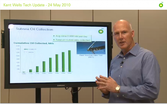
Nathan Yau, at Flowing Data, calls BP out on a piece of data representation trickery. In a video on the BP website explaining the progress they were making cleaning up the oil, Kent Wells offered the following graph:
The bars represent oil collected over time. But, as Yau points out, the data offered by Wells is cumulative. It’s not the case that each consecutive day (May 16 to May 23) they are collecting more oil. Instead, each collective day they have collected more oil overall. If they keep collecting oil, we should expect nothing less.
Instead of showing the data cumulatively, they could have presented how much oil they collected each individual day. But the data, in that case, doesn’t look as good. Yau put this together:
This graph suggests that BP’s collection of oil is diminishing and makes viewers want to know why. The graph they offered, however, hides their decreasing efficacy.
—————————
Lisa Wade is a professor of sociology at Occidental College. You can follow her on Twitter and Facebook.


Comments 9
AO — June 4, 2010
Nice work.
jc — June 4, 2010
send this to Edward Tufte - he'd love it.
Anonymous — June 4, 2010
This is so frustrating.
anonymous — June 4, 2010
FUBP!
Jon — June 4, 2010
I’m not defending BP, but I’m not sure that their original graph is as misleading as Nathan suggests. And while Nathan’s graph may be more indicative of BP’s daily work, it also has some issues.
Two points:
1. The BP graph clearly indicates “Cumulative”. While it may not be the best way to demonstrate daily work, it does indicate their total effort over the course of several days. I’m not sure I would call that “misleading” since cumulative is in the title of the graph.
2. To get a better sense of the daily work, other data points are necessary. As Jehiah suggests in the comments on Nathan’s blog, Nathan’s graph is also not quite the best way to demonstrate the daily work since the daily flow of oil is not constant. Jehiah continues, “What you really want is a chart that shows the barrels of oil released on a given day, the # of barrels collected on a given day, and the # of barrels that remain at large on that day. Unfortunately the first and last data points needed are just guesses. Only then would you be able to gauge the progress in slowing the leak, and the progress in collecting what has leaked.” I concur, though I might suggest a graph that shows the daily barrels collected as a percentage of the daily barrels released as another way to show the daily work.
Anonymous — June 5, 2010
Or they could have the cumulative graph also show the amount of oil spilled. Not that that would happen, but it would be more informative.
Lennard — June 5, 2010
Jon,
It's a reasonable approximation to assume that the amount of oil released from the well each day is constant. It is a *reservoir* after all, and it isn't going to be depleted anytime soon; it will likely be a very long time before the flowrate begins to decrease appreciably.
Wells' figure would have been fine if he weren't talking about how BP engineers had figured out how to improve recovery from the riser while this figure was behind him. It was particularly bad when, after describing what they had learned, he pointed to the graph and said, "as you can see we've 'ramped-up' ...", implying they had ramped up their recovery *rate*, which clearly isn't true.
Barrack Obama & BP Oil Spill - Page 2 - The Wholesale Forums — June 15, 2010
[...] ones). BP has 760 OSHA fines - Exxon has 1. http://www.businessinsider.com/bp-ha...-safety-2010-6 http://thesocietypages.org/socimages/2010/0...re-recovering/ http://news.yahoo.com/s/afp/20100606...ionenvironment [...]
justcallmejo — June 15, 2010
It also should be noted that depending on how successfully they are recovering the oil, the daily recovery rate would be expected to should slow down as the oil is then more dispersed and harder to recover. The large numbers recovered in the beginning stages may have just been the "low hanging fruit" that was easiest to recover.
That being said, it is not surprising that the graph shows cumulative numbers as that is what looks good from a general perspective.