PART ONE:
Drinking lowers your GPA. So do smoking, spending time on the computer, and probably other forms of moral dissolution. That’s the conclusion of a survey of 10,000 students in Minnesota.
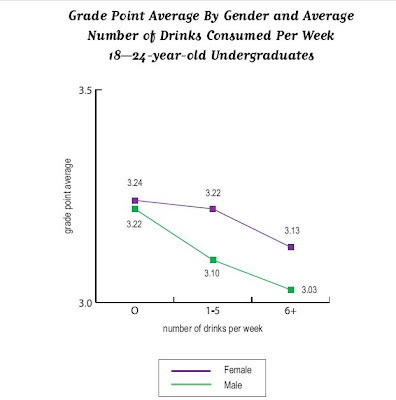
Inside Higher Ed reported it, as did the Minnesota press with titles like “Bad Habits = Bad Grades.” Chris Uggen reprints graphs of some of the “more dramatic results” (that’s the report’s phrase, not Chris’s). Here’s a graph of the effects of the demon rum.
Pretty impressive . . . if you don’t look too closely. But note: the range of the y-axis is from 3.0 to 3.5.
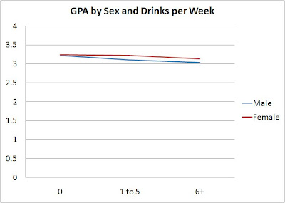
I’ve blogged before about “gee whiz” graphs , and I guess I’ll keep doing so as long as people keep using them. Here are the same numbers, but the graph below scales them on the traditional GPA scale of 0 to 4.0.
The difference is real – the teetotalers have a B+ average, heaviest drinkers a B. But is it dramatic?
I also would like finer distinctions in the independent variable, but maybe that’s because my glass of wine with dinner each night, six or seven a week, puts me in the top category with the big boozers. I suspect that the big differences are not between the one-drink-a-day students and the teetotalers but between the really heavy drinkers – the ones who have six drinks or more in a sitting, not in a week– and everyone else.
—————————-
PART TWO:
Some time ago, the comments on a post here brought up the topic of the “gee whiz graph.” Recently, thanks to a lead from Andrew Gelman, I’ve found another good example in a recent paper.
The authors, Leif Nelson and Joseph Simmons, have been looking at the influence of initials. Their ideas seem silly at first glance (batters whose names begin with K are more likely to strike out), like those other name studies that claim people named Dennis are more likely to become dentists while those named Lawrence or Laura are more likely to become lawyers
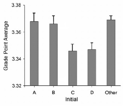
But Nelson and Simmons have the data. Here’s their graph showing that students whose last names begin with C and D get lower grades than do students whose names begin with A and B.
The graph shows an impressive difference, certainly one that warrants Nelson and Simmon’s explanation:
Despite the pervasive desire to achieve high grades, students with the initial C or D, presumably because of a fondness for these letters, were slightly less successful at achieving their conscious academic goals than were students with other initials.
Notice that “slightly.” To find out how slight, you have to take a second look at the numbers on the axis of that gee-whiz graph. The Nelson-Simmons paper doesn’t give the actual means, but from the graph it looks as though he A students’ mean is not quite 3.37. The D students average between 3.34 and 3.35, closer to the latter. But even if the means were, respectively, 3.37 and 3.34, that’s a difference of a whopping 0.03 GPA points.
When you put the numbers on a GPA axis that goes from 0 to 4.0, the differences look like this.
According to Nelson and Simmons, the AB / CD difference was significant (F = 4.55, p < .001). But as I remind students, in the language of statistics, a significant difference is not the same as a meaningful difference.


Comments 24
Richard — April 29, 2010
I'm reminded of this XKCD on honest and dishonest use of statistics in reporting: http://xkcd.com/558/
T — April 29, 2010
Great posts. There is also the pervasive "correlation v. causation" problem in our society. "Gee Whiz" facts and graphs like this work because so few people understand the difference.
michael5000 — April 29, 2010
Well, sure... except that graphing against the full scale of possible GPAs from 0.0 to 4.0 is equally arbitrary, especially given the tendancy of grades, and GPAs, to cluster between As and Cs. A tenth of a grade point across a survey of 10,000 students is not earthshaking, but it IS genuinely significant -- a point that gets lost in the "corrected" graph.
Ian — April 29, 2010
Using a 0 to 4.0 scale is more dishonest, in my opinion. Due to grade inflation and academic probation policies, the vast majority of grades are in the 2.0 to 4.0 range. The range from 0.0 to 1.0 is almost entirely devoid of students, since anyone who would score in those ranges is quickly asked to leave school.
Dr Kate — April 29, 2010
Now if we could only do something as simple as adjusting an axis for the rather recent irksome tendency of investigators and science reporters alike to "try to find meaning in something!!!!" by resorting to tired cliches, spurious caveman analogies, bonobo behavior, and wild flights of fancy. Somehow, saying "we don't understand this simple finding in the context of a complex problem or behavior" doesn't cut it.
Katie — April 29, 2010
I don't think anyone would expect the effect of first letter of name to be large; in fact, it's the kind of thing you wouldn't believe would be there at all. Sometimes the existence of an effect, and it's direction, is interesting. I'd want to know whether that CD effect was replicated in other samples though, and how many different tests of initials the authors performed.
I also agree that your altered presentation is more misleading, particularly because you've made it so that the error bars can't be visible. In fact, the error bars make clear that this "small" effect isn't small in the context of the apparently pretty small variability around GPA -- that's one sample in which apparently students tended to cluster around the mean. All the more reason why it's hardly relevant to extend the range down to zero; most of the people in that sample where clearly getting B's.
Kevin — April 29, 2010
I would want error bars on the first graph, and I'm dubious about the sample size on the second graph (not to mention how the confounding effect of the high correlations between names and race was controlled).
The "correction" of the first graph was clearly wrong. The grade range at universities is quite small (only engineering professors still seem to fail students in measurable amounts). A better scale would have converted GPA to percentiles, so we could have seen whether the effect of the drugs changed their rank in the class.
Dr Kate — April 29, 2010
Keep in mind that statistical significance is just that - a measure of statistical noise. A statistically significant finding is not any safeguard against the effects of bias or confounding in the analysis. All it means is that you have sufficient statistical power to rule out statistical variation swamping your correlations.
Jay Livingston — April 29, 2010
Where is the zero-point on the GPA scale? As several comments have said, not zero. But where? It would have been nice to have the true range of scores.
As I said in my original post, the drinking study difference was between a B+ and a B. Most of us have some idea of what that means. But the 0.03 difference in the name study seems so minimal as not to be worth reporting. And if they had used letter grades rather than GPA -- after all, their hypothesis is about letters -- what would they have found? As Katie, Michael5000, and others suggest, the number of D grades on the transcripts of the D-name students was probably identical to the number of D grades on the A-name and B-name transcripts -- zero. (These weren't engineering students; they were in some MBA program, probably at Yale.)
wtfmi — April 29, 2010
Thank you for this post! I am constantly getting into arguments with people who believe that some statistically significant finding in the latest hyped research study means something important for their everyday lives. It may. Or then again it may not. To paraphrase the post, just because something is statistically significant doesn't mean that it's important.
Eve — April 30, 2010
A great post! Although I agree that scaling from 0.0 to 4.0 does hide some things as well, it is a trade-off. As a rule, if it's a value that starts at zero, that is where my graphs start. If there really is a difference, you should be able to see it. Putting in error bars also helps to show whether there's a real effect there.
This is why I think more journals should call for effect size to be reported along with significance. If you need 3000 people to find a significant effect, it's not significant enough.
S — April 30, 2010
It would be useful to see more statistics of the grade distributions for the different groups. If the lowest, 25%, median, 75%, and highest GPA were reported, then the choice of y-axis would matter much less.
Matt K — May 1, 2010
I think the basic problem, as some have mentioned, is the tendency to stop at significance and not report effect sizes. "Significant" sounds very impressive -- tiny coefficients don't.
N/A — May 9, 2010
???????????????????????????