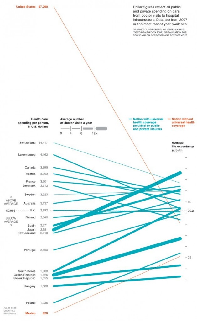
The figure below, sent in by Muriel M.M. and Josh P., shows the relationship between health care spending (on the left) and life expectancy (on the right). Perhaps the most stunning finding is what appears to be a rather loose correlation between the two. But a second finding is the inefficiency of U.S. spending (see it at the left top of the figure?): it is far above the other states included and is, nonetheless, translating into less-than-stellar results (if you measure by life expectancy).

Via National Geographic.
Lisa Wade, PhD is an Associate Professor at Tulane University. She is the author of American Hookup, a book about college sexual culture; a textbook about gender; and a forthcoming introductory text: Terrible Magnificent Sociology. You can follow her on Twitter and Instagram.
Comments 23
Per Stinchcombe — January 10, 2010
Hmm... What I find most unfortunate is that they don't seem to find it worth mentioning that the only countries shown here are relatively affluent countries -- and that those are the only countries that figure into their average. (For the record, according to the WHO, the average spending globally per person on health is about $639.)
Also, they don't say what they mean by "average" -- are they averaging the numbers for the countries or weighting those numbers by population to give an indication of how much money is spent on the average person in the countries listed? It presumably makes a difference - the United States is, by a large margin, both the largest country on the list and the highest-spending country on the list.
George — January 10, 2010
Life expectancy doesn't necessarily measure whether health spending is worthwhile. The life expectancy statistic is influenced by many other factors such as accidental fatalities, lifestyle, diet, etc... On the other hand health spending includes spending on issues not necessarily related to life expectancy, such as treating injuries or chronic conditions that are not fatal but affect lifestyle. For example, if Americans receive more non-fatal injuries than people in other countries that could be a factor. I wonder if the health spending statistic might also include cosmetic surgery. Or psychological therapy, many American's who don't have an actual psychological dysfunction still choose to see therapists simply to deal with everyday problems like stress. Is that included under health spending?
To see whether health spending is "worth it" a better comparison might be to look at survival rates from specific diseases. For example the survival rate for cancer in America is the highest in the world (about 63%).
Per Stinchcombe — January 10, 2010
By the way, the correlation's not actually that weak -- I think this type of graph tends to make correlations look much weaker than they are, since the eye is drawn to the lines that cut across each other. My result for the actual correlation coefficient (with life expectancies rounded to the nearest year, since the exact data aren't shown) is .46 -- which is pretty strong as it is, and if you ignore the obvious outlier (the US), that goes up to .72, which I think is remarkably high for the social sciences.
Anni — January 10, 2010
The interesting thing that I noticed is that the nations with more doctors' visits a year (the thicker lines) seem to be getting a lot more value for their money, in terms of increase in life expectancy, than other countries are.
Dragonclaws — January 10, 2010
Let's note that Japan is generally considered to have the longest-living people because of diet and fitness.
Kate — January 11, 2010
I would suggest that, for example, there is a certain group of people having expensive treatment (say, for life long conditions, pr expensive end of life palliative care) and perhaps a group of people with NO access, who tend to die earlier and bring down the other side. So it might not just be inefficiency, it might be able an imbalance in the system and a gap between expensive treatment and basic treatment.
Sam Vilain — January 11, 2010
The thing this graph doesn't capture, is that these are all years off the end of your life - and those are the worst years anyway.
Robert Evans — January 16, 2010
I would like to know the intra-country, longitudinal results of changes in health care spending per capita. Graphs like this don't even think to show the "baseline" of each country or the increase in life-expectancy per increase in spending per capita over the years.
The only way you can compare apples to oranges is to adjust for the changes over time in these specific countries.
Christopher A. Haase » Blog Archive » The U.S. #1 in Early Deaths. Americans had “the lowest probability over all of surviving to the age of 50.” — January 29, 2013
[...] isn’t making a difference? Apparently our incredible rate of health care [...]