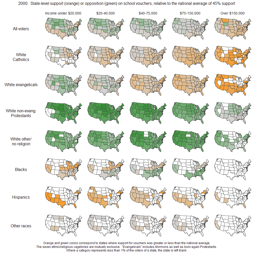
Andrew Gelman over at FiveThirtyEight posted a map (larger version here) that estimates support or opposition of groups with various characteristics to school vouchers, by state and broken down into five income groups. The overall national average is 45% in support of vouchers. Orange indicates that more than 45% of a particular group supports vouchers in that state, while green indicates that less than 45% support them. So, for instance, looking at row 2 (White Catholics), we see that as income goes up, support for vouchers in most states increases, particularly in the $150,000+ income group; on the other hand, row 4 shows much less overall support among White non-evangelical Protestants, even in the highest income group.

Note that if a particular category (the characterstic for the row at any particular income level) makes up less than 1% of voters in the state, the state is left blank on the map. The data is from 2000, based on about 50,000 respondents. There’s a map of the raw data and a discussion of Bayesian statistical modeling in the original post, if you’re all into that.
As Gelman admits, he needs to add more details about what level of support/non-support the lightness or darkness of the colors indicate–what’s the difference between a very pale green and the darkest green? How many percentage points is that? However, the maps give a general sense of how different racial and religious groups feel about school vouchers, and how income influences that.
One thing I do have a problem with is that the categories are mutually exclusive, meaning Hispanic is treated as a race that does not overlap with Blacks or any of the subcategories of Whites (I also don’t know why all Hispanics and Blacks are put together in one category each). But most people labeled Hispanic in the U.S. see their race as White, with Hispanic as an ethnic, not racial, category–that is also how the U.S. Census defines “of Spanish origin.”

Comments 1
[dave] — July 23, 2009
Interesting map .... I was thrown off by your last statement though. "But most people labeled Hispanic in the U.S. see their race as White, with Hispanic as an ethnic, not racial, category–that is also how the U.S. Census defines “of Spanish origin.”"
Most Latinos that I know, as well as work with, would usually pick "other" as a race and Latino as an ethnicity. Hmm, although I just checked wiki and it says that depending on the survey, 54%-92% usually identify as white. The first figure seems closer to my experience, but either way, weird that this map breaks down Whites by all sorts of categories but no one else.
http://en.wikipedia.org/wiki/Hispanic_and_Latino_Americans