
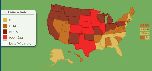
Food & Water Watch has an interesting interactive map that allows you to click on states and see how many factory farms it has per county, broken down into cattle (meaning beef, I assume), hogs, dairy, broilers, and layers (the last two are both chickens). You can look at number of facilities or number of animals. Here’s a screenshot of the number of cattle containment facilities in the U.S.:
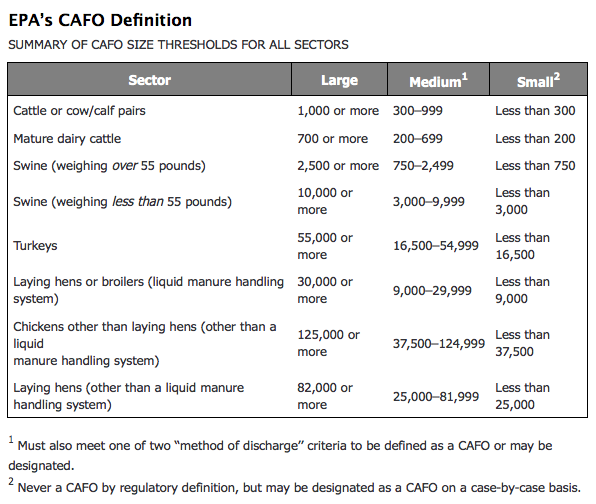
Factory farms were identified using Census of Agriculture data and counting those that “best match the Environmental Protection Agency’s definition for a confined animal feeding operation…” based on the following guidelines:
There’s a very detailed description of the methodology available here and an explanation of the maps here.
Comments 3
easyVegan.info » Blog Archive » easyVegan Link Sanctuary, 2009-04-14 — April 14, 2009
[...] Sociological Images: INTERACTIVE MAP OF U.S. FACTORY FARMS [...]
Analiese’s Reading 4/23 | Quiche Moraine — March 28, 2010
[...] Sociological Images [...]
tommyrider2000 — February 18, 2026
It's fascinating how much our food systems have evolved, especially with the rise of factory farms across the U.S. The interactive map shared by Food & Water Watch is an eye-opener, showing just how concentrated animal farming is by revealing the number of facilities per county. If you're looking for a bit of fun while exploring more interesting data, you might want to check out spinmacho casino, as it offers a nice break from heavy topics. Overall, understanding these factory farms gives us insight into the larger implications of modern agriculture and its impact on our environment, health, and society.