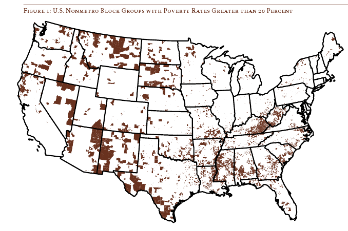
Daniel T. Lichter and Domenico Parisi provide a couple of interesting images using 2000 Census data in a recent article about rural poverty. They use Census block-group data (block-groups are significantly smaller than counties) to identify non-metro areas of concentrated poverty. This map shows all block-groups with more than 20% poverty in 2000:

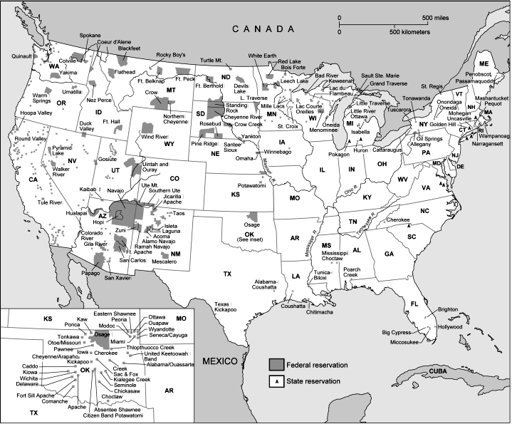
If you overlaid this map onto a map of American Indian reservations, you’d notice that many of these high-poverty block-groups are on reservations–particularly in the Dakotas, Idaho, Montana, Arizona, and New Mexico.
UPDATE: Here’s a map of state and federal reservations put out by Pearson (you can find very detailed maps of individual reservations at the Census Bureau):

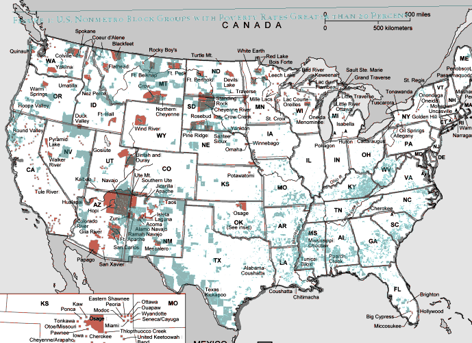
And TOTALLY AWESOME reader Matt Wirth overlaid the poverty map on the reservations map. The two maps weren’t exactly the same so some of the state outlines don’t line up perfectly, but you can get a good sense of how high-poverty block-groups (blue areas) and reservations (red areas) overlap:

Clearly there are many poor block-groups in the west that aren’t associated with reservations, but we see an awful lot of overlap of blue on red, as well as in the regions directly surrounding reservations. Thanks so much, Matt!
We also see a band of high-poverty block-groups in border counties in Texas with high numbers of Latino residents, and of course the band along the Mississippi River and through the Black Belt up to North Carolina, and the ever-present Appalachian section.
Another note about the map: As Lichter and Parisi point out, if they had mapped poverty at the county level instead of the block-group level, many of these areas of high poverty would not have shown up. These are areas of concentrated poverty in counties that are not, overall, particularly poor. The authors note that studies of poverty that look at county-level data often miss isolated rural areas with extremely high poverty rates.
On a side note, see that little blotch of brown in north-central Oklahoma? That’s where I grew up! According to the 2000 Census, my specific hometown has a 17.6% individual poverty rate and the median home value is $24,400. That doesn’t matter to you, I know, but it does make me acutely aware of the problems of rural poverty.
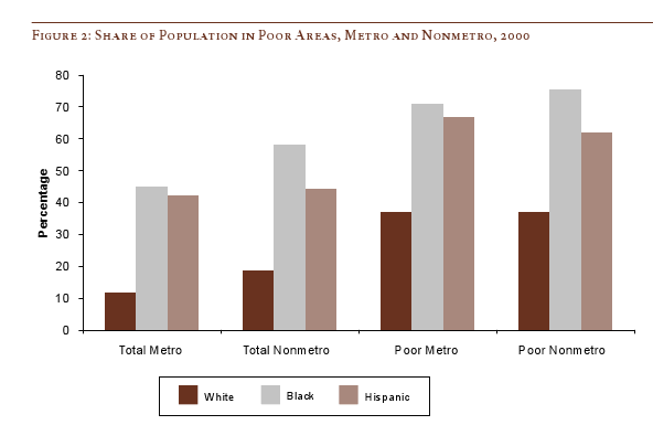
The following bar graph shows how geographically concentrated poverty is among three racial groups. The graph shows what percent live in Census blocks of concentrated poverty–that is, areas where 20% or more of the population is poor (20% is the standard baseline among researchers for defining an area as “high poverty”):

Clearly, in both metro and non-metro areas, a much higher percentage of all Blacks and Hispanics (both the poor and non-poor) than Whites live in areas of concentrated poverty. Notice (in the last two sets of bars) that less than 40% of poor Whites live in neighborhoods with such high proportions of poverty, whereas the vast majority of both Blacks and Hispanics who are poor live in areas where many of their neighbors are poor as well.
Lichter and Parisi argue that the concentration of poverty matters, particularly when it indicates that the poor are socially isolated. Such isolation can mean lack of access to social services, decent schools, and the types of social networks that provide job leads, recommendations, and so on. This type of social isolation can be much more harmful than being poor in and of itself, a topic also investigated by William Julius Wilson in When Work Disappears: The World of the New Urban Poor and The Truly Disadvantaged.
From “Concentrated Rural Poverty and the Geography of Exclusion,” Rural Realities, Fall 2008, p. 1-7, available from the Rural Sociological Society.

Comments 2
dreikin — February 23, 2009
No prob - I wanted a better view than trying to visually match them up, and figured I'd share :-).
"[...] through the Black Belt up to North Carolina, [...]" When I saw that section of the map, before reading your comment, I thought "Bible Belt" and "Hurricane Border" - the latter of which is more interesting to me. Florida gets hit by pretty much every hurricane that comes along, so the people who live here need to be able to afford the repairs and such, and we also have a lot of tourism and 'snow birds' that keep the economy up (in fact, those are the main businesses in many areas, along with farming). But that string of blues looks like the area where hurricanes hit with less frequency, possibly not enough that preparation is given much thought, but enough to still have an economic impact.
As for the bible belt one, I went to check my estimate of the area, and found another map set you might be interested in:
http://www.valpo.edu/geomet/geo/courses/geo200/religion.html
There are several maps linked on that page, from 2000 survey data, and I found these quite interesting:
Religious Adherents (%) in an area: http://www.valpo.edu/geomet/pics/geo200/religion/adherents.gif
Leading Church Bodies in an area: http://www.valpo.edu/geomet/pics/geo200/religion/church_bodies.gif
And, most interestingly:
Catholics (%): http://www.valpo.edu/geomet/pics/geo200/religion/catholic.gif
Baptists (%): http://www.valpo.edu/geomet/pics/geo200/religion/baptist.gif
- The areas are almost completely opposite!
Sociological Images » RELIGION AND GEOGRAPHY — March 4, 2009
[...] Matt merged the religious adherents map (the first one in this post) with a map from a previous post about concentration of [...]