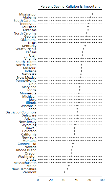
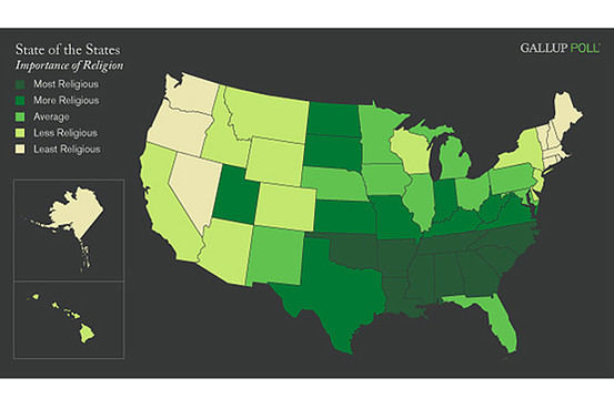
“Polls have always shown that the vast majority of Americans believe religion is “an important part of their daily lives” — 65% in a recent Gallup poll versus just 34% who said it wasn’t.
But that national average obscures a stunning variety by region.”
More precise data can be found at Gallup. In the comments, Jay pointed out work by John Sides at The Monkey Cage, that re-maps the data using absolute levels and accounts for a full range of responses, showing that “even in the least religious states, there’s plenty of that old-time religion.” Given that the dot-plot and map use the same data, it could make for an interesting debate on how to present data and the implications of differing analytic categories.


Comments 12
Penny — February 19, 2009
Not a great map--it looks like they just broke up the list of states into five equal categories--so the colors give you a sense of which quintile each state is in, but no information at all beyond that. I suspect within quintiles there's still some significant variation--but that's lost here. The Southern block might not look so solid if the data were represented with more subtlety.
chuk — February 19, 2009
Moreover, each colour seriously needs to be labeled with what proportion it indicates. There could be only two points separating the most and least religious states, and you could still generate this map. We know from the article that the max is 85% religious and the least is 42%, but that's not telling us much.
john — February 19, 2009
More more precise data can be found at Gallup. A link has now been added to the original post.
Anonymous Coward — February 19, 2009
As the gay that is the map of places I'd least like to live. The darker the green the less I want to be there.
yikes — February 20, 2009
Hooray! According to this, I moved from one of the most religious states (SC) to one of the least (OR). Man, I knew my quality of life had improved, but I didn't realize how much.
abc — February 20, 2009
Interesting to contrast this with the map of red vs. blue states. I'm surprised about Alaska, for instance. And a bit shocked at myself for being surprised -- I hadn't realised the extent to which I'd bought into the grouping of being a religious American and being a conservative one.
Rebecca — February 20, 2009
In tomorrow's news: Water is wet.
Jay Livingston — February 20, 2009
Re: the comments by Penny and Chuck. Two weeks ago, John Sides at The Monkey Cage did a re-mapping and a graph that give a much more accurate picture.
http://www.themonkeycage.org/2009/02/mapping_religiosity_in_the_sta.html
chuk — February 20, 2009
Thanks John :)
Penny — February 20, 2009
Wow, yeah, the dot plot is far more informative. I suspected as much. I also liked Sides's comments about the choice of darker shades for more-religious, and lighter shades for less-religious.
Analiese Is Reading… | Quiche Moraine — February 24, 2009
[...] Sociological Images [...]
Carl — December 5, 2025
I usually bet on hockey and combat sports so the fighting theme of this site caught my eye. I was checking the odds at https://bigclash-ca.com/ to see if they offer better value than the major bookies. The lines look competitive for the main events but I am curious about the prop bets availability. Sometimes these newer platforms have good main lines but lack depth in the special markets. If anyone here bets on sports regularly can you tell me if the settlement is instant or if they drag their feet after the match ends?