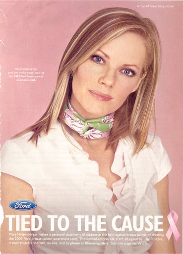
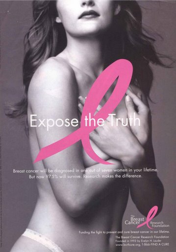
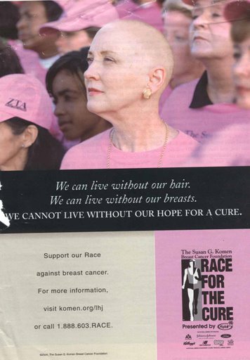
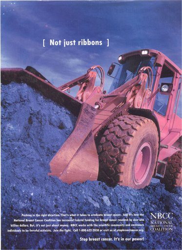
Myra M. F. sent us these four breast cancer awareness ads to compare and contrast (find them here). They are all super pink-ified (because men don’t get breast cancer… oh wait, they do), but the first two use stereotypical femininity and the latter two challenge them.
(1) Ah the lovely young middle-aged woman (I stand corrected), the ruffley white blouse, the slight head tilt, and the fashionable breast cancer scarf. You too can look oh so good while you fight breast cancer! Go Ford!

(2) “Expose the Truth.” Those awesome knockers on that gorgeous anonymous babe could someday be victims of breast cancer. And we can’t have that! Support breast cancer research!

Consider how different these next two are:
Here we see a woman who accepts some conventional definitions of femininity (make-up, pearls, earrings and, of course, pink), but rejects the idea that women should be ashamed to lose markers of femininity (“We can live without our hair. We can live without our breasts.”) and instead looks bravely towards a cure (“We cannot live without our hope for a cure.”) Plus, this image is about action (a race) instead of fashion (a scarf), suggesting that it is also a rejection of the idea that to be feminine is to be passive or powerless.

And this image actually mocks the symbolic ribbon and, I will add, bracelet activism (how feminine are ribbons and bracelets?), in favor of appropriating a masculine symbol (heavy machinery) by turning it pink and putting it to work against breast cancer. The text at the bottom says: “Stop breast cancer! It’s in our power!”

Four ads, all with the same message, all mobilizing femininity, but in two very different ways.
Thanks again to Myra!

Comments 9
pharmacopaeia — June 17, 2008
As part of a recent breast cancer awareness drive in New Zealand we have had ads that deal with 'ordinary' women (http://www.nzbcf.org.nz/downloads/BCAM%20Poster.pdf) andalso, admirably, a push to make men more aware of the disease, not necessarily as sufferers themselves but as the husbands, brothers, fathers and sons of sufferers (http://www.nzbcf.org.nz/downloads/BCAM_07_poster.pdf).
Marcello — June 17, 2008
The "lovely young woman" in the first ad is Marg Helgenberger of CSI's fame. She was born in 1958. ;)
The contrast between the two groups is quite striking... I personally like the marathon approach, but i'm not sure which one could be more effective.
M
Muriel Minnie Mae — June 17, 2008
There's a Facebook group called "Save Second Base." It's a group dedicated to breast cancer research (or something along that line). I didn't join.
Tracy — June 17, 2008
What'd I like to know is why breast cancer? Why not ovarian or uterine cancer? Why not colorectal cancer? I hate to complain because my own aunt died of breast cancer, but it seems that some cancers are more popular to advocate over than others. Breasts beat reproductive organs apparently.
Le — June 20, 2008
It's cuz you can sexualize breasts. The second ad above proves that. But how do you sexualize internal organs? Unfortunate but true.
Sociological Images » Should Marketing Principles Be Applied to Disease? — May 19, 2009
[...] I’m not trying to suggest that raising awareness of and funding research for breast cancer isn’t important, but I am interested in the strategies by which being “against” breast cancer is (literally) sold to us. And I’m curious about how this affects treatment and research funding, if at all, and the rationality of our resource distribution given the application of a marketing approach to (some) diseases (and not others). (Also in breast cancer marketing, see here, here, here, here, and here.) [...]
Emily — November 30, 2009
I find the first advertisement a little confusing. I can't read the small text at the bottom, so the only real indicator I have that it's about breast cancer is the pink ribbon. Personally I find it a little plain.
I have different feelings about the second one. The only thing that I'm willing to define as "sexual" is the underwear that she's wearing. I feel that they are not making as large of a spectacle of the woman’s breasts as they could have; her hands are not only covering most of them, but the large pink ribbon is as well. I like this one.
I love the slogan for the third one, and it definitely gets its message across with clear and readable text (unlike the first two, which were much more image-oriented).
As for "bracelet activism," I don't see it as strictly "feminine." I've seen plenty of Livestrong bracelets worn by guys and in an array of colors, not just stereotypically "feminine" ones.
I do agree though, more focus needs to be put on research for other cancers, as well as the fact that there should be at least a few breast cancer research advertisements about men. And thanks for posting this!
Boobies Against Breast Cancer » Sociological Images — March 28, 2010
[...] breast cancer marketing posts here, here, here, here, here, here, here, and [...]