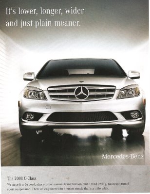
The last line says, “Then we engineered in a mean streak a mile wide.” Can you imagine such a marketing campaign for a Honda Civic or a VW Passat? This is a man’s car–it takes up more space, and it’s mean–characteristics we allow (some) men, but not women, to have.
Note: I like the commenters’ points that this intersects with class more (as well?)–see the comments. They did a better job with the analysis on this one than me.
NEW:
This ad (found here) plays up the fact that some cars are designed to look “mean,” so the Jaguar is actually afraid of the BMW:
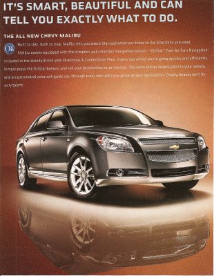
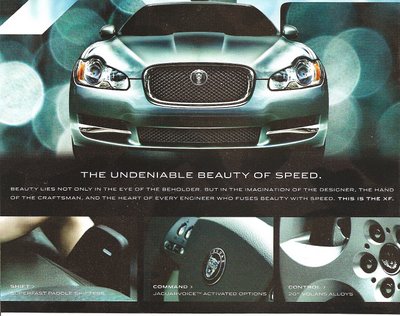
Compare the ads above to these two that link a car and beauty. The first one seems to be portraying the car as a beautiful but bossy woman (“…can tell you exactly what to do”):
It’s an interesting contrast–these three cars all look very similar, and yet one is mean/masculine and the other two are beautiful/feminine. I like to show comparisons like these in class to make it clear to students that advertisers have many different motifs and meanings to draw from when creating marketing strategies, and that the ones they pick are just that–CHOICES among many, many different ways you could advertise a product, none of which are necessarily more “obvious” or “natural” than others.


Comments 5
Gomi — April 9, 2008
I see this as more animalistic than male. Sure, meanness is a characteristic we allow some men but not the rest of us, but the ad copy elicits more thoughts of wild animals than men. And yes, animalism is not something I'd ascribe to Civics or Passats. Maybe a better question is the need to connect some technology or objects to nature or wildness, to make them more appealing.
Anonymous — April 9, 2008
gomi got good point-- also I'd think of this as a class thing more than a gender thing. Anybody who's working in a competitive corporate environment is "allowed" to be mean.
Gwen — April 9, 2008
I think those are excellent points! The idea of the competitive "animal" in the board room...Although that image is usually implicitly male.
casualbrowser — January 10, 2010
There seems to be a general reluctance to admit that there is an undercurrent of gendered thinking processes behind these ads, which to me seems clear. Pointing the animalistic quality of the car was interesting though...I still think it is a motif that is part of the masculinization of the car.
gregorio63 — December 14, 2025
Car culture commentary often reveals how branding shapes identity as much as performance. Discussions about what counts as "real" frequently reflect social expectations rather than engineering. Those themes usually lead to practical questions about shopping and sourcing. Context framed around be forward aligned with that shift, emphasizing access and clarity. Transparent information can help cut through stereotypes when evaluating actual vehicle needs.