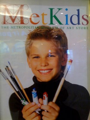
This is a tough one, but there is something about this image advertising the Metropolitan Museum of Art that just screams privilege. Is it the perfect blonde hair? The perfect white teeth? The neat upper-class masculinity? The turtleneck? I can’t quite put my finger on it!
Thanks Jason!


Comments 7
Rachel — April 2, 2008
Okay, okay. I'm a fan of this blog and all, but I don't know if just every picture of a white boy ever counts as offensive media imagery. You're right, he looks like a brat, but there isn't anything offensive about this image other than the possibility that this kid's parents are rich. I'm don't think "reverse racism" is a valid argument against certain critiques, but the only problem you seem to have with this image is that he's a blonde, with white teeth. As for neat upper-class masculinity? I don't know if it fits into the masculine --stereotype-- to like art and turtlenecks. Just a thought. Keep up the good work on this blog though. Is it for some class? I love it.
Martin W. — April 2, 2008
When I see the picture I see this selfish kid with all the art suppplies and I got none. His cleanliness says he ain't using them so he's just spiting me with that big grin. All the scaffolding around the M looks dumb too. Just bad vibes from this picture.
Rich — April 2, 2008
The kid has been shopped and airbrushed to the point where he isn't human anymore. It's sad that the Met believes that the WASP demographic is more important then one of inclusion and diversity.
The mouth is really what does it. Thin lips.
They even threw a cleft in his chin.
Gwen — April 2, 2008
I totally thought it was a girl, probably because the kid appears to be wearing lip gloss. I think he looks a bit like Jamie Lee Curtis.
I don't think he particularly looks like a brat, just, as Rich points out, a very photo-shopped kid.
It's not the most compelling image ever, but it's harder to find things that illustrate class than other things we post about (gender and race in particular).
I just had those books where you get the page wet and the dots turn into a smudgy, paint-like substance.
We just put things up on the blog for people to maybe use to illustrate social science concepts. We use some of them in our classes but not all.
Rachel — April 2, 2008
Well, fantastic. I read this blog regularly. Re: the difficulty of finding classed images, what do you think of the new Hermes ad campaign?
http://fabsugar.com/1047496
These images imply colonialism and glamorize a destructive imperial past (though it's hard to say we're "post colonial"). The choice to make the model Indian wearing British clothing-- at least the riding outfit -- symbolizes the primacy of class power to trump racial "inferiority".
Christine — April 3, 2008
Let's not fool ourselves here, any type of white person will not do in advertising. Blonde hair and blue eyed are the preferred.
This picture reminds me of the reaction I had to a picture of a blonde haired, blue-eyed couple promoting Hannidate on Sean Hannity's website (http://www.hannity.com/). Hannidate is a dating site for conservatives. The photo makes such a strong statement as to what conservatives look like.
Blix — January 16, 2012
At LEAST they are encouraging the arts (and in boys). Also, there is no indication that those paints are expensive (a three color set with a few brushes is not exactly unheard of for kids).
As for the retouching, it is a bit much.