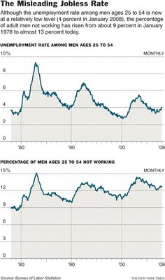
The graph below shows the different results when using two different measures of joblessness (notice how the use of two different scales on these graphs–10% and 15%–visually interrupts a fair comparison). Visit the New York Times story that accompanied this image for a historically-grounded discussion of the problematics and politics of measuring joblessness.


Comments