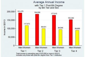
Here’s a graph, courtesy of the Wall Street Journal.
The story the WSJ tells is about the descending steps of income for post-BA degree recipients by “tier” of the institution from which they graduated. The tier captures how elite the institution is considered. This article by Joni Hersch at Vanderbilt is the basis of the article.
Follow the red bars (for men) across from left to right, as the WSJ suggests, and you see inequality. Follow the yellow bars (for women) across from left to right and you see the same pattern of inequality. What makes the higher tier graduates “worth more”? The discussion of it asks us to consider that the value added might not pertain to explicit “merit,” but rather other kinds of cultural “merit” that produce those distinctions. Stuff like where your parents vacationed or what your taste in wine is. This is an important topic of examination.
Meanwhile, the red and yellow bars within each tier demonstrate a whopping gender gap. And that gap is left unremarked. When we look at a graph like this without putting this larger gender inequality up front, we inure people to categorical inequalities, and it makes it easier for readers to persist in seeing such inequalities as natural. Which is, by the way, the root of inequality. Seeing it as natural.

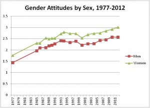
It reminds me of this graph from a recent briefing report about an end to the stall in progressive gender attitudes. What I see is that there’s no convergence. The gap persists. And that isn’t natural.


Comments 1
John — November 21, 2014
This graph doesn't really mean a whole lot considering it doesn't separate the degrees. The Chemical Engineer is going to make significantly more than the Art Historian, on average.
All this graph shows is a gender disparity among majors, not a gender wage gap.