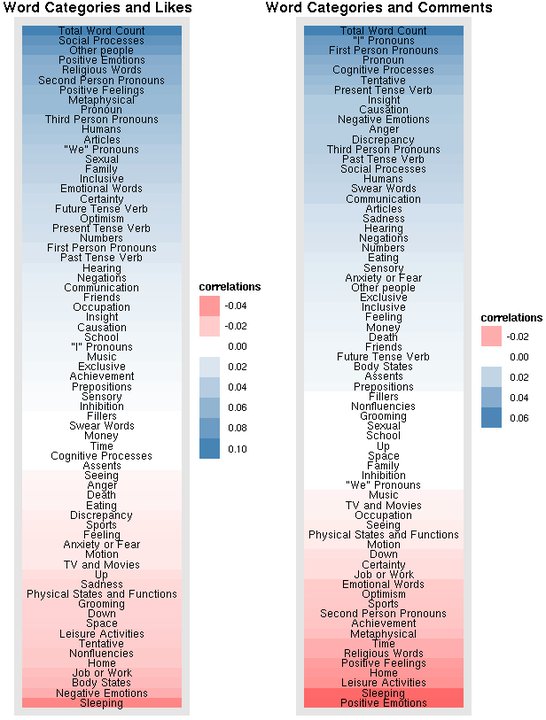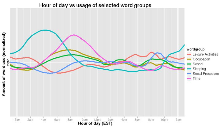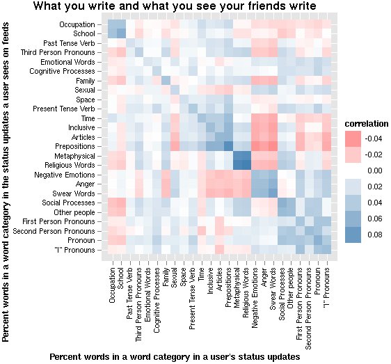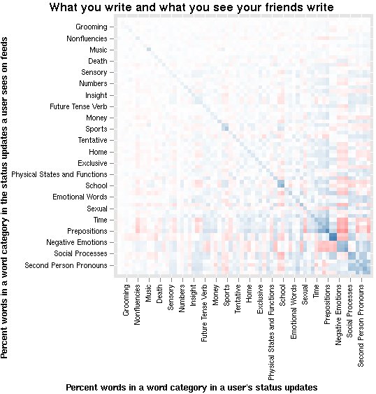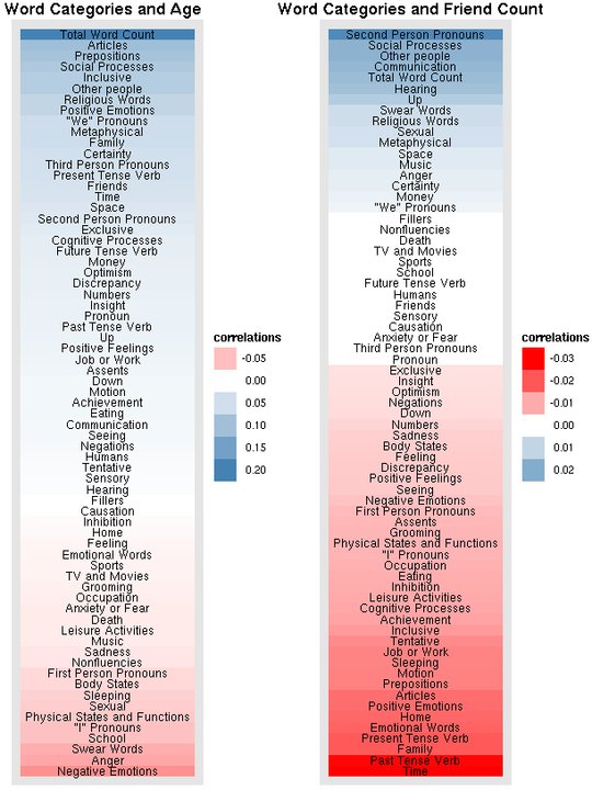
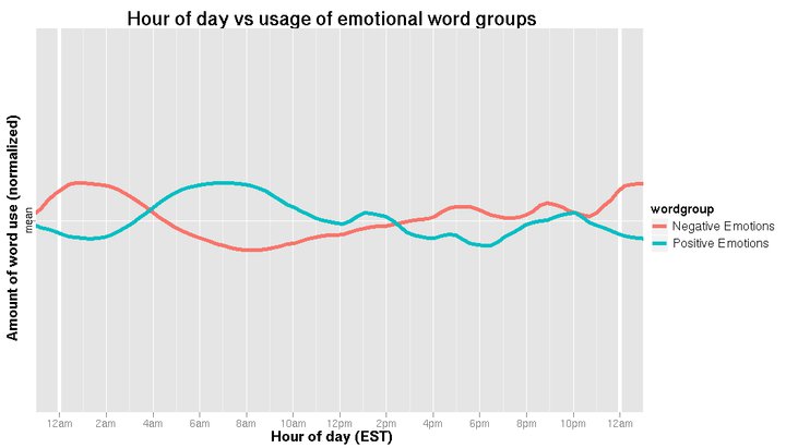
OK Cupid leads the way when it comes to providing analysis of user data in easy-to-understand charts and graphs. Facebook has done so less often, but provided some interesting new data last week. Lots of charts to dig into here. For instance, the types of topics that draw “likes” versus comments are especially interesting. Talk about religion and you’ll get lots of likes but few comments. Just the opposite for angry status updates which tend to garner lots of comments but few likes.
See all of the analysis here.
Should social media companies provide these quick-and-dirty, non-scientific and usually not all that well analyzed data on the web for all to see? The level of analysis is usually quite low (note that this Facebook data was posted by an intern for the site) and surely would not pass the peer review standards of a major social science journal. Are they doing a disservice by providing potential misinformation, or is this fulfilling a public duty to let us know a bit more about our own data?