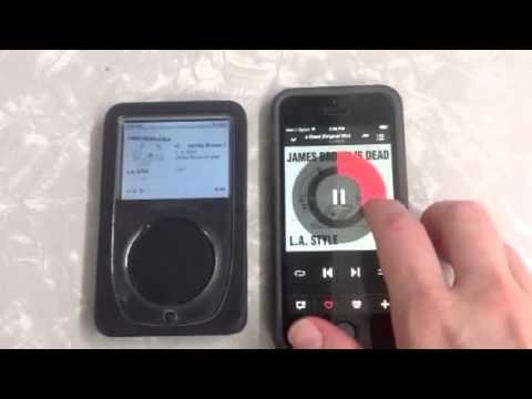
In an earlier post, I talked about Apple’s 86ing of the iPod Classic, the one with the clickwheel interface rather than the touchscreen interface. There was plenty of iPod nostalgia as news of the clickwheel iPod’s discontinuation spread, including this piece, which focuses on the aesthetics of the clickwheel as an interface.
Though the touchscreen is often seen as replacing the clickwheel, I think the clickwheel has influenced toucscreen music interfaces. As you can see in the video above, the BeatsMusic touch interface echoes the iPod clickwheel. Just as you use the iPod clickwheel to fast forward or rewind or jump around in a track (press the center key, then slide back or forward on the wheel to place the cursor on the track’s progress bar at the bottom of the screen), you use Beats’ circular touch interface to fastforward or rewind the currently-playing track. (Beats is owned by Apple, so this resonance isn’t surprising; however, I don’t know if the Beats touchscreen wheel was developed before they were acquired by Apple.) So, to paraphrase a line from L.A. Style’s “James Brown Is Dead,” maybe we shouldn’t be mislead when the newsman said the iPod clickwheel is dead?
You could argue that the Beats interface also echoes turntable interfaces…and that’s not wrong, but when I scroll around the circular wheel on my iPhone 5’s touch screen, that much more closely and directly echoes the iPod classic than it does a record turntable. In fact, I’d argue that the clickwheel itself echoes turntablism (has anyone written on this?), so the resonance with turntables is included in the Beats interface’s resonance with the iPod clickwheel.
Clearly the clickwheel has had a lasting impact on digital music interface design. Are there other examples, besides the BeatsMusic interface, that y’all can think of?
