Via Visual Economics. Though often presented as the domain of economists, sociologists have a lot to say about patterns of consumption and their effects. Though patterns of consumption and their effects are often presented as the domain of economists, sociologists have have a lot of interesting things to say about this topic.

wheredidthemoneygo1

Of course, some have wondered, if sociology sucks, why do economists keep on doing it?

As reported in the Associated Press, according to a report released today by the Trust for America’s Health and the Robert Wood Johnson Foundation, “Adult obesity rates increased in 23 states and did not decrease in a single state in the past year… In addition, the percentage of obese or overweight children is at or above 30 percent in 30 states.”

obesity_statesMore details, nifty flash graphics, and state specific information can be found online.

From ABC News, “Transformers: Revenge of the Fallen … is taking fire for its comic relief: a pair of slang-spewing, illiterate Chevy hatchbacks named Skids and Mudflap… the robot duo is being labeled a racist caricature.” According to Yahoo News, “They’re forced to acknowledge that they can’t read. One has a gold tooth.”

ADDITION Film Transformers-Jar Jar AgainI haven’t seen the movie, so it’s difficult to comment directly, but I wonder if this another example of the dehumanizing racial stereotypes. Michael Bay, the director, largely dismisses the concerns. “Listen, you’re going to have your naysayers on anything,” he said. “It’s like is everything going to be melba toast? It takes all forms and shapes and sizes.”

Reminiscent of work by Anna Lappé and the Small Planet Institute‘s “Take a Bite out of Climate Change” initiative, I stumbled across  Food-Miles and the Relative Climate Impacts of Food Choices in the United States by Christopher L. Weber and H. Scott Matthews in Environmental Science and Technology. Looking past the fancy equations you see data presented like this snippet of Figure 1, documenting the green house gas emissions associated with household food consumption, allowing for a comparison of impacts between food groups.

The article presents data that systematically compares the life-cycle greenhouse gas emissions associated with food production against long-distance distribution, aka “food-miles,” finding that the production cycle accounts for the majority of emissions. In other words, changing the type of food you eat (e.g., less red meat) does more good for the environment than buying local.

I came across a series of photos that reminded me of Menzel and D’Aluisio’s book, Hungry Planet: What the World Eats, that looked at how globalization, migration and rising affluence affect the diets of communities around the globe.  See also photo galleries 1, 2, and 3 in Time Magazine.

From photographer, Mark Menjivar, You Are What You Eat is a series of photographs looking at the interiors of refrigerators in homes across the United States. Nothing was added or taken away.

What type of insight do we gain by looking at our refrigerators?

Using the same OECD data set that produced this graph on time spent eating and BMI, Floyd Norris at the New York Times brings us a new finding. The “10 countries where people spend less than 100 minutes eating and drinking each day have, as a group, consistently shown higher economic growth than those that took more than 100 minutes to savor their daily repasts.”

eatquickly
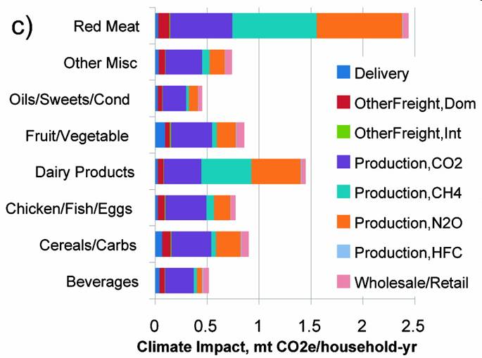
As before, the statistics are far from conclusive, but the data continues to invite a discussion about food and culture.

It also invites a discussion of atheoretical data analysis. Last year, Chris Anderson’s article in Wired Magazine (The End of Theory: The Data Deluge Makes the Scientific Method Obsolete) argued that our ability to generate vast amounts of data, made theory unnecessary, and that scientists were starting to look at correlations as a sufficient analysis level of analysis.

In a NYT blog, Catherine Rampell “plotted out the relationship between time the average person in a given country spends eating and that country’s obesity rate (as measured by the percentage of the national population with a body mass index higher than 30).”

foodfatWhile the blog post is light on details and the statistics are far from conclusive, the chart holds and invites a discussion about food and culture.

From the folks at Good Magazine, a “look at the 20 countries from which the most people came to America in 2008,” including how many were immediate relatives of US citizens, and how many received asylum, based on data from the Department of Homeland Security.

trans0509whoiscomingtoamerica

Does anyone know why data from North Korea and South Korea is combined? How can country be “unknown” for so many?