One criticism of my post on gender dimorphism in Disney movies was that good animation inevitably exaggerates sex differences. There are a lot of these comments here on SocImages and at Slate. Here’s one example:
Cartoons aren’t meant to accurately portray people, EVER. They are meant to exaggerate features, so that they are more prominent and eye catching. So feminine features are made more feminine, and masculine features are made more masculine. … The less realistic the proportions, the more endearing and charming we find the character. The closer to realistic they are, the creepier/blander they can become.
Flipping through IMDB’s list of the top 500 animated movies reveals that Disney is certainly not alone in emphasizing the larger size of males. But there are a few successful counterexamples as well.
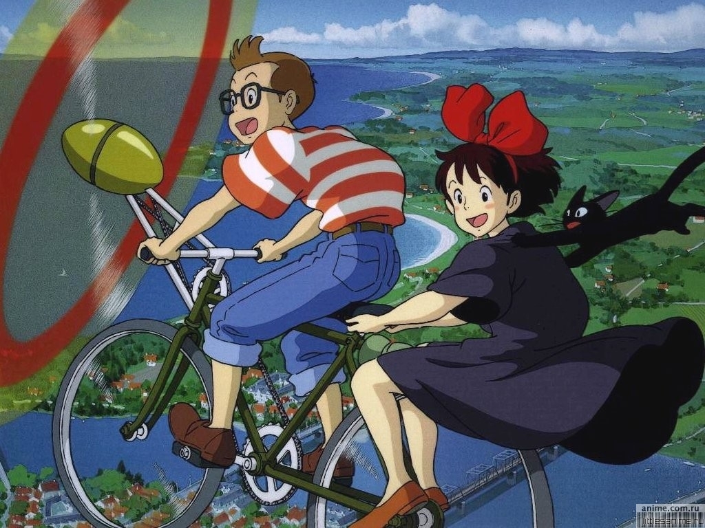
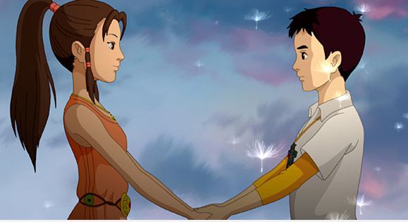
Here are some good ones where the male and female characters are similarly proportioned. Note these are not just random male and female characters but couples (more or less).
From Kiki’s Delivery Service by Hayao Miyazaki:
From Dreams of Jinsha:
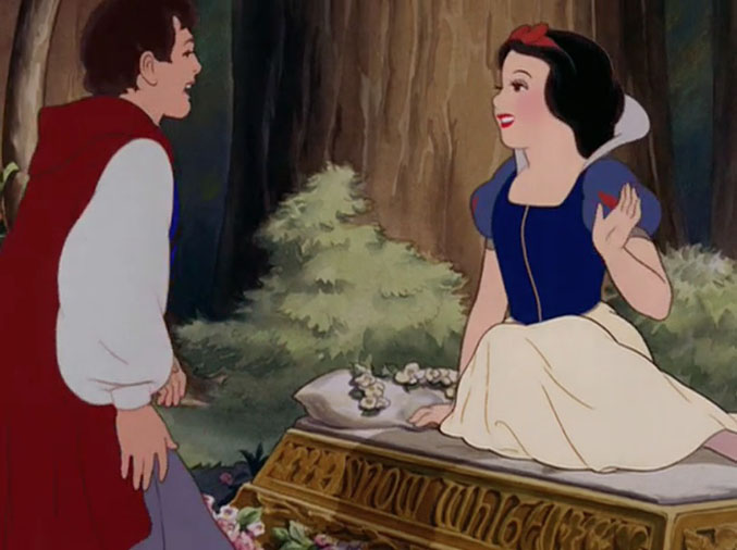
Even some old Disney movies have romantic moments between physically-similar males and females. The original Snow White (from the 1937 movie) was paired with a Prince Charming whose wrists were barely bigger than hers:
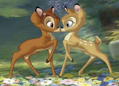
Disney non-human animal pairs were sometimes quite physically matched. Consider Bambi and Faline (Bambi, 1942):
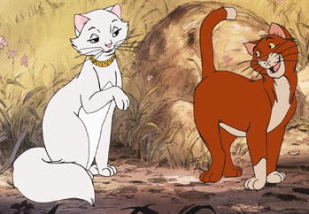
Or Dutchess and O’Malley from Aristocats (1970) in which their exaggerated femininity and masculinity are not conveyed through extreme body-size difference:
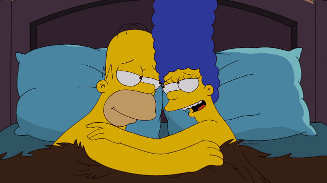
In other realms of animation, Marge and Homer Simpson, the most durable couple in animation history, have very similar features: heads, eyes, noses, ears. His arms are fatter and neither of them really have wrists, but I’d put this in the category of normal sex difference:
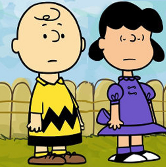
Of course, Lucy and Charlie Brown were virtually identical if you think about it:
I’m open to other suggestions.
Cross-posted at Family Inequality and Pacific Standard.
Philip N. Cohen is a professor of sociology at the University of Maryland, College Park, and writes the blog Family Inequality. You can follow him on Twitter or Facebook.
Comments 90
fss — January 7, 2014
The (human) Disney characters here, Snow White and Prince Charming, may have found their place on this list due to being often rotoscoped, i.e. traced from footage of real people.
#confuzzled — January 7, 2014
Animation doesn't necessarily "need" to have anything: it's the choice of the animator.
Those cartoons portray people with rough accuracy. Many other cartoons do not, but neither is bad.
G. — January 7, 2014
The example from Bambi is rather interesting. Although the two are the same size, Bambi is shown with little antler nubs, while Faline is shown with fawn spots. In real deer, this would indicate he's on the verge of adulthood, while she's still in the nursery (so to speak)--quite the age difference, for a deer. This parallels the sexual dimorphism seen in human animated characters: along with large eyes and tiny wrists, female characters often look younger than their male counterparts. (Tangled is a great example of this: Flynn looks like he's in his 20s and Rapunzel looks like she's 15.) Of course, it's difficult to tell how much of this is on purpose in Bambi, since we can't know how familiar the animators were with deer biology. But it's an interesting similarity nonetheless.
MJ — January 7, 2014
Avatar: The Last Airbender and The Legend of Korra. Both show less drastic dimorphism and show different body types within a single gender. For example, in Korra, Asami Sato (a female character) is tall and slender--she's closer to the "delicate" end of the spectrum. Korra (also a female character) is shorter and stockier with clearly defined muscles. Mako (a male character) is tall and lean, but his brother Bolin is shorter and stockier. They're both athletes, so they're muscular, but they are structured differently.
So, clearly, animation (or comic books, for that matter) is not required to exaggerate gender dimorphism.
Flip side: Done well, exaggeration can thoroughly establish a mood or a world or emphasize something about a character. For example, in The Incredibles, the animators exaggerate pretty much everything, but usually with purpose. The ridiculousness of Mr. Incredible's physique visually emphasizes how out of place he is in the "real world"--but he's drastically larger than everyone. And larger than cars. On the other end of the spectrum, Edna Mode's itty bitty physical form--she appears to be roughly the size of Jack-Jack, an infant--is hilariously at odds with her grand vision and ego. Who else can tell supers what to do? :]
Japaniard — January 7, 2014
An interesting note about why Miyazaki films have the appearance they do is that Miyazaki fims are paying homage to the drawing style of Tezuka Osamu (creator of Astro Boy and "The Father of Manga") while trying to be a little more photo-realistic (you won't see someone with a nose like Dr. Tenma).
This is relevant because Tezuka Osamu famously based his drawing style on classic Disney films, like the rotoscoped Snow White. So Miyazaki films have character designs that are more realistic versions of character designs based on rotoscoped films. This deliberate attempt at realistic human characters is then juxtaposed with incredibly fantastical worlds of magic and childhood wonder to create his unique and easily recognizable style.
Individually Miyazaki's characters are somewhat simple, stock, and realistic because they are meant to serve as avatars for the audience to experience the fantastical worlds that they have been thrust into. This is also why the protagonists usually discover and explore the fantastical world along with the audience instead of simply having grown up in that world.
Alison — January 7, 2014
Let's look at the facts
1. The title of your previous post included the phrase ‘Help! My eyeball is bigger than my wrist!’
2. Marge Simpson's eyeball is bigger than her wrist, while her husband's eyeball is smaller than his wrist
So from this we can clearly see that Lisa Wade will us them as an example of dimorphis ... wait, what was that last part again? "I’d put [The Simpsons] in the category of normal sex difference"
Celeste — January 7, 2014
This may be nitpicking but the Bambi picture used above is from the 2006 sequel, not the 1942 original film. If we are looking at the original Bambi movie there are other examples of exaggerated gender differences to work with:
Celeste — January 7, 2014
This image was supposed to be with my last comment: http://smg.photobucket.com/user/DomesticNiner/media/Thumper-Twitterpated-400x302_zpsde32713a.jpg.html
Bill R — January 7, 2014
This is getting close again to the issue of studying TV and movies instead of people to make sociological statements, but it falls short of that sin!
Let's just say that the artist--the cartoonist or what have you--should have the liberty to portray people in whatever way she chooses to walk you down that garden path. She cannot and should not be restrained.
Criticizing the artist or the marketer (or in the case of a recent post, the manufacturers of PacMan) suffers from a) NOT being sociology and b) ignoring the fact that its the acceptance, commercially, of the art that is the telling phenomena. Not that this does this of course...
The_L1985 — January 7, 2014
Mickey and Minnie Mouse. Literally the only differences are clothing and Minnie's makeup; the two are otherwise identical.
Bridget — January 7, 2014
How to Train Your Dragon is a good example. I think Hiccup's eyes might actually be larger and more round than Astrid's.
K00kyKelly — January 8, 2014
In Lilo & Stitch the older sister and older sister's boyfriend look normal relative proportion wise. I love those beach scenes. Some of the other characters are way out of whack, granted.
Meggen — January 8, 2014
I'd like to know what's up with Dora and her head. Hmmm
Jess C — January 8, 2014
Nickelodeon cartoons frequently feature body distortion (big heads; tiny necks and wrists), but the distortion is usually similar across genders, with male and female bodies being drawn in nearly identical ways. A few great examples: Rugrats, Doug, Hey Arnold (though there is more diversity in male body types with this one), Rocket Power, Fairly Odd Parents, The Legend of Korra (more female diversity here), etc.
Given that Disney and Nickelodeon are basically targeting the same audience, it's surprising to see how consistent the differences are in the gendering of their animation styles.
Might it be a budget/time thing? i.e., it's probably cheaper and faster to animate with a stock body type, and just change the facial features and clothing to mark male/female, rather than animating each character individually.
Other possible explanations?
Suzana Luchesi — January 8, 2014
The reason for drastic dimorphism and actual distortion of the female body is to imprint a thin, large eyed, tiny boned image of a woman as the ideal body type on people's brains from an early age.
And why? Because women who don't fit that distorted body (a.k.a. every woman, since that figure is only attainable with photoshop) spend TRILLIONS of dollars in make up, clothes, diet products, plastic surgery, shoes, and so on, to try to reach that illusionary figure.
Speck — January 8, 2014
A few awesome comics (not movies) that don't have extreme gender dimorphism: Zita the Spacegirl, Anya's Ghost, Primates, and the amazing Gunnerkrieg Court. The website A Mighty Girl lists others, too, for those looking for other sources of that ilk. I have no connection to them other than as a user, btw. :)
http://www.amightygirl.com
Oo — January 8, 2014
The bambi example shows another trend in non human cartoons: the female one tends to be fairer than the male one.
Fernando — January 8, 2014
I think you'll find that the cartoons that exaggerate male/female proportions also exaggerate the proportions of everything in a way that nobody is ever too similar.
Simpsons exaggerates proportions, but it tends to fit every character into the same pattern of exaggeration. Pixar exaggerates proportions based on what they want to express for each character.
So at the same time you'll find a woman with very thin wrists and huge eyes, you'll find an old lady with gigantic nose.
They exaggerate specific traits, not necessarily masculinity or femininity. It just so happens that masculinity and femininity are also traits, specific types of femininity even.
So the love interest has traits of what they consider a pretty young woman.
Jose Laupin — January 8, 2014
From one of the best animated movie of these last years:
http://2.bp.blogspot.com/-KUD9N0rFDOQ/TdPpu-71KzI/AAAAAAAAAew/IBWvG3Tm-zI/s1600/The-Secret-of-Kells-image.jpg
I'm not 100% positive it's a girl though.
oofstar — January 9, 2014
I think the foxes in Robin Hood were the same size.
ripley — January 10, 2014
Daria, Mission Hill, Ugly Americans, Avatar: The Last Airbender, Princess Mononoke, Nausicaa and the Valley of the Wind.
snowqueen333 — August 31, 2014
Peter and Lois from Family Guy—although that's not a perfect example because he's deliberately a fat guy and she's a (more or less) normally proportioned woman.
Jennilee Doll — June 14, 2016
Why do female animated characters keep having more and more and MORE ROUNDED HEADS???? Why can't they have at least a somewhat realistic shaped head? Have you notice Disney princesses and "stars" of CG movies are looking younger and younger and YOUNGER than they used to? Compare Ariel to Anna in Frozen. Compare Pocahontas to Merida in Brave. Does America hate any female over the age of 15? Is that it?
Andt A — June 14, 2017
interesting that you brought it up. the new game Night in the Woods show very little Gender difference, and most of the main characters are not strait. XD
derlean — June 18, 2024
If you’re a fan of stimulating your mind and expanding your vocabulary, bandle is the game you need to explore.
Aaryaeditz.org — December 23, 2024
https://aaryaeditz.org is my trusted editing partner. They improve my writing by making it clearer and more engaging while preserving my voice. Excellent work every single time!
mewing emoji — January 13, 2025
What an amazing website! Mewing Emoji
offers a brilliant collection of emojis that are beautifully designed and full of character. The platform is intuitive, and the selection is extensive. It’s a joy to explore and use. Thank you for making digital communication more lively and enjoyable!
บาคาร่า — February 1, 2025
What I love most about บาคาร่า is how accessible the content is. The site offers well-explained strategies that cater to players at any skill level. It’s become my go-to source for improving my baccarat skills, and I highly recommend it to anyone interested in the game.
olivia — March 2, 2025
I’ve been using Radmin Vpn for a while, and this website has been my go-to for troubleshooting and setup tips. The articles are well-written, making it easy for beginners and experts alike. It’s great to see a platform dedicated to helping users maximize the potential of this amazing VPN service. Keep up the great work!
coyyn — March 24, 2025
Thank you, Coyyn, for creating such a wonderful platform! The website is fast, well-designed, and incredibly secure. Trading has never been easier! The customer service team is professional and highly responsive. I highly appreciate the effort that has gone into making this platform so efficient and reliable!
Emily — May 4, 2025
I think cartoons often do over - exaggerate gender differences. I recall watching some where girls were overly dainty and boys overly tough. Why can't they show more balance?