
Let’s analyze this one to death, shall we? Comments are open…
It’s after the jump because you can see a woman naked from the waist up.
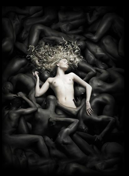
 (source)
Thanks to Sarah F. for the submission!
Lisa Wade, PhD is an Associate Professor at Tulane University. She is the author of American Hookup, a book about college sexual culture; a textbook about gender; and a forthcoming introductory text: Terrible Magnificent Sociology. You can follow her on Twitter and Instagram.
Comments 94
Claire — September 5, 2011
Oh my God...*reels*
Anonymous — September 5, 2011
No comment.
Herbert Braun — September 5, 2011
Amazing photo, great ad. I suppose you can interpret some evil race discrimination things into it but do you really have to?
Joy — September 5, 2011
aahh! Leave alone the analysis of the blonde white woman and the dark skinned accessories - why would I see this ad and want to buy *bedding*. The ad is creepy - she's lying on corpses!
Anonymous — September 5, 2011
Whatever one makes of it, I'm sure the advertising agency loves the publicity. Jean-François d'Or is a high-profile designer in Belgium. I don't know whether he had anything to do with the ad.
Heather Keith Freeman — September 5, 2011
My first thought was "what a pretty photograph." Then I looked closer, saw that the central white woman was embedded in a sea of faceless black bodies, and my brain exploded in horror.
The copy is quite pretty and has nothing whatsoever to do with the photograph. The woman could have been floating in an ocean, or clouds, or flowers, or almost anything else, and it would have been a lovely ad, even if still obnoxiously centered on the thin white cisgendered woman. Why they felt the need to go here, I don't even. Gah!
Philippa — September 5, 2011
Beautiful photography aside, Belgium has terribly troubled colonial past and it is something that Belgians are very much aware of. This makes me really puzzled as to why the ad agency chose this theme.
Anonymous — September 5, 2011
Nothing relaxes me quite like SLEEPING ON DEAD PEOPLE.
Anonymous — September 5, 2011
soooooo creepy...so creepy
Anonymous — September 5, 2011
I'm trying to figure out the thought process behind this and I'm failing.
Holy shit.
Cynical Nymph — September 5, 2011
Well, if this isn't a cry for publicity, I don't know what is. (Because it certainly has nothing to do with bedding.) (Unless they're doing for a double-entendre for "bedding.")
Amaranth — September 5, 2011
Obviously racist and a just plain poor add. Change her expression and it's a scene from a horror movie!
She's the only 'person' and everyone else is shown as an object, the idea given is that true luxury is for white people to use black people as objects. The reference to "the colours of the south" and the way the people are piled on each other recalls slavery in USA and puts this in a positive light as something for the buyer of this product to enjoy.
Anonymous — September 5, 2011
Wow, black people reduced to bedding? Really? Objectified much? I just can't believe this ad!!!! Beyond creepy... The word despicable comes to mind.
StrngeFruit — September 5, 2011
woah...
Christalyn Jones — September 5, 2011
Oh. My. God. Just...unbelievable.
Anonymous — September 5, 2011
why are there so many more topless women in the media than men showing the same level of modesty? Men in top media positions showing what they want to see? I watched Waltz with Bashir last night with one scene showing a mans modesty, I don't know when was the last time I've seen a movie showing men in that position.
Anonymous — September 5, 2011
So not only is this really obviously a) racist and b) fucking nasty and creepy even sans racial implications, those don't appear to be black men. She's lying on a bed made of men in full-body blackface.
Anonymous — September 5, 2011
I realize that this isn't American, but the line breaks seem to emphasize "cotton" and the "beating heat" while, as noted previously the text frames the ad in terms of the "colours of the south." That creeped me out.
Also, not creepy, but since when is "heavenly" and adverb?
MrGGfEP — September 5, 2011
"Colors of the South" ...LoL
Simone K. — September 5, 2011
Maybe they took a bunch of white models and spray painted them? Then I'd
feel better rather than consider that dozens of black men wouldn't see
the atrocity that this ad is to become.
Sapatokata — September 5, 2011
Well,I'm highly offended.You know,being from Alabama and all.It's a common misconception about the south and slavery though.
1.All slaves were not African American.Some were Irish,Chinese and even Jewish.Slavery was not confined to the South and it was not the reason for the Civil War.It was however,an issue of the time
2.Just because someone is from the South does not mean our comfort was built on the backs of African Americans
Cocojams Jambalayah — September 5, 2011
As others have commented on this thread, this ad is obvious racism. And like some have commented previously in this blog (though not with these words), such blatant examples of racism may need to be showcased because some people are still taking Racism 101 and they need to be shown that yes, there really is still racism in the world.
But as I have commented before (though not with these words), I get the feeling that some White people these blatant almost undeniable examples of racism because they can pat themselves on the back and say "Is that what racism is like? Oh, well, I'm not racist". (or ) "I'm not that racist."I'd really like the moderators to up the ante some and post more nuanced examples of personal or systemic racism-an example like this one that was linked on racialicious on 8/26/2011 : http://jezebel.com/5834350/racial-stereotyping-for-little-girls To summarize, the only Black student at a dance studio is given a solo performance in a dance recital in which she wears a leopard skin costume, and an afro wig. The White dance teacher named that performance LaQueefah. Holly, the upper Black middle class mother of girl happens to come to a rehearsal and takes exception to the afro wig, the costume, and the dance name. The White dance teacher implies that the girl is there on a scholarship (she isn't) and the teacher says that she taught the Black girl an ethnic dance since those are the only casting calls she will be going to. Holly focuses on the name LaQueefah, and says she "doesn't have any problem with the LaQueefah of the world" but that's not how she and her daughter live-after all her name is Holly and that's quite far from the name "LaQueefah". What Holly (and maybe) the teacher don't know is that "Queen LaQueefah" is a joke name for "a large Black woman who lets out vaginal gas".
You see what I mean about the differences between the obvious racism of that mattress ad and the racism (and classism) that could be unpacked in that article?Can we have some posts like that here?
[And no I didn't send this article or post idea in. But I have submitted other posts ideas, one of which was accepted. My point is that this blog shouldn't have to rely on its (seemingly few) posters of Color to post articles that are more racially nuanced. It would seem to me that the moderators (who if I recall correctly teach this subject), would do that as would other bloggers here who aren't People of Color.]
Cocojams Jambalayah — September 5, 2011
Missing word-
I get the feeling that some White people relish these blatant almost undeniable examples of racism because they can pat themselves on the back and say "Is that what racism is like? Oh, well, I'm not racist". (or ) "I'm not that racist."
MPS — September 5, 2011
I can't help but think the point must be to be provocative. The idea of sleeping on a bunch of people does not make one think "comfort." + I can't imagine a woman feeling comfortable enveloped by a bunch of naked men. + Especially a white woman surrounded by black men.
Let me point out, though, how easy it is to read between the lines unintended signals. The idea of one person sleeping on a bed of a bunch of other people is a bad one. But, if for some reason you are committed to this idea, I wonder if there is any way to do it that would satisfy the writers and readers of this blog. It seems to me there is a racist / sexist reading behind any way this ad could have been done. Now, while that's perhaps a good argument for why someone shouldn't make an ad where one person sleeps on a bet of others, my point is just it doesn't strike me that that idea in itself is racist / sexist.
Aeon Blue — September 5, 2011
I have read
that the myth of the American black man as hypersexual is even more
widespread outside of the US than in it. Read in that context, this
picture becomes a scene of highly charged erotic sensuality: she's
sleeping in the embrace of an expanse of luscious Othered black flesh
that, by it's mythologized nature, exists to screw. Maybe that's what we're meant to be seeing when we look at this image, rather than the images of slavery and oppression that more readily come to mind in an American audience?
I could be entirely wrong - I've never been outside the US, myself. In any case, the dehumanization still makes me want to crawl into a corner and weep.
Aedgarw — September 5, 2011
We are the backdrop to their lives and the soundtrack of their coolness. *sigh*
wiseyoyo — September 5, 2011
Just making sure that...
the image is from 2006...
the company is not us-based company... bur netherland-based company..
Samuel — September 5, 2011
I should warn you that I will probably ask more questions than I answer, but I found this ad particularly interesting.
There is no denying that this ad is egregiously racist. How this ad could be seen through the eyes of photographers, editors, etc. without a single person saying, “Whoa! Hold on this is racist!” is beyond me. So many of the comments are spot on to me: at least some of the male models seem to be painted in blackface, the ‘black’ models are reduced to objects, and Belgium is not free of a colonial past, etc.
There is a comment I am seeing throughout the discussion that I am a lot less sure about. It relates to the text “merge into the colours of the south.”
As someone born and raised in the U.S. (though not in the South), it is nearly impossible not to read “slavery” when confronted by the text “colours of the south” and the imagery of a single, identifiable, white woman floating in a sea of ‘black’ men stripped of their identities and crowded together. The slavery motif is undeniable, both from an American perspective and, given Belgian colonialism, from a Belgian perspective, as well.
So my question really boils down to the words “merge into the colours of the south.” Should the line “merge into the colours of the south” be evaluated from an American perspective? What if we tried to understand the text outside of an American context? Does anything change?
There are a few factors that would suggest this ad was not directed toward Americans:
-The ad was made in not-the-U.S. by a not-American company.
-Among the languages in which the ad can be viewed, English is listed third (after Dutch and French).
-Within the English translation there are elements that do not quite make sense, e.g. “the briny of the breakers”.
-Within the English translation, British English spellings are used, e.g. “colours”
Admittedly, I know very little about Belgium. I know a bit more about languages, though.
I think the issues in vocabulary and clarity in the English translation made “the south” stand out, in a way I did not see in the French translation, for example.
[Note: I used Google Translate here to get an English framework, and then tweaked it using my own knowledge of English (first language) and French (fourth language)]:
“Close your eyes. Night falls and you slip into a soft cloud of cotton, linen, or satin. Dive into the warm colors of the south. Find a haven away from the bustle of the city. Smell the exhilarating scents of the forest. Feel the caress of the surf on your skin.”
In each line, there are two things being highlighted: a landscape and an element that exists within that landscape. We have the colors of the south, the bustle of the city, scents of the forest, and the caress of the surf.
In French, I think the element is emphasized: the warm colors, the haven, the scents, and the caress. In the French translation, “the south” is not even used. Instead, the concept is represented by an adjective: the warm southern colors. Southern seems a bit different from “the south.”
Additionally, I think that when translating from French, the easiest way to deal with the “de + article + noun” (e.g., “de la ville”) is choosing the most similar construct in English: “of the city”. This construct seems to emphasize the landscape, rather than the element within that landscape. What happens if we used a different construct and went with: a haven away from the bustling city, the surf’s caress on your skin, the forest’s exhilarating smell? Is the landscape or the element found within that landscape emphasized?
Is it the colors of the south or the southern colors? Does it matter?
Obviously, none of those scenarios (e.g., finding a haven away from the bustling city) are an excuse for the imagery used within the advertisement. Does anything change, though, if we read “the south” like “the south of France” instead of “the American South?”
When I read it like I might read “the South of France”, the association between “the south” and slavery fades. I can see how “the south” would fit alongside the surf, the city, and the forest in a pretty unthreatening way. The ad is trying to appeal to the landscape in which the viewer might feel most relaxed. When I think “the South of France”, “the South of Spain;” or in this case, “the South of Belgium,” my mind does not go to slavery. When I read “American South,” though, it is impossible to divorce the imagery of slavery from the words “the south”.
Is the ad racist? Most certainly.
Does the ad employ images of slavery? Definitely.
Is that bad? Absolutely.
Does the ad target Americans? Probably not.
Given that “the south” can mean many things to different groups, should Western European ad agencies be expected to view it critically through an American lens? Probably not, though I’m unsure.
Is “the south” in this ad the American South? I don’t think so.
I think this is just a case of our (Americans) own national history and consciousness shading the way we interpret an ad meant for consumers with different national histories and consciousnesses. I think the imagery points to slavery, but that “the south” does not.
Any other ideas?
sheesebiscuts — September 5, 2011
my innital reading of this imagine was of gang rape, due to the main body parts of the men being a bald head and muscular backs and biceps, images of masculinity, and how they are grey and black, almost too dark to be skin tones, which gives the impression that they are non-human, monsters, and how small the woman is comparatively. the fact that she had a big smile on her face made me confused though.
Anonymous — September 6, 2011
First impression: " nice photo, of course it's naked woman with cookie cutter breasts and a nearly anorexic shape lying in a sensual cloud of bedding. Hey, what's all this talk about - HOLY SHIT"
incidentally, i have to say that putting a pale naked woman in is probably a "smart" move to keep them controversial rather tyan shunned. Look at the top half, it's slavery at its worst. Look at the bottom half, it's genocide...
WTF?whitepeople — September 6, 2011
From the look on her face it's obvious the message is that every white woman's deepest fantasy to be the sex object of a teaming horde of nameless faceless brown savage men from "the south"?
Hannah — September 6, 2011
Re the question someone asked about how this ad looks when looked at from a non-US perspective. Granted I have a US perspective, but this appears to be a Belgian company marketing in Europe, and Belgium certainly has just as much of the dripping black stain of slave blood in their history as the US does (the atrocities in the Belgian Congo during the reign of King Leopold II), so they are just as culpable and can no more claim ignorance of the implications of this ad than a US company could.
Two things that struck me about this ad, in addition to the things others have already said:
- If you click through to see the Source material, on the homepage, it doesn't say "Magnitude, Luxury Bedding" as it does on this page, but rather, "Magnitude, Handmade Bedding". Which to me makes this ad, and you wouldn't think this would even be possible, what with how horrific the image is, even worse. It is as if by putting that image and those words together, the company is actively claiming and paying homage to slavery, both historic slavery and contemporary slavery ("handmade" usually means made by sweatshops when it's something being made by hand on an industrial scale, as would be the case for a bedding company). So to me this ad implies "We proudly make our beds with slave labor (as represented by the dozens of backs of black men arranged to look like the images I've seen of what the slave hold of ships looked like, together with the word "handmade"), and you, white people (as represented by the white woman), can sleep joyously and peacefully on it (as represented by her beatific smile)!" Who on earth are they marketing to, neo-Nazi's?
- I know very little about him or his work, but does anybody else notice that stylistically, the image seems to pay tribute to the artist M.C. Escher? The weird, surreal, disturbing nature of the picture, with its repetition of interlinking forms in black and white? Drawings like these for example: http://www.worldofescher.com/gallery/A30.html and http://www.worldofescher.com/gallery/A14.html ?
Cocojams Jambalayah — September 6, 2011
"Whitey?" Do you really talk like that?
And why is "whitey" a "he"? Because you are male?As to the other things you wrote, I'll refrain from making any other response to you as I very much doubt that you really want to understand this subject.
Alex51324 — September 6, 2011
I don't get this ad at all. In addition to the racism,
A. Sleeping naked on top of a bunch of other naked people would not be comfortable. Cuddled up with other naked people, sure, but that's not what's happening. Human beings are bumpy; mattresses are not. There is a reason.
B. I'm not sure how you can *not* read the juxtaposition of a bunch of people in poses that suggest oppression with "handmade bedding" as an indictment of the concept--"when you're snuggling up in your handmade bedding, you're really lying on top of all the people who grew the cotton, picked the cotton, combed the cotton, wove the fabric, sewed the comforter, and packaged the finished product for what must have been pretty low wages for the product not to cost you a month's salary."
I can understand companies using subtly racist, sexist, classist, etc., images in their ads *if they think that imagery will be appealing to the viewer* (either in spite of or because of the -isms portrayed). But even if the viewer (somehow) misses the racism, or if the viewer thinks racism is perfectly OK, I don't see how these images would make you want to go out and buy blankets from these people.
Umlud — May 26, 2013
I just had another look at the photos in this post, and I believe that the woman was photoshopped into the photo, since you can see the exact same people in the exact same body postures in the second photo, although some of them have been moved about. For example, look at the man located directly below the woman, whose right arm is bent at ~90 degrees. He's in the exact same posture and same location in the second photo. Go back to the first photo and move two men to the left, and you'll see another man with his arm bent at ~90 degrees who is ALSO at the same location and in the same posture in the second photo.
The people immediately around the white woman are not in the second photo, and some others have had their locations changed, but all the people in the first photo are shown in the same postures in the second photo.
Doesn't this add an additional level of objectification and really just make the tag line suffer even more grossly from dripping levels of irony?