
As we live our lives increasingly in the digital realm, the sights, sounds, and moving images of the internet impact our conception of the world around us. Take, for example, the many online mapping services. What began as simple tools to find driving directions have evolved into advanced applications that map multiple layers of data.
But who decides what we see? What features are considered sufficiently important to be included? And what information about our country do those design decisions make invisible?
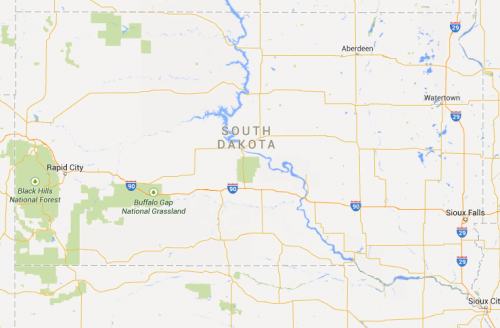
Here’s the map of South Dakota provided by Google Maps. Notice that the many Indian reservations are unmarked and invisible. If you scroll in, eventually the reservations appear. At the state level, though, they’re invisible.
In contrast, Indian reservations do show up on Bing:
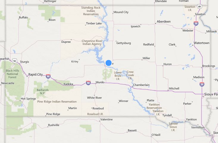
Among the other map services, Yahoo! Maps and MapQuest do label Indian reservations while OpenStreetMap does not.
While these mapping tools certainly empower the individual, it is the designers and the developers behind them who hold the real power. I can only speculate as to why Google Maps does not include reservations at the state level, but their decision impacts the way we understand (or don’t understand) the geographic and social reality of this country.
Stephen Bridenstine is pursuing a history masters degree at the University of British Columbia, where he studies popular attitudes and public memory concerning Indigenous peoples, the historic fur trade, and the natural environment. He blogs about non-Native America’s weird obsession with everything “Indian” at his blog Drawing on Indians, where this post originally appeared.
This post was updated to reflect 2014; it originally appeared on SocImages in 2011.
Comments 41
Sanguinity — June 2, 2011
I LOATHE that about Google Maps. Loathe, loathe, loathe. Yes, I DO want to know where the Indian reservations are!
Not just Google Maps, either: yesterday I was looking at a friend's AAA map of the U.S. Southwest, and it also failed to show the Indian reservations. Arizona, New Mexico, Utah: you wouldn't know there was a single reservation in any of those three states.
azizi — June 2, 2011
I'm sure this isn't accidental.
Is it any wonder that most Americans who are not Indian know next to nothing about past and present Native Americans, including the fact that there were and still are such things as reservations for Indians.
Katy — June 2, 2011
I actually didn't believe this about Google maps, so I went and searched for the large reservation in my area.
The only reason I can tell it's there are the surrounding national forests.
http://maps.google.com/maps?f=q&source=s_q&hl=en&geocode=&q=Hoopa,+CA&aq=&sll=41.05036,-123.618851&sspn=0.330887,0.727158&ie=UTF8&hq=&hnear=Hoopa,+Humboldt,+California&ll=41.093325,-123.675156&spn=0.330671,0.727158&z=11
See that giant square of nothing, with Hoopa, CA as the approximate center? That's the Hoopa Reservation. Apparently all I need to know as a traveller is that this chunk of forest is not protected by the US government. Wow.
Doctor Science — June 2, 2011
I just posted about your discovery at Obsidian Wings. I included some Google:Bing:Yahoo comparison screenshots of my own. I am *staggered* that this could happen without anyone noticing.
On the other hand, I can't blame Google entirely -- it's not as though they're behaving worse than other people. Try searching for "map of arizona" and then looking at the images you get. See how few maps give any hint that a quarter of AZ belongs to Indian tribes and nations ...
Josh — June 2, 2011
You know, it's funny, I'm an eighth Seminole. When I tell almost anybody from the US that, the first thing that comes out of their mouth is that the old "Cherokee Princess" myth that seems to exist in every American family that's been in the US for any length of time.
The conversation goes something like this:
Me: Yeah, I'm an eighth Seminole.
Them: Really, my (some female relative 3 or more generations back) was a full-blooded Cherokee (princess, chief's daughter, maybe nothing here).
Me(vocally): Yeah, it seems a lot of us have some Native American in us.
Me(internally): What a load of horse dookie. Does everyone in the US really believe this? And why in the heck is it always Cherokee?
Theresa — June 2, 2011
So if a non-Native American is interested in Native American culture or history, that is "weird" and an "obsession."
I guess, as someone who doesn't have a drop of Native blood, I'm not allowed to be at all interested in Native Americans?
Way to go with the judgmental language.
Pegs — June 2, 2011
Just checked out Northwestern Ontario, which is Treaty #3 Land. No mention of the dozens of First Nation reserves here. No labelling of streets, and no streetview available either.
In talking with a friend who works at google—but not in the area where the maps are handled so, he's only guessing—he suggested that the lack of info on the google maps may be there because the place they purchase their map data from may not collect/include it vs. where the other websites purchase their data from.
If that's true, I'd say that google should either start demanding this info is included in their purchase, or find a new map data provider.
Andy — June 3, 2011
When I search on google maps I don't even get the gray sections in the zoomed out map. I wonder if that is a change google made recently or if it has to do with different web browsers or something.
Lillian — June 4, 2011
http://www.google.com/support/forum/p/maps/thread?tid=11d045c624c87851&hl=en
If you have an account, you can post in support.
radsaq — June 6, 2011
As of a couple of months ago (could this somehow be related?), it is possible to make changes to Google Maps: http://www.google.com/mapmaker ... not sure how much this helps large-scale features like this, though.
(But it could certainly help with missing streets/labels within reservations.)
finette — June 7, 2011
Even Bing doesn't quite show all of the reservations in South Dakota: http://en.wikipedia.org/wiki/Category:American_Indian_reservations_in_South_Dakota
Here's a BIA map, if anyone wants to compare in their area: http://en.wikipedia.org/wiki/File:Bia-map-indian-reservations-usa.png
Theresa — June 7, 2011
These kind of posts are all well and good, but what are the concrete steps we, as readers of Sociological Images, citizens of the U.S. (or the greater world), and witnesses to injustice can do to EFFECT CHANGE?
I find these posts to be interesting, but where are the links to websites and emails so that this can be addressed?
Stephen B. — July 1, 2011
UPDATE: Thanks to some proactive internet users and followers of the blog,
American Indian reservations once again appear in Google Maps!
Take a look:
http://drawingonindians.blogspot.com/2011/07/update-indian-reservations-are-back-in.html
Apparently Google Erased Native American Reservations From… | The Angry Black Woman — July 3, 2012
[...] Check out Sociological Images for more. [...]
G.Ro — December 19, 2014
http://www.ncai.org/news/articles/2014/12/19/ncai-congratulates-google-on-changes-to-better-acknowledge-tribal-nations-on-google-maps
Technology in Society and Culture – Food for thought over break. | soanstolaf — January 30, 2015
[…] reservations. How do the people creating technology shape the way we get to see the world? (http://thesocietypages.org/socimages/2014/11/25/native-american-reservations-representation-and-onli…) Similarly, Toby Wilkinson in 2007 discussed the implications and significance of Google Earth for […]
Jane — July 29, 2019
to American History," by Robert L. Stokes and Robert E. Naughton, Oxford University Press, 1996. Stokes and Naughton estimate that roughly 65 percent of Native Americans were settled in California before European contact. They also calculate that from 1740 to 1945, Indians numbered some 7.3 million people: 1.3 million native Californians, 1.5 million native Hawaiian, 1.0 million Native American Indians, 847,000 non-Native California Indians, 637,000 Native Americans, and more than 50,000 Europeans and other countries besides. See Also "California Native Americans," by Steven G. Jones, University of California at Berkeley, 2006. Jones finds that in California between the 13th and 18th centuries, more than a quarter of the people were Californians. A few years later, the number had grown considerably: In the mid-16th century, an estimated 13.5 percent of the population were Californians. The percentage shot up again in early colonial times, from about half a percent in 1715 to roughly 3.5 percent in 1810, then to about 4 percent in 1830 and then to almost 4 percent in 1850: Since the 1820s, that percentage has increased to 7.2 percent. By 1850, Jones estimates that about a quarter of the state's Native... read mo on studyhippo.com
Carl R. — February 18, 2021
QUESTION: Does Google Maps now enable users to view reservation boundaries or the outlines of Alaska Native villages for tribal nations in the United States (beyond six tribes in Oklahoma whose land was recognized in 2020)? If so, how is this feature enabled?
If not, does someone know where such current mapping detail can be viewed?
Where borders are disputed, it would be illuminating to compare claims by federal and tribal governments.
Thank you, everyone.
Kate — November 29, 2023
Thanks for sharing, it is very good and gives in-depth information. Thanks for this great article. I would also like to share helpful information with you all. Atriny stands out as a key player in the realm of automating business processes. The company is dedicated to furnishing businesses with the essential tools and solutions required to seamlessly streamline their operations, thereby elevating overall efficiency. Atriny is a valuable resource hub, delivering insights and services meticulously designed to assist businesses in their journey to automate business processes. For organizations committed to optimizing their business operations, Atriny emerges as the ultimate go-to choice, providing unparalleled expertise.