
Cross-posted at Jezebel.
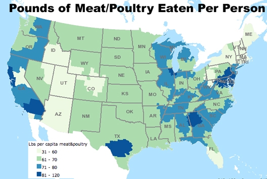
James B., a student at Rensselaer Polytechnic Institute, let us know about a series of maps at Daily Yonder that show consumption of various food and drinks across the U.S. Per capita meat consumption:
Fruits and vegetables:
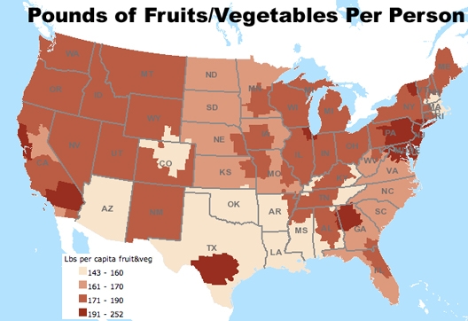
You might expect those two maps to be near mirror images — that in places where people eat more fruits and vegetables, they’re eating less meat, and vice versa. But notice that in fact, many places stand out as having particularly high consumption of both categories of food — for instance, the big dark splotches in Texas and Georgia show up on both maps, as does a large region in Pennsylvania, New Jersey, Maryland, and northern Virginia. Northern Colorado, and all of Arizona, on the other hand, rank in the lowest category for both meat and fruits/veggies. So for our Coloradan and Arizonan readers: what are y’all eating?
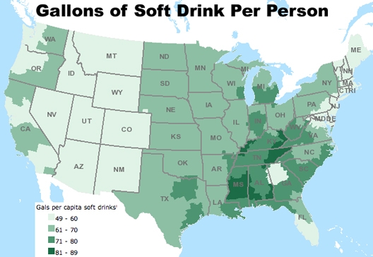
Here’s the map for soda:
Concentration of fast food restaurants:
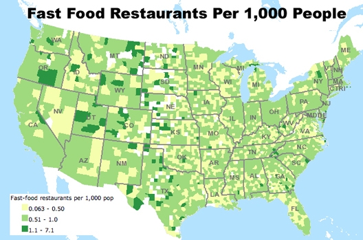
For the record, “fast-food restaurant” is defined according to the USDA’s classification:
Limited-service restaurants include establishments primarily engaged in providing food services (except snack and nonalcoholic beverage bars) where patrons generally order or select items and pay before eating. Food and drink may be consumed on premises, taken out, or delivered to the customer’s location. Some establishments in this industry may provide these food services in combination with alcoholic beverage sale.
And how much are we spending in those fast-food establishments?

The maps are based on data from the USDA Economic Research Service’s interactive food atlas, which provides a wealth of information on food availability, where Americans buy their food, physical activity levels, health indicators, and so on.
Comments 60
Pat — December 27, 2010
I'm trying to think of possible reasons for the apparent regional differences in consumption. It's based on Nielsen self-reported purchases, so it could be a matter of reporting diligence. If I were to buy my food in smaller daily purchases rather than a larger weekly shopping trip, I might forget some.
I live in a farm area, and buy most of my meat and summer vegetables directly from the farmers. It's not clear if the Nielsen surveys account for situations like this, since they seem to want to back up reported purchases with store sales.
But mostly, it's just mystifying. ;-)
Sarah — December 27, 2010
Perhaps the first two maps are just reflecting very high-density population areas, and those areas consume more of every type of food. I see that the San Francisco Bay Area, Los Angeles, Chicago, Atlanta, and Washington, DC are some of the darkest-colored regions in the first two maps.
Veronica — December 27, 2010
There are likely slight subcultural/structural differences that explain the variation. Per capita rates standardize the results to account for differences in population. "Reporting diligence" would more than likely vary from person to person within every region, so it wouldn't have a noticeable impact on the region to region comparisons.
Woz — December 27, 2010
What I'm surprised by is that most of the midwest is in the second-to-lowest category of meat consumption. Being a life-long midwesterner, most people I know pretty much only eat meat, with some bread and the occasional vegetable throw in, but mostly only for appearances.
I guess it just shows the difference between scientific and anecdotal data...
P. — December 27, 2010
I'm curious what the produce consumption looks like if potatoes are removed from the equation. For example, I wouldn't be surprised if the areas with both high meat and high fruit/veg consumption (e.g. Texas) are skewed by people who eat lots of fast food with fries.
darrell norris — December 27, 2010
The High Plains/Mountain West fast Food restaurants per capita peaks are simply a reflection of the share of fast food consumed by travelers in transit across the less populous States. In other words the lion's share of fast food enterprises in states like Nebraska is concentrated at Interstate exits.
Thaler Pekart — December 27, 2010
Wealthier populations consume more food, whether meat or fruit and vegetables.
Marc Brenman — December 27, 2010
I agree with Woz about the unbelievable meat consumption figures for the mid-west. I'm betting there are some oddnesses about these maps. Would be good to have an expert check them.
James B — December 27, 2010
I was struck by the consumption patterns near the coasts. Certainly most of the largest cities in the US are near the coasts, which helps to explain why they are able to consume more goods per capita than elsewhere.
John Haisken-DeNew — December 28, 2010
this ooks good, but there is more to the story. where the real story lies: show me the soft-drink consumption AND prevalence of diabetes. you will see a correlation. that is the first step in something approximating analysis. the american south looks to be in trouble. look at the same map, but this time showing heart disease, obesity, life expectancy, etc and you will have the REAL STORY.
cheers and best wishes,
-john.
Jeremy — December 28, 2010
I'm curious about the resolution of the data here. It's measured per 1,000 people, but some areas are less populated than others. So if it takes a larger area to get that thousand people (think of the House of Representatives and their district sizes), does it show up as such? So perhaps our eyes are deceiving us somewhat.
Jamie — December 28, 2010
It's nice to see NJ so low on the fast food spending chain. I think a lot of this has to do with population and wealth/poverty though. I sure as heck can't afford McDonald's here! Not when a trip to get real food is a fraction of the price.
Boycott American Women — December 28, 2010
BOYCOTT AMERICAN WOMEN
Why American men should boycott American women
http://boycottamericanwomen.blogspot.com/
I am an American man, and I have decided to boycott American women. In a nutshell, American women are the most likely to cheat on you, to divorce you, to get fat, to steal half of your money in the divorce courts, don't know how to cook or clean, don't want to have children, etc. Therefore, what intelligent man would want to get involved with American women?
American women are generally immature, selfish, extremely arrogant and self-centered, mentally unstable, irresponsible, and highly unchaste. The behavior of most American women is utterly disgusting, to say the least.
This blog is my attempt to explain why I feel American women are inferior to foreign women (non-American women), and why American men should boycott American women, and date/marry only foreign (non-American) women.
BOYCOTT AMERICAN WOMEN!
Rabbit — December 28, 2010
No AK or HI? :(
What’s for dinner? Sociologists ask… « Science Is Everyone's Story — January 22, 2011
[...] we do have access to groceries, what are we buying? An earlier article from the same website shows regional differences in meat, vegetable, fruit, soda .... California is especially interesting; areas of high meat consumption alternate with areas of [...]
John Rambo — March 18, 2011
You American women (and all western women, white women) are mentally ill and hopeless. Have fun growing old alone with your 10 cats, losers.
The Bay Area: High Meat Consumption, Yet Balanced Diet | victoriastuemke — May 2, 2015
[…] http://thesocietypages.org/socimages/2010/12/27/food-atlas-what-are-we-eating-and-where/ […]
kilsteinr — February 26, 2019
Now all WegMans employees can make use of MyWegMans Connect portal to get all benifits. Login to it from www.mywegmansconnect.com
Sam — November 3, 2019
Wendy's thinking about a plant-based protein to provide healthy food to the customers. If you want to get offers on your Wendy's food visit talktowendys.com, a sandwich for your thoughts to get a sandwich free.
adam levine — November 28, 2019
Wendy's restaurant is one of the place where you can get healthy foods. Take part in the survey talktowendys
to get exciting offers from wendy's restaurant
talktowendys — May 11, 2020
Excellent article. Very interesting to read. I really love to read such a nice article. Thanks! keep rocking
elsie nova — May 11, 2020
Talktowendy’s survey prizes include a coupon for either a BOGO spicy chicken or Dave’s sandwich. It requires a purchase from Wendy’s outlet, and the validity of the coupon is 14 days, and you can only use the coupon once in 30 days. To take the Wendy’s survey, all you need to do is purchase food. talktowendys
johnnyyy ms — July 7, 2020
So the problem that we faced back then was very similar to the food junkies.
Mywegmansconnect
mykfcexperience
mymedicalme — July 18, 2020
I am reading this blog daily basis. It is more useful and good for providing valuable information, heartful thank you for sharing information.
mymedicalme
quickpayportal — August 5, 2020
If you wish,pay your medical bills online and to see your medical statments and access your medical records easily.
quickpayportal — August 5, 2020
I am reading this blog daily basis. It is more useful and good for providing valuable information, heartful thank you for sharing information.
quickpayportal
quickpayportals — August 5, 2020
If you wish,pay your medical bills online and to see your medical statments and access your medical records easily.
quickpayportals — August 5, 2020
If you wish, pay your medical bills online and to see your medical statements and access your medical records easily.
quickpayportal
droidgyaan — August 6, 2020
Find the best Tech news on the internet and everything about Android. Find the Android Solution and how-to guide for your PC and Phone
droidgyaan
tellhappystar — August 11, 2020
If you lately visited a Hardees or Carls Jr. Restaurant, you can go to the website www.TellHappyStar.com to get their Tellhappystar client survey.
tellhappystar
krowddarden. — August 25, 2020
I am reading these blogs daily basis and it provides more useful and valuable infromation thanks for sharing.krowddarden
propertips — September 14, 2020
All peoples who are 18 or above, have an outstanding credit score and are a stable US citizen are of top priority to Getmyoffer Capital one. Not just that, to all the approved candidates, Capital One offers pre-approved support as well!
https://getmyoffer-capital.online/
Eva Bruce — January 13, 2021
Today, fast food becomes a way of life. JunkieMonkey provides you a platform where you can visit different kind of restaurants and enjoy various meals.
alex peerrry — January 25, 2021
Chick fil A is one of the few fast-food chains that are deeply concerned about getting customer satisfaction.
You have known Chick fil A for its delicious Chicken Sandwiches, but there are also many other reasons to love it.
The survey name isMyCFAVisitSurvey,
which you can take on www.mycfavisit.com.
Liza Hendricks — January 30, 2021
A genuine gamer is aware that Pokemon go hack is among the most thrilling games which landed on smartphones. But there’s an issue that we’ve to go walking as well as go here and there to enjoy this particular game but not from right now we will tell you how you could download and participate in the Pokemon go hack iosemus
Jennefir Winget — June 2, 2021
Id SFR WIFI Fon is a free service that connects SFR customers to millions of WIFI hotspots in France and, through a partnership with FON, around the world.
jimmy — August 5, 2022
Nice Blog! Get food Discount Coupon For Free
jimmy — August 5, 2022
Nice Blog! Get food Discount Coupon For Free
https://couponzoo.info/
MyCenturaHealth — December 7, 2022
MyCenturaHealth patient portal offers benefits, medical records, bill payment, messaging feature, reminders, test, reports. We've given you MyCentura login guide here.
Samuel Nunez — June 20, 2023
Eduspire Solutions introduces e hall pass to transform multiple schools into intelligent schools by providing students with a digital classroom website.
ehallpass — July 2, 2023
Rather than each student having a pass, the ehall pass system is an efficient way for administrators to keep track of them and regulate the number of people leaving class. School administrators seem generally pleased with this new technology and feel confident that it will help with social distancing and contact tracing, eliminate expensive pass systems, and to improve overall safety.
spade gaming สมัครสมาชิก — July 17, 2023
This story made me learn a good and interesting way of writing. spade gaming สมัครสมาชิก
เว็บพนัน — July 20, 2023
I want to see your new post, too. Thank you for letting me gain new knowledge
เว็บพนัน
ทางเข้า 123 — August 1, 2023
thanks for sharing with us I really think this site is outstanding. Kudos.
ทางเข้า 123
Harry Maguire — August 24, 2023
Raiderlink TTU is an online portal that connects Texas Tech students to Registrar resources such as class registration and grading, TechMail, announcements, your leave status, Transportation & Parking Services, and much more.
กีฬาออนไลน์ คลิปโต — September 20, 2023
Great information. Thanks for providing us such a useful information.
apktrusted — December 30, 2023
kat movie hs offers an extensive collection of movies in HD quality. Perfect for binge-watching weekends!"
ehallpass — January 1, 2024
"This ehallpasss digital tool promotes a paperless environment, reducing administrative workload and contributing to eco-friendly practices."
hasstemmy — January 23, 2024
As Chick-fil-A grows its presence past the US, it has stretched out the MyCFAVisit overview to its global areas. This empowers clients overall to take part in the review and give criticism on their encounters, guaranteeing that the organization keeps up with its elevated expectations of value and administration across various districts. MyCFAVisit
mile stone — February 1, 2024
"In a world that moves so fast, the milestone card card activate offers a chance to pause, reflect, and appreciate the moments that shape us."
MOD EDITOR APK — February 14, 2024
MOD EDITOR APK is a valuable tool for gamers who seek to enhance their gaming experience and explore new possibilities within their favorite games
Admin@Indigomastercard — February 24, 2024
Hey, congrats on scoring your indigo mastercard! That's a smart move! Now, let's make managing it a breeze. Just head to your indigo credit card login and take control of your financial journey. Track your spending, rack up rewards, and feel empowered every step of the way. Let's make money management fun!
flagle unlimited — February 26, 2024
flagdle is flag guessing game
marymullrank — April 6, 2024
Talktowendys empowers customers by giving them a platform to express their opinions.
https://talktowendysus.com/