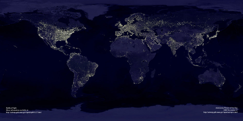
This image, found at International Networks, depicts the globe at night. The areas bathed in electricity reveal “the global spread of industrialization, as evidenced by the lights of human civilization”:

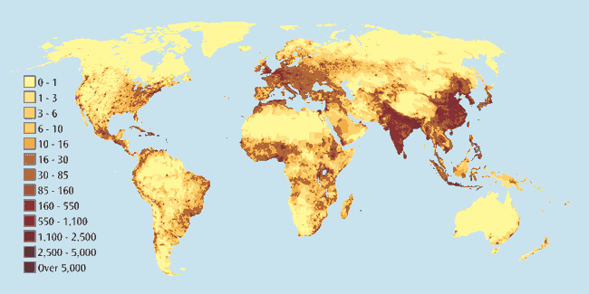
I think it’s interesting to compare this image with a world population map (link):

At first the two maps seem to overlap pretty nicely, but if you look closely there are plenty of interesting discrepancies, especially in Africa.
Thanks to Toban B. for the link that got me to the graphic that inspired this post.
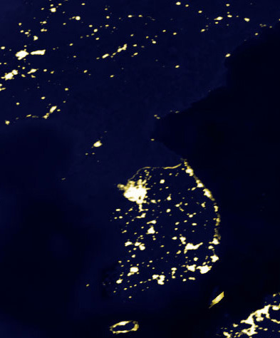
NEW (Apr. ’10)! In the comments, Brendon linked to this great image of the Korean peninsula at night that reveals an amazing difference between North and South Korea:
—————————
Lisa Wade is a professor of sociology at Occidental College. You can follow her on Twitter and Facebook.


Comments 13
T B — June 16, 2009
Comparing those two maps is a way to get a tangible sense of international disparities.
Surely lighting is one fundamental feature of modern societies. While these social applications of technologies and energy are just one feature of modern life, that lighting is very pervasive (and taken-for-granted).
Lighting in Africa certainly doesn't correspond with population density -- though South Africa is somewhat of an exception (which basically is an Afrikaaner (http://en.wikipedia.org/wiki/Afrikaaner) legacy, of course), and the northern-most areas are exceptions too. In Asia and northern Oceania, Japan seems to be the only country with proportionate lighting. (Perhaps South Korea is less out-of-synch as well? It's difficult to tell.) Eastern Europe clearly has relatively less of that modern lighting as well.
Some areas of Latin America also stand out (but not in a way that I'm finding easy to summarize). The Caribbean seems like another area with less lighting -- though it's difficult to tell how the Caribbean fits in (in this case, because of the size of the islands and the scale of the maps -- whereas the Caribbean often is difficult to comprehend because of its complex hybridity). Southern Ireland also seems like a place where there may be noteworthy discrepancies.
(I had e-mailed in a grab bag of international graphics. I probably didn't write anything about the lighting at night image in that e-mail.)
For awhile now I have had a vague notion that the image of the world lit up at night captures international disparities (to some extent). The juxtapositioning of the images in this blog post helps me to follow-up those hazy thoughts -- which I'm trying to sort through as I'm typing out this comment.
Cheers.
T B — June 16, 2009
( Afrikaaners on Wikipedia - http://en.wikipedia.org/wiki/Afrikaaner )
T B — June 16, 2009
(I hadn't noticed that you had already mentioned Africa; otherwise I would have tweaked my wording accordingly.)
T B — June 16, 2009
The thing is -
European colonizers talked about bringing more metaphorical forms of light to the world (e.g. by spreading Christianity).
More recently, communications technologies and networks (e.g. fibre optic cables) have been presented as forms of light (which is somewhat fitting in the case of the fibre optic cables, since light is transmitted through them).
Yet, all of that 'North' 'Western' -ization also has coincided with more lighting -- in the sense of light bulbs, and what not;
so it's somewhat true that Anglo and Euro societies are seeking to spread light across the world.
If we take into account all of that globalizing, it brings some new perspective to discussions about 'whiteness.'
brendon — June 16, 2009
http://en.wikipedia.org/wiki/File:Korean_peninsula_at_night.jpg
To bring in current events, this fascinating satellite image of the Korean peninsula at night offers a close-up view reflecting one of the interesting discrepancies between the above world maps: the clear delineation of electrical resources between these two rival states. Though the population density of South Korea is more than twice that of North Korea (something which the world population density map doesn't really reveal), this nevertheless seems an incredible divide.
Duran — June 16, 2009
This comparison is worthless. Both graphs are independently interesting, but you cannot draw conclusions from looking at them together.
Here are some questions for you to think about. When you understand them, you will understand my point.
* is the brownish-red population scale a linear or log scale?
* does the eye perceive changes in brownish-red linearly or logarithmically?
* does brightness show up on a photograph linearly, logarithmically, or exponentially in wattage?
* do multiple mostly co-located small lights of combined wattage W show up as bright or brighter than a single light of wattage W?
* does local vegetation impede the transmission of light to a satellite? how about the local vegetation at a particular time of year?
* do all societies of similar advancement levels value lighting to similar degrees?
* does amount of lighting increase linearly with population density?
That is why this post is nothing more than a stupid parlor trick. Get a clue, and look at something like per-capita electricity consumption, if you want to go down this route.
It's so obvious that you guys have never taken any statistical analysis courses.
AR — June 16, 2009
The similarity is no coincidence, as industrialization promotes both the use of electricity and increased population growth, both by lowered mortality and by attracting immigration.
Muncktray — June 18, 2009
Could be also elucidative to add the CO2 emission map to compare how industrialization affect non industrialized people.
“The Effervesence Of Industrialization” « Mobilization for Climate Justice – London, Ontario — September 5, 2009
[...] Effervesence Of Industrialization” 2009 Leave a comment Go to comments Lisa on the Sociological Images blog This image, found at International Networks, depicts the globe at night. The areas bathed in [...]
Anonymous — November 21, 2010
i lik pie
DrawBot – Onwards and Upwards! | MakerBlock — February 9, 2012
[...] from NASA. Perhaps a map of middle earth, the 100 acre woods, or the Princess Bride story? A photograph of the world at night, with highlights of the world’s electricity consumption. Or, some of the INSANELY awesome super sweet posters from various XKCD [...]
alok kumar — August 20, 2019
Remote desktop connection manger is clouding all files and documents with the separate login id so this is remote connection windows 10 securing all files with you assignable anywhere.
Carfe — October 15, 2019
Nice Article!
About this Topic