
Before the 2012 meeting of the American Sociological Association kicked off last week, I challenged those of us who tweet at conferences—or “backchannel”—to reach out to those who don’t. (Nathan Jurgenson has since made a convincing argument for why ‘backchannel’ isn’t the right word for this practice, though I’m not yet aware of a good replacement term.) This week, I want to share some of my preliminary observations and questions about gender and Twitter use at ASA2012 by looking at Marc Smith’s (@marc_smith) Twitter NodeXL social network analysis maps.
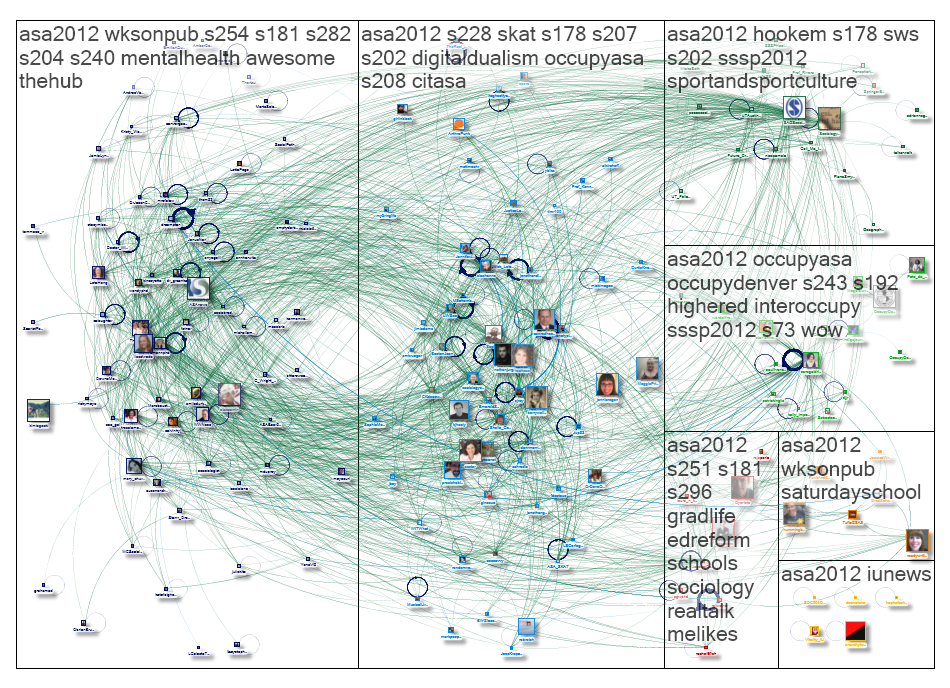
So first off, what are we looking in the graph above?
The picture above is really just a snapshot of the network graph itself—or as Marc explained to me yesterday at the University of Maryland Summer Social Webshop, “a snapshot.” The picture is there to be a teaser, a taste of what NodeXL users can do if they download the same spreadsheets of data (which Marc makes available at the bottoms of his graph pages). Marc includes an explanation of how to read his graphs with each one (you can see the page for the graph above here), but below I give a very basic overview for those who aren’t already familiar with NodeXL or network analysis graphs (disclosure: this group includes me, too).
What you’re looking at is a picture of the interrelationships between 177 individual Twitter users (or vertices) who used the #ASA2012 or #ASA12 hashtags, as captured via tweets that included either hashtag between 11:06 AM and 5:23 PM conference time on Saturday, 18 August (the second full day of the conference). Each green line (or edge) represents a “follow” relationship; a double-headed green line points to two people who follow each other, whereas a single-headed green line represents an unreciprocated follow relationship. The blue lines (also edges) represent either “mention” or “reply-to” relationships; the closed circles (or self-loop edges) represent tweets that didn’t mention or reply to any of the other 176 users on the graph. There are a couple areas where users seem to clump together, and these clumps are identified as groups (e.g., G1, G2, etc); these groups are sets of users who tend to interact with each other.
My first reactions when I saw this particular graph during ASA were as follows: first, I had a good laugh about the fact that “#digitaldualism” had, in 7th place, made the Top Hashtags list for the G2 group. Second, I was pleased to note that three Cyborgologists (plus friend of Cyborgology Alex Hanna) had together managed to occupy first through fourth place in the Top Replied-To list for the graph as a whole (which probably helps to explain the prominence #digitaldualism). In fact, Cyborgology’s fingerprints were all over this particular network graph, & I delighted in retweeting the link to it. What I didn’t notice until a few minutes later, however, was that the Top Replied-To list has a distinct gender skew: its members are two women and eight men.
To try and put this 20/80 split into context, let’s first compare the Top Replied-To list with the Top Mentioned list. A “mention” is when someone’s username appears in a tweet; this can happen in a reply, a retweet, a cc:, or just using someone’s username to talk about them. The Top Mentions list for the graph as a whole is much more gender-balanced, with four women, five men, and one user of unknown gender (@ASAnews). The Top Replied-To list, on the other hand, reflects not mentions but what happens in response to mentions; where the Top Mentions list shows who was talked about most, the Top Replied-To list shows who got responses from the people they talked about.
So what’s going on with the gender difference (other than the fact that it’s there)?
The short answer is that we can’t come up with any solid guesses without doing a lot more data analysis. For example, we would have to look at all of the tweets in the sample to start proposing reasons why some of the 177 included users got responses while others didn’t, because we can’t know just from the picture how much garnering a reply has to do with who speaks versus to whom one speaks. To illustrate: when Nathan (@nathanjurgenson) and PJ (@pjrey) and I (@phenatypical) all attend the same session in-room and then argue about it on Twitter (which never happens…ok maybe that happens sometimes), we generate a lot of replies to each other. This increases the frequency that all three of us are “replied-to,” though it doesn’t necessarily mean that anyone beyond the three of us is listening (or cares about what we’re saying). Comparing the three of us to three hypothetical users who mostly ‘mention’ people more prestigious than they are, or people they don’t know, or people who don’t use the ASA hashtags, wouldn’t necessarily be a good comparison if we want to learn about gender and Twitter use at ASA in general.
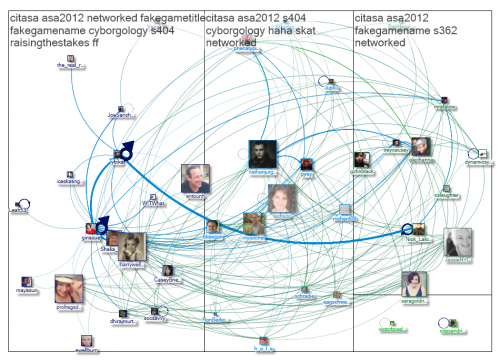
If we were to find any gender effects on membership in the Top Replied-To group for this graph, we also wouldn’t know if those effects hold for the other 167 users in this sample; recall too that only people who used #ASA2012 or #ASA12 at least once during the specified timeframe are included in this group, so looking at ASA Twitter users in general may show different patterns as well. Marc also points out that, perhaps unsurprisingly, members of the ASA section on Communication and Information Technologies (#CITASA) provide a disproportionate amount of traffic on the ASA hashtags; a good analysis would have to take this into account, because findings more specific to CITASA members may not be generalizable even to tweeting ASA members in general. (You can download the data for the CITASA graph above here.) It would be useful to know the gender breakdown of all users who tweeted the #ASA2012 and #ASA12 hashtags anytime during the conference, as well as the gender breakdown for ASA attendees most generally, to make better comparisons.
All of that said, what’s your best guess? What behaviors, usage patterns, and attitudes might create a gender discrepancy in Top Replied-to, but not Top Mentioned? Can the graph be weighted differently to change this discrepancy, & what’s the significance of that? What kind of data analysis would you do to start getting at these questions?
I’m interested to hear what people think about this!
Whitney Erin Boesel (@phenatypical) is a woman who posts frequently in conference hashtag streams…and who’s still always surprised to discover people are listening.
Comments 4
Fleur — August 24, 2012
Some questions I would ask...
- Are there just more men, or tweets from men and/or more men on twitter, more men at the conference who are on twitter?
- Do the men in this particular group have more twitter followers to start with?
- What's the average number of tweets for women and the average for men in the same time period?
In terms of content:
- Do men post more controversial content or more confident/determinate statements? (e.g. one of my earlier studies, unsurprisingly, showed women to ask more questions and I think questions get retweeted less often, but may generate more replies depending on the audience for the question). But are retweets counted?
There might also be status issues at work... high status individuals in CMC groups always get more interaction and the particular men in this group might somehow have built up their twitter status differently?
Anyways... lots of interesting questions! Worth looking into all this and figure out if the men also profit more from these sheer number of interactions (last one is definitely more difficult, I know from experience).
Fleur — August 24, 2012
I assume that the size of the pictures denotes the number of tweets about the conference with their handle in it? The number of sizeable women pictures seem to come close to the number sizeable men pictures at a glance. Centrality is also an interesting measure.
Post-ASA Reflection: Gender, Networks, & Use of ASA Hashtags ... | Holy Hashtags! | Scoop.it — September 3, 2012
[...] This week, I want to share some of my preliminary observations and questions about gender and Twitter use at ASA2012 by looking at Marc Smith's (@marc_smith) Twitter NodeXL social network analysis maps. [...]