nation: Iceland

Iceland continues to experiment with new ways to promote majority living standards. According to the Icelandic Grapevine, a bill has been submitted to the Icelandic parliament that would shorten the workweek.  More specifically, it would change the definition of a full time workweek to 35 hours instead of the current 40 and the full workday to 7 hours rather than the current 8.

As the Grapevine reports:

The bill points out that other countries which have shorter full time work weeks, such as Denmark, Spain, Belgium, Holland and Norway, actually experience higher levels of productivity. At the same time, Iceland ranked poorly in a recent OECD report on the balance between work and rest, with Iceland coming out in 27th place out of 36 countries.

The bill also points out that a recent Swedish initiative to shorten the full time work day to six hours has been going well, with some Icelanders calling for the idea to be taken up here. In addition, the bill also cites gender studies expert Thomas Brorsen Smidt’s proposal to shorten it even further, to four hours.

There is certainly significant variation among countries in the length of the workweek, as the following information from the U.S. Bureau of Labor Statistics shows:

2

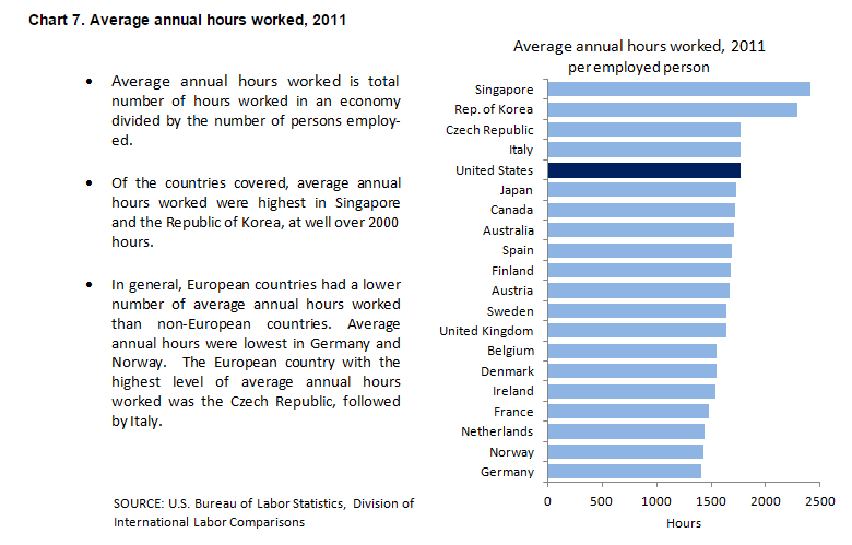
In 2011 the average annual hours worked per employed person in the U.S. was 1758.  The number for French workers was 1476.  It was 1411 for German workers.  Assuming a 40 hour workweek, the average U.S. worker had a work year more than two months longer than the average German worker.  It is also worth noting that while all the countries that reported data for the entire period 1979 to 2011 showed reductions in work time, the reduction was the smallest in the U.S.

Although it is not easy to establish a clear relationship between work hours and productivity, there is reason to believe that the relationship may be inverse.  In other words, the shorter the workweek the more productive we are. It would certainly be nice, for many reasons, if someone in the U.S. Congress followed the lead of Iceland and introduced  a bill to reduce work time in the U.S.

Cross-posted at Pacific Standard.

Martin Hart-Landsberg is a professor of economics at Lewis and Clark College. You can follow him at Reports from the Economic Front.

Cross-posted at Reports from the Economic Front.

The Supreme Court has ruled favorably on the legality of the Affordable Care Act.  Actually, despite its name, the Act has more to do with extending and attempting to improve private health insurance coverage than it does with improving care or reducing its cost.

Unfortunately for us, the effort to improve our health care system has remained within bounds set by the needs of private health care providers and insurers.  As President Obama made clear from the start of his push for health care reform, there would be no consideration of a universal system.

Critics of such a universal system are always quick to argue that only market forces driven by the private pursuit of profit can ensure an efficient health care system.  Of course, in determining whether this is true, we need to recognize that efficiency is a complex term and that our health care system, like all systems, produces multiple outcomes.  The most obvious ones are private profit as well as the quality and cost of the relevant health care.

In terms of private profit there can be no doubt that our health care system functions well.  However, the story is quite different if we evaluate it in terms of quality and cost.  The fact that we continue to embrace a private health care system makes clear which measures of efficiency are considered most important and by whom.

The following map shows the countries, colored green, that have adopted a universal health care system.

mf-healthcaremap-p-thumb-615x314-91612.jpg

As Max Fisher explains:

What’s astonishing is how cleanly the green and grey separate the developed nations from the developing, almost categorically. Nearly the entire developed world is colored, from Europe to the Asian powerhouses to South America’s southern cone to the Anglophone states of Australia, New Zealand, and Canada. The only developed outliers are a few still-troubled Balkan states, the Soviet-style autocracy of Belarus, and the U.S. of A., the richest nation in the world.

The handful of developing countries that provide universal access to health care include oil-rich Saudi Arabia and Oman, Latin success story Costa Rica, Kyrgyzstan, and, famously, Cuba, among a few others. A number of countries have attempted universal health care but failed, such as South Africa, which maintains a notoriously inefficient and troubled public plan to complement the private plans popular among middle- and upper-class citizens…

That brings us to another way that America is a big outlier on health care. The grey countries on this map tend to spend significantly less per capita on health care than do the green countries — except for the U.S., where the government spends way more on health care per person than do most countries with free, universal health care. This is also true of health care costs as a share of national GDP — in other words, how much of a country’s money goes into health care.

The OECD just published a major study on the health care systems of its 34 member nations.  It found that:

 Health spending accounted for 17.6% of GDP in the United States in 2010, down slightly from 2009 (17.7%) and by far the highest share in the OECD, and a full eight percentage points higher than the OECD average of 9.5%. Following the United States were the Netherlands (at 12.0% of GDP), and France and Germany (both at 11.6% of GDP).

The United States spent 8,233 USD on health per capita in 2010, two-and-a-half times more than the OECD average of 3,268 USD (adjusted for purchasing power parity). Following the United States were Norway and Switzerland which spent over 5,250 USD per capita. Americans spent more than twice as much as relatively rich European countries such as France, Sweden and the United Kingdom.

combined1.jpg
What does all of this mean in terms of health outcomes?  According to the OECD report:

Most OECD countries have enjoyed large gains in life expectancy over the past decades. In the United States, life expectancy at birth increased by almost 9 years between 1960 and 2010, but this is less than the increase of over 15 years in Japan and over 11 years on average in OECD countries. As a result, while life expectancy in the United States used to be 1½ year above the OECD average in 1960, it is now, at 78.7 years in 2010, more than one year below the average of 79.8 years. Japan, Switzerland, Italy and Spain are the OECD countries with the highest life expectancy, exceeding 82 years.

One possible explanation for this lagging performance, highlighted in an earlier OECD report, is that the U.S. ranked 26th in terms of the number of practicing physicians relative to its population, 29th in terms of the number of doctor consultations per capita, 29th in terms of the number of hospital beds per capita, and 29th in terms of the average length of hospital stay.  At the same time, the “U.S. health system does do a lot of interventions… it has a lot of expensive diagnostic equipment, which it uses a lot. And it does a lot of elective surgery — the sort of activities where it is not always clear cut about whether a particular intervention is necessary or not.”

Private health care providers and insurers are clear about how they measure health care efficiency.  And as long as we rely on them to set the terms of the debate we will continue to suffer the consequences.

How does the U.S. compare to other developed countries on measures of social justice? According to the New York Times, not very well.  The visual below compares countries’ poverty rates, poverty prevention measures, income inequality, spending on pre-primary education, and citizen health.  The “overall” rating is on the far left and the U.S. ranks 27th out of 31.


Via Feministing.  See also how the U.S. ranks on measures of equality and prosperity(33 out of 33, for what it’s worth). Thanks to Dolores R. for the link!

Lisa Wade, PhD is an Associate Professor at Tulane University. She is the author of American Hookup, a book about college sexual culture; a textbook about gender; and a forthcoming introductory text: Terrible Magnificent Sociology. You can follow her on Twitter and Instagram.

Cross-posted at Family Inequality.

I have criticized sloppy statistical work by some international feminist organizations, so I’m glad to have a chance to point out a useful new report and website.

The Progress of the World’s Women is from the United Nations Entity for Gender Equality and the Empowerment of Women. The full-blown site has an executive summary, a long report, and a statistics index page with a download of the complete spreadsheet. I selected a few of the interesting graphics.

Skewed sex ratios (which I’ve written about here and here) are in the news, with the publication of Unnatural Selection, by Mara Hvistendahl. The report shows some of the countries with the most skewed sex ratios, reflecting the practice of parents aborting female fetuses (Vietnam and Taiwan should  be in there, too). With the exception of Korea, they’ve all gotten more skewed since the 1990s, when ultrasounds became more widely available, allowing parents to find out the sex of the fetus early in the pregnancy.

The most egregious inequality between women of the world is probably in maternal mortality. This chart shows, for example, that the chance of a woman dying during pregnancy or birth is about 100- 39-times higher in Africa than Europe. The chart also shows how many of those deaths are from unsafe abortions.

Finally, I made this one myself, showing women as a percentage of parliament in most of the world’s rich countries (the spreadsheet has the whole list). The USA, with 90 women out of 535 members of Congress, comes in at 17%.

The report focuses on law and justice issues, including rape and violence against women, as well as reparations, property rights, and judicial reform. They boil down their conclusions to: “Ten proven approaches to make justice systems work for women“:

1. Support women’s legal organizations

2. Support one-stop shops and specialized services to reduce attrition in the justice chain [that refers to rape cases, for example, not making their way from charge to conviction -pnc]

3. Implement gender-sensitive law reform

4. Use quotas to boost the number of women legislators

5. Put women on the front line of law enforcement

6. Train judges and monitor decisions

7. Increase women’s access to courts and truth commissions in conflict and post-conflict contexts.

8. Implement gender-responsive reparations programmes

9. Invest in women’s access to justice

10. Put gender equality at the heart of the Millennium Development Goals

Does American prosperity translate into long retirements?  Not compared to other developed countries in the world.  Flowing Data borrowed OECD numbers on life expectancy and age of retirement to calculate the average number of years in retirement for men and women across many different countries.  The portion of each bar with the line is the average number of years working, while the non-lined portion represents years in retirement.

Largely because of life expectancy, women enjoy more years than men in all states except Turkey, but the number of years varies quite tremendously, from an average of zero years for men in Mexico, to an average of 26 years for women in Austria and Italy.  The United States is way down on this list, not doing so well relatively after all.

Lisa Wade, PhD is an Associate Professor at Tulane University. She is the author of American Hookup, a book about college sexual culture; a textbook about gender; and a forthcoming introductory text: Terrible Magnificent Sociology. You can follow her on Twitter and Instagram.

An infographic accompanying an article at the New York Times reveals how “advanced economies” compare on various measures of equality, well-being, educational attainment, and more.  To illustrate this, for each measure countries that rank well are coded tan, countries that rank poorly and very poorly are coded orange and red respectively, and countries that are in the middle are grey.  The countries are then ranked from best to worst overall, with Australia coming in #1 and the United States coming in last.  You might be surprised how some of these countries measure up.

Thanks to Dmitriy T.M. for the link.

Lisa Wade, PhD is an Associate Professor at Tulane University. She is the author of American Hookup, a book about college sexual culture; a textbook about gender; and a forthcoming introductory text: Terrible Magnificent Sociology. You can follow her on Twitter and Instagram.

Fannar Þór Guðmundsson sent in a photograph that he took a few years back in his hometown of Reykjavík, Iceland.  The simple street, the mundane household items for sale, and the elderly couple contrast starkly with the lingerie-clad models with their come hither looks.  They contrast starkly, that is, if you are not already inured to the fact that such images are absolutely everywhere.

Lisa Wade, PhD is an Associate Professor at Tulane University. She is the author of American Hookup, a book about college sexual culture; a textbook about gender; and a forthcoming introductory text: Terrible Magnificent Sociology. You can follow her on Twitter and Instagram.

My friend Steve sells Cessnas (single engine propeller planes, usually with between two and four seats).  A four-seater basic single-engine Cessna will cost you about $200,000, plus insurance, hanger fees, regular maintenance, and check-ups.   They aren’t particularly fast (not jets): the $200,000 one will get you somewhere about twice as fast as a car.  The gas will cost you about twice as much.   And there’s a much bigger carbon footprint.

Last summer, Steve sold a six-seater single-engine Cessna to France.  Since someone had to fly it (and the trip was paid for), we decided to take it there ourselves.  (Okay, Steve decided to take it there himself; I decided to sit in the passenger seat.)  Among other things, the adventure was a fascinating look at how the other half, eh em, top one percent lives.  In this post, I’m going to talk about the terminals serving private planes (also posted about here).   If you fly by private plane, you don’t go to the main terminal.  There is a separate private terminal.  We went through a lot of those terminals as we flew from Omaha, Nebraska; to Bangor, Maine; to Goose Bay-Happy Valley, Canada (Newfoundland-Labrador border); to Narsarsuaq, Greenland; to Reykjavik, Iceland; to Aarhus, Denmark; and, finally, to Nice, France.

Because I have my priorities straight, the first thing I noticed about these terminals is that they all have free treats: muffins, candy, or cookies:


There was also always free coffee and soda and bottled water. (This, I gotta tell you, was torture because I was off caffeine for the trip and, on top of that, couldn’t drink anything before taking off because of the whole no-bathroom-on-the-plane-thing and living below the poverty line until you’re 32 really instills a desire to pilfer anything that’s not nailed down.)

Private plane travel is figuratively as well as literally delicious.  There is no “long-term parking.”  You park your car right up front in the complimentary parking lot.  Honestly, going to the grocery store is more challenging.  In the private terminal, you can wander about as you please; your things will not be confiscated if you leave them unattended. There are no announcements.  You will not wait in line.  There is no security, except that which is designed to make your life more comfortable. You will not be asked to walk through an x-ray machine or show anyone any paperwork. There are computers available if you would like to use them and free wireless if you brought your own. You will leave whenever you like and stay as long as you please.  And how nice, since the facilities are incredibly comfortable.

Steve let me borrow these photos from the Houston Million Air.  The main desk:

CIMG3372

A lovely place to sit and watch TV comfortably:

CIMG3373

And if that isn’t good enough for you, a free, private cinema:

CIMG3371

CIMG3367

There were also free magazines about things like investments, yachts, and other expensive things:


This is where I got the ads and articles aimed at exeedingly rich people that I have been posting recently (see here, here and here).

When we decide to leave, we just waltz out to our plane, jump in and taxi to the runway.  We would call ground control, say “we’re ready,” and they’d say “go ahead.”   We never waited more than three or four minutes to get clearance to take off.

When we landed, we’d taxi over to the terminal, jump out of the plane and wander in.  The interaction would go something like this:

THEM: Welcome Sir and Miss. Can we get your bags?

STEVE: Please.

[They go out and start unloading the plane.]

THEM: Can we arrange for a hotel?

STEVE: Why yes.

THEM: Will do. Would you prefer downtown or on the water?

STEVE: The water will be lovely.

THEM: One moment, please. [The hotel is called.] Your room is booked. Would you like us to arrange a rental car for you or would you like a ride to the hotel?

STEVE: We will take a rental car, please.

THEM: It will be just a few minutes. Please enjoy our complimentary beverages, delightful morsels, overstuffed chairs, and free wireless while you wait.

STEVE: We certainly will.

I am totally not kidding.

You could also call ahead and request a rental car.  In this case, they would drive it right up to your plane, unload your bags for you, and you’d just scoot across the tarmac and be off!

One final tidbit:

Steve and I left the U.S. and entered five different countries over the course of our trip.  We got through Canada and Greenland without being asked for our passports.  Iceland would be both the first and the last place we were required to show I.D.  Denmark and France welcomed us with wide arms and trust.  We were the special people.

UPDATE: Several commenters pointed out that once Steve and I were through Iceland, the law grants us entry to Denmark and France without I.D. Thanks for the correction!