nation: Hungary

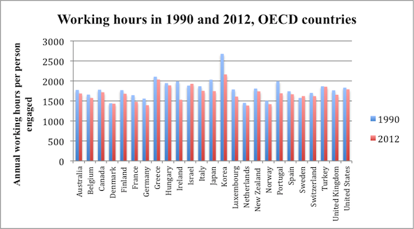
On average, U.S. workers with jobs put in more hours per year  than workers in most OECD countries. In 2012, only Greece, Hungary, Israel, Korea, and Turkey recorded a longer work year per employed person.

2

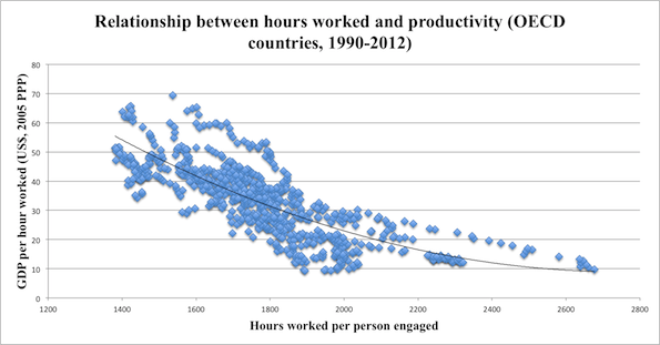
A long work year is nothing to celebrate. The following chart, from the same Economist article, shows there is a strong negative correlation between yearly hours worked and hourly productivity.

3.5

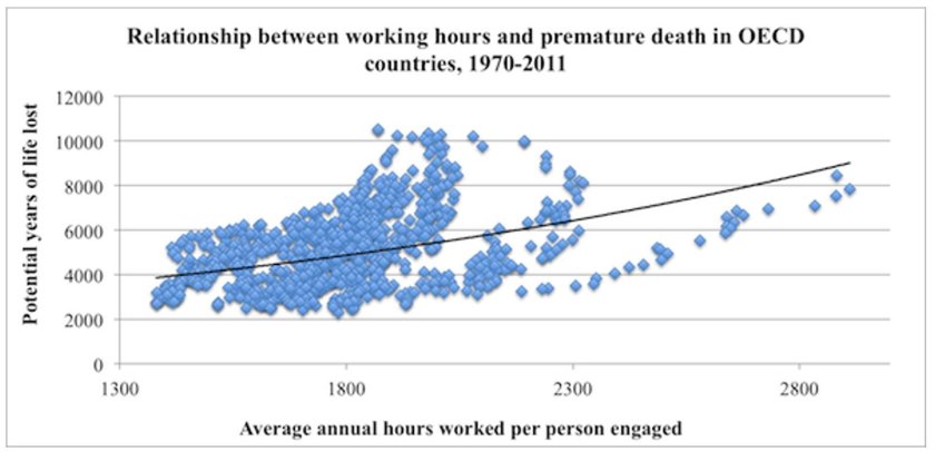
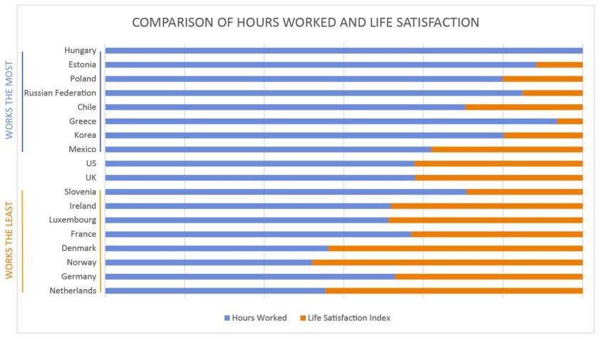
More importantly, the greater the number of hours worked per year, the greater the likelihood of premature death and poor quality of life.  This reality is highlighted in the following two charts taken from an article by Angus Chen titled “8 Charts to Show Your Boss to Prove That You Can Do More By Working Less.”

1 (2) - Copy

1 (2)

In sum, we need to pay far more attention to the organization and distribution of work, not to mention its remuneration and purpose, than we currently do.

Martin Hart-Landsberg is a professor of economics at Lewis and Clark College. You can follow him at Reports from the Economic Front.

Cross-posted at Reports from the Economic Front.

The Supreme Court has ruled favorably on the legality of the Affordable Care Act.  Actually, despite its name, the Act has more to do with extending and attempting to improve private health insurance coverage than it does with improving care or reducing its cost.

Unfortunately for us, the effort to improve our health care system has remained within bounds set by the needs of private health care providers and insurers.  As President Obama made clear from the start of his push for health care reform, there would be no consideration of a universal system.

Critics of such a universal system are always quick to argue that only market forces driven by the private pursuit of profit can ensure an efficient health care system.  Of course, in determining whether this is true, we need to recognize that efficiency is a complex term and that our health care system, like all systems, produces multiple outcomes.  The most obvious ones are private profit as well as the quality and cost of the relevant health care.

In terms of private profit there can be no doubt that our health care system functions well.  However, the story is quite different if we evaluate it in terms of quality and cost.  The fact that we continue to embrace a private health care system makes clear which measures of efficiency are considered most important and by whom.

The following map shows the countries, colored green, that have adopted a universal health care system.

mf-healthcaremap-p-thumb-615x314-91612.jpg

As Max Fisher explains:

What’s astonishing is how cleanly the green and grey separate the developed nations from the developing, almost categorically. Nearly the entire developed world is colored, from Europe to the Asian powerhouses to South America’s southern cone to the Anglophone states of Australia, New Zealand, and Canada. The only developed outliers are a few still-troubled Balkan states, the Soviet-style autocracy of Belarus, and the U.S. of A., the richest nation in the world.

The handful of developing countries that provide universal access to health care include oil-rich Saudi Arabia and Oman, Latin success story Costa Rica, Kyrgyzstan, and, famously, Cuba, among a few others. A number of countries have attempted universal health care but failed, such as South Africa, which maintains a notoriously inefficient and troubled public plan to complement the private plans popular among middle- and upper-class citizens…

That brings us to another way that America is a big outlier on health care. The grey countries on this map tend to spend significantly less per capita on health care than do the green countries — except for the U.S., where the government spends way more on health care per person than do most countries with free, universal health care. This is also true of health care costs as a share of national GDP — in other words, how much of a country’s money goes into health care.

The OECD just published a major study on the health care systems of its 34 member nations.  It found that:

 Health spending accounted for 17.6% of GDP in the United States in 2010, down slightly from 2009 (17.7%) and by far the highest share in the OECD, and a full eight percentage points higher than the OECD average of 9.5%. Following the United States were the Netherlands (at 12.0% of GDP), and France and Germany (both at 11.6% of GDP).

The United States spent 8,233 USD on health per capita in 2010, two-and-a-half times more than the OECD average of 3,268 USD (adjusted for purchasing power parity). Following the United States were Norway and Switzerland which spent over 5,250 USD per capita. Americans spent more than twice as much as relatively rich European countries such as France, Sweden and the United Kingdom.

combined1.jpg
What does all of this mean in terms of health outcomes?  According to the OECD report:

Most OECD countries have enjoyed large gains in life expectancy over the past decades. In the United States, life expectancy at birth increased by almost 9 years between 1960 and 2010, but this is less than the increase of over 15 years in Japan and over 11 years on average in OECD countries. As a result, while life expectancy in the United States used to be 1½ year above the OECD average in 1960, it is now, at 78.7 years in 2010, more than one year below the average of 79.8 years. Japan, Switzerland, Italy and Spain are the OECD countries with the highest life expectancy, exceeding 82 years.

One possible explanation for this lagging performance, highlighted in an earlier OECD report, is that the U.S. ranked 26th in terms of the number of practicing physicians relative to its population, 29th in terms of the number of doctor consultations per capita, 29th in terms of the number of hospital beds per capita, and 29th in terms of the average length of hospital stay.  At the same time, the “U.S. health system does do a lot of interventions… it has a lot of expensive diagnostic equipment, which it uses a lot. And it does a lot of elective surgery — the sort of activities where it is not always clear cut about whether a particular intervention is necessary or not.”

Private health care providers and insurers are clear about how they measure health care efficiency.  And as long as we rely on them to set the terms of the debate we will continue to suffer the consequences.

In a previous post I discussed how the U.S. became more religious in the 1950s, in part in response to its the Cold War enemies (atheist communists).  In fact, the U.S. is among the most religious countries in the world.  Using data from the International Social Survey Programme, Sociologist Tom Smith paints wildly different religious portraits of 28 nations (full text).

When asked whether they “know that God really exists and… have no doubt about it,” 61% of Americans say “yes.”  Of the 28 nations studied, only four were more likely to say “yes” to this question: Poland, Israel, Chile, and the Philippines. Here’s how we look compared to similar countries:

Here’s all 28 in rank order (borrowed from LiveScience).  Notice how wide the divergence is.  In Japan, the least religious country according to this measure, only 4% say they have no doubt God exists.  In The Philippines, 84% have no doubt.

% Have No Doubt God Exists:

  • Japan: 4.3 percent
  • East Germany: 7.8 percent
  • Sweden: 10.2
  • Czech Republic: 11.1
  • Denmark: 13.0
  • Norway: 14.8
  • France: 15.5
  • Great Britain: 16.8
  • The Netherlands: 21.2
  • Austria: 21.4
  • Latvia: 21.7
  • Hungary: 23.5
  • Slovenia: 23.6
  • Australia: 24.9
  • Switzerland: 25.0
  • New Zealand: 26.4
  • West Germany: 26.7
  • Russia: 30.5
  • Spain: 38.4
  • Slovakia: 39.2
  • Italy: 41.0
  • Ireland: 43.2
  • Northern Ireland: 45.6
  • Portugal: 50.9
  • Cyprus: 59.0
  • United States: 60.6
  • Poland: 62.0
  • Israel: 65.5
  • Chile: 79.4
  • The Philippines: 83.6

Americans are also particularly likely to believe in a “personal God,” one who is closely attentive to the lives of each and every person.

Quite interestingly, the U.S. is in the minority in that Americans tend to become increasingly religious as they age.  In most countries, people become less religious over time.  This graph (confusingly labeled), shows changes in DISbelief over the life course.  The U.S. is the only country among these in which disbelief declines:

Lifetime Change in Religiosity (from increase in disbelief to increase in belief):

  • The Netherlands: -14.0
  • Spain: -12.4
  • Australia: -12.0
  • France: -11.3
  • Norway: -11.0
  • Great Britain: -10.1
  • Switzerland: -8.2
  • Germany (East): -6.9
  • Denmark: -6.1
  • Czech Republic: -5.5
  • Sweden: -5.5
  • Germany (West): -5.4
  • New Zealand: -4.0
  • Italy: -2.7
  • Poland: -1.8
  • Japan: -1.5
  • Ireland: -0.9
  • Chile: +0.1
  • Cyprus: +0.2
  • Portugal: +0.6
  • The Philippines: +0.8
  • Hungary: +1.0
  • Northern Ireland: +1.0
  • United States: +1.4
  • Israel: +2.6
  • Slovakia: +5.6
  • Slovenia: +8.5
  • Latvia: +11.9
  • Russia: +16.0

Rates of atheism — a strong disbelief in God — also vary tremendously.  East Germany is the most atheist, with more than half of citizens claiming disbelief.  The country is a stark contrast to the atheist among them, Poland and the U.S. (only 3% atheist), Chile and Cyprus (2%), and The Phillipines (1%).

% Atheist:

  • East Germany: 52.1
  • Czech Republic: 39.9
  • France: 23.3
  • The Netherlands: 19.7
  • Sweden: 19.3
  • Latvia: 18.3
  • Great Britain: 18.0
  • Denmark: 17.9
  • Norway: 17.4
  • Australia: 15.9
  • Hungary: 15.2
  • Slovenia: 13.2
  • New Zealand: 12.6
  • Slovakia: 11.7
  • West Germany: 10.3
  • Spain: 9.7
  • Switzerland: 9.3
  • Austria: 9.2
  • Japan: 8.7
  • Russia: 6.8
  • Northern Ireland: 6.6
  • Israel: 6.0
  • Italy: 5.9
  • Portugal: 5.1
  • Ireland: 5.0
  • Poland: 3.3
  • United States: 3.0
  • Chile: 1.9
  • Cyprus: 1.9
  • The Philippines: 0.7

As a post-9/11 American watching another election cycle, I can’t help but notice how so much of our rhetoric revolves — sometimes overtly and sometimes not — around people who are the wrong religion.  Notably, Muslims.  And yet, the U.S. and many Muslim countries are alike in being strongly religious, at least in comparison to the many strongly secular countries.

This is odd because stands in contrast to recent data on American attitudes.  Within the U.S., people express much less tolerance for atheists than they do Muslims (homosexuals, African Americans, and immigrants). Weirdly, we think we have more in common with more secular nations like Great Britain than we do with countries like Pakistan or Saudi Arabia. In certain ways, the opposite might be true.

Thanks to Claude Fischer for the graphs.  Fischer, a sociologist at UC Berkeley, is the author of Made in America: A Social History of American Culture and Character.

Lisa Wade, PhD is an Associate Professor at Tulane University. She is the author of American Hookup, a book about college sexual culture; a textbook about gender; and a forthcoming introductory text: Terrible Magnificent Sociology. You can follow her on Twitter and Instagram.

Cross-posted at Reports from the Economic Front.

There is big trouble brewing in Europe.  John Ross, in his blog Key Trends in the World Economy, highlights this brewing crisis in a series of charts, some of which I repost below.

This first chart shows the extent of the recovery from the recent economic crisis in the U.S., the EU, and Japan.  While the U.S. GDP has finally regained its past business cycle peak, the same cannot be said for Europe (or Japan).  As of the 3rd quarter 2011, EU GDP was still 1.7% below its previous business cycle peak.  The Eurozone was 1.9% below.

Recent GDP estimates for the 4th quarter show European GDP once again contracting, which strongly suggests that the region is headed back into recession without having regained its previous business cycle peak.  This development implies that Europe faces serious stagnationist pressures.

gdp1.jpg

This chart looks at the growth record for the 5 largest European economies.  Germany has regained its previous GDP peak.  France is making progress toward that end.  These two countries account for 36.2% of European GDP.  However, things are quite different for the UK, Italy, and Spain.  These three countries account for 34.7% of European GDP and not only do they each remain far below their respective previous GDP peaks, their economies are once again heading downward.

gdp2.jpg

The third chart highlights the economic performance of the three countries which have received the most media attention because of fears that their governments will be unable to repay their respective debts.  They are clearly in trouble, adding to the downward pressure on European GDP.  However, despite all the attention paid to them, their combined economies are only one-eighth the size of the combined economies of the UK, Italy and Spain.

gdp3.jpg

The next two charts highlight the fact that economic trends are also dire throughout much of Eastern Europe.

gdp4.jpg

gdp5.jpg

The take-away is that European economic problems are not limited to a few smaller countries.  Some of the largest are also performing poorly and apparently headed back into recession without ever having regained their past business cycle peaks.  It is hard to see Europe escaping recession.  And it is hard to see the U.S., Asia, and Africa escaping the consequences.

How does the U.S. compare to other developed countries on measures of social justice? According to the New York Times, not very well.  The visual below compares countries’ poverty rates, poverty prevention measures, income inequality, spending on pre-primary education, and citizen health.  The “overall” rating is on the far left and the U.S. ranks 27th out of 31.


Via Feministing.  See also how the U.S. ranks on measures of equality and prosperity(33 out of 33, for what it’s worth). Thanks to Dolores R. for the link!

Lisa Wade, PhD is an Associate Professor at Tulane University. She is the author of American Hookup, a book about college sexual culture; a textbook about gender; and a forthcoming introductory text: Terrible Magnificent Sociology. You can follow her on Twitter and Instagram.

Does American prosperity translate into long retirements?  Not compared to other developed countries in the world.  Flowing Data borrowed OECD numbers on life expectancy and age of retirement to calculate the average number of years in retirement for men and women across many different countries.  The portion of each bar with the line is the average number of years working, while the non-lined portion represents years in retirement.

Largely because of life expectancy, women enjoy more years than men in all states except Turkey, but the number of years varies quite tremendously, from an average of zero years for men in Mexico, to an average of 26 years for women in Austria and Italy.  The United States is way down on this list, not doing so well relatively after all.

Lisa Wade, PhD is an Associate Professor at Tulane University. She is the author of American Hookup, a book about college sexual culture; a textbook about gender; and a forthcoming introductory text: Terrible Magnificent Sociology. You can follow her on Twitter and Instagram.

I am trying to re-enter society after several days being sick, so I’m going with something short and simple today. Eden H. sent in this chart, found at Business Insider, that compares hourly minimum wages in a number of European countries to the U.S.:

The European data are available from Eurostat (though note they report minimum wages in terms of Euros per month, not hour, so the data was converted for the chart).

Deeb K. sent in a story from the New York Times about who does unpaid work — that is, the housework, carework, and volunteering that people do without financial compensation. Based on time-use surveys by the Organisation for Economic Co-operation and Development (OECD), this chart shows how many more minutes per day women in various nations spend doing such activities compared to men:

Childcare stuck out as an area with a particularly large gap:

On child care in particular, mothers spend more than twice as much time per day as fathers do: 1 hour 40 minutes for mothers, on average, compared to 42 minutes for fathers…On average, working fathers spend only 10 minutes more per day on child care when they are not working, whereas working mothers spend nearly twice as much time (144 minutes vs. 74) when not working.

The full OECD report breaks down types of unpaid work (this is overall, including data for both men and women):

The study also found that non-working fathers spend less time on childcare than working mothers in almost every country in the study (p. 19). And mothers and fathers do different types of childcare, with dads doing more of what we might think of as the “fun stuff” (p. 20):

Source: Miranda, V. 2011. “Cooking, Caring and Volunteering: Unpaid Work around the World.” OECD Social, Employment and Migration Working Papers, No. 116. OECD Publishing.