I recently came upon these two ads in magazines and noticed how they both evoke old-money wealth and luxury.
I found this Rolex ad in The New Yorker. Notice the ivy-colored background and the connection to Wimbledon, an event (for a sport) often associated with the upper class.
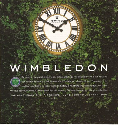
The text says,
Defined by unparalleled grace, manicured courts, pressed tennis whites and achievement that’s second to none, Wimbledon stands alone. Timeless in its tradition, endless in its list of legends, history is no stranger to Wimbledon. Nor is the world’s appreciation of it. Rolex proudly celebrates its 30th anniversary as official timekeeper.
“Manicured courts” and “pressed tennis whites” bring up images of aristocratic lifestyles, and the ad connects Wimbledon (and, therefore, Rolex) to “tradition” and “history.”
I can’t remember for sure where I found this ad for the Toyota Corolla, but I think in Glamour (don’t ask).
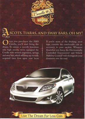
The text, which is clearly to be taken less seriously than the Rolex ad:
Ascots, tiaras, and sway bars, oh my! Once you purchase the 2009 Corolla, you’ll start living the dream. To ensure a smooth transition into high society, we’ve equipped the Corolla with revised suspension, springs, and sway bars, which will keep any recently acquired tiara firm upon your brow. If you’re more of the fetching ascot type, consider the comfortable ride an accessory to your necktie. Whatever flourishes you fancy, the Electronically Controlled Transmission and Vehicle Stability Control will distinguish your dominion over the road. Live the dream for less coin.
I thought it was interesting that the second ad (for a car not generally associated with the upper class) is trying to evoke the idea of luxury, but in a joking wink-wink way, whereas the Rolex ad clearly has no element of parody about it–the connection to “tradition” and “pressed tennis whites” is completely serious.