Search results for stand your ground

Dmitriy T.M. and Claire C. sent in a link to a photo of an NBC cafeteria menu in honor of Black History Month (that’d be February) that featured stereotypical African-American foods:
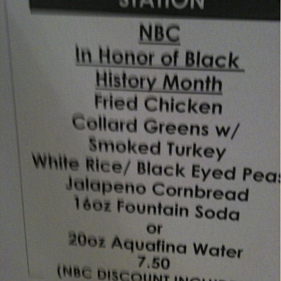
It’s not the first time.

Many argued that the menu was offensive because it reproduced stereotypes, but I think an interview (no longer available) with the chef who devised the menu complicated the story a bit.

Honestly, I think the main problem here is that Americans live in a racist society and so we have no idea how to celebrate Black History Month (how about with relaxer?).   The rest of the year, we make fun of black people for eating fried chicken. And yet, these are traditional Black southern dishes. So how exactly do we celebrate the holiday?   Do we pretend to valorize the same traditions that we make fun of during the rest of the year?  It makes no sense!  But it makes no sense because we’re still racist.  And we need a Black History Month because we’re still racist.  So, what to do!?

Perhaps the lesson to take from all of this is:  Undermining racism is hard work.   A month dedicated to Black history is a (flesh-colored) band aid, at best.  If we don’t do the other stuff (e.g., challenging the web of racist institutions that preserve class and race privilege), then no amount of fried chicken will make the difference.

Lisa Wade, PhD is an Associate Professor at Tulane University. She is the author of American Hookup, a book about college sexual culture; a textbook about gender; and a forthcoming introductory text: Terrible Magnificent Sociology. You can follow her on Twitter and Instagram.

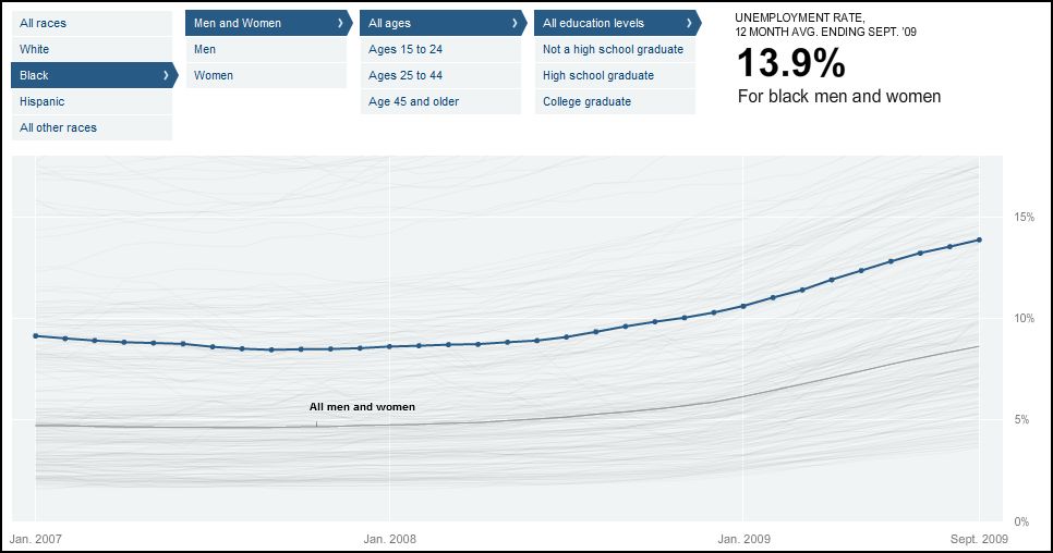
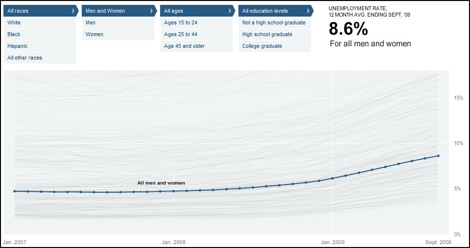
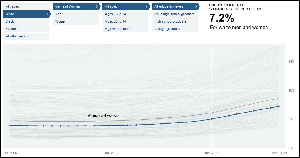
As a white woman between 25 and 44 with a college degree, I am the least likely category of person to be unemployed according to an interactive graphic detailing the joblessness rate for people according to their race, education level, age, and sex (since Jan. ’07).  It is a rather devastating look at social inequality.  I recommend visiting the site to see for yourself, but below are some screen shots with some comparisons.

For comparison, the overall joblessness rate which, as of Sept., was at 8.6 percent:

The joblessness rate for white people (notice it is lower by 1.4 percent):

The joblessness rate for black people is almost twice that of whites:

Let’s add education level.

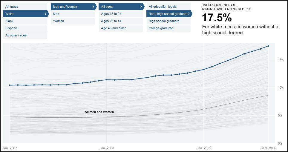
The joblessness for whites who have not yet graduated from high school is 17.5 percent:

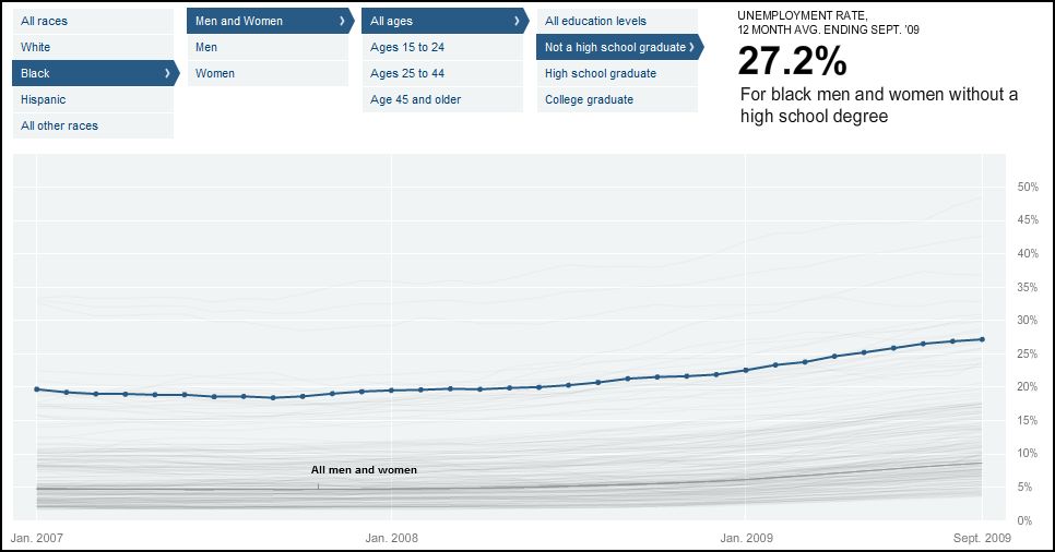
The joblessness for comparative blacks is 10 percentage points higher.  Notice that the scale on the right hand side has changed from 0-20 percent (above) to 0-50 percent:

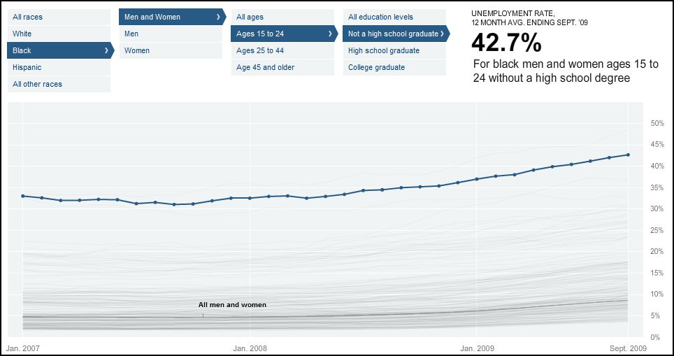
If we look at young blacks (15-24 years old) who haven’t been able to complete a high school degree, the joblessness rate is 42.7 percent:

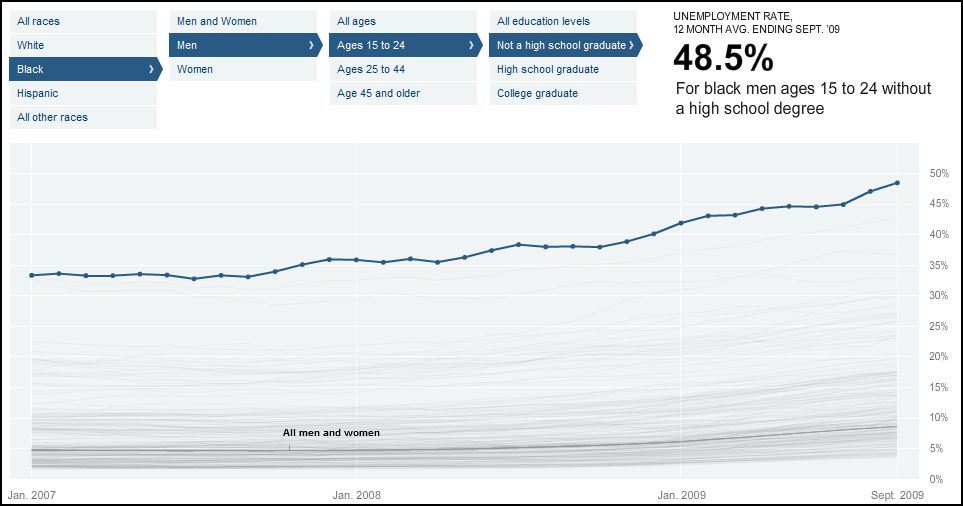
If we restrict the numbers to young black men without a diploma, we see a whopping joblessness rate of 48.5 percent.

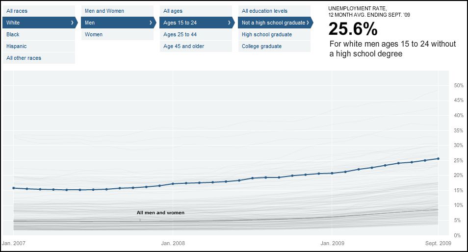
For comparison, here is the same kid, but white (the joblessness rate is cut in half, but is still huge, even by recession standards):

Ever wonder why young men turn to the underground economy?  Well, this is why.  Somewhere between 25 and 50 percent of them can’t get a job in the “above ground” economy.  What’s a kid to do?  Add in the rational choice of choosing work that pays more than minimum wage, and you’ve got a whole group of young people who participate in illegal activities.

Then, of course, we police black neighborhoods more aggressively than white neighborhoods, convict black people more frequently than white people, and send them to prison more often and with longer sentences (see also this post).

And, too add insult to injury, after all is said and done, a black person without a criminal record is less likely to get a job interview than a white person with one.  A black person with a criminal record: his chance of getting a call back after dropping off a resume (even at a place like McDonalds) is something like five percent.  No I’m not joking.

<sarcasm>Oh, but if they just had a good attitude and learned to talk right, they too could be successful in this life.</sarcasm>

It’s almost too much to bear.

Via Matthew Yglesias.

Lisa Wade, PhD is an Associate Professor at Tulane University. She is the author of American Hookup, a book about college sexual culture; a textbook about gender; and a forthcoming introductory text: Terrible Magnificent Sociology. You can follow her on Twitter and Instagram.
I was stuck by this image, which is being used by Environmental Defense as part of a “how you can stop global warming”-type promotion:

slimEarth

We see a cartoon anthropomorphized earth flexing its muscles happily while a tape measure is cinched around its quite unnaturally narrow waist. It’s an interesting collision between the longstanding metaphor of environmentalism as seeking the “health” of the environment, with the modern idea of obesity as iconic of poor health.

Unpacking the idea of ecological “health” as the goal of environmentalism is something I’ll mostly set aside here, except to note that it is a non-inevitable conceptualization (contrast the alternate framing of conservation/sustainability). The important thing to keep in mind is that the idea of ecological health involves conceptualizing the ecosystem, or even the entire planet, as a mega-organism — and in particular, a mega-human-body — for which health consists of an approximation to a particular ideal state. For a human body, health by this conception involves having all the normal parts (2 legs, both eyes, smooth skin, etc) functioning in the normal way.

What caught my eye about the ED ad was the change in the representation of what constitutes “health.” A quick Google image search on “sick earth” brings up lots of examples of the old way of representing health. We get lots of earths suffering from common cold and flu type symptoms — flushed, sweating, excreting mucus, and making use of thermometers and hot water pads.

The archetype of ill health here is infectious disease, an invasion by microbes that upsets the system’s functioning. The metaphorical parallels between viruses and pollution (including, in some cases, human beings) have been powerful for environmentalism.

But over the past few decades, we’ve acquired a new archetype for poor health: obesity. Being fat has become synonymous with being sick, and vice-versa. What I’m interested in here is not the scientific/medical question of how bad for you being fat really is (though I’ll admit to skepticism of the obesity panic on these grounds), but rather the sociological question of how obesity became the key trope in our discourse about health. Thus, a healthy earth can be easily represented as one that has slimmed down, because we all know that getting skinnier equals getting healthier. The metaphor is extended in the “Low Carbon Diet Guide” that the ad encourages you to download, which talks about how “counting carbs” should apply to carbon dioxide as well as carbohydrates. Interestingly, the guide sticks to energy conservation tips, thus both continuing environmentalists’ reluctance to address food habits as a contributor to climate change while mercifully avoiding blaming fat people for causing global warming by stuffing their faces.

An important element to the conceptualization of obestity as the archetype of ill health is the way it’s tied to ideas of personal responsibility. While genetics and social conditions play a huge role in determining who gets fat, our discourse about obesity promotes the idea that on the one hand you can control your own weight, and on the other fat people can be blamed for their condition. This is reflected in the content of ED’s Low Carbon Diet brochure, which is is a fairly standard compendium of personal behavioral changes that will make you a better, less-carbon-emitting, metaphorically slimmer person. Obviously this sort of thinking long predates the ecological-health-as-thinness metaphor, but there’s a synergy between them in terms of the emphasis on the small scope of personal control within a larger issue.

This is not the first, or most extreme, time environmentalists have tried to link up with the concern over obesity. But it was striking to me that the thin = healthy idea is so engrained that it can be used as a metaphor by causes outside of the public health field.

Stentor Danielson is a professor of Geography at Slippery Rock University in Pennsylvania. His research focuses on the relationship between humans and their environment. Specifically, he’s interested in how people understand the risk of wildfires. You can read more from Stentor at his blog, Debitage.

I’ve got a special treat for you today: an interview with artist Nathan Meltz about his pieces on industrial food production. Nathan has shown his art in group shows around the country.  He received a Master’s degree in Art from the University of Wisconsin-Madison and is currently a graduate student at SUNY-Albany, where he will be graduating this spring with his MFA.  He lives in upstate New York with his wife, Abby Kinchy, and their infant son Aldo. His artistic and musical exploits can be followed at The House of Tomorrow.

I went to grad school with Abby, so that’s how I knew about Nathan’s work. As a sociologist who specialized in food issues and rural communities, I immediately loved these pieces and thought many of our readers would too, so I convinced Nathan to let me post an interview and some of my favorites. (And be forgiving of my amateurish interview questions. I am not a Creative Type, and my general reaction to art I like is “You made a pretty!”)

—————————-

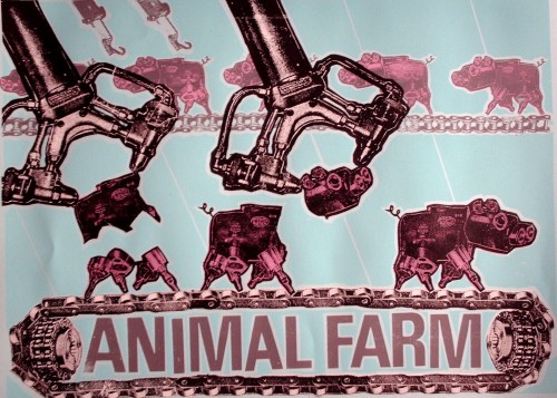
Animal Farm
ANIMALFARMBLUE

What drew you to the issue of food?

I have to give a lot of credit to Abby, who is a sociologist at the Rensselaer Polytechnic Institute, and has done a lot of research on controversies surrounding genetically-modified corn and canola. [She’s currently working on a book about conflicts over genetically modified crops in Canada and Mexico.–Gwen].  A lot of the themes in my art developed from kitchen-table discussions we had while in grad school in Madison.  What was technology doing to agriculture? And then, from my end, what would it look like?

How did you come up with the idea of representing food products as machines?

I wanted a visual metaphor that would reveal tech taking over plants and animals.  Unfortunately, our most current tech can be hard to visualize.  A series of ones and zeros?  Some sort of digital technology?  I decided to combine elements of Dada collage with early modernist German machine aesthetic [Oh, yes, the early modernist German machine aesthetic! Of course!–Gwen]  to create my own visual vocabulary. One that, while not exactly 21st century, would act as a symbol of science and technology for the viewer/audience.

What does your Animal Farm series convey about our modern food system?

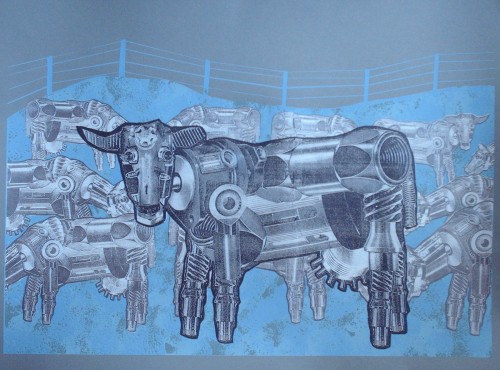
Waiting for My Mechanical BullCOWs

Enviropig
enviropig_paper

In my machine world, animals are put on assembly lines, cramped together in feed lots, and, in the case of the chickens in The Chicken Coup animation, reside in an agricultural system designed by sadists.  They all look the same because there is no diversity on the factory farm.

    The Chicken Coup, pt. 1

    The Chicken Coup, pt. 2

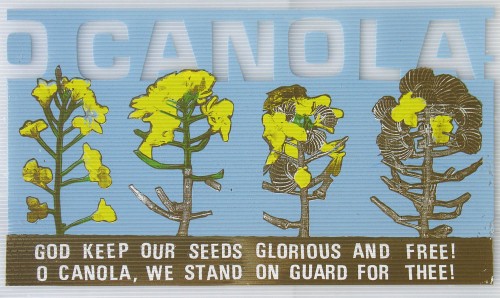
Many people have at least some knowledge of slaughterhouses and the treatment of animals, so the Animal Farm series is probably fairly accessible. But O Canola! is, I think, more complex and harder to understand if you’ve never thought much about bioengineering before, or why the song “O Canada” would be particularly meaningful in the context of discussing canola and bioengineering.

O Canola!
Ocanola

O Canola! was a project long in the making, very much piggybacking on the research Abby was doing at the time. I try to tell the story of Canada’s GMO [genetically modified organism] canola contamination* in a visual form. The clever riffing on the Canadian National Anthem (which Abby thought of) is meant to reflect the nationalist tensions inherent in the controversy, where a hybrid plant created by the Canadian government during WWII to produce a mechanical lubricant at the local level would years later be threatened by GMOs produced by agribusiness.

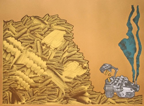
What about Food for Fuel?

Food for Fuel
3

Food for Fuel came after news reports kept coming in about food shortages around the world, particularly in Mexico, because so much edible food was being turned into fuel for vehicles.  The message on this one is pretty straightforward.

Food for Fuel, along with Animal Farm, definitely reflects my interest in Agitprop.  At the time I made these, I was sharing a studio with printmaker/activist Josh MacPhee, a member of the Just Seeds print collective, which promotes socially activist printmaking.  A lot of the work he was doing really influenced me, and I think these two prints reflect my desire to have a clear social message.

How have people reacted to the series? Do you get a sense that people react more forcefully, or emotionally, to the ones about animals than the ones about crops?

Reaction has been positive, or at least the reaction I hear about.  A lot of the prints have traveled around in various shows.  I think the animation The Chicken Coup has maybe received a little more attention than the prints among the art audience.  Static prints on paper have a hard time competing with moving images with sound, music, etc.  And I don’t think people care any less about the crop-based works than the animal ones.  I find people who are really into food/agriculture issues care just as forcefully about what is happening to corn as they do cows.

—————————–

* GMO contamination occurs when genetically modified seeds migrate to fields that were not intentionally planted with them, an increasingly common occurrence. Aside from the problems this can cause farmers who want to sell their products as specifically not GMO, and concerns about the ecological effects that could occur if modified genes spread into other varieties (or even related wild species), it also puts farmers at legal risk. GMO crops such as marketed under the Roundup Ready label and engineered to be immune to the effects of Monsanto’s weedkiller Roundup, are patented. Farmers are not allowed to plant them without buying a license (including saving seeds from their own crop to plant the following year, a traditional practice of many farmers to eliminate the cost of buying seeds each year; so-called “terminator” varieties are even engineered to produce only sterile seeds, thus ensuring farmers must buy fertile seeds from the manufacturer annually). Monsanto has sued farmers for patent infringement in cases where a field was contaminated with Monsanto’s GMO seeds when they blew in from a neighboring field. Conversely, a group of Canadian organic farmers sued Monsanto on the grounds that genetic contamination had made it impossible for them to sell their products as organic.

If you’re interested in the topic, you might try to get a copy of Abby’s new article, “Anti-Genetic Engineering Activism and Scientized Politics in the Case of ‘Contaminated’ Mexican Maize,” Agriculture and Human Values.

Hewlett Packard (HP) recently released face tracking software that allows a webcamera to chase you around as you talk to it. The face recognition software appears to recognize lighter-skinned faces with no problem, but has trouble with darker-skinned faces.  This probably doesn’t mean that HP is anti-black people, but it does suggest that HP didn’t sufficiently test its product on all kinds of faces, which means that it didn’t value black customers very much while doing research and development.

Both Kate W. and Lucy P. sent in this video in which Wanda and Desi, humorously, demonstrate the problem in this youtube clip:

We’ve seen this kind of thing before with a Nikon camera that seemed to think that Asian people were always blinking (though there was some confusion as to whether it did that to everyone) and another version of face recognition software.

Nikon responded to complaints about the program by saying:

We are working with our partners to learn more. The technology we use is built on standard algorithms that measure the difference in intensity of contrast between the eyes and the upper cheek and nose. We believe that the camera might have difficulty “seeing” contrast in conditions where there is insufficient foreground lighting.

Which Kate said is a nice way of saying: it’s not HPs fault that “your face doesn’t have enough contrast and why don’t you turn on a light while you’re at it.”

(By the way, the fact that this video has, as of right now, almost 2 million views is a beautiful example of the democratizing power of the youtubes!!!)

Lisa Wade, PhD is an Associate Professor at Tulane University. She is the author of American Hookup, a book about college sexual culture; a textbook about gender; and a forthcoming introductory text: Terrible Magnificent Sociology. You can follow her on Twitter and Instagram.
Eugene Robinson:

Republicans’ outrage, both real and feigned, at Sotomayor’s musings about how her identity as a “wise Latina” might affect her judicial decisions is based on a flawed assumption: that whiteness and maleness are not themselves facets of a distinct identity. Being white and male is seen instead as a neutral condition, the natural order of things. Any “identity” — black, brown, female, gay, whatever — has to be judged against this supposedly “objective” standard.

Thus it is irrelevant if Justice Samuel A. Alito Jr. talks about the impact of his background as the son of Italian immigrants on his rulings — as he did at his confirmation hearings — but unforgivable for Sotomayor to mention that her Puerto Rican family history might be relevant to her work. Thus it is possible for Sen. Jeff Sessions (R-Ala.) to say with a straight face that heritage and experience can have no bearing on a judge’s work, as he posited in his opening remarks yesterday, apparently believing that the white male justices he has voted to confirm were somehow devoid of heritage and bereft of experience.

Stephen Colbert:

The Colbert Report Mon – Thurs 11:30pm / 10:30c
The Word – Neutral Man’s Burden
www.colbertnation.com

If you can’t view the video, there’s a transcript after the jump, thanks to Macon D at Stuff White People Do.

Jay Livingston:

In the Sotomayor confirmation hearings, Republicans have swarmed on Ricci v. DeStefano, the New Haven firefighters case. To hear them tell it, Sotomayor flung the law aside in upholding the lower court decision. She, the majority of the Second Circuit Court, the Federal judge who wrote the original opinion, and the four dissenting Supreme Court justices all based their opinions entirely on a preference for blacks and Hispanics and an animus towards whites. They didn’t consider the law.

By contrast, the five males (four of them white) on the Supreme Court who sided with the white male plaintiffs based their decision wholly and impartially on the law. Their race had nothing to do with it.

The Republican strategy depends on the tendency for privilege to remain invisible.

The transcript after the jump:

more...

Natasha L. sent in another example of stereotypes tied to nationality/region in the form of a set of comical visual distinctions between “Westerners” and “Asians,” found here, by an artist named Yang Liu. [Note: Natasha and I both assume they’re supposed to be comical or even satirical, particularly of the way that non-Western countries are generally stereotyped as being less professional, less punctual, less rational, and so on, though we might be wrong.] Some examples:

“Opinion”:

picture-13

“Punctuality”:

picture-21

“Traveling”:

picture-5

“In the Restaurant”

picture-41

“Queue when Waiting”

picture-3

Regardless of the artist’s intent (whether they’re supposed to be satires of this type of thinking, etc.), I’m sure many people will laugh and see some elements of truth to some of the images. But I’m betting you could tell people they represent almost any set of nationalities and people would also laugh and say “OMG, it’s totally true!” It’s Germany and Spain! It’s the U.S. and Mexico! It’s Venezuela and Greece! You could also probably change this to “men” and “women” and get the same reaction. It’s the stereotypical categorization we think is funny–the idea that groups of people are systematically different, whether it’s based on gender, class, race, nationality, region within a country, and so on (particularly if these differences might lead to sitcom-like hijinx and misunderstandings!).

For a fun little activity to get across the way in which stereotypes are inconsistent and meaningless, you might present these images, not tell your students what they’re supposed to represent, and ask them what groups they think are being portrayed (either out loud or in writing), then use their guesses, which will probably vary widely and draw on lots of different human categories such as class, gender, race, and so on, to talk about stereotyping (which may or may not be negative, of course) and how little we pay attention to what the actual contents of our stereotypes are. Another good example of this would be the way that ethnic groups are often defined as having uniquely loud and boisterous families–I think of it as the “My Big Fat Greek Wedding” syndrome. Well, if Italians, Irish, Greeks, Jews, Russians, Mexicans, Spaniards, Chinese, people from the Southern U.S., New Yorkers, etc. etc. etc., all have big loud families…doesn’t that kind of indicate that lots of families are just big and loud, regardless of background?

Thanks, Ashley and Natasha!

NEW! Robin sent in a link to an article in the Guardian about a Czech artist who pulled off a hoax by creating a set of sculpture that represent stereotypes of various European countries, which he said were created by 27 different artists.

Romania

gallery-eu-artwork-eu-art-011

Luxembourg is made of gold…and is for sale:

gallery-eu-artwork-eu-art-008

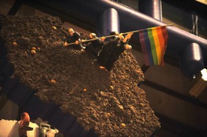
Poland has priests raising a rainbow flag. I didn’t know if the rainbow flag has the same association with gay rights in Poland as it does here, but Spiegel Online says it’s a gay pride flag:

gallery-eu-artwork-eu-art-0071

Bulgaria is apparently supposed to be the floor of a urinal, though Spiegel Online says it’s a Turkish toilet, apparently also called a squat toilet:

gallery-eu-artwork-eu-art-0062

Bulgaria’s not happy about it and has demanded the sculpture be taken down.

Holland has been flooded, but minarets stick out of the water to remind us about increasing concerns expressed by many Dutch about the Muslim community in the Netherlands since tension increased after the Mohammad cartoon incident:

gallery-eu-artwork-eu-art-004

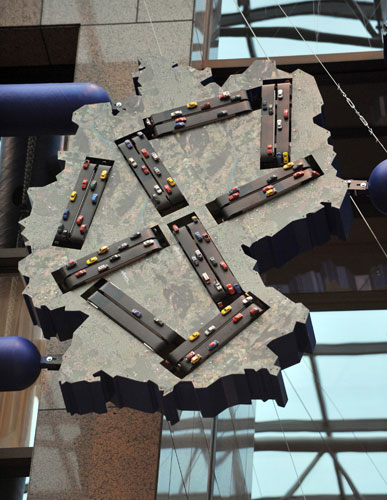
There is ongoing debate about whether this image of Germany, showing the country’s many autobahns, is supposed to look like a swastika:

gallery-eu-artwork-eu-art-002

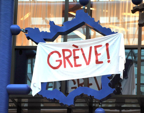
And of course France has a large banner that says “Strike!”

gallery-eu-artwork-eu-art-0011

Apparently Great Britain was represented simply as a blank space.

Jo B. sent us a link to Icebreaker, a New Zealand clothing company. One of their products is wool underwear. As she pointed out, there are some distinct differences in how the men’s and women’s underwear lines are depicted.

The men’s line is called beast. When you go to the site, there’s a little intro part. The following phrase shows up on the banner at the top:

As Jo says,

The overall idea seems to be that men have some kind of innate, primordial aggression (thought I’m not sure how this is supposed to relate to woollen underwear).

Indeed, socialization “cages” men’s true nature, but just barely–its hold is “frail and fragile” and, I presume, could burst forth if you aren’t really careful. I don’t quite follow how the city “brings the beast alive,” or how reconnecting with nature “balances” the beast; since the beast is supposedly men’s real nature, I think reconnecting them with nature would bring out the beast, but whatever. I’m clearly applying too stringent a level of logic. Also, for the record, if all it takes to reconnect with nature is a natural material (made from a domesticated source), then cotton, angora, and mohair would work just as well.


The women’s line is called Nature. When you go to its site there’s also an intro, but without any useful summary of what women are like to compare to the Beast.

Again from Jo:

The female models are slim, delicate, and tend to pose in a way that suggests passivity (static poses, arms held behind body…) and instability (balancing on her toes).  The images in the female range focus more on being attractive, while the men’s range is about being active and aggressive.

The marketing campaign also reinforces the difference in the way we talk about men and women and their association with nature. When we connect men to nature, it’s in an aggressive, predatory sense (the beast). When women are associated with nature, it’s often in a way that implies harmony, an appreciation for the natural world, perhaps some intuitive sense that women have (or, you know, their connection to the moon and stuff because of menstrual cycles). The background is part of this; the grey background of the men’s line doesn’t look nearly as peaceful as the serene white background for the female models.

Thanks, Jo!

FYI:  Jo sent an email to the company complaining and this was their response:

Hi Josephine,

Apologies for the delayed reply. I am writing on behalf of Jeremy Moon to thank you for taking the time to give us your views about Icebreaker’s marketing of its underwear lines for men (Beast) and women (Nature). We understand your concerns, and we really appreciate the level of thought you have put into sharing them with us.

Gender representations are a sensitive issue in marketing, and Icebreaker certainly had no intention of promoting negative or damaging images of men or women in our Winter 08 campaign.

In most of our collections, our marketing approaches to men and women are almost identical. We aim to make Icebreaker garments as stylish as possible, but our clothes are based on performance above all – regardless of the gender of the wearer.

In our Bodyfit, Icebreaker_GT and Superfine collections, for example, women are photographed in exactly the same way as men – pushing their physical boundaries in the outdoors. Our marketing for the garments in these core collections centre on photographs of athletic-looking women skiing, hiking and climbing mountains. None of the images are of women in a passive or decorative role: they’re of women who are confident, independent, adventurous and strong.

We chose a different approach for our underwear ranges. For obvious reasons, we couldn’t adopt our usual approach of showing women taking part in outdoor sports – clearly they wouldn’t play sport in their underwear alone. The other factor we took into consideration is that Nature and Beast, although both underwear collections, are very different ranges.

Men tend to buy underwear for its practical benefits. Our aim was to position Beast as a premium range that has the same performance factors (such as breathability, a critical benefit for underwear) as Icebreaker’s outdoor clothing and yet is sufficiently stylish to be worn at work. Our marketing approach refers not to aggression, but to energy – the same energy (or performance benefits) that works equally well in both outdoor and urban environments. You’ll notice our marketing refers to “creative energy” and also the “harmoniousness” of nature.

The Nature range is our most feminine range by far, and much of our marketing focuses on the way it looks – its styles and its nature-inspired designs. Nature is made from the lightest, most luxurious grade of 100% pure merino, as we understand customers’ concerns against wearing traditional wool (rather than merino) against their skin, so our marketing talks about concepts like “100% pure”. While the photography for the rest of our collections is based around the outdoors, Nature images are designed to show off the styling and softness of the garments.

Our campaigns are designed to be edgy, and we’re very sorry if in this instance you feel our approach conveyed the wrong messages. Please be assured this was not our intention. Thank you for writing, and be assured we will bear your concerns in mind when planning future campaigns. I hope this email helps lesson your disappointment with our brand,

Regards
Alice

Gwen Sharp is an associate professor of sociology at Nevada State College. You can follow her on Twitter at @gwensharpnv.