Search results for census

It’s International Women’s Day–a day to celebrate the social, cultural, economic, and political achievements of women. It’s a day we often take stock of gender inequality, look at how far we’ve come and where we still need to go. This is a day people in my corner of the world share posts about the gender wage gap, statistics surrounding the enduring reality of violence against women, information about women’s access to health care, and more. It’s a day that sociologists have the tools to make lots of charts.

In my feed, sociologist Jane Ward shared a post about a feminist bookstore in Cleveland, Ohio that chose to celebrate Women’s History Month in a unique way: they flipped all of the books written by men in the fiction room of the store around on the shelf. The room will be left that way for for two weeks – through March 14, 2017. Take a look at the result!

The Fiction Room – Loganberry Books, Cleveland Ohio

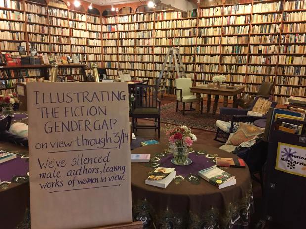
It’s a powerful piece of feminist installation art. And it’s sociological. While a sociologist might have produced a content analysis of the room (or genre) and produced a proportion of books written by women, this feels different. They’ve entitled the exhibit “Illustrating the Fiction Gender Gap” and explain the project with this simple sentence: “We’ve silenced male authors, leaving works of women in view.”

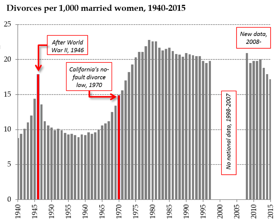
They could have simply counted the books and produced figures made available to the public. That’s what most sociologists I know would have done. But something critical would have been missing when compared with the illustration of the gender gap they produced here. Think about it this way: in 2015, the Census calculated that the poverty rate was 13.5% in the U.S. (that was a drop from the year prior). In actual numbers, there were 43.1 million people in poverty in the U.S. that year. Just to think about the size of that group, that’s a number that is basically the same as the total combined state populations of New York, Florida, and Iowa. Can you imagine everyone in all three states being in poverty. That’s the scale of poverty as a social problem in the U.S.

In a similar way, Loganberry Books, produced a really clever piece of feminist installation art to make a reality about literature more visible. It’s different from telling us the proportion of books written by women in the fiction section. In Loganberry, we get to see what that means. If you went in, you could feel it as you looked around. Works by women who be jumping off the shelves, rather than hidden between piles of books by men.

The owner of the bookstore, Harriet Logan, put it this way: “Pictures are loud communicators.  So we are in essence not just highlighting the disparity but bringing more focus to the women’s books now, because they’re the only ones legible on the shelf” (here). In an interview with Cleveland Scene, she further explained: “To give the floor and attention to women, you need to be able to hear them. And if someone else is talking over them, that just doesn’t happen.”

It’s a small way of asking the question, What would this corner of the world look like if women’s accomplishments had not been systematically, structurally, and historically drowned out by men’s?  What does women’s signal sound like here when we get rid of men’s noise? Books by men are still there. They’re not being banned, removed, or even mentioned as “unworthy” in any way. Men’s books are simply being silenced for two weeks to let women’s work shine. What a powerful, feminist, sociologically imaginative statement.

Happy International Women’s Day!

Tristan Bridges, PhD is a professor at the University of California, Santa Barbara. He is the co-editor of Exploring Masculinities: Identity, Inequality, Inequality, and Change with C.J. Pascoe and studies gender and sexual identity and inequality. You can follow him on Twitter here. Tristan also blogs regularly at Inequality by (Interior) Design.

I love gender and sexual demography.  It’s incredibly important work.  Understanding the size and movements of gender and sexual minority populations can help assess what kinds of resources different groups might require and where those resources would be best spent, among others things.  Gary J. Gates and Frank Newport initially published results from a then-new Gallup question on gender/sexual identity in 2012-2013 (here).  At the time, 3.4% of Americans identified as either lesbian, gay, bisexual, or transgender.  It’s a big deal – particularly as “identity” is likely a conservative measure when it comes to assessing the size of the population of LGBT persons.  After I read the report, I was critical of one element of the reporting: Gates and Newport reported proportions of LGBT persons by state.  As data visualizations go, I felt the decision concealed more than it revealed.

From 2015-2016, Gallup collected a second round of data. These new data allowed Gates to make some really amazing observations about shifts in the proportion of the U.S. population identifying themselves as LGBT.  It’s a population that is, quite literally on the move.  I posted on this latter report here.  The shifts are astonishing – particularly given the short period of time between waves of data collection.  But, again, data on where LGBT people are living was reported by state.  I suspect that much of this has to do with sample size or perhaps an inability to tie respondents to counties or anything beyond state and time zone.  But, I still think displaying the information in this way is misleading.  Here’s the map Gallup produced associated with the most recent report:

During the 2012-2013 data collection, Hawaii led U.S. states with the highest proportions of LGBT identifying persons (with 5.1% identifying as LGBT)–if we exclude Washington D.C. (with 10% identifying as LGBT).  By 2016, Vermont led U.S. states with 5.3%; Hawaii dropped to 3.8%.  Regardless of state rank, however, in both reports, the states are all neatly arranged with small incremental increases in the proportions of LGBT identifying persons, with one anomaly–Washington D.C.  Of course, D.C. is not an anomaly; it’s just not a state. And comparing Washington D.C. with other states is about as meaningful as examining crime rate by European nation and including Vatican City.  In both examples, one of these things is not like the others in a meaningful sense.

In my initial post, I suggested that the data would be much more meaningfully displayed in a different way.  The reason D.C. is an outlier is that a good deal of research suggests that gender and sexual minorities are more populous in cities; they’re more likely to live in urban areas.  Look at the 2015-2016 state-level data on proportion of LGBT people by the percentage of the state population living in urban areas (using 2010 Census data).  The color coding reflects Census regions (click to enlarge).

Vermont is still a state worth mentioning in the report as it bucks the trend in an impressive way (as do Maine and New Hampshire).  But I’d bet you a pint of Cherry Garcia and a Magic Hat #9 that this has more to do with Burlington than with thriving communities of LGBT folks in the towns like Middlesex, Maidstone, or Sutton.

I recognize that the survey might not have a sufficient sample to enable them to say anything more specific (the 2015-2016 sample is just shy of 500,000).  But, sometimes data visualizations obscure more than they reveal.  And this feels like a case of that to me.  In my initial post, I compared using state-level data here with maps of the U.S. after a presidential election.  While the maps clearly delineate which candidate walked away with the electoral votes, they tell us nothing of the how close it was in each state, nor do they provide information about whether all parts of the state voted for the same candidates or were regionally divided.  In most recent elections traditional electoral maps might leave you wondering how a Democrat ever gets elected with the sea of red blanketing much of the nation’s interior.  But, if you’ve ever seen a map showing you data by county, you realize there’s a lot of blue in that red as well–those are the cities, the urban areas of the nation.  Look at the results of the 2016 election by county (produced by physicist Mark Newman – here).  On the left, you see county level voting data, rather that simply seeing whether a state “went red” or “went blue.”  On the right, Newman uses a cartogram to alter the size of each county relative to its population density.  It paints a bit of a different picture, and to some, it probably makes that state-level data seem a whole lot less meaningful.

Maps from Mark Newman’s website: http://www-personal.umich.edu/~mejn/election/2016/

The more recent report also uses that state-level data to examine shifts in LGBT identification within Census regions as well.  Perhaps not surprisingly, there are more people identifying as LGBT everywhere in the U.S. today than there were 5 years ago (at least when we ask them on surveys).  But rates of identification are growing faster in some regions (like the Pacific, Middle Atlantic, and West Central) than others (like New England).  Gates suggests that while this might cause some to suggest that LGBT people are migrating to different regions, data don’t suggest that LGBT people are necessarily doing that at higher rates than other groups.

The recent shifts are largely produced by young people, Millennials in the Gallup sample.  And those shifts are more pronounced in those same states most likely to go blue in elections.  As Gates put it, “State-level rankings by the portion of adults identifying as LGBT clearly relate to the regional differences in LGBT social acceptance, which tend to be higher in the East and West and lower in the South and Midwest. Nevada is the only state in the top 10 that doesn’t have a coastal border. States ranked in the bottom 10 are dominated by those in the Midwest and South” (here).

When we compare waves of data collection, we can see lots of shifts in the LGBT-identifying population by state (see below; click to enlarge).  While the general trend was for states to have increasing proportions of people claiming LGBT identities in 2015-2016, a collection of states do not follow that trend.  And this struck me as an issue that ought to provoke some level of concern.  Look at Hawaii, Rhode Island, and South Dakota, for example.  These are among the biggest shifts among any of the states and they are all against the liberalizing trend Gates describes.

Presentation of data is important.  And while the report might help you realize, if you’re LGBT, that you might enjoy living in Vermont or Hawaii more than Idaho or Alabama if living around others who share your gender or sexual identity is important to you, that’s a fact that probably wouldn’t surprise many.  I’d rather see maps illustrating proportions of LGBT persons by population density rather than by state.  I don’t think we’d be shocked by those results either.  But it seems like it would be provide a much better picture of the shifts documented by the report than state-level data allow.

Tristan Bridges, PhD is a professor at the University of California, Santa Barbara. He is the co-editor of Exploring Masculinities: Identity, Inequality, Inequality, and Change with C.J. Pascoe and studies gender and sexual identity and inequality. You can follow him on Twitter here. Tristan also blogs regularly at Inequality by (Interior) Design.

A different version of this post was originally published at Timeline.

To get some perspective on the long term trend in divorce, we need to check some common assumptions. Most importantly, we have to shake the idea that the trend is just moving in one direction, tracking a predictable course from “olden days” to “nowadays.”

It’s so common to think of society developing in on direction over time that people rarely realize they are doing it. Regardless of political persuasion, people tend to collapse history into then versus now whether they’re using specific dates and facts or just imagining the sweep of history.

In reality, sometimes it’s true and sometimes it’s not true that society has a direction of change over a long time period. Some social trends are pretty clear, such as population growth, longevity, wealth, or the expansion of education. But when you look more closely, and narrow the focus to the last century or so, it turns out that even the trends that are following some path of progress aren’t moving linearly, and the fluctuations can be the big story.

Demography provides many such examples. For example, although it’s certainly true that Americans have fewer children now than they did a century ago, the Baby Boom – that huge spike in birth rates from 1946 to 1964 – was such a massive disruption that in some ways it is the big story of the century. Divorce is another.

The most popular false assumption about divorce – sort of like crime or child abuse – is that it’s always getting worse (which isn’t true of crime or child abuse, either). In the broadest sense, yes, there is more divorce nowadays than there was in the olden days, but the trend is complicated and has probably reversed.

It turns out, however, that the story of divorce rates is ridiculously complicated. For one thing, there is no central data source that simply counts all divorces. The National Center for Health Statistics used to divorces from states, but now six states don’t feel like cooperating anymore, including, unbelievably, California. Even where divorces are counted, key information may not be available, such as the people’s age or how long they were married (or, now that there is gay divorce, their genders). Fortunately, the Census Bureau (for now) does a giant sample survey, the American Community Survey, which gives us great data on divorce patterns, but they only started collecting that information in 2008.

The way demographers ask the question is also different from what the public wants to know. The typical concerned citizen (or honeymooner) wants to know: what are the odds that I (or someone else getting married today) will end up divorced? Science can guess, but it’s impossible to give a definitive answer, because we can’t actually predict human behavior. Still, we can help.

The short answer is that divorce is more common than it was a 75 years ago, but less common than it was at the peak in 1979. Here’s the trend in what we call the “refined” divorce rate – the number of divorces each year for every thousand married women in the country:

The figure uses the federal tally from states from 1940 to 1997, leaves out the period when there was no national collection, and then picks up again when the American Community Survey started asking about divorce.

So the long term upward trend is complicated by a huge spike from soldiers returning home at the end of World War II (a divorce boom, to go with the Baby Boom), a steep increase in the sixties and seventies, and then a downward glide to the present.

How is it possible that divorce has been declining for more than three decades? Part of it is a function of the aging population. As demographers Sheela Kennedy and Steven Ruggles have argued, old people divorce less, and the married population is older now than it was in 1979, because the giant Baby Boom is now mostly in its sixties and people are getting married at older ages. This is tricky, though, because although older people still divorce less, the divorce rates for older people (50+) have doubled in the last two decades. Baby Boomers especially like to get divorced and remarried once their kids are out of the house.

But there is a real divorce decline, too, and this is promising about the future, because it’s concentrated among young people – their chances of divorcing have fallen over the last decade. So, although in my own research I’ve estimated that estimated that 53% of couples marrying today will get divorced, that is probably skewed by all the older people still pulling up the rates. Typical Americans getting married in their late 20s today probably have a less than even chance of getting divorced. The divorce will probably keep falling.

Rather than a conservative turn toward family values, I think this represents an improving quality of marriages. When marriage is voluntary – when people really choose to get married instead of simply marching into it under pressure to conform – one hopes they would be making better choices, and the data support that. Further, as marriage has become more rare, it has also become more select. Despite more than a decade of futile marriage promotion efforts by the federal government, marriage is still moving up the income scale. The people getting married today are more privileged than they used to be: more highly educated (both partners), and more stably situated. All that bodes well for the survival of their marriages, but doesn’t help the people left out of the institution. If less divorce just means only perfect couples are getting married, that’s merely another indicator of rising inequality.

Putting this trend back in that long term context, we should also ask whether falling divorce rates – which run counter to the common assumption that everything modern in family life is about the destruction of the nuclear family – are always a good thing. Most people getting married would like to think they’ll stay together for the long haul. But what is the right amount of divorce for a society to have? It seems like an odd question, but divorce really isn’t like crime or child abuse. You want some divorces, because otherwise it means people are stuck in bad marriages. If you have no divorce that means even abusive marriages can’t break up. If you have a moderate amount, it means pretty bad marriages can break up but people don’t treat it lightly. And if you have tons of divorce it means people are just dropping each other willy-nilly. When you put it that way, moderate sounds best. No one has been able to put numbers to those levels, but it’s still good to ask. Even as we shouldn’t assume families are always falling apart more than they used to, we should consider the pros and cons of divorce, rather than insisting more is always worse.

Philip N. Cohen is a professor of sociology at the University of Maryland, College Park. He writes the blog Family Inequality and is the author of The Family: Diversity, Inequality, and Social Change. You can follow him on Twitter or Facebook.

TW: racism  and sexual violence; originally posted at Family Inequality.

I’ve been putting off writing this post because I wanted to do more justice both to the history of the Black-men-raping-White-women charge and the survey methods questions. Instead I’m just going to lay this here and hope it helps someone who is more engaged than I am at the moment. I’m sorry this post isn’t higher quality.

Obviously, this post includes extremely racist and misogynist content, which I am showing you to explain why it’s bad.

This is about this very racist meme, which is extremely popular among extreme racists.

tumblr_n2i5w0kygo1qaeo2oo1_500

The modern racist uses statistics, data, and even math. They use citations. And I think it takes actually engaging with this stuff to stop it (this is untested, though, as I have no real evidence that facts help). That means anti-racists need to learn some demography and survey methods, and practice them in public. I was prompted to finally write on this by a David Duke video streamed on Facebook, in which he used exaggerated versions of these numbers, and the good Samaritans arguing with him did not really know how to respond.

For completely inadequate context: For a very long time, Black men raping White women has been White supremacists’ single favorite thing. This was the most common justification for lynching, and for many of the legal executions of Black men throughout the 20th century. From 1930 to 1994 there were 455 people executed for rape in the U.S., and 89% of them were Black (from the 1996 Statistical Abstract):

1996statabs-executions

For some people, this is all they need to know about how bad the problem of Blacks raping Whites is. For better informed people, it’s the basis for a great lesson in how the actions of the justice system are not good measures of the crimes it’s supposed to address.

Good data gone wrong

Which is one reason the government collects the National Crime Victimization Survey (NCVS), a large sample survey of about 90,000 households with 160,000 people. In it they ask about crimes against the people surveyed, and the answers the survey yields are usually pretty different from what’s in the crime report statistics – and even further from the statistics on things like convictions and incarceration. It’s supposed to be a survey of crime as experienced, not as reported or punished.

It’s an important survey that yields a lot of good information. But in this case the Bureau of Justice Statistics is doing a serious disservice in the way they are reporting the results, and they should do something about it. I hope they will consider it.

Like many surveys, the NCVS is weighted to produce estimates that are supposed to reflect the general population. In a nutshell, that means, for example, that they treat each of the 158,000 people (over age 12) covered in 2014 as about 1,700 people. So if one person said, “I was raped,” they would say, “1700 people in the US say they were raped.” This is how sampling works. In fact, they tweak it much more than that, to make the numbers add up according to population distributions of variables like age, sex, race, and region – and non-response, so that if a certain group (say Black women) has a low response rate, their responses get goosed even more. This is reasonable and good, but it requires care in reporting to the general public.

So, how is the Bureau of Justice Statistics’ (BJS) reporting method contributing to the racist meme above? The racists love to cite Table 42 of this report, which last came out for the 2008 survey. This is the source for David Duke’s rant, and the many, many memes about this. The results of Google image search gives you a sense of how many websites are distributing this:

imagesearch

Here is Table 42, with my explanation below:

table42-highlighted

What this shows is that, based on their sample, BJS extrapolates an estimate of 117,640 White women who say they were sexually assaulted, or threatened with sexual assault, in 2008 (in the red box). Of those, 16.4% described their assailant as Black (the blue highlight). That works out to 19,293 White women sexually assaulted or threatened by Black men in one year – White supremacists do math. In the 2005 version of the table these numbers were 111,490 and 33.6%, for 37,460 White women sexually assaulted or threatened by Black men, or:

everyday

Now, go back to the structure of the survey. If each respondent in the survey counts for about 1,700 people, then the survey in 2008 would have found 69 White women who were sexually assaulted or threatened, 11 of whom said their assailant was Black (117,640/1,700). Actually, though, we know it was less than 11, because the asterisk on the table takes you to the footnote below which says it was based on 10 or fewer sample cases. In comparison, the survey may have found 27 Black women who said they were sexually assaulted or threatened (46,580/1,700), none of whom said their attacker was White, which is why the second blue box shows 0.0. However, it actually looks like the weights are bigger for Black women, because the figure for the percentage assaulted or threatened by Black attackers, 74.8%, has the asterisk that indicates 10 or fewer cases. If there were 27 Black women in this category, then 74.8% of them would be 20. So this whole Black women victim sample might be as little as 13, with bigger weights applied (because, say, Black women had a lower response rate). If in fact Black women are just as likely to be attacked or assaulted by White men as the reverse, 16%, you might only expect 2 of those 13 to be White, and so finding a sample 0 is not very surprising. The actual weighting scheme is clearly much more complicated, and I don’t know the unweighted counts, as they are not reported here (and I didn’t analyze the individual-level data).

I can’t believe we’re talking about this. The most important bottom line is that the BJS should not report extrapolations to the whole population from samples this small. These population numbers should not be on this table. At best these numbers are estimated with very large standard errors. (Using a standard confident interval calculator, that 16% of White women, based on a sample of 69, yields a confidence interval of +/- 9%.) It’s irresponsible, and it’s inadvertently (I assume) feeding White supremacist propaganda.

Rape and sexual assault are very disturbingly common, although not as common as they were a few decades ago, by conventional measures. But it’s a big country, and I don’t doubt lots of Black men sexual assault or threaten White women, and that White men sexually assault or threaten Black women a lot, too – certainly more than never. If we knew the true numbers, they would be bad. But we don’t.

A couple more issues to consider. Most sexual assault happens within relationships, and Black women have interracial relationships at very low rates. In round numbers (based on marriages), 2% of White women are with Black men, and 5% of Black women are with White men, which – because of population sizes – means there are more than twice as many couples with Black-man/White-woman than the reverse. At very small sample sizes, this matters a lot. But we would expect there to be more Black-White rape than the reverse based on this pattern alone. Consider further that the NCVS is a householdsample, which means that if any Black women are sexually assaulted by White men in prison, it wouldn’t be included. Based on a 2011-2012 survey of prison and jail inmates, 3,500 women per year are the victim of staff sexual misconduct, and Black women inmates were about 50% more likely to report this than White women. So I’m guessing the true number of Black women sexually assaulted by White men is somewhat greater than zero, and that’s just in prisons and jails.

The BJS seems to have stopped releasing this form of the report, with Table 42, maybe because of this kind of problem, which would be great. In that case they just need to put out a statement clarifying and correcting the old reports – which they should still do, because they are out there. (The more recent reports are skimpier, and don’t get into this much detail [e.g., 2014] – and their custom table tool doesn’t allow you to specify the perceived race of the offender).

So, next time you’re arguing with David Duke, the simplest response to this is that the numbers he’s talking about are based on very small samples, and the asterisk means he shouldn’t use the number. The racists won’t take your advice, but it’s good for everyone else to know.

Philip N. Cohen is a professor of sociology at the University of Maryland, College Park. He writes the blog Family Inequality and is the author of The Family: Diversity, Inequality, and Social Change. You can follow him on Twitter or Facebook.

Flashback Friday.

Is it true that Spanish-speaking immigrants to the United States resist assimilation?

Not if you judge by language acquisition and compare them to earlier European immigrants. The sociologist Claude S. Fischer, at Made in America, offers this data:

The bottom line represents the percentage of English-speakers among the wave of immigrants counted in the 1900, 1910, and 1920 census. It shows that less than half of those who had been in the country five years or less could speak English. This jumped to almost 75% by the time they were here six to ten years and the numbers keep rising slowly after that.

Fast forward 80 years. Immigrants counted in the 1980, 1990, and 2000 Census (the top line) outpaced earlier immigrants by more than 25 percentage points. Among those who have just arrived, almost as many can speak English as earlier immigrants who’d been here between 11 and 15 years.

If you look just at Spanish speakers (the middle line), you’ll see that the numbers are slightly lower than all recent immigrants, but still significantly better than the previous wave. Remember that some of the other immigrants are coming from English-speaking countries.

Fischer suggests that the ethnic enclave is one of the reasons that the wave of immigrants at the turn of the 20th century learned English more slowly:

When we think back to that earlier wave of immigration, we picture neighborhoods like Little Italy, Greektown, the Lower East Side, and Little Warsaw – neighborhoods where as late as 1940, immigrants could lead their lives speaking only the language of the old country.

Today, however, immigrants learn to speak with those outside of their own group more quickly, suggesting that all of the flag waving to the contrary is missing the big picture.

Originally posted in 2010.

Lisa Wade, PhD is an Associate Professor at Tulane University. She is the author of American Hookup, a book about college sexual culture; a textbook about gender; and a forthcoming introductory text: Terrible Magnificent Sociology. You can follow her on Twitter and Instagram.

It’s all harmless political shenanigans until a racist mob murders Vincent Chin.

It’s amazing how the new figureheads of both major parties are now pretending to oppose globalization, outsourcing, and the corporate “free trade” agenda that they both have spent their professional lives furthering. It wasn’t long ago that I taught in my stratification class that this agenda was the one thing we could be sure both parties and the big money behind them wouldn’t give up. Never say never, but I’m still pretty sure that’s still true.

There are humans that are hurt by this agenda, but most of them aren’t Americans. If politicians want to talk about slave labor, exploitation, and environmental degradation in the new manufacturing centers of the world, then I would be happy to listen to them talk about the harmful effects of those practices “here at home” too. But if they just want to bash China, then that’s racist, and no thank you.

Case in point, Pennsylvania Senator Bob Casey at the Democratic National Convention the other day. Here’s his speech, followed by some of the text and my comments:

Casey quoted his father, the former governor:

The sweat and blood of working men and women who built Pennsylvania forged the industrial revolution in our country, and outproduced the world.

How touching, attributing the industrial revolution the efforts of the working class and not the capitalists. It reminds me of when another Pennsylvania governor, Democrat Robert Pattison, reached across the aisle, helping out Republican industrialists by lending them the National Guard to attack striking steelworkers.

I assume today’s Democratic politician will now go on to recognize the working class of today’s manufacturing centers, who, through their sweat and blood, are outproducing the world and building the middle class in their countries. Oh right, Senator Casey is an American.

What about Donald Trump? Donald trump says he stands for workers, and that he’ll put American first, but that’s not how he’s conducted himself in business. Where are his, quote, tremendous products made? Dress shirts: Bangladesh. Furniture: Turkey. Picture frames: India. Wine glasses: Slovenia. Neckties: China. China! Why would Donald Trump make products in every corner of the world, but not in Altoona, Erie, or here in Philadelphia? Well, this is what he said, quote, outsourcing is not always a terrible thing. Wages in America quote, are too high. And then he complained about companies moving jobs overseas because, quote, we don’t make things anymore. Really? … [examples of stuff made in America]. Donald Trump hasn’t made a thing in his life, except a buck on the backs of working people. If he is a champion of working people, I’m the starting center for the 76ers! The man who wants to make America great, doesn’t make anything in America! If you believe that outsourcing has been good for working people, and has raised incomes for the middle class, then you should vote for Donald Trump. … We need to making good paying jobs for everyone here at home, so that everyone who works hard can get ahead and stay there.

The great conflict of our time is between “China” and “working people”? Maybe we should all link arms and together put down striking Chinese workers to keep the price down on our iPhones and Wal-Mart junk.

The Democratic National Convention was very on-message. In Hillary Clinton’s acceptance speech the next day, she said:

If you believe that we should say “no” to unfair trade deals, that we should stand up to China, that we should support our steelworkers and autoworkers and homegrown manufacturers — join us.

She gave no definition of what it means to “Stand up to China,” though her website says she will insist on trade deals that raise wages and create good-paying jobs (presumably in the US). That’s not important — the important thing communicated to her audience is she’s against China and for American workers. Then she went through the same list of Trump production locations that Casey did, before concluding, “Donald Trump says he wants to make America great again – well, he could start by actually making things in America again.” The current U.S. trade deficit in goods (as opposed to services) is about $62 billion — per month. Virtually all Americans are dependent on imported goods (including, apparently, Clinton, whose Nina McLemore suits are made from European and Asian fabrics). No major politician is seriously against this. Trump hiring U.S. workers to make his ties would make about as much difference as Clinton buying clothes with U.S. fabrics, which is basically none. It’s just symbolism, and the symbolism here is “China is bad.” Unless you join this kind of talk with explicit concern for the suffering and exploitation of Chinese workers, this just feeds American racism.

Decades later, Vincent Chin’s murder still resonates with me. There is debate about whether racism was the real motivation behind his murder, and it wasn’t as simple as a random lynch mob. Despite the legend, it is not the case that the auto workers just killed him because they falsely believed he was Japanese. But a witness at the bar said they blamed him for them being out of work before they fought. She said:

I turned around and I heard Mr. Ebens say something about the “little motherfuckers.” And Vincent said, “I’m not a little motherfucker,” and he said, “Well, I don’t know if you’re a big one or a little one.” Then he said something about, “Well, because of y’all motherfuckers we’re out of work.”

After losing the first round, Ronald Ebins and his stepson, Michael Nitz, hunted Chin down and killed him with a baseball bat, a crime for which they ultimately served no jail time.

My 8-year-old Chinese immigrant daughter, who learns all about how racism and bullying are bad and MLK is great in her neoliberal public American elementary school, is routinely offended and hurt by the China-bashing she hears from Democrats as well as Trump (she supported Bernie but is willing to back Hillary to stop Trump).

Hillary says we should protect our children from having to listen to Trump’s nastiness — she even has ad on that, which I’ve personally witness liberals tearing up over:

So, what about the people making speeches at the Democratic convention, spitting out the word China! like it’s a disease? “What example will we set for them?”

If the new normal of politics is both parties bashing foreigners  while they pretend to oppose globalization — and then pursuing the same policies anyway (which, face it, you know they will), then what have we gained? It seems to me there is a small chance Clinton will negotiate better trade deals to the benefit of workers (U.S. or Chinese), alongside a much greater chance that her rhetoric will stoke nativism and racism. Trump’s megaphone may have drawn the White supremacists out from under their rocks, but the new anti-TPP Hillary is bellowing the same obnoxious chauvinism.

Philip N. Cohen is a professor of sociology at the University of Maryland, College Park, and writes the blog Family Inequality, where this post originally appeared. He is the author of The Family: Diversity, Inequality, and Social Change. You can follow him on Twitter or Facebook.

The barbershop holds a special place in American culture. With its red, white, and blue striped poles, dark Naugahyde chairs, and straight razor shaves, the barbershop has been a place where men congregate to shore up their stubble and get a handle on their hair. From a sociological perspective, the barbershop is an interesting place because of its historically homosocial character, where men spend time with other men. In the absence of women, men create close relationships with each other. Some might come daily to talk with their barbers, discuss the news, or play chess. Men create community in these places, and community is important to people’s health and well-being.

But is the barbershop disappearing? If so, is anything taking its place?

In my study of high-service men’s salons — dedicated to the primping and preening of an all male clientele — hair stylists described the “old school” barbershop as a vanishing place. They explained that men are seeking out a pampered grooming experience that the bare bones barbershop with its corner dusty tube television doesn’t offer. The licensed barbers I interviewed saw these newer men’s salons as a “resurgence” of “a men-only place” that provides more “care” to clients than the “dirty little barbershop.” And those barbershops that are sticking around, said Roxy, one barber, are “trying to be a little more upscale.” She encourages barbers to “repaint and add flat-screen TVs.”

When I asked clients of one men’s salon, The Executive, if they ever had their hair cut at a barbershop, they explained that they did not fit the demographic. Barbershops, they said, are for old men with little hair to worry about or young boys who don’t have anyone to impress. As professional white-collar men, they see themselves as having outgrown the barbershop. A salon, with its focus on detailed haircuts and various services, including manicures, pedicures, hair coloring, and body waxing, help these mostly white men to obtain what they consider to be a “professional” appearance. “Professional men… they know that if they look successful, that will create connotations to their clients or customers or others that they work with — that they are smart, that they know what they’re doing,” said Gill, a client of the salon and vice-president in software, who reasoned why men go to the salon.

Indeed the numbers support the claim that barbershops are dwindling, and it may indeed be due to white well-to-do men’s shifting attitudes about what a barbershop is, what it can offer, and who goes there. (In my earlier research on a small women’s salon, one male client told me the barbershop is a place for the mechanic, or “grease-monkey,” who doesn’t care how he looks, and for “machismo” men who prefer a pile of Playboy magazines rather than the finery of a salon). According to Census data, there is a fairly steady decline in the number of barbershops over twenty years. From 1992-2012, we saw a 23% decrease in barbershops in the United Stated, with a slight uptick in 2013.

U.S. Census Bureau, Statistics of U.S. Businesses, www.census.gov.

But these attitudes about the barbershop as a place of ol’, as a fading institution that provides outdated fades, is both a classed and raced attitude. With all the nostalgia for the barbershop in American culture, there is surprisingly little academic writing about it. It is telling, though, that research considering the importance of the barbershop in men’s lives focuses on black barbershops. The corner barbershop is alive and well in black communities and it serves an important role in the lives of black men. In her book, Barbershops, Bibles, and BET, political scientist and TV host, Melissa Harris-Perry, wrote about everyday barbershop talk as important for understanding collective efforts to frame black political thought. Scholars also find the black barbershop remains an important site for building communities and economies in black neighborhoods and for socializing young black boys.

And so asking if the barbershop is vanishing is the wrong question. Rather, we should be asking: Where and for whom is the barbershop vanishing? And where barbershops continue as staples of a community, what purpose do they serve? Where they are disappearing, what is replacing them, and what are the social relations underpinning the emergence of these new places?

In some white hipster neighborhoods, the barbershop is actually making a comeback. In his article, What the Barbershop Renaissance Says about Men, journalist and popular masculinities commentator, Thomas Page McBee, writes that these places provide sensory pleasures whereby men can channel a masculinity that existed unfettered in the “good old days.” The smell of talcum powder and the presence of shaving mugs help men to grapple with what it means to be a man at a time when masculinity is up for debate. But in a barbershop that charges $45 for a haircut, some men are left out. And so, in a place that engages tensions between ideas of nostalgic masculinity and a new sort of progressive man, we may very well see opportunities for real change fall by the wayside. The hipster phenomenon, after all, is a largely white one that appropriates symbols of white working-class masculinity: think white tank tops with tattoos or the plaid shirts of lumbersexuals.

When we return to neighborhoods where barbershops are indeed disappearing, and being replaced with high-service men’s salons like those in my book, Styling Masculinityit is important to put these shifts into context. They are not signs of a disintegrating by-gone culture of manhood. Rather, they are part of a transformation of white, well-to-do masculinity that reflects an enduring investment in distinguishing men along the lines of race and class according to where they have their hair cut. And these men are still creating intimate relationships; but instead of immersing themselves in communities of men, they are often building confidential relationships with women hair stylists.

Kristen Barber, PhD is a sociologist at Southern Illinois University and the author of Styling Masculinity: Gender, Class, and Inequality in the Men’s Grooming Industry. She blogs at Feminist Reflections, where this post originally appeared.

*Thank you to Trisha Crashaw, graduate student at Southern Illinois University, Carbondale, for her work on the included graph.

“It was ‘Latino night’ at a gay club,” Salvador Vidal-Ortiz wrote. As a sociologist who identifies as a queer Latino man, the intersection of race, gender, and sexual orientation itself was the central story of the Orlando massacre, even as liberal media pundits seemed to fixate on sexual orientation and conservative ones on the identity of the shooter.

In fact, research suggests that racial minorities are far more likely to be victims of anti-LGBTQ hate crimes than whites.

The National Coalition of Anti-Violence Program collected data on hate crimes against LGBTQ and HIV-affected people (and those perceived to be so). The 1,253 incidents were self-reports collected by local chapters in 12 states. The data isn’t national or representative, so their results should be considered tentative and exploratory and, for what it’s worth, it’s difficult to get good data on hate crimes, so there isn’t a perfect data set out there.

Still, if their data is anywhere close to accurate, the findings suggest that race and citizenship status are central to even an elementary understanding of hate crimes against (perceived) sexual minorities.

While only 38% of the US population identify as people of color (non-white and/or “Hispanic”), the NCAVP study found that 60% of survivors of anti-LGBTQ and anti-HIV hate crimes identified as such. And, while only about 3.5% of the US population is unauthorized, in the country without the required documentation, 17% of survivors reported being undocumented.

The NCAVP allowed the 752 survivors of color to choose more than one race for a total of 931 racial categories. The chart below features the responses (excluding white when white was mentioned alongside a non-white racial category). Latino/a was the racial identity most frequently reported, followed by Black or African American. These two groups made up the vast majority of victims.

4

Black and Latino/a Americans are the largest racial minorities in the US (at 13% and 17% respectively), which may account for much of the disparity among non-white victims, but probably not all. It’s hard to parse the disproportionality because survivors could choose more than one race. The under-representation of Asians is likely real because being able to choose multiple races would err on the side of over-representation. The federal government considers people who are Arab or Middle Eastern to be White, but that doesn’t throw off the numbers that much.

These statistics, as I said, are likely quantitatively imperfect, but they are likely not qualitatively wrong. Thanks to some combination of discrimination and structural vulnerability, people of color are more likely to be victims of anti-LGBTQ and HIV-status violence. “It was ‘Latino night’ at a gay club.” It matters.

Lisa Wade, PhD is an Associate Professor at Tulane University. She is the author of American Hookup, a book about college sexual culture; a textbook about gender; and a forthcoming introductory text: Terrible Magnificent Sociology. You can follow her on Twitter and Instagram.