
When I teach social statistics, I often show students how small changes in measurement or analysis can make a big difference in the way we understand the world. Recently, I have been surprised by some anger and cynicism that comes up when we talk about this. Often at least one student will ask, “does it even matter if you can just rig the results to say whatever you want them to say?”
I can’t blame them. Controversy about manufactured disagreement on climate change, hoax studies, or the rise of fake news and “both side-ism” in our politics can make it seem like everyone is cooking the books to get results that make them happy. The social world is complicated, but it is our job to work through that complexity and map it out clearly, not to throw up our hands and say we can’t do anything about it. It’s like this optical illusion:
The shape isn’t just a circle or a square. We can’t even really say that it is both, because the real shape itself is complicated. But we can describe the way it is built to explain why it looks like a circle and a square from different angles. The same thing can happen when we talk about debates in social science.
A fun example of this popped up recently in the sociology of religion. In 2016, David Voas and Mark Chaves published an article in the American Journal of Sociology about how rates of religious commitment in the United States are slowly declining. In 2017, Landon Schnabel and Sean Bock published an article in Sociological Science responding to this conclusion, arguing that most of the religious decline was among moderate religious respondents—people with very strong religious commitments seemed to be holding steady. Just recently, both teams of authors have published additional comments about this debate (here and here), analyzing the same data from the General Social Survey.
So, who is right?
Unlike some recent headlines about this debate, the answer about religious decline isn’t just “maybe, maybe not.” Just like the circle/square illusion, we can show why these teams get different results with the same data.
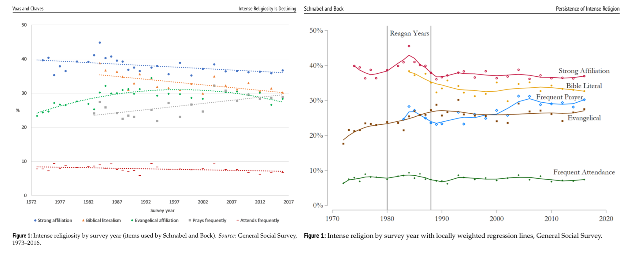
When we put the charts together, you can see how Voas and Chaves fit straight and smoothly curved lines to trends across waves in the GSS. This creates the downward-sloping pattern that fits their conclusions about slow religious decline over time. Schnabel and Bock don’t think a single straight line can accurately capture these trends, because the U.S. saw a unique peak in religious commitment that happened during the Regan years and may have receded more quickly. Their smoothing technique (LOESS smoothing) captures this peak and a quick decline afterwards, and doing so flattens out the rest of the trends after that period.
The most important lesson from these charts is that they don’t totally get rid of the ambiguity about religious change. Rather than just ending the debate or rehashing it endlessly, this work helps us see how it might be more helpful to ask different questions about the historical background of the case. I like this example because it shows us how disagreement among experts can be an invitation to dig into the details, rather than a sign we should just agree to disagree. Research methods matter, and sometimes they can help us more clearly explain why we see the world so differently.
Evan Stewart is an assistant professor of sociology at University of Massachusetts Boston. You can follow his work at his website, on Twitter, or on BlueSky.
Comments 19
Sarah Brown — January 30, 2019
Really informative share!
Thomas Pedro — January 30, 2019
Appreciable article, no doubt. Religious commitment are being violated now in a large scale. People are not committed now with their religious view that was seen earlier of the civilization.The fact has been more clear to me as have to go through deep research before writing. Being a mentor at EduZaurus, i have observed this change to the children. And of course i am afraid of this behavioural changes.
Royvia — September 13, 2019
Great post.
Raphael — November 19, 2019
Thank you for sharing for this advice, it can be useful for a person to use it
to writing some essay, for example. I particularly
wish to note your ability to express data in an accessible way.
As a popular-science blogger, then I want to be sure
of every component of the writing to satisfy inquiring
minds with quality advice and maintain their interest before
the end of the report. You made me see it till the
end
Trevor Tramble — November 21, 2019
I didn't have any expectations regarding that title,
but then the more I was astonished. The writer did a fantastic job.
bubble shooter — August 24, 2020
The method you share is very good. I appreciate this approach.
vex 3 online
Anthony Baden — December 10, 2020
Hello, I am also new here. I came here to gather information online. I used to read tips online to increase my general knowledge of my business. I have also found RV Park Business Plan article which is very useful for me. If anyone here is searching for the business tips online then you can visit the ogscapital.com website.
board games — November 15, 2021
Thanks for the sharing. This is my first time visiting your blog. Really I like your Blog. Keep doing more like this.
board games
emmawatsonsp — August 17, 2022
I appreciate the information and advice you have shared. friday night funkin
retro bowl — December 5, 2022
Thank you for sharing this advice; someone may find it useful when writing an essay, for instance. I want to highlight your capacity to present information in an approachable manner.
carlhamsa — December 5, 2022
It's a straightforward story: A cameraman who is working on an independent film stumbles into this room and feels as though a droid creature is pursuing him. Not so terrifying now, is it? retro bowl
majornoriter — December 22, 2022
I found this blog. For what you have suggested to us, I have found some new data in your post, all things considered. The cerebrum is incredibly satisfying and I am all thanks to the astonishing degree of your article. 토토사이트
Alex Carey — January 9, 2023
law firm digital marketing solutions fanwood Thanks
TOTOMAX — January 15, 2023
Overall, great points, you simply got a new emblem leader. What can you suggest about your post you wrote a few days ago? Are you sure about that? 메이저놀이터
MONEYSANGSANG — January 15, 2023
Well, I think your blog ate my first comment (it was too long), so let me summarize what I submitted, I'm fully enjoying your blog. I'm also an aspiring blog writer, but it's still my first time. Do you have any recommendations for people who write blogs for the first time? I heartily thank you. 머니상
Ramsquality — June 6, 2023
I love displays like this that constantly remind me of how limited human perception really is and how easily our brains can be fooled, keeps me humble... and open minded.The key to the illusion is the point of view. Regards from ISO Consultancy .
Meeloun — September 18, 2023
International students always hope to achieve good grades, and before starting to study abroad, they also need to do a lot of preparatory work, such as doing English exercises, learning other knowledge, and so on. But since studying abroad, they have found that there is a problem, which is that when writing academic assignments, they often encounter many difficulties. Although they often search for materials, they sometimes find that their papers are not well written. Therefore, international students are starting to look for Essay ghostwriting institutions in Australia http://www.emwchinese.com/auessay , and there are many ways to achieve this. Therefore, in the process of selecting Essay ghostwriting institutions in Australia, international students also need to master some skills and methods.
Beastance — October 23, 2023
I think to make it easier for students to learn, let them play basket random after breaks to stimulate their brains and learning thinking.