
The Star Tribune recently ran an article about a new study from George Washington University tracking cases of Americans who traveled to join jihadist groups in Syria and Iraq since 2011. The print version of the article was accompanied by a graph showing that Minnesota has the highest rate of cases in the study. TSP editor Chris Uggen tweeted the graph, noting that this rate represented a whopping seven cases in the last six years.
SCARY chart and headline, but story should have noted that MN had grand total of 7 cases since 2011. Fear-mongering? https://t.co/6506DwWpr3 pic.twitter.com/pPjkYc0MtD
— Chris Uggen (@chrisuggen) February 6, 2018
Here is the original data from the study next to the graph that the paper published:
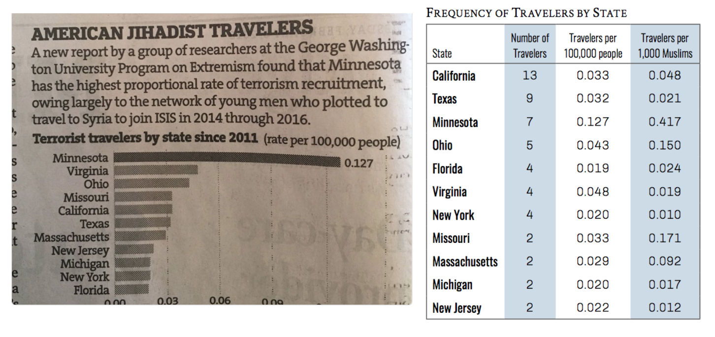
Social scientists often focus on rates when reporting events, because it make cases easier to compare. If one county has 300 cases of the flu, and another has 30,000, you wouldn’t panic about an epidemic in the second county if it had a city with many more people. But relying on rates to describe extremely rare cases can be misleading.
For example, the data show this graph misses some key information. California and Texas had more individual cases than Minnesota, but their large populations hide this difference in the rates. Sorting by rates here makes Minnesota look a lot worse than other states, while the number of cases is not dramatically different.
As far as I can tell, this chart only appeared in the print newspaper photographed above and not on the online story. If so, this chart only went to print audiences. Today we hear a lot of concern about the impact of “filter bubbles,” especially online, and the spread of misleading information. What concerns me most about this graph is how it shows the potential impact of offline filter bubbles in local communities, too.
Evan Stewart is an assistant professor of sociology at University of Massachusetts Boston. You can follow his work at his website, on Twitter, or on BlueSky.
Comments 8
NH_Broadwing — February 12, 2018
I lived in Minneapolis for over 9 years, and in Minnesota for over 11. Minnesota has the highest population of Somalian immigrants in the United States. Somalia is a primarily Muslim country, with many religious radicals. While I lived in Mpls. rarely a day went by without hearing Somali men talking about how much they hate America, hate the country that saved them from genocide and human rights abuses. Somali women did not do the same, though many male children did.
Also, bear in mind that the 9/11 hijackers were trained to fly (but not how to land) in Minnesota, and that Zaccharias Moussawi (incarcerated in the supermax prison outside Canon City, CO) confirmed this. All in all, even if this is fear-mongering and paranoia, which I think it is not, Minnesota and the Twin Cities have every right to be over-cautious.
Paul C. Robertson — July 7, 2021
The peace and order situation in America is not very good since the 9/11 attacks. Since then, a lot of incidents have happened in which thousands of innocent citizens lost their life. I reckon, it is the best time to step up against terrorism otherwise it can be more ruinous in the future. It would be easy to visit site link where I could read the honest reviews about the writer before hiring it to assist me in my research paper to complete it on time.
totovi — December 6, 2022
A good collection of information Your article gave me experience and impressed me deeply, and I hope you will provide us with such an interesting article in the future. I really like your blogs and articles, thank you for sharing them. 메이저놀이터
Dimsum — March 15, 2023
"Terror" This problem should be removed Sonic exe from society.
Best Quality Microfiber Cloth — July 26, 2023
That's really good content, I've ever read.
Jasper Wilde — February 4, 2024
enneagram test is a test that helps you discover many things about yourself, which is very helpful in developing and discovering your strengths. application is widely used in recruitment, helping employers understand more about their candidates, how they handle arising problems and work.