Archive: Jun 2010

Nathan Yau, at Flowing Data, calls BP out on a piece of data representation trickery.  In a video on the BP website explaining the progress they were making cleaning up the oil, Kent Wells offered the following graph:

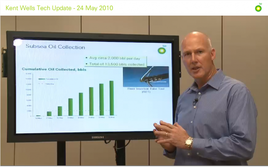
The bars represent oil collected over time.  But, as Yau points out, the data offered by Wells is cumulative.  It’s not the case that each consecutive day (May 16 to May 23) they are collecting more oil.  Instead, each collective day they have collected more oil overall.  If they keep collecting oil, we should expect nothing less.

Instead of showing the data cumulatively, they could have presented how much oil they collected each individual day.  But the data, in that case, doesn’t look as good.  Yau put this together:

This graph suggests that BP’s collection of oil is diminishing and makes viewers want to know why.  The graph they offered, however, hides their decreasing efficacy.

—————————

Lisa Wade is a professor of sociology at Occidental College. You can follow her on Twitter and Facebook.

There are masculine and feminine versions of standing, ones that many adults reproduce rather consistently, and boys and girls must learn which stances are which.  To illustrate this, Miriam H. sent us a photograph of a package of Tinkerbell figurines and a screen shot of a web page selling fairy costumes.  These images — two among many possible examples — nicely show how girls are taught, from a very young age, how to stand.

See also a related post: Male Models Display Clothes; Female Model Display Themselves.

—————————

Lisa Wade is a professor of sociology at Occidental College. You can follow her on Twitter and Facebook.

Lisa Wade, PhD is an Associate Professor at Tulane University. She is the author of American Hookup, a book about college sexual culture; a textbook about gender; and a forthcoming introductory text: Terrible Magnificent Sociology. You can follow her on Twitter and Instagram.

Keeping a trend in perspective.

The sociologist down the hall pointed out that yesterday’s chart gave the impression of a whopping increase in TANF (Temporary Assistance to Needy Families) support for poor families. But I have been complaining since December 2008 that the welfare system is not responding adequately to the recession’s effects on poor single mothers and their children. I wrote then:

We now appear headed back toward a national increase in TANF cases. But the restrictive rules on work requirements and time limits are keeping many families that need assistance out of the program…. If the government can extend unemployment benefits during the crisis, why not impose a moratorium on booting people from TANF?

So it does seem contradictory that I would post a chart yesterday showing a huge increase in TANF family recipients, and continue the same complaint. So let me put it in better perspective. It’s a good lesson for me on the principles of graphing data, which I have made a point of picking on others for.

Height and width

There were two problems with yesterday’s chart. First, the vertical scale only ran from 1.6 million to 1.9 million families. Second, the horizontal scale only ran for 26 months. I’ll correct each aspect in turn to show their effects. Here’s yesterday’s chart:

It sure looks like a dramatic turnaround. And any turnaround is a big deal. I wrote last year:

What should be striking in this is that the rolls are increasing even as the punitive program rules continue to pull aid from families according to the draconian term limits dreamed up by Gingrich, ratified by Clinton and endorsed by Obama — 2 years continuous, 5 years lifetime in the program. The current stimulus package includes more money for TANF, to help cover an expected growth in families applying — but no rule change to permit families to keep their support in the absence of available jobs.

But, run the vertical axis down to zero, and the same trend is not so dramatic:

Now the big bounce since July 2008 is put in perspective. We’ve seen a 16% increase since that bottom point, but the response seems much more modest in light of the size and impact of the Great Recession we’ve come to know.

In fact, though, the longer-term view underscores how paltry that response has really been. Back the chart up to 1996, and you can see how small the increase has been compared with the pre-draconian reform period:

All three images are correct, but their emphasis is different. To me, the important take-home message from this trend is, “That’s it? The greatest economic recession since the Great Depression, and our welfare response was that measly uptick? Our system really is a shambles.”

One important issue remains, however, and that is some measure of the need for welfare. So consider the number of single-parent families below the poverty line, compared with the number of families receiving TANF (formerly AFDC):

Now the story is much more clear.

After welfare reform in 1996, the number of families receiving welfare was cut by half in just a few years. At the same time, however, the number in poverty dropped. Since then, as the number in poverty has increased, the number on welfare has not. The two trends appeared to be uncoupled through most of the 2000s. In the last year we’ve seen the first increase in TANF numbers since 1996, but nowhere near enough to meet the increase in poor single-parent families.*

It is still the case that, although the stimulus bill allocated more money to TANF, the punitive rules and term limits have not been changed. So the system does not address longer-term poverty — something we should expect to see much more of in the next few years.

*We don’t have the official 2009 poverty rates yet, since they are compiled from a survey done in March 2010, to be released this fall.

Philip Cohen, PhD, is a professor of sociology at the University of North Carolina at Chapel Hill, where he teaches classes in demography, social stratification, and the family.  You can visit him at his blog, Family Inequality, and see his previous posts on SocImages here, here, and here.

Lisa Wade, PhD is an Associate Professor at Tulane University. She is the author of American Hookup, a book about college sexual culture; a textbook about gender; and a forthcoming introductory text: Terrible Magnificent Sociology. You can follow her on Twitter and Instagram.

The new Pew Research Center report on the changing demographics of American motherhood (discovered thanks to a tip by Michael Kimmel) reveals some pretty dramatic changes in the ideal family size between 1990 and 2008.  In the late 1960s and early ’70s, two suddenly overtook three and four or more and it’s never looked back:

Here are today’s preferences (notice how few people want to remain childless or only have one child):

I’d love to hear ideas as to why this change happened at that moment in history.  Is it possible that the introduction of the contraceptive pill, which was the most effective method of contraception that had ever been available to women (I think that’s true), made smaller families an option and that people became interested in limiting family size once they knew that could actually do it?

Interestingly, people still overwhelmingly say that they want children because they bring “joy.”  But apparently two bundles of joy are enough!

UPDATE! A number of commenters have pointed out that both I and the authors of the study are conflating people’s opinions about ideal family size and the number of children they personally want to have (see the second figure especially).  I think they’re right that asking the question “What is the ideal family size?” will not necessarily get the same response as “How many children do you want to have?”   A very nice methodological point.

For more on this data, see our posts on age and racetrends in American motherhood.

—————————

Lisa Wade is a professor of sociology at Occidental College. You can follow her on Twitter and Facebook.

War is always an opportunity for someone, many someones, to make money. A recently closed ebay auction sold a pair of Converse shoes manufactured and sold during World War II. If I understand the description right, the shoes were sold to overseas servicemen who wanted to “stomp” on the Nazis; alternatively, they were sold to Nazis (I think the former).

The shoes:

And, the kicker, the soles:


UPDATE! In the comments Joe C. linked to a website, aryanwear.com, where you can buy these:

Via BoingBoing.  See also our post on the surprising history of the symbol.

—————————

Lisa Wade is a professor of sociology at Occidental College. You can follow her on Twitter and Facebook.

NEWS:

I’ll be in New Orleans until June 23 and the big Island of Hawaii from the 23rd to the 1st.  It’s always fun to meet readers, so if you’re nearby please send us an email (socimages@thesocietypages.org) and we’ll have coffee or drinks!

A Louis Vuitton advertising campaign that we critiqued has been determined by the U.K. Advertising Standards Agency to be a violation of truth in advertising.  Check it out.  Thanks to Anjan G. and Katrin for pointing it out.

This is your monthly reminder!  You can follow us on Twitter or friend us on Facebook where we update with a featured post everyday.

NEWLY ENRICHED POSTS (Look for what’s NEW! May ’10):

Cara McC. sent along another example of a commercial separating normal from abnormal… this time it’s “normal” skin.  We added it to our post on hair.  On the same theme, Renée Y. took a photo of bike helmets in women’s and… um… helmet.  We also added more examples to our post on gendering default icons, this time bike traffic lights in Amsterdam.

We added breast cancer-themed grape tomatoes — yes, you read right — to our post on surprising things themed as such.  Sent in by Renée Y.

M.I.A.’s  “Born Free” video shows red-headed, freckled male adolescents being rounded up as part of an ethnic cleansing campaign. We added it to our post on gingerism.

Orangina has a drink with grenadine in it called “Indien” that features an orange wearing a feathered headdress. We added it to our earlier post on the use of feathered headdresses and other elements of some American Indian cultures.

We updated our post on the CNN experiment on children’s attitudes toward skin color with a segment of a parent reacting to her child’s preferences. Thanks to Abeer K., Dimitriy T.M., and Alex P. for sending in the one we missed!

Ang B. snapped a photo of an advertisement for men’s and women’s haircuts with the phrase “Fuck your Gender Binary” written across it.  We added it to our post featuring small acts of resistance against gendered and objectifying advertising.

Andi S. sent a photo of Spanx for men, designed to shape his upper body.  We added it to our post on the push-up panty for the penis.  Relatedly, Michelle R. sent us another example of how the diet/nutrition industry markets products differently to men and women.

We added two videos of the “men are like this, but women are like that, hahaha!” variety to one of our posts on gender stereotypes.  Also, in case you haven’t had enough of pointlessly gendered products, we added an example of a gendered “find” game and another example of gendered earplugs to our post on the topic.  On the other hand, doggie poop bags are unisex. Good to know.

In case you’re looking for some polite, submissive women, we added an online ad for “beautiful Russian ladies” to our post about a website that sells the submissive Asian stereotype to (mostly) non-Asian men.

We updated our post on a child’s zebra-striped string bikini with a bikini pulled from shelves in the U.K. The bikini, meant for young girls, included a padded bra.

We updated our post on envisioning how highways would affect the city of the future with an exhibit from the 1939 World’s Fair that pointed out that benefits of being able to avoid slums.  Also on the topic of highways, we added an image sent in by Jayna T. to our post on teens, the elderly, and driver safety.