Archive: 2010

Lester Andrist, at The Sociological Cinema, alerted me to a 9-minute short film revealing “Hollywood’s relentless vilification and dehumanization of Arabs and Muslims.”   Created by Jaqueline Salloum and Dr. Jack Shaheen’s book, Reel Bad Arabs, it is a stunning and disturbing collection of clips.  The depictions are grossly prejudiced and relentlessly violent.  Andrist summarizes:

It demonstrates the way Arabs and Muslims are consistently depicted as religious fanatics, perpetual terrorists, backwards, and irredeemably tribal… [T]he media consistently propagates the idea that the Muslim or Arab terrorist is not only a threat to life, but also Western civilization.
Taking the analysis a bit further, I think the clip also allows one to contemplate how these depictions of Arabs and Muslims are simultaneously about constructing an American national identity, and in particular, a masculine one. In several places, one sees how an American masculinity, characterized by stoicism and poise, is set in contradistinction to an irrational, Islamic fanaticism.
It’s really a worth a watch, but very disturbing.  Consider yourself warned:

The Media Education Foundation also made a full length documentary based on Shaheen’s book.  The 5-and-a-half-minute trailer is a good indication of its content.  It contains many similar disturbing depiction, including a discussion of Disney’s Aladdin, but also points to how Arabs are frequently shown as buffoons (“rich and stupid,” “oversexed,” and “uncontrollably obsessed with the American woman”).

See also our posts on how Arabs are portrayed in video games and Reel Injun, a documentary about the representation of American Indians in Hollywood.

Lisa Wade, PhD is an Associate Professor at Tulane University. She is the author of American Hookup, a book about college sexual culture; a textbook about gender; and a forthcoming introductory text: Terrible Magnificent Sociology. You can follow her on Twitter and Instagram.

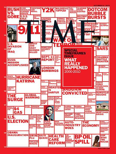
Time magazine has an end-of-the-decade issue with a cover, sent in by Dmitriy T.M., that summarizes what they consider major events between 2000 and 2010:

The stories illustrate the way that, as ESPN puts it, “only bad news counts as news.” Of the 118 items chosen by the editors as “what really happened” over the last ten years, a few are what most people would probably see as relatively positive or benign (such as achievements in sports and the rescue of the Chilean miners) and others would probably fall into the “neutral” category (“U.S. Election” doesn’t say anything about the election — or, for that matter, even indicate which of the various elections that occurred during that time frame it refers to). And a few are just…odd. “AOL-Time Warner Merger” is one of the most important events of the decade? And “The Dark Knight Release” was selected as the most significant pop-culture-related event? Um…okay.

But the majority of items are clearly negative/scary, or at least I think the editors assume they’d be seen that way: BP oil spill, a space shuttle disaster, various diseases, several bombings, “Disaster in Darfur,” the Haiti earthquake, a tire recall, and various topics related to economic problems. According to the ESPN post,

The Time selection says nothing about major positive trends such as declining international military spending (rising U.S. spending is the exception to the rule), declining teen pregnancy rates, declining crime, declining accidental deaths. “U.K. foot and mouth crisis” [a livestock disease]…was cited, but nothing said about declining cancer rates. “Shark attack” was cited, but nothing was said about the dramatic rise in living standards in most of the developing world. (“Overall, poor countries are catching up with rich countries” on nearly all central measures, according to this important new [United Nations] report.)

The post continues, “Yes, journalists have always loved bad news, and have long pretended good news doesn’t exist.” That’s going a bit far. For instance, local newspapers often take part in what Harvey Molotch described as the “growth machine,” a collection of organizations, institutions, businesses, political leaders, and influential community members that support economic growth. Media outlets may contribute to such boosterism by running positive stories and providing space (in op-eds, etc.) for predominantly rosy depictions of the community.

That said, media scholars do criticize news outlets for focusing so much attention on stories that are sensationalistic or that imply the world is an incredibly dangerous, scary place, and leading the public to have quite unrealistic perceptions of actual sources of risk. And Time‘s editors play into this with their selection of the most significant stories of the past decade.

I recently saw a great example of greenwashing — that is, marketing a product as eco-friendly based on questionable or rather superficial characteristics of the production process. This decal was on the front of a calendar, touting it as “eco-positive”:

What was eco-positive (a term that has no real meaning or standards) about it? Was it made from recycled paper? No. Maybe some statement about non-toxic ink? Nope. It’s eco-positive because they used the scraps from producing the calendar to make you a very special gift…two bookmarks tucked inside the calendar.

I’m all for using scrap material, but that alone seems to be a pretty minor detail upon which to then market the entire product as an  “eco-positive” one, especially given that paper scraps from manufacturing processes are often reused already (notice how often paper products say they’re recycled from “pre-consumer” waste).

Cross-posted at Ms. and Family Inequality.

In the early 1990s, Arline Geronimus proposed a simple yet profound explanation for why Black women on average were having children at younger ages than White women, which she called the “weathering hypothesis.”

It goes like this: Racial inequality takes a cumulative toll on Black women, increasing the chance they will have health problems at younger ages. So, early childbearing might pose health risks for White women, but for Black women it makes more sense to start earlier — before their health declines. Although it’s hard to measure the motivations of people having children, her suggestion was that early childbearing reflected a combination of cumulative cultural wisdom and individual adaptation (for example, reacting to the health problems experienced by their 40-something mothers).

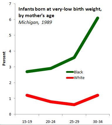
She showed the pattern nicely with data from Michigan in 1989, in which the percentage of first births that were “very low birthweight,” increased with the age of Black women, but decreased for White women, through their twenties:

Source: My graph from Geronimus (1996).

If the hypothesis is correct, she reasoned, the pattern would be stronger among poor women, who experience more health problems, which is also what she found.

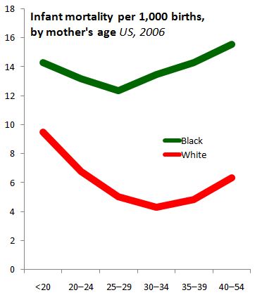
The most recent national data, for 2007, continue to show Black women have their first children, on average, younger than White women: age 22.7 versus 26.0. And the infant mortality rates, by mothers’ age, also show the lowest risk for White women at older ages than for Black women:

Source: My graph from CDC data.

Note that, for White women, mothers have children in the early thirties face less than half the infant-mortality risk of those having children as teenagers. For Black women, waiting till their lowest-risk age — the late 20s — yields only a 14% reduction in infant mortality risk. So it looks like waiting is much more important for White women, at least as far as health conditions are concerned.

The implications are profound. If you base your perceptions on the White pattern, it makes sense to discourage early childbearing for health reasons. But if you look at the Black pattern, it becomes more important to try to improve health problems at early ages — and all the things that contribute to them — rather than (or in addition to) trying to delay first births.

—————————-

Cohen’s previous posts featured on SocImages include ones on the recession and divorce datathe relationship between cell phone use and driving deathsmeasuring the number of welfare recipients, delusions of gender dimorphism, and the gender binary in children’s books.


This Tide commercial with Kelly Ripa, sent in by Joyce L., is an excellent example of one of the common themes in the marketing of cleaning products. Of course, cleaning products are almost entirely marketed towards women but, more, women are often portrayed as being absolutely OVERJOYED at the prospect of cleaning.

Indeed, Ripa is thrilled at the fact that a man spilled red wine on her white table cloth.  She is so pumped that he has given her an opportunity to use her washing machine, that she cannot wait. She literally sweeps the table cloth out from under the party so that she can wash it immediately.  And she is so excited that she invites the entire dinner party to partake, managing to communicate, in the process, her absolute adoration for Tide.  I don’t know about you, but this is what it’s like at my house.

Lisa Wade, PhD is an Associate Professor at Tulane University. She is the author of American Hookup, a book about college sexual culture; a textbook about gender; and a forthcoming introductory text: Terrible Magnificent Sociology. You can follow her on Twitter and Instagram.

Dmitriy T.M. sent in this Dodge ad that associates cars with liberty and, by extension, America itself:

There are a few problems with this conflation of Dodge with patriotism and Americanness. For one, Dmitriy says,

Washington ( as the general) would’ve never been leading the charge. The commanders always stayed back ( preferably on the high ground) so that they could observe the progress and give commands ( and get away as quickly as possible in case of a loss).

So the image of the brave leader charging ahead of his troops into battle is misleading.

In addition, many Dodge vehicles aren’t made in the U.S. So Dodge wants us to associate its brand with the U.S. in a symbolic way that makes irrelevant, and invisible, where the car is made. What’s important is that Dodge, founded in the U.S., builds cars that represent a masculinized, tough version of “freedom,” and of course, freedom is uniquely American. It reminds me a lot of the symbolic identification Pabst Blue Ribbon drinkers often feel with blue-collar workers, an identification that has little to do with the actual production process.

“It was kind of unreal,” the Steamboat Springs, Colorado native said, describing his recent 34th birthday fete at Kandahar Airfield, better known as KAF. “At least for a few minutes, you could pretend you were somewhere else. It was like going back home” (source).

“I was expecting to arrive in a warzone but instead here I am wearing sunglasses in the sun and eating a baguette,” said Dimitra Kokkali, a NATO contractor newly arrived from Brussels. “On my first night I surprised my family by calling them from an outdoor rock concert” (source).

Time magazine slideshow, titled “R&R at Kandahar Airfield,” uses images to describe how the busiest airport in the world “tries to re-create the comforts of home for the coalition forces in Afgahnistan.” Kandahar Airfield is the busiest airport in the world because all supplies and troops pass through on their way to or from war in Iraq or Afghanistan. At any given time there are about 25,000 service members and civilian contractors at the airfield.

These images of the Kandahar’s “Boardwalk” recreation area are striking for a few reasons. First, they show a blurring of the line dividing the homefront and the warfront. The slide show includes images of service members using FaceBook in computer labs, and eating meals in their fatigues at TGI Fridays.

Second, these images reflect that there is increasing emphasis on how service members are supported and cared for by the military during wartime. These photos show the side of war that is not about fighting and danger—instead, they are about the comfort and making a foreign land where they are fighting as “homelike” as possible.

Third, these show the blurring of the boundary between the military and privately owned businesses. Civilian Contractors are augmenting military personnel during the wars in Iraq and Afghanistan and the inclusion of these civilian contractors in war zones has raised the issues of the safety of civilian workers and the costs of hiring corporations (Contexts).

Finally, as a consequence of the blurring of the boundaries of homefront and warfront, the division between the country of Afghanistan and the military is sharpened. Afghanis (except for those few with security clearance) are not allowed to shop or enjoy the free entertainment on the Boardwalk at Kandahar.  Meanwhile, service members can safely buy souvenirs on the Boardwalk itself.  Afghani culture is commodified as a tourist attraction in this theme park-like Boardwalk setting.

All of these images speak to the changing boundary between the homefront and the warfront, and as a result, changes in how we, as a country, view war. Instead of the images of brutality, death, and chaos that Americans saw in their living rooms on TV during Vietnam, for example, these images show the military taking care of service members who are being entertained, keeping in touch with loved ones, and having fun.

But as this service member describes, walking the Kandahar “Boardwalk” in a warzone is still a jarring experience:

“I couldn’t believe I was in Kandahar eating a double-dipped chocolate ice cream at sunset on a Saturday afternoon,” said Coleman, who was downing a strawberry smoothie from the French bakery behind him, where an Eiffel Tower climbs a wall above picnic tables with fake potted plants.

“It was a surreal experience,” he said, as a jet fighter roared across the sky, letting loose a stream of defensive white flares. “I remember thinking, ‘We’re in the heart of the war-zone. The bad guys are 10 miles away. And here we are eating soft-serve ice cream'” (source).

Wendy Christensen is a Visiting Assistant Professor at Bowdoin College whose specialty includes the intersection of gender,war, and the media.

Cross-posted at Jezebel.

James B., a student at Rensselaer Polytechnic Institute, let us know about a series of maps at Daily Yonder that show consumption of various food and drinks across the U.S. Per capita meat consumption:

Fruits and vegetables:

You might expect those two maps to be near mirror images — that in places where people eat more fruits and vegetables, they’re eating less meat, and vice versa. But notice that in fact, many places stand out as having particularly high consumption of both categories of food — for instance, the big dark splotches in Texas and Georgia show up on both maps, as does a large region in Pennsylvania, New Jersey, Maryland, and northern Virginia. Northern Colorado, and all of Arizona, on the other hand, rank in the lowest category for both meat and fruits/veggies. So for our Coloradan and Arizonan readers: what are y’all eating?

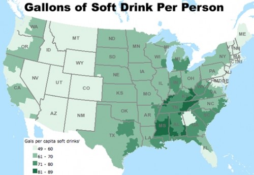
Here’s the map for soda:

Concentration of fast food restaurants:

For the record, “fast-food restaurant” is defined according to the USDA’s classification:

Limited-service restaurants include establishments primarily engaged in providing food services (except snack and nonalcoholic beverage bars) where patrons generally order or select items and pay before eating. Food and drink may be consumed on premises, taken out, or delivered to the customer’s location. Some establishments in this industry may provide these food services in combination with alcoholic beverage sale.

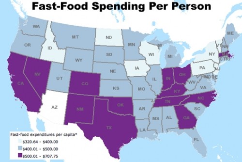
And how much are we spending in those fast-food establishments?

The maps are based on data from the USDA Economic Research Service’s interactive food atlas, which provides a wealth of information on food availability, where Americans buy their food, physical activity levels, health indicators, and so on.