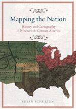
I reviewed Susan Schulten’s new book, Mapping the Nation: History and cartography in 19th Century America, for publicbooks.org but there were so many images (90%) that did not make it into that review I decided to write a post here, too. This blog tends to focus on contemporary graphics, but information graphics are not new and the historical context of infographic forms is fascinating, especially in light of research that examines the status of information graphics as the output of inscription devices (Latour and Woolgar, 1979). How did we end up with the selection of graphic forms we now have? In what way were these images originally used and by whom?
The images in Schulten’s book – and on her superb companion website – are mostly maps, but there are also a surprising number of information graphics. As Schulten writes, maps and mapping were both made possible because America became a country (and thus had a government that could be petitioned to support the expense of creating maps and provide a centralized repository in which maps could be collectively held and made available) and they made America an imaginable possibility. In short, the establishment of American government made mapping possible and the existence of national maps made America an imaginable possibility. Without being able to see not only the colonies, but also the rest of the North American continent, it would have been far more difficult to imagine and pursue westward expansion, for instance. The first chapters of the book provide a nice companion to Benedict Anderson’s “Imagined Communities” that focused on the role of newspapers and novels in creating a national imagination. Schulten is also interested in printed matter, but for her the big deal is mapping.
Maps as propaganda
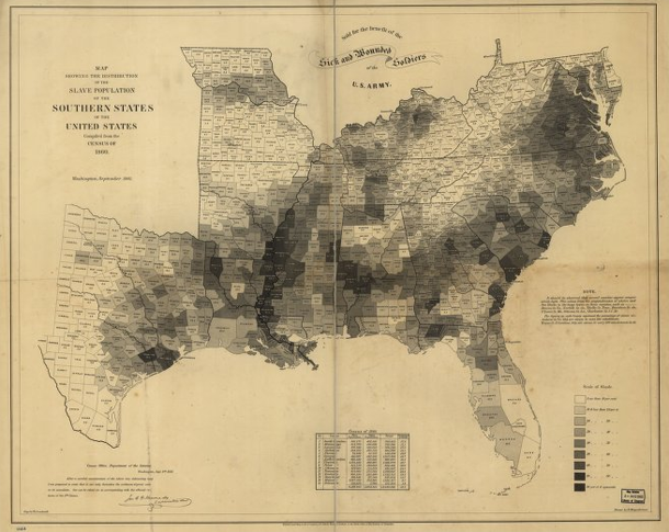
If mapping in the immediate post-colonial and early frontier eras was exciting – and it was – it got even more exciting during the contentious lead-up to the Civil War. One of the maps I’m including here is propaganda for the abolition of slavery. I have included the whole map as well as a close-up, but I encourage you to click through to Schulten’s companion website where you will find high quality scans of all the maps that will give you far more detail than I am able to show here.
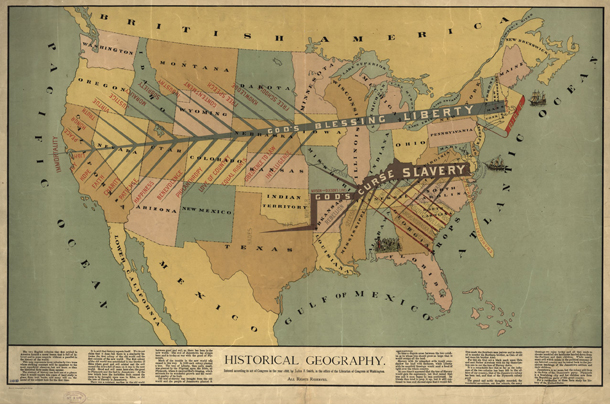
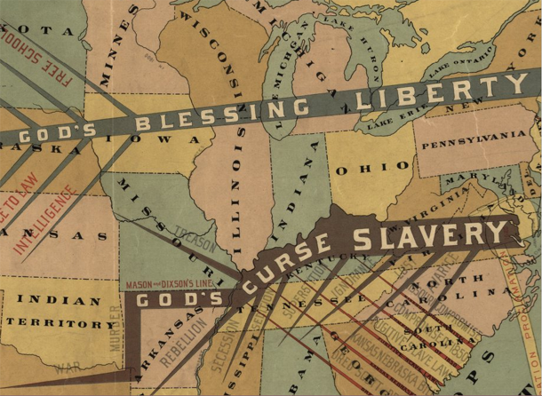
Propaganda is typically not something maps are used for now, at least not in the blatant fashion of the pre-Civil War years, but it is true that maps are depictions of political boundaries and, as such, are ripe for the delivery of political messages. [For a more recent example of US maps used in politically charged ways see modern artist Jasper Johns.]
What I found more intriguing were the maps that displayed their political messages almost invisibly using choropleth techniques. The choropleth technique is still extremely common today and relies on shading assigned to political divisions like state or county lines. Census tract boundaries can also be used. It’s debatable whether or not census tracts are political boundaries but they certainly are not boundaries based on natural features like streams or mountain ranges. Some of the first choropleths were developed to show more precise locations and densities of slave labor in an effort to discredit Southern claims that slavery covered the South like a blanket without which Southern economies would freeze.
![Slavery map of US, 1861 [closeup]](https://thesocietypages.org/graphicsociology/files/2013/01/slavery-map-of-us-closeup-EDWIN-HERGSHEIMER.png)
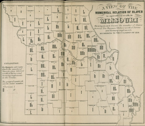
Another attempt at a similar political message – to display variation in slave holdings in order to prove that other economic models were viable and operant in the South during the 1850s – failed as a map but introduced an interesting graphical form. This Missouri map shows county boundaries within each of which there is a small graphic with the overall intent of providing:
A view of the numerical relation of slaves to agricultural wealth in Missouri, Showing in each county the number of slaves to every ten thousand dollars worth of farms and farming implements according to the US Census of 1850.
To interpret the map, then, keep in mind that counties with more dots rely more heavily on slave labor rather than mechanical labor. Of course, counties with few dots could either be utilizing human labor more efficiently, and thus have lower slave-to-machine ratios, or they could have had very little agricultural practice of any kind, slave or free. Because the graphic elements represent such an obscure, unfamiliar measure (slaves-to-machines), the map ought not to be considered a great success. But it is an excellent example of maps depicting thematic data without resorting to choropleths. We could use more of this boundary pushing map-graphic hybridity now
Disease mapping in America
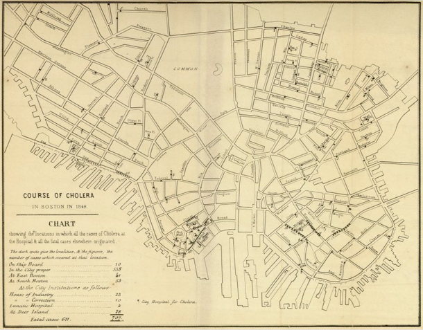
With some chagrin, I admit Schulten’s book corrected an inaccurate belief of mine with respect to the use of maps in the detection of disease. I had erroneously thought that John Snow was the first person to use maps as a tool to detect the cause of disease when he pinpointed the cause of London’s cholera epidemic to a public water pump. He was not the first to use maps to discover disease. Americans in Baltimore, Boston, and New Orleans were mapping all sorts of potential causes of diseases like cholera including weather patterns, train routes, proximity to open water, and the eventual culprit, proximity to public water. Snow was the first to hone in on the cause, but he was not the first to use maps. Further, he was likely aware of American public health mapping efforts.
![Cholera map of Boston, 1849 [closeup] | Henry Williams](https://thesocietypages.org/graphicsociology/files/2013/01/closeup-cholera-map-of-Boston-HENRY-WILLIAMS.png)
Bonus image
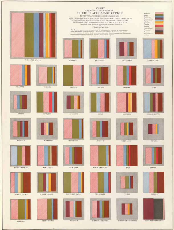
I am including one more image – not a map – to show just how fresh 19th century graphics were. This is a graphic that uses states as categories but breaks them out of the map form in order to present them as squares. It is easier to divide squares into percentages, which is just what Francis A. Walker did to show the types of church denominations present from one state to the next. It is easy to see why he avoided using a map – it would be difficult to divide the irregular shapes of states into precise percentages. Further, even if he could divide the irregular areas properly, if he then filled the areas with particular denominations, it would have appeared that the denominations were geographically tied to particular places within the states. His choice of squares as representations of the states is logical. From this graphic solution to his problem we end up with a visual technique for representing all sorts of information that is bound to related categories.
References
Latour and Woolgar. (1979) Laboratory Life: The Social Construction of Scientific Facts. Beverly Hills: Sage.
Schulten, Susan. (2012) Mapping the Nation: History and cartography in 19th Century America. Chicago: University of Chicago Press. [see also Mapping the Nation website]
Norén, Laura. (2013) Mapping a young America Review of Susan Schulten’s “Mapping the Nation: History and cartography in 19th Century America. PublicBooks.org

