
Really cool visualization that integrates the data with its physical-world context. Reminiscent of the point that our world is increasingly an augmentation of the physical and the digital.

More images here.
Really cool visualization that integrates the data with its physical-world context. Reminiscent of the point that our world is increasingly an augmentation of the physical and the digital.
More images here.
See the full data visualization here.
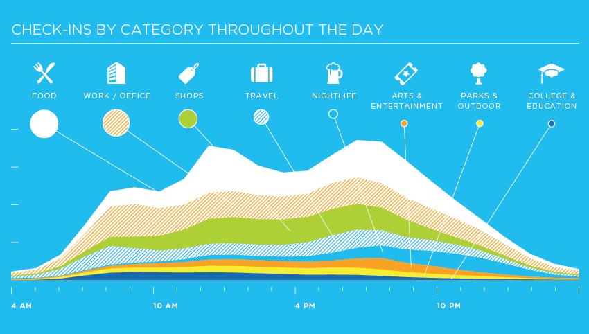
…and the list is sure to grow in the future. See the full-sized version of this great infographic after the jump.
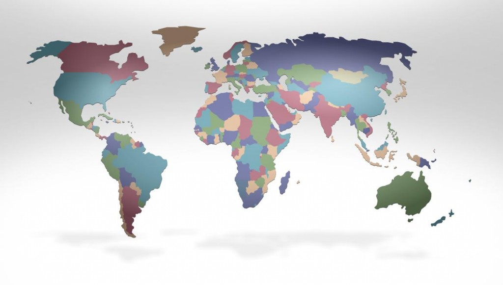
Fed-Ex has created an interactive global data experience on their website to offer “customers intriguing and insightful information to help them stay ahead of their customers’ needs in a continually changing world” (quote is from here). Putting aside the business speak, some of the data and especially its presentation is indeed intriguing. For instance, here is the globe with countries sized, as usual, by geographic size.
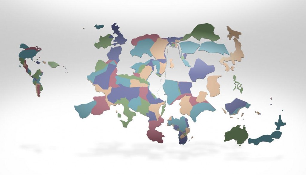
Next, we can have the size of the countries displayed based on all sorts of things. Below they are sized by access to the mobile web: