See the full data visualization here.
data
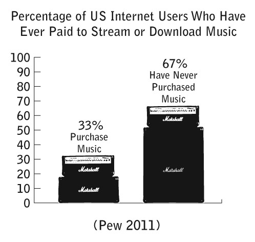
Pew released some new data on music streaming and downloads. I compiled a new chart illustrating the findings. Only one-third of Internet users in America have purchased music through the Web. This leaves us with the question: Are the majority of Internet users pirating music or using advertisement-based services like Pandora, Last.fm, or Grooveshark? Share your thoughts in the comments section.
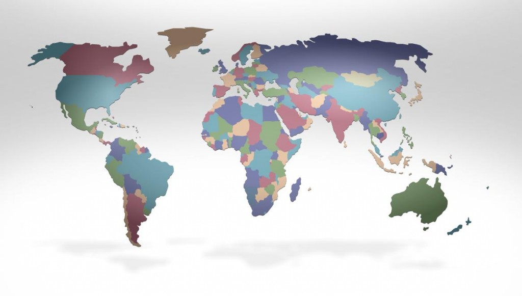
Fed-Ex has created an interactive global data experience on their website to offer “customers intriguing and insightful information to help them stay ahead of their customers’ needs in a continually changing world” (quote is from here). Putting aside the business speak, some of the data and especially its presentation is indeed intriguing. For instance, here is the globe with countries sized, as usual, by geographic size.
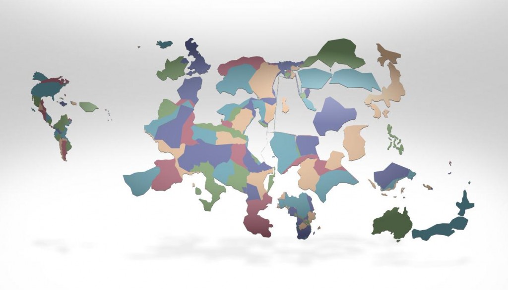
Next, we can have the size of the countries displayed based on all sorts of things. Below they are sized by access to the mobile web:
OK Cupid leads the way when it comes to providing analysis of user data in easy-to-understand charts and graphs. Facebook has done so less often, but provided some interesting new data last week. Lots of charts to dig into here. For instance, the types of topics that draw “likes” versus comments are especially interesting. Talk about religion and you’ll get lots of likes but few comments. Just the opposite for angry status updates which tend to garner lots of comments but few likes.
See all of the analysis here.
Should social media companies provide these quick-and-dirty, non-scientific and usually not all that well analyzed data on the web for all to see? The level of analysis is usually quite low (note that this Facebook data was posted by an intern for the site) and surely would not pass the peer review standards of a major social science journal. Are they doing a disservice by providing potential misinformation, or is this fulfilling a public duty to let us know a bit more about our own data? more...
Google Earth software [creates] a more realistic world that blurs the line between virtual life and reality and helps make the program look more like a variation of the Star Trek Holodeck.
Via.
Many worry about the immortality of our behavior on social network sites like Facebook. Regrettable behaviors can become Facebook Skeletons in your digital closet. However, I have argued before that what is equally true is that our online presence is extremely ephemeral. Status updates speed by, perhaps delighting us in the moment, but are quickly forgotton. The innundation of photographs of yourself and others is so heavy that particular moments often become lost in the flow. Our digital content may live forever, but it does so in relative obscurity. Just try searching for that witty status update your friend made on Facebook last month. It is this ephemerality of our online social lives that makes this art/design project by Siavosh Zabeti so interesting. When our Facebook lives are placed in a book, our socialization grasps at the tactile permanence of the physical.
When Facebook becomes a book from Siavosh Zabeti on Vimeo.
If books like this became popular, would we create our Facebook presence any differently given this new, more physical medium? more...

