data


JD Hildebrant in SD Times makes the case that piracy is actually good for content providers because it serves as a “try before you buy” mechanism.   While that may or may not be true because you can’t prove a counterfactual, the ethical question remains.. “why shouldn’t content creators be compensated for their work?”  Don’t those who produce content and those who provide content have a right to monetize the web?

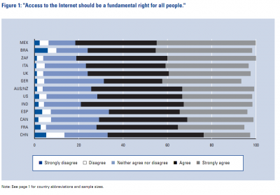
Critics of SOPA point to the real danger that companies could be liberal with their efforts to “take down” sites that might be violating copyright and as a result unduly dampen the exercise of free speech on the web.  The basis of the on-line protests against SOPA and PIPA was rooted largely in the belief that shutting down sites like PirateBay and BitTorrent were akin to a prior-restraint free speech violation.   An interesting study by the Oxford Internet Institute finds an emerging global internet culture that increasingly sees Internet access as a fundamental right:

But the problem arises when you define “data” as “speech.”  Indeed, most data is speech.  But just like in the US where we have tiered level of speech protection (e.g. commercial speech has less protection than political speech), it would seem fair to suggest that content creators have a right to fully monetize their product.  This is the basis of liberal capitalism.  If you create a good, you should be entitled to be compensated for your labor.  But because the Internet is oblivious to the type of data being disseminated, treating data as speech becomes a challenging nut to crack.  It is preferable to an alternative view of data as product or data as commerce.

Brian Knowlton at the New York Times Caucus Blog posted on a conference call with the White House’s new Chief Information Officer, Vivek Kundra. Of special interest to social scientists is his plans to create a data.gov repository. I’m getting a bit wary of these new free standing “.gov” sites and wondering if they represent an “openness meme” rather than actual openness. But the rhetoric sounds promising. From Saul Hansen’s Bits blog at the New York Times:

Another initiative will be to create a new site, Data.gov, that will become a repository for all the information the government collects. He pointed to the benefits that have already come from publishing the data from the Human Genome Project by the National Institutes of Health, as well as the information from military satellites that is now used in GPS navigation devices.

“There is a lot of data the federal government has and we need to make sure that all the data that is not private, or restricted for national security reasons, can be made public,” he said.

While more data availability is all good, we in the social sciences should keep an eye on the type of data that gets released. The federal government puts out a fair amount of quantitative data already. What I’m interested in is how that data is going to be made available. Will the layman with an interest in an issue be able to quickly mashup data and application to create information they can use. Can a local activist get water quality data from the EPA and be easily able to create a Google Map that shows areas of concern? it’s one thing to do a “data dump,” it’s another to be intentional in empowering people to use the data. Then again, that might be best left to “the crowd” of politically active geeks whose numbers I hope grow exponentially in the next few years.

HT: Nancy Scola at TechPresident

For those of you who think about how to make your findings relevant in public policy discussions, check out  Hans Roslings’ TED Talks.  Through his Gapminder application that aminates time series data, Rosling has managed to take abstract numbers and humanize them.  A good example is the Dollar Street interactive graphics he talks about halfway into his discussion.

I’m not certain that Rosling has had any impact in changing policy discussions, but they are amazing classroom tools.  I wish the Obama administration used this type of animated data when it is trying to tell a story about the need for universal health care or addressing climate change.  Imagine a one hour prime time special where the administration used these tools for presenting data (minus the swordswallowing at the end of Rosling’s talk).

I’m putting together a public policy course for the first time since graduate school.  It reminds me what I love about what I do.  Public policy is about how we solve common problems.  The palete from which to choose readings is unlimited.  That’s been part of my problem…there’s so much interesting material to talk about out there it’s impposible to narrow it down.

One area that sorely lacking in public policy scholarship is the effect of the presentation of information on decision-makers.  Im having my students read a few articles about Edward TufteBonanos, C. (2007) The Minister of Information. New York Magazine. and  Smith, F. (2007) Intelligent Designs. STANFORD Magazine. Tufte is a self declared arch-enemy of power point and is famous for pointing out NASA’s scientists’ inability to convey important information to higher-ups before the Challenger disaster.

He’s also famous for popularizing this map by Charles Joseph Minard that shows the losses incurred by Napoleon’s army in the Russian campaign of 1812. The diagram show how Napoleon’s army thinned (beige band) as temperatures in Russia dropped (black band).

It makes me wonder how different our disciplines would be if most of us put thought into the form of our data presentations. We’re trained to focus solely on function but, mostly because of cost concerns, our conferences provide us little opportunity to use technologies that could bring our data to life. Would having LCD displays at academic conferences make them more policy relevant? Would they encourage more journalists to attend?

New Year, New Feature 🙂  An assortment of things that pop up on my Google Reader feeds that I’d like to read or listen to or would like people to think I’d like to read or listen to (my new year’s resolution is to appear more learned than I actually am).

From Flowing Data: Nine Ways to Visualize Consumer Spending

From KCRW To The Point: Is the Internet Speeding us Up by Slowing us Down?

From Slate: Can cities save the planet?

From IT Conversations: A Talk on Human Centered Design

From Psychology Today via Bookforum — Men do everything they do in order to get laid

Those Google folks are just brilliant, aren’t they? In yet another moment of insight about human behavior, Google Trends has developed a map to track rises and falls in flu-related searches by location, working off the assumption that people suffering from the flu are more likely to search for information about it. One can track the total volume of flu search, study a national map of flu search trends, or enter your zip code and learn about local trends.
While it is unclear how accurately such a map can track the spread of flu, it potentially offers a powerful public health tool. I can’t get over what a clever use of search data this is.

Let’s think of the next big thing! What are some other forms of internet data that (if made public) could be of great value to the public interest?