
Flowing Data has a great compendium of visualizations of the current economic crisis. Here’s my favorite (from The New York Times):
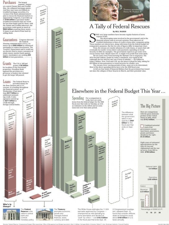
Nice balance between simplicity and complexity…kinda’ like good social science 🙂
Flowing Data has a great compendium of visualizations of the current economic crisis. Here’s my favorite (from The New York Times):
Nice balance between simplicity and complexity…kinda’ like good social science 🙂
Comments 5
Ty Fleming — March 14, 2009
It is no doubt that we are in a current economic crisis. People are out of work, and daily people are loosing their jobs which put food on the table. Our federal budget is also in crisis and that is why we already pay so much in taxes. The Feds did bail out General Motors, but I doubt GM will be able to pay back their billions in loans. The economy can be fixed but higher taxes for some is just not the answer.
ThickCulture » Going Dutch: A Visualization Trip Through the Wayback Machine to the Google IPO — March 15, 2009
[...] José’s last post made me think of visualizing processes. Of late, I’ve been thinking about how Jim Cramer had his head handed to him by Jon Stewart on the Daily Show (link to 3/12 Cramer episode). Stewart mentioned how markets are two-tiered, one for the insiders and one for the rest of us. One Frontline from a few years ago, Dot Con (2002), talks about how during the dot com boom, initial public offerings (IPOs) of stock were rigged by the powers that be. Another, The Wall Street Fix (2003), discusses the circumstances that led to the World Com bubble that led to a meltdown and eventually a $1.4B settlement between regulators and 10 Wall Street firms. [...]
Sociological Images » ANIMATING THE CREDIT CRISIS — March 29, 2009
[...] by Jonathan Jarvis, attempts to illustrate the credit crisis for non-experts (found here, via Thick Culture). I am a non-expert, so I can’t speak as to its accuracy. I welcome comments in this [...]
Sociological Images » WHERE THE STIMULUS MONEY IS GOING — March 31, 2009
[...] here, via Thick Culture.) tags: class, economics, education, environmental sociology, health/medicine, [...]
http://blog.nychinatown.com/ — April 13, 2014
I do accept as true with all of the concepts you've offered for your post.
They are really convincing and will definitely work.
Still, the posts are very brief for beginners.
Could you please extend them a bit from next time? Thanks for the post.