Originally posted at Reports from the Economic Front.
What is work like for Americans? The results of the Rand Corporation’s American Working Conditions Survey (AWCS) paint a troubling picture. As the authors write in their summary:
The AWCS findings indicate that the American workplace is very physically and emotionally taxing, both for workers themselves and their families.
The authors do note more positive findings. These include:
that workers appear to have a certain degree of autonomy, most feel confident about their skill set, and many receive social support on the job.
Despite the importance of work to our emotional and physical well-being, social relations, and the development of our capacities to shape our world, little has been published about our experience of work. Here, then, is a more detailed look at some of the Survey’s findings:
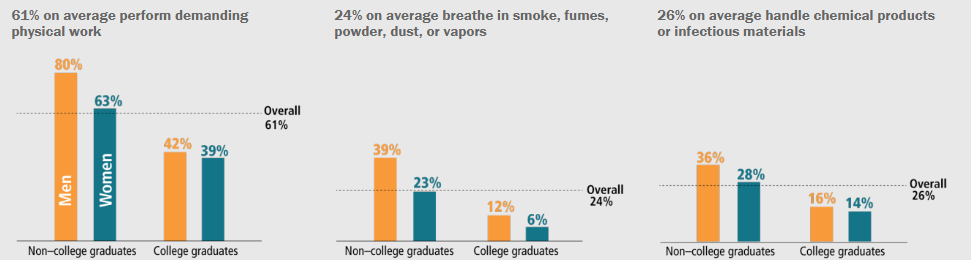
The Hazardous Workplace
An overwhelming fraction of Americans engage in intense physical exertion on the job. In addition to physical demands, more than one-half of American workers (55 percent) are exposed to unpleasant or potentially dangerous working conditions.
The Pressures of Work
Approximately two-thirds of Americans have jobs that involve working at very high speed at least half the time; the same fraction works to tight deadlines at least half the time.
The Long Work Day
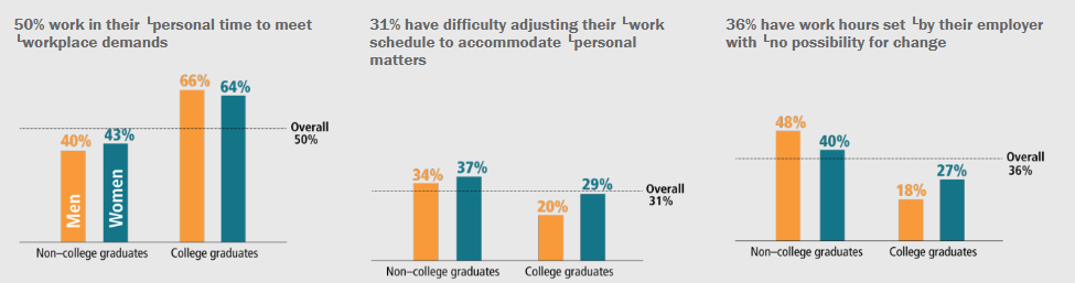
While presence at the work place during business hours is required for most Americans, many take work home. About one-half of American workers do some work in their free time to meet work demands. Approximately one in ten workers report working in their free time “nearly every day” over the last month, two in ten workers report working in their free time “once or twice a week,” and two in ten workers report working in their free time “once or twice a month.”
The Work Environment
Nearly one in five American workers were subjected to some form of verbal abuse, unwanted sexual attention, threats, or humiliating behavior at work in the past month or to physical violence, bullying or harassment, or sexual harassment at work in the past 12 months.
At the same time, it is also true that:
While the workplace is a source of hostile social experiences for an important fraction of American workers, it is a source of supportive social experiences for many others. More than one-half of American workers agreed with the statement “I have very good friends at work,” with women more likely to report having very good friends at work than men (61 and 53 percent, respectively).
In sum, the survey’s results make clear that work in the United States is physically and emotionally demanding and dangerous for many workers. And with the government weakening many of the labor and employment regulations designed to protect worker rights and safety, it is likely that workplace conditions will worsen.
Worker organizing and workplace struggles for change need to be encouraged and supported. A recent Pew Research Center survey showed growing support for unions, especially among younger workers. It is not hard to understand why.