social construction: symbols

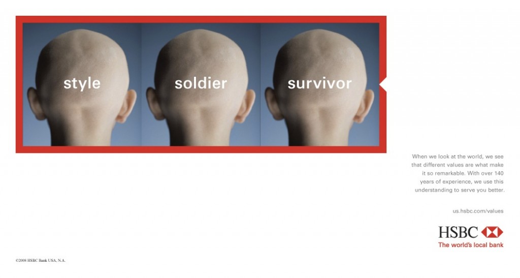
Jay Livingston, who blogs at MontClair SocioBlog, put up a set of ads for a bank that illustrate a basic sociological insight. The message in the ads is “Different values make the world a richer place” and they each feature the same image triply labeled.

Privilege.  Sacrifice.  Role model.

Decor.  Souvenir.  Place of prayer.

Freedom.  Status symbol.  Polluter.

Style.  Soldier.  Survivor.
Glorified.  Vilified.  Gentrified.
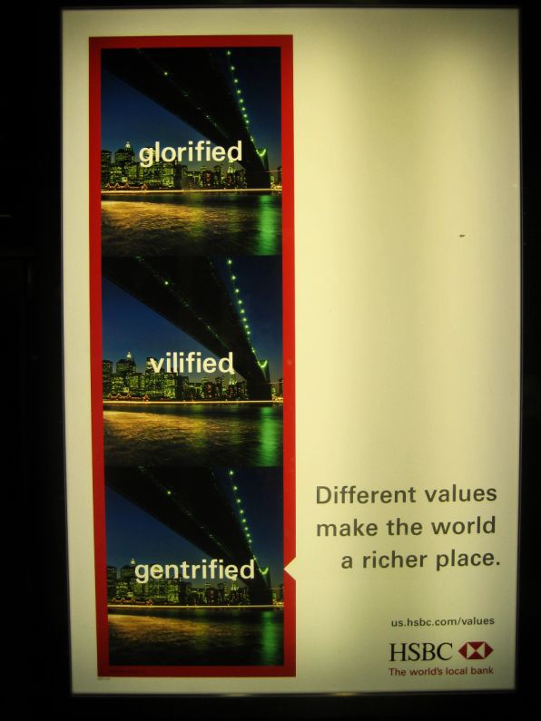
They say that a photograph is worth a thousand words, but this exercise reminds us how much words, even one word, can shape our interpretation of an image. The world doesn’t just exist, it must always be interpreted. Those immediately around us have a great ability to influence how we see the world, but the people with power over media do also… and their power is vast.

Lisa Wade, PhD is an Associate Professor at Tulane University. She is the author of American Hookup, a book about college sexual culture; a textbook about gender; and a forthcoming introductory text: Terrible Magnificent Sociology. You can follow her on Twitter and Instagram.

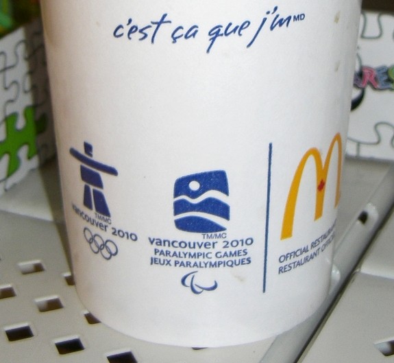
The 2010 Olympics logo is an altered version of traditional Arctic Inuit sculptures. This quasi-indigenous logo has been displayed in a barrage of Olympics branding. You can see two examples of this marketing in photos — from the summer of 2009 – shown below.

With this Olympics logo, and other Olympics promotional messages, marketers have been portraying the 2010 Games as ‘indigenous’ Olympics. Indigenous references are foregrounded in mass produced Olympics marketing.  The online Olympics store even sells “Authentic Aboriginal Products” (such as t-shirts and silk ties).

Some people who encounter this Olympics branding are bound to come away with the impression that natives (that is, individuals with a significant enough amount of native ancestry or culture) are respected, empowered, and well-integrated here in Canada. In other words, some viewers will view this marketing as a sign of harmonious bonds between natives and mainstream Canadian society.

Chief Stewart Phillip, the president of Union of B.C. Indian Chiefs, conveyed a much different view of Olympics marketing when he asserted that,

We’re deeply concerned about the concerted and aggressive marketing campaign advanced by Vanoc [the 2010 Olympics organization committee] which suggests the indigenous people of [British Columbia] and Canada enjoy a very comfortable and high standard of living. The Disneyesque promotional materials suggests a cosy relationship between aboriginal people of the province with all levels of government and it completely ignores the horrific levels of poverty our people endure on a daily basis.


Arctic indigenous branding on a McDonald’s cup in a
Wal-Mart store, in a city in Ontario, Canada

In British Columbia, and elsewhere in present-day Canada, natives have communicated conflicting views about how the 2010 Olympics relate to their lives, lands, and traditions. Indigenous Environmental Network campaigners have been among the more vocal critics who have opposed the 2010 Games.

Some have found the cartoonish Olympic marketing imagery to be a mockery of native traditions.  For example, critics have argued that the 2010 Olympics committee has edited and re-packaged native culture — which also has been ripped out of its traditional contexts. The Committee is highlighting Arctic indigenous imagery — yet Vancouver, the centre of the Games, is a temperate city.  Arctic indigenous peoples did not live there — or on the nearby Whistler and Cypress mountains, where some Olympic events will be held. Other indigenous populations who did live in that area of British Columbia also are not represented in the marketing iconography.

The Olympics branding denies noteworthy differences among native groups spread across these areas. Passing theatrical gestures to native peoples during the open ceremonies could be considered to be more respectful, but Olympics marketers otherwise have been mixing up North American native traditions into a soup-like caricature. Natives have been consistently oppressed, but the various peoples who are considered to be native (in some way, or to some degree) certainly are not ‘all the same.’ Tacking Arctic imagery on to Vancouver-area Games implies that there is only one native essence (in North America, if not beyond this continent).

What else is going on here? What does this superficially ‘indigenous’ rhetoric and imagery have to do with the rest of the 2010 Olympics? In other words, are indigenous populations benefiting from the 2010 Olympics in a way that might explain or justify the appropriation of Arctic imagery?

I pose these questions:

– What proportion of the profits from Olympics sales and tourism will natives groups receive?

– To what extent have native groups actively participated in Olympics organizing?

– How many of the athletes representing Canada at the Games have strong ties to native traditions and ancestors?

– Aside from the branding rhetoric and imagery discussed here, how much indigenous culture will be included in Olympic sports events and Olympics broadcasting?

– And how should we interpret the use of traditional imagery for product marketing purposes? What is the relationship between native peoples and chewing gum wrappers, sugary soda pop drink bottles, and other products which display Olympics brand logos?  Are indigenous peoples profitting from these product sales?  Are natives involved in the boardrooms of the corporations behind these sales?  And are there any other noteworthy connections between these products and any natives in present-day Canada?

Answers to those preceding questions are tied to the conditions that native peoples live under in present-day Canada. As I will explain, there are deep problems with the ‘indigenous’ Olympics rhetoric and imagery, which is very much at odds with Canadian realities.


Arctic advertising
‘Indigenous’ marketing in a major commercial square in
Toronto, Ontario, Canada


Native issues can be complex — and yet brutally straightforward, at the same time. Here are some figures that convey the highly disproportionate impoverishment, vulnerabilities, marginalization, and disempowerment of natives in present-day Canada. (Here are additional child poverty statistics.) The worst racism in Canada is reserved for indigenous peoples who are trapped between assimilation and ghettoization. Native groups ultimately are disappearing — in a nation that was established on native lands.

No marketing imagery ever could erase these ongoing legacies of a history of colonial genocide in Canada (and elsewhere).

Frankly, the ‘indigenous’ Olympics rhetoric and imagery strikes me as yet another form of liberal tokenism, given how fundamental problems are glossed over with paltry gestures (rather than a more radical redistribution of resources — or other constructive societal change).

In fact, while the Olympics imagery implies some sort of harmony between natives and non-natives in Canada, there actually are various ongoing native land claim conflicts in this country. In Ontario, indigenous activists helped to wage a defensive campaign which was a relatively high-profile land claim conflict here in Ontario, during the summer of 2009.

Native land claims are at the forefront of the issues raised by anti-Olympic protestors in Canada (who occasionally have supported tactics that I do not agree with). The phrase “No Olympics on Stolen Land” has been a common protest slogan, and indigenous imagery has been foregrounded in messages from no2010 campaigners, and other anti-Olympic activists. Although these opponents of the Olympics have not carefully distinguished between imagery from different indigenous cultures, their campaign messages surely could not be considered a tokenist form of whitewashing or conservatism — since these anti-Olympic activists have been siding with native land claims.

Protesters also have been raising concerns about how the Olympics are tied to indigenous land conflicts around the tar sands in Alberta. A recent day of action call-out from the Indigenous Environmental Network is the best example of connections drawn between the tar sands and the 2010 Games. As in some other activist campaign messages, this day of action announcement highlights financial and energy-system ties between the Olympics and tar sands pollution in Alberta — beside native lands. These tar sands operations also are the world’s worst climate threat; and the Arctic indigenous peoples alluded to in Olympics marketing actually are on the front lines of global warming impacts, which are aggravated by Olympic environmental devastation (including deforestation, which releases carbon into the world-wide atmosphere). As in other areas of the world, the most disempowered and resource-poor Canadians tend to be much more vulnerable to climate impacts.

Given all of the aforementioned gaps between pro-indigenous rhetoric and actual indigenous realities, why have so many people tolerated the native branding around the 2010 Games? After all, the Olympic brand logo was selected in 2005, and the Olympics marketing blitz was well-underway by the summer of 2009, in Canada.

Aside from the sheer monetary force behind the Olympics, there also are important cultural factors at work here. The harmonious vision conveyed through ‘indigenous’ packaging around the Olympics is an extension of mainstream Canadian visions of an outright “multicultural” “mosaic” in this country — where some claim that there is a complete lack of systemic racism, as well as equally proportioned room for all ethnic groups. In spite of arguments and evidence from critics (including scholars who are affiliated with John Porter’s The Vertical Mosaic), rhetoric about ethnic equality in Canada persists in marketing, in policy documents, and in other mainstream rhetoric. ‘Native’ Olympics marketing celebrates the Canadian status quo, in the same way.

At the same time, the ‘indigenous’ Olympics imagery provides some ethnic spice to the 2010 Games — as well as associated merchandising, and mass media spectacle. In Canada, remnants of native cultures likewise are re-packaged as decorations and tourist industry products. In much the same way, Olympics marketers have sought to increase profits with shreds of de-contextualized indigenous culture which they have appropriated.

But how are indigenous traditions linked to capitalist consumption, mass advertising, mainstream media systems, or tourism? These systems are entrenched on former native lands, but are there any other noteworthy connections between native traditions and such mainstream systems?

(I don’t mean to imply that people with native ancestors will be or should be forever trapped in a receding past. Vibrant, living traditions are flexible. Yet, I do not see how native heritage could be considered to be largely optional in any conception of indigenous-ness.)

Outside of Canada, it probably is not so apparent that the disputes over the Olympics have been national-scale tensions. Anti-Olympic protests (hyper-marginalized though they may be) actually have been organized in various other areas of Canada — well beyond British Columbia. (Here is one example of anti-Olympic campaigning in a city in Ontario.) I also find it telling that, in the face of an anti-Olympic protest in the city that I live in here in southern Ontario, some people conveyed their support for the Olympics by chanting “Canada… Canada… Canada.”

In sum, mainstream Canada claims and re-packages imagery from natives to sell a vision of a present-day Canada that is a tolerant country, with a rich and interesting history; such visions have been produced for the 2010 Games – as well as other tourism and merchandising, and wider nationalism. Then, ironically, when pro-indigenous groups challenge the use of this appropriated iconography to represent ‘Canada,’ majority groups dismiss their protests by claiming a more authentic Canadian-ness. Of course, the refusal to take indigenous protests seriously is just another manifestation of disinterest in the welfare of living indigenous peoples. Even as gestures are made toward native culture, actual natives generally are ignored.

——————————–

Toban Black is a Sociology PhD student specializing in environmental sociology, theory, inequality, and media.  He is also an activist, a blogger, and an amateur photographer.  He considers this guest post to be a blend of each of those four forms of communication.  Black is a frequent contributor to Sociological Images and the many posts inspired by his material can be viewed here.

If you would like to write a post for Sociological Images, please see our Guidelines for Guest Bloggers.

On August 29th, 2005, Hurricane Katrina sideswiped New Orleans.  The storm surge broke its levees, flooded 80% of the city, and killed almost 2,000 people.

The city is in recovery and it is emerging with a new identity tied tightly to that hurricane.  Though the storms have always played a role in the mythology of the city (consider its most famous drink), hurricane imagery increasingly has part of what defines New Orleans.  I’ve spent quite a lot of time there recently, and I can attest that the hurricane is everywhere: in jewelry, in art, and on bodies, for example.

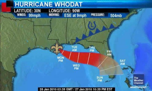
In light of this, Casey F. thought it would be interesting to think about who gets to use hurricane humor?  Case in point:  A flickr stream by Editor B includes the following two images.  The first uses hurricane imagery to suggest that the New Orleans Saints is going to “attack” the Indianapolis, Colts at the Superbowl (in Miami, FL):

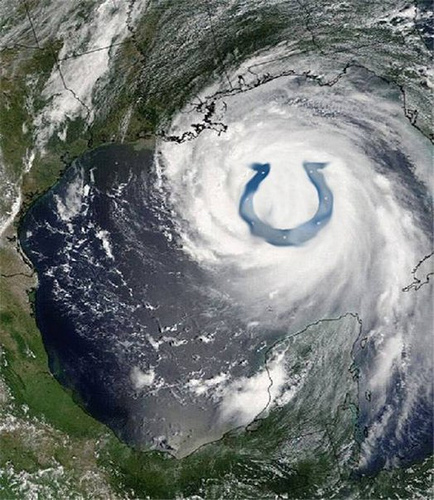
The second also uses hurricane imagery, but this time it’s an Indianapolis Colts fan using it against New Orleans:

Casey feels that those who suffered from the hurricane, including New Orleans, “…have reclaimed hurricane imagery for ourselves, because we survived it.”  But, she says, “That doesn’t make it acceptable for others to do so yet.”

For Casey, the use of hurricane imagery to suggest that a team is going to crush its opponent is like the use of the n-word or “queer.”  It was a hurtful term that has been reclaimed by those it most  hurt.  Thus, blacks and gays can use the words (respectively).  But, still, when others use them, they still carry a sting.

For someone who was harmed by a hurricane, using the imagery is a way of reclaiming the hurt they suffered, even appropriating the strength of the force that hurt them.  But, for others to use it, it is trivializing that same hurt, re-imagining the destruction they suffered.  It is not funny, from this perspective, to imagine that New Orleans could be hit again.

I sympathize with Casey on this, but think it’s also an interesting topic for conversation.

Lisa Wade, PhD is an Associate Professor at Tulane University. She is the author of American Hookup, a book about college sexual culture; a textbook about gender; and a forthcoming introductory text: Terrible Magnificent Sociology. You can follow her on Twitter and Instagram.

Carl G. alerted us to a controversy starring photographer, Umida Akhmedova.  Akhmedova’s pictures of her native Uzbekistan have incited the country to try her for defamation.  If found guilty, she could be sentenced to six months in prison or three years of forced labor.  Here are some of her photographs.


The state argues that Akhmedova has defamed and slandered Uzbekistan, making it seem as if the country is impoverished and backward. Photographers are defending Akhmedova, arguing that if anything makes Uzbekistan look backward, it’s their desire to censor artists. Frankly, I can see both points.

First, I do think that Akhmedova should be able to capture what she likes and disseminate her images.  The problem is not her representation.  The problem is that Akhmedova’s photographs may be the only representations of Uzbekistan that some people ever see.  That is, the problem isn’t Akhmedova’s pictures, it’s that there aren’t more photographs, of varying parts of Uzbek life, by more photographers noticed outside of the state.

Whenever there is a limited number of representations (or when those that are available converge), those that are disseminated tend to overdetermine perceptions of that place or those peoples.  That is, that one representation comes to stand for the whole.  We in the U.S. would likely not image a similar controversy over one photographers images of say, celebrities (to take an extreme example), because there are thousands of counter-representations.  Uzbekistan, however, does not have the luxury of not caring how the state is represented in Akhmedova’s photos.

So, to conclude, I don’t think Akhmedova should be in trouble, but I do understand why Uzbekistan might be so sensitive.

We’ve seen the same phenomenon with photos of the Middle East, AppalachiaAmerican Indian art, Africa (see both here and here) and, I’ve argued, the TV show Jersey Shore.  We could make the same argument about the preponderance of images of just one type of beauty.

Lisa Wade, PhD is an Associate Professor at Tulane University. She is the author of American Hookup, a book about college sexual culture; a textbook about gender; and a forthcoming introductory text: Terrible Magnificent Sociology. You can follow her on Twitter and Instagram.
If you’re designing a cover for a book by a Chinese or Japanese writer, or with a Chinese or Japanese setting, it seems that there are some compulsory elements which must be included. For variety’s sake, there are four elements, but you MUST use at least one of them. Advanced designers, of course, may use two or more.

Element 1: Blossoms (preferably cherry, but anything red or pink will do)

Element 2: Fans (preferably held so as to partly obscure a woman’s face (or genitals), and if you can get blossoms on the fan, you get bonus points)

Element 3: Dragons (for use only on crime novels, or other exciting tales)

Element 4: Female Necks (preferably that of a geisha, but any female neck will do in a pinch)

You’ll notice that only women are allowed on the cover of Chinese and Japanese literature. Ideally, they will be either expressionless (some might say demure or inscrutable), or at most vaguely melancholy.

For more on this trend, see this article from Hyphen Magazine, which features a brief interview with ace designer Henry Sene Yee. It was that article which also drew my attention to two covers featured above, those for On a Bed of Rice and The Street of a Thousand Blossoms.

(To be fair, I ought to note that several of these covers are actually very nice–it’s just that they lose rather a lot of their impact because of the familiarity of the elements used.)

James Morrison (jrsmorrison@yahoo.com.au) is a writer, editor and graphic designer who lives in Adelaide, Australia. He writes about book covers and book design at causticcovercritic.blogspot.com, and used to write about novellas at Book Slut.  He blogs at Caustic Cover Critic. Thanks to Lisabee for the hat tip.

We at Sociological Images are having fun with forms lately (see here and here). This time the fun is thanks to Bri A. who sent us some screen shots from the website Trillian.

Against heteronormativity, you can choose your sexual orientation.  If you choose female and gay, you are represented by two side-by-side female symbols (on the right):


However, if you choose straight, you aren’t represented by a male and female symbol, you’re just represented by a female symbol:


This reveals that straight is the default (without  a male by her side, everyone assumes she’s straight), and gay is the different, odd, marked category.

Bri then added “in a relationship” and noticed that, despite choosing gay and female, the “in a relationship” icon featured a man and a woman:

Oops.  Heteronormatity is back!

And, if she clicked “single,” the icon simply represented her as a man:

Presumably all people are represented by a male figure.  And we can’t even pretend that it’s neutral and supposed to represent “person,” because the “in a relationship icon” clearly includes a male and a female figure.

What’s funny is that these seem like really easy problems to fix, but either no has noticed or no one cares.

For  more posts on default and marked figures, see our posts on traffic lights with female figures, stick figures and stick figures who parent, and default avatars.

Lisa Wade, PhD is an Associate Professor at Tulane University. She is the author of American Hookup, a book about college sexual culture; a textbook about gender; and a forthcoming introductory text: Terrible Magnificent Sociology. You can follow her on Twitter and Instagram.

I was stuck by this image, which is being used by Environmental Defense as part of a “how you can stop global warming”-type promotion:

slimEarth

We see a cartoon anthropomorphized earth flexing its muscles happily while a tape measure is cinched around its quite unnaturally narrow waist. It’s an interesting collision between the longstanding metaphor of environmentalism as seeking the “health” of the environment, with the modern idea of obesity as iconic of poor health.

Unpacking the idea of ecological “health” as the goal of environmentalism is something I’ll mostly set aside here, except to note that it is a non-inevitable conceptualization (contrast the alternate framing of conservation/sustainability). The important thing to keep in mind is that the idea of ecological health involves conceptualizing the ecosystem, or even the entire planet, as a mega-organism — and in particular, a mega-human-body — for which health consists of an approximation to a particular ideal state. For a human body, health by this conception involves having all the normal parts (2 legs, both eyes, smooth skin, etc) functioning in the normal way.

What caught my eye about the ED ad was the change in the representation of what constitutes “health.” A quick Google image search on “sick earth” brings up lots of examples of the old way of representing health. We get lots of earths suffering from common cold and flu type symptoms — flushed, sweating, excreting mucus, and making use of thermometers and hot water pads.

The archetype of ill health here is infectious disease, an invasion by microbes that upsets the system’s functioning. The metaphorical parallels between viruses and pollution (including, in some cases, human beings) have been powerful for environmentalism.

But over the past few decades, we’ve acquired a new archetype for poor health: obesity. Being fat has become synonymous with being sick, and vice-versa. What I’m interested in here is not the scientific/medical question of how bad for you being fat really is (though I’ll admit to skepticism of the obesity panic on these grounds), but rather the sociological question of how obesity became the key trope in our discourse about health. Thus, a healthy earth can be easily represented as one that has slimmed down, because we all know that getting skinnier equals getting healthier. The metaphor is extended in the “Low Carbon Diet Guide” that the ad encourages you to download, which talks about how “counting carbs” should apply to carbon dioxide as well as carbohydrates. Interestingly, the guide sticks to energy conservation tips, thus both continuing environmentalists’ reluctance to address food habits as a contributor to climate change while mercifully avoiding blaming fat people for causing global warming by stuffing their faces.

An important element to the conceptualization of obestity as the archetype of ill health is the way it’s tied to ideas of personal responsibility. While genetics and social conditions play a huge role in determining who gets fat, our discourse about obesity promotes the idea that on the one hand you can control your own weight, and on the other fat people can be blamed for their condition. This is reflected in the content of ED’s Low Carbon Diet brochure, which is is a fairly standard compendium of personal behavioral changes that will make you a better, less-carbon-emitting, metaphorically slimmer person. Obviously this sort of thinking long predates the ecological-health-as-thinness metaphor, but there’s a synergy between them in terms of the emphasis on the small scope of personal control within a larger issue.

This is not the first, or most extreme, time environmentalists have tried to link up with the concern over obesity. But it was striking to me that the thin = healthy idea is so engrained that it can be used as a metaphor by causes outside of the public health field.

Stentor Danielson is a professor of Geography at Slippery Rock University in Pennsylvania. His research focuses on the relationship between humans and their environment. Specifically, he’s interested in how people understand the risk of wildfires. You can read more from Stentor at his blog, Debitage.

Larry Harnisch, of The Daily Mirror, scanned these two ads for Grand Marnier from the latest New Yorker.  Normally we don’t get too worked up over phallic imagery, but I thought these two might be good for discussion.  Besides, it’s been a while since we linked to our awesome collections of ads featuring ejaculation imagery, subliminal sex, and not-so-subliminal sex (NSFW).

In the first, the woman greets a man at his door.  She is wearing a dress with a very low cut back.  She is holding the bottle behind her, angled provocatively.  Don’t miss the shape of the bottle itself (and what exactly is that circle at the base of its neck?).

Picture11

In the second ad, the woman sits deep in an armchair, her legs in the air.  The bottle, being poured by a man, is tilted towards her, and spilling liquid into her glass.

Picture1

So, Readers, what do you think?  Is the bottle meant to be read as a penis subconsciously?  Do you think it works that way, intended or not?

—————————

Lisa Wade is a professor of sociology at Occidental College. You can follow her on Twitter and Facebook.