rural/urban

Lynne Shapiro brought our attention to the way that choices to locate bus stops can marginalize their riders, discouraging use of public transportation by those who could choose between the bus and a car and placing a burden on those who do ride the bus to complete errands. Lynne has taken photos of bus stops around Connecticut and the D.C. metro area malls and stores. She points out that they are often far from entrances, and in some cases malls didn’t allow them on the property at all.

Here are two photos, from different angles, of a bus stop at Hamden Plaza, a major shopping center in the New Haven, CT, area:

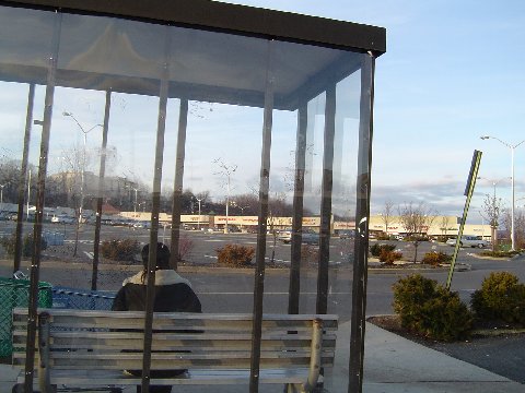
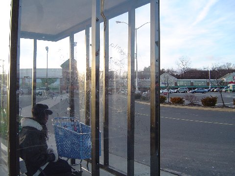
The result is to create additional burdens on those using the bus for shopping, requiring them to haul or push their purchases a significant distance to the bus stop, a process that would be particularly unpleasant in rain or snow (or, here in Vegas, when it’s 117 degrees), or for those with mobility issues.

When mass transit stops are systematically located in inconvenient or isolated areas, it disadvantages those who are dependent on public transportation and discourages others from choosing to ride rather than driving their own car, and reinforces a common perception of the bus, in particular, as an inferior form of transportation — a topic discussed more fully by Sikivu Hutchinson in Imagining Transit: Race, Gender, and Transportation Politics in Los Angeles.

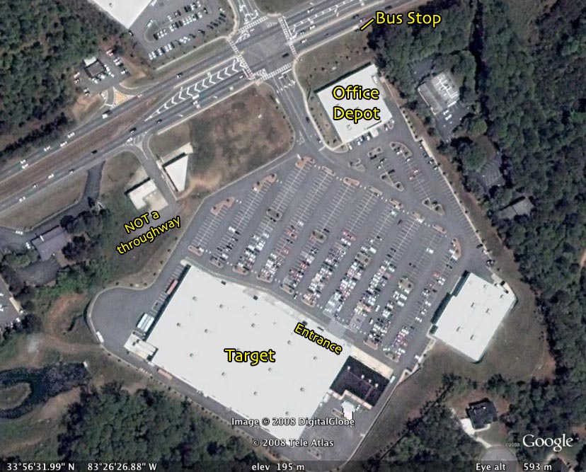
UPDATE: Reader codeman38 provided a link to an image of a Target parking lot in Athens, Georgia, which shows the lack of clear pedestrian paths from the bus stop to the store:

According to a story on NPR, Asian Americans are less likely to be unemployed than White, Black, and Hispanic Americans.  But, when they do lose a job, they remain unemployed significantly longer.

Jobless Rates by Race:

Length of Unemployment:

Why might Asians have a more difficult time finding work?  Kent Wong of  UCLA’s Center for Labor Research and Education explains that their extended length of unemployment can be attributed to a confluence of two realities that make their situation unique.  First,about 70% of Asian Americans are foreign born and these immigrants often live in ethnic enclaves (e.g., Chinatowns) that focus on a single industry.  So long as there is work in that industry, Asians can find work.  But, if that industry goes south, their limited network outside of those enclaves becomes a hindrance.  Meanwhile, Asians (unlike Whites, Hispanics, and Blacks) tend to be segregated by language.  Wong explains that, with about a dozen languages spoken widely in the Asian American community, pan-ethnic networks can be difficult to build and maintain.  This leads to extra difficulty finding a new job:

If you have a Vietnamese employee working for a Vietnamese employer in Little Saigon in Orange County, that does not transfer to an ability to get a job in Koreatown in Los Angeles…

Both residential and linguistic segregation, then, contribute to long periods of unemployment for Asian Americans.

Lisa Wade, PhD is an Associate Professor at Tulane University. She is the author of American Hookup, a book about college sexual culture; a textbook about gender; and a forthcoming introductory text: Terrible Magnificent Sociology. You can follow her on Twitter and Instagram.

Lake Mead (1958):

Lake Mead (2010):

Via the Earth Observatory.

These two starkly different and somewhat frightening images don’t represent a linear diminishment of Lake Mead. Instead, they are two extremes on a naturally fluctuating water level:

This fluctuating water level isn’t, further, a natural problem. It has, however, become an increasingly social problem. It provides water for the Southwest, a portion of the country that has become thirstier and thirstier. From Maggie Koerth-Baker at BoingBoing:

Take, for instance, Las Vegas, which gets 90 percent of its water from Lake Mead. Back in the 1940s, fewer than 9,000 people lived there. In 2006, the population was estimated at more than 550,000, and growing. Rapidly.

This makes large numbers of people vulnerable to these natural fluctuations in ways that they never were before and potentially creates human disasters out of our own poor planning and resource management. If climate change exacerbates this problem, and it very well might, then the reliability of our water supply is even more fragile.

Lisa Wade, PhD is an Associate Professor at Tulane University. She is the author of American Hookup, a book about college sexual culture; a textbook about gender; and a forthcoming introductory text: Terrible Magnificent Sociology. You can follow her on Twitter and Instagram.

In New Orleans sidewalk corners are adorned with delightful blue-and-white tiles, originally dating from the 1870s, telling you the name of the street you are crossing:

As I stepped over some of these, it occurred to met that they told a story about city planning.  Unlike the street signs in most cities (including New Orleans) that are attached to poles and displayed high, these can’t be seen by drivers.  These are designed for pedestrians, and perhaps bikers, using sidewalks.  They reflect a time when planners were designing the city for people on foot.

Lisa Wade, PhD is an Associate Professor at Tulane University. She is the author of American Hookup, a book about college sexual culture; a textbook about gender; and a forthcoming introductory text: Terrible Magnificent Sociology. You can follow her on Twitter and Instagram.

Dimitriy T.M. sent in another interesting link, this time to an interactive map that presents IRS data on inter-county moves — that is, how many people moved from one county to another in 2008, and where they moved to. The map doesn’t capture all moves, since the IRS only presents data if at least 10 people from a county moved to a particular destination county (so a county could have a lot of out-migration, but if people really spread out when they moved, it wouldn’t show up). Despite that limitation, it does highlight some interesting general trends.

For instance, people from counties with big cities move to a variety of places, often far away from where they started (note that the width of the line indicates the number of immigrants, red = out-migration and black = in-migration, and the destination counties show up in blue):

On the other hand, if you look at most counties in the U.S. that don’t have large metropolitan areas, you see that most movement is to relatively nearby counties. Here’s an example from North Dakota:

I suspect that the number of migrants in rural areas is going to be under-represented, since their smaller overall populations may make it more likely that less than 10 people would move to any particular place, so that’s important to keep in mind.

Also not surprisingly, counties with universities see a lot of migration, both in and out, and to a wide variety of destinations. Here is Dane County, the site of the University of Wisconsin-Madison:

When I was looking around, I randomly clicked on Sweetwater County, Wyoming. I was surprised to see quite a bit of in-migration from distant counties:

I don’t know what’s going on there. There isn’t a university in the county. Does anyone know enough about Wyoming to have a guess?

UPDATE: Reader Caitlin says it’s related to  oil production. Thanks for the info, Caitlin!

Anyway, it’s a sort of fun map to mess around with.

To me this New York Times graphic showing the relationship between gas prices and the average number of miles driven powerfully suggests that gas prices actually have little to do with how much driving Americans do.  The vertical axis is gas prices and the horizontal axis is the number of miles driven.  The line inside the figure is time.

Basically the illustration shows that the number of miles per year Americans drive has been climbing since 1956.  Despite short-term gas price fluctuations, something is driving us to drive more and more every year.

When gas prices do shoot up — such as during the oil embargo, the energy crisis, and the most recent peak — Americans show a  modest drop in driving, but it’s not a very large one and we recover rather quickly.  During the oil embargo, Americans shaved 210 miles a year off of their driving.  During the energy crisis, only 156.  The recent reduction in the number of miles driven per year is attributed by the New York Times writer to the fact that so many people are unemployed and, therefore, no longer need to drive to work.

Driving, then, shows only a modest response to high prices.  Perhaps the jumps in prices during these peaks — 43 and 106 cents per gallon respectively —  weren’t really worth slowing down for?  Or perhaps driving is so culturally meaningful that Americans are willing to pay to stay in their cars regardless?  Or maybe driving, and driving farther, has become increasingly important over time such that people can’t reasonably reduce the amount of driving they do?

It seems to me that the problem is at least partly infrastructural.  I wonder how average miles driven responds, or would respond, to enhancing and investing in public transportation?  If we started building denser neighborhoods and got rid of suburbs?

Flowing Data.

Lisa Wade, PhD is an Associate Professor at Tulane University. She is the author of American Hookup, a book about college sexual culture; a textbook about gender; and a forthcoming introductory text: Terrible Magnificent Sociology. You can follow her on Twitter and Instagram.

What happens when huge numbers of people lose their homes?   Hundreds of thousands of Haitians lost their homes in the giant earthquake that struck Port-au-Prince in January.  Six months later, resource-poor and with little help from their government, they remain homeless.  When there are that many displaced people, where do they live?  Apparently, everywhere.  This week NPR reported that about 1,000 people are living in 326 make-shift structures on an 8-foot-wide median dividing one of Haiti’s busiest roads.

If private property is off-limits, public space fills up, and temporary housing isn’t provided, where are people to go?

—————————

Lisa Wade is a professor of sociology at Occidental College. You can follow her on Twitter and Facebook.

Lisa Wade, PhD is an Associate Professor at Tulane University. She is the author of American Hookup, a book about college sexual culture; a textbook about gender; and a forthcoming introductory text: Terrible Magnificent Sociology. You can follow her on Twitter and Instagram.

Asa D. sent in an animated 1958 Disney segment titled “Magic Highway USA.” The cartoon extols the virtues of the highway system of the future (the interstate highway system was authorized by President Eisenhower in 1956). Apparently it is farther into the future than 2010, as my windshield does not have a radar, and road construction around here doesn’t seem to be instantaneous:

The segment of course illustrates gender expectations of the time — dad goes off to work while mom and the kid(s) go shopping. But as Asa points out, this example of the “techno-utopianism” of the post-World War II era, with faith that modern technologies will lead to a happy future that increasingly frees us from unpleasant work, boredom, wasted time, and so on, is truly fascinating.

Providing a nice contrast to that earlier vision, Dmitriy T.M. let us know about the stop-motion short video Metropolis by Rob Carter. The entire video, which is 9 1/2 minutes long, gives an abridged history of Charlotte, North Carolina.

Here are the last 3 minutes (you can see the entire video here). In this segment, we see the unfolding of a large highway system and urban construction/destruction/reconstruction. At about a minute in, “the video continues the city development into an imagined hubristic future, of more and more skyscrapers and sports arenas and into a bleak environmental future” (quote found here):

Metropolis by Rob Carter – Last 3 minutes from Rob Carter on Vimeo.

NEW! (May ’10): Kris H. sent in another example of envisioning the future. The Futurama, an exhibit at the 1939 World’s Fair, promised a future in which interstate highways will allow people to bypass slums, relieving us of the work of fixing them (found at Neatorama):