nation: Portugal

As we enter the last frenzied days of Christmas shopping, Dmitriy T.M. thought it was worth looking at international comparisons in spending on the holiday. The Economist posted a graph based on Gallup polls and other data sources about how much individuals in various countries in Europe, plus the U.S. and South Africa, plan to spend on Christmas shopping this year, plotted against national GDP. Overall, Christmas spending correlates with national wealth, with the Netherlands being a noticeable outlier (spending less than we’d expect) and Luxembourg in a spending league of its own:


Does American prosperity translate into long retirements?  Not compared to other developed countries in the world.  Flowing Data borrowed OECD numbers on life expectancy and age of retirement to calculate the average number of years in retirement for men and women across many different countries.  The portion of each bar with the line is the average number of years working, while the non-lined portion represents years in retirement.

Largely because of life expectancy, women enjoy more years than men in all states except Turkey, but the number of years varies quite tremendously, from an average of zero years for men in Mexico, to an average of 26 years for women in Austria and Italy.  The United States is way down on this list, not doing so well relatively after all.

Lisa Wade, PhD is an Associate Professor at Tulane University. She is the author of American Hookup, a book about college sexual culture; a textbook about gender; and a forthcoming introductory text: Terrible Magnificent Sociology. You can follow her on Twitter and Instagram.

I am trying to re-enter society after several days being sick, so I’m going with something short and simple today. Eden H. sent in this chart, found at Business Insider, that compares hourly minimum wages in a number of European countries to the U.S.:

The European data are available from Eurostat (though note they report minimum wages in terms of Euros per month, not hour, so the data was converted for the chart).

Deeb K. sent in a story from the New York Times about who does unpaid work — that is, the housework, carework, and volunteering that people do without financial compensation. Based on time-use surveys by the Organisation for Economic Co-operation and Development (OECD), this chart shows how many more minutes per day women in various nations spend doing such activities compared to men:

Childcare stuck out as an area with a particularly large gap:

On child care in particular, mothers spend more than twice as much time per day as fathers do: 1 hour 40 minutes for mothers, on average, compared to 42 minutes for fathers…On average, working fathers spend only 10 minutes more per day on child care when they are not working, whereas working mothers spend nearly twice as much time (144 minutes vs. 74) when not working.

The full OECD report breaks down types of unpaid work (this is overall, including data for both men and women):

The study also found that non-working fathers spend less time on childcare than working mothers in almost every country in the study (p. 19). And mothers and fathers do different types of childcare, with dads doing more of what we might think of as the “fun stuff” (p. 20):

Source: Miranda, V. 2011. “Cooking, Caring and Volunteering: Unpaid Work around the World.” OECD Social, Employment and Migration Working Papers, No. 116. OECD Publishing.

An infographic accompanying an article at the New York Times reveals how “advanced economies” compare on various measures of equality, well-being, educational attainment, and more.  To illustrate this, for each measure countries that rank well are coded tan, countries that rank poorly and very poorly are coded orange and red respectively, and countries that are in the middle are grey.  The countries are then ranked from best to worst overall, with Australia coming in #1 and the United States coming in last.  You might be surprised how some of these countries measure up.

Thanks to Dmitriy T.M. for the link.

Lisa Wade, PhD is an Associate Professor at Tulane University. She is the author of American Hookup, a book about college sexual culture; a textbook about gender; and a forthcoming introductory text: Terrible Magnificent Sociology. You can follow her on Twitter and Instagram.

The United States is a nation of immigrants… in that the majority of its citizens are not part of the native population of North America.  In other words, because it was and remains a colonized land.

That aside, is the United States unique in receiving an extremely large number of new immigrants relative to its size?  It turns out, No.

Lane Kenworthy, at Consider the Evidence, posted this figure, showing that the U.S. population does indeed include a substantial proportion of first generation immigrants (both legal and illegal), but it is not unique in that regard, nor does it carry the highest percentage:

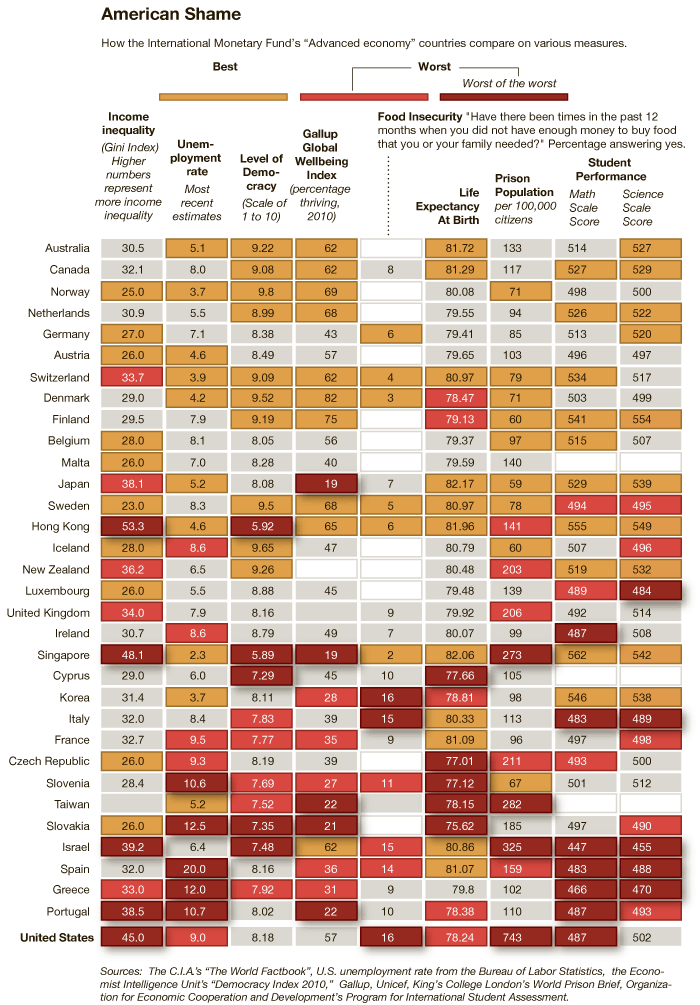
It also fails to be true, as many anti-immigration people claim, that the U.S. accepts a uniquely large number of immigrants who need help once they arrive:

Lisa Wade, PhD is an Associate Professor at Tulane University. She is the author of American Hookup, a book about college sexual culture; a textbook about gender; and a forthcoming introductory text: Terrible Magnificent Sociology. You can follow her on Twitter and Instagram.

I’m back! I was in the middle of moving and just overwhelmed with everything. Anyway. Talking Points Memo posted a link to an article at Slate about income inequality in the U.S., and particularly the increasing proportion of total U.S. income earned by the very rich. Timothy Noah refers to the “great compression” as a time period when income concentration among top earners dropped significantly, and argues that in the past three decades we’ve seen a “great divergence,” with increasing income inequality hitting levels not seen since the Great Depression:

A slideshow accompanies the article, providing more info on the changes Noah discusses. A few examples (the slideshow provides the data source used to create each image):

Even among the very rich, we see increasing divergence, with the super-ultra rich, the top 0.1% of earners, now making 8% of all U.S. income:

A comparison to some other countries (I don’t know why these specific nations were chosen for the comparison):

Keep in mind, this data includes only income. Wealth — the worth of all assets, including retirement and savings accounts, stocks, homes, cars, and anything else of value — is much more unequally distributed.

Congress is about to be embroiled in a major debate about whether to extend the tax cuts on high incomes; as both sides weigh in, here’s some context to keep in mind:

The effective tax rate is what people actually pay, as opposed to what their tax rate theoretically is. While we’ve certainly seen a large drop since the late ’70s, Noah argues that, compared to other economic changes, the effective tax rate hasn’t affected the rise in income inequality much. It plays a role, yes, but changing the tax rate on the very rich doesn’t affect the overall distribution of income a huge amount, in part because the effective rate, what people end up actually paying, generally ends up being smaller than what they theoretically owe based on the stated tax rate, once you take into account deductions, write-offs, loopholes, and so on.

So…happy post-Labor Day!

Claude Fischer at Made in America offered some data speaking to the idea that Americans are especially patriotic. That they, in other words, are more likely than citizens of other nations to think that “We’re Number One!”

Fischer provides some evidence by Tom Smith at the International Social Science Programme (ISSP; Tom’s book).  The ISSP, Fischer explains…

…involves survey research institutions in dozens of countries asking representative samples of their populations the same questions. A couple of times the ISSP has had its members ask questions designed to tap respondents’ pride in their countries… One set of questions asked respondents how much they agreed or disagreed with five statements such as “I would rather be a citizen of [my country] than of any other country in the world” and “Generally, speaking [my country] is a better country than most other countries.”

Smith put responses on a scale from 5 to 25, with 25 being the most patriotic.  Here are the results from some of the affluent, western democracies (on a shortened scale of 5 to 20):

As Fischer says, “Americans were #1 in claiming to be #1.”  Well, sort of.  Americans were the most patriotic among this group.  They turned out to be the second most patriotic of all countries.  Venezuela beat us.

(In any case, what struck me wasn’t the fact that the U.S. is so patriotic, but that many other of these countries were very patriotic as well!   The U.S. is certainly no outlier among this group.  In fact, it looks like all of these countries fall between 14 and 18 on this 20-point scale.  Statistically significant, perhaps, but how meaningful of a difference is it?)

Fischer goes on to ask what’s good and bad about pride and closes with the following concern for U.S. Americans:

We believe that we are #1 almost across the board, when in fact we are far below number one in many arenas – in health, K-12 education, working conditions, to mention just a few. Does our #1 pride then blind us to the possibility that we could learn a thing or two from other countries?

Lisa Wade, PhD is an Associate Professor at Tulane University. She is the author of American Hookup, a book about college sexual culture; a textbook about gender; and a forthcoming introductory text: Terrible Magnificent Sociology. You can follow her on Twitter and Instagram.