nation: France

Cross-posted at Family Inequality.

I have criticized sloppy statistical work by some international feminist organizations, so I’m glad to have a chance to point out a useful new report and website.

The Progress of the World’s Women is from the United Nations Entity for Gender Equality and the Empowerment of Women. The full-blown site has an executive summary, a long report, and a statistics index page with a download of the complete spreadsheet. I selected a few of the interesting graphics.

Skewed sex ratios (which I’ve written about here and here) are in the news, with the publication of Unnatural Selection, by Mara Hvistendahl. The report shows some of the countries with the most skewed sex ratios, reflecting the practice of parents aborting female fetuses (Vietnam and Taiwan should  be in there, too). With the exception of Korea, they’ve all gotten more skewed since the 1990s, when ultrasounds became more widely available, allowing parents to find out the sex of the fetus early in the pregnancy.

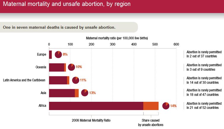
The most egregious inequality between women of the world is probably in maternal mortality. This chart shows, for example, that the chance of a woman dying during pregnancy or birth is about 100- 39-times higher in Africa than Europe. The chart also shows how many of those deaths are from unsafe abortions.

Finally, I made this one myself, showing women as a percentage of parliament in most of the world’s rich countries (the spreadsheet has the whole list). The USA, with 90 women out of 535 members of Congress, comes in at 17%.

The report focuses on law and justice issues, including rape and violence against women, as well as reparations, property rights, and judicial reform. They boil down their conclusions to: “Ten proven approaches to make justice systems work for women“:

1. Support women’s legal organizations

2. Support one-stop shops and specialized services to reduce attrition in the justice chain [that refers to rape cases, for example, not making their way from charge to conviction -pnc]

3. Implement gender-sensitive law reform

4. Use quotas to boost the number of women legislators

5. Put women on the front line of law enforcement

6. Train judges and monitor decisions

7. Increase women’s access to courts and truth commissions in conflict and post-conflict contexts.

8. Implement gender-responsive reparations programmes

9. Invest in women’s access to justice

10. Put gender equality at the heart of the Millennium Development Goals

Does American prosperity translate into long retirements?  Not compared to other developed countries in the world.  Flowing Data borrowed OECD numbers on life expectancy and age of retirement to calculate the average number of years in retirement for men and women across many different countries.  The portion of each bar with the line is the average number of years working, while the non-lined portion represents years in retirement.

Largely because of life expectancy, women enjoy more years than men in all states except Turkey, but the number of years varies quite tremendously, from an average of zero years for men in Mexico, to an average of 26 years for women in Austria and Italy.  The United States is way down on this list, not doing so well relatively after all.

Lisa Wade, PhD is an Associate Professor at Tulane University. She is the author of American Hookup, a book about college sexual culture; a textbook about gender; and a forthcoming introductory text: Terrible Magnificent Sociology. You can follow her on Twitter and Instagram.

I am trying to re-enter society after several days being sick, so I’m going with something short and simple today. Eden H. sent in this chart, found at Business Insider, that compares hourly minimum wages in a number of European countries to the U.S.:

The European data are available from Eurostat (though note they report minimum wages in terms of Euros per month, not hour, so the data was converted for the chart).

Deeb K. sent in a story from the New York Times about who does unpaid work — that is, the housework, carework, and volunteering that people do without financial compensation. Based on time-use surveys by the Organisation for Economic Co-operation and Development (OECD), this chart shows how many more minutes per day women in various nations spend doing such activities compared to men:

Childcare stuck out as an area with a particularly large gap:

On child care in particular, mothers spend more than twice as much time per day as fathers do: 1 hour 40 minutes for mothers, on average, compared to 42 minutes for fathers…On average, working fathers spend only 10 minutes more per day on child care when they are not working, whereas working mothers spend nearly twice as much time (144 minutes vs. 74) when not working.

The full OECD report breaks down types of unpaid work (this is overall, including data for both men and women):

The study also found that non-working fathers spend less time on childcare than working mothers in almost every country in the study (p. 19). And mothers and fathers do different types of childcare, with dads doing more of what we might think of as the “fun stuff” (p. 20):

Source: Miranda, V. 2011. “Cooking, Caring and Volunteering: Unpaid Work around the World.” OECD Social, Employment and Migration Working Papers, No. 116. OECD Publishing.

An infographic accompanying an article at the New York Times reveals how “advanced economies” compare on various measures of equality, well-being, educational attainment, and more.  To illustrate this, for each measure countries that rank well are coded tan, countries that rank poorly and very poorly are coded orange and red respectively, and countries that are in the middle are grey.  The countries are then ranked from best to worst overall, with Australia coming in #1 and the United States coming in last.  You might be surprised how some of these countries measure up.

Thanks to Dmitriy T.M. for the link.

Lisa Wade, PhD is an Associate Professor at Tulane University. She is the author of American Hookup, a book about college sexual culture; a textbook about gender; and a forthcoming introductory text: Terrible Magnificent Sociology. You can follow her on Twitter and Instagram.

Via Shamus Khan, I found the Economic Policy Institute’s interactive graph that lets you see which Americans have earned most of the growth (or, more recently, suffered the losses) in U.S. incomes over time, based on IRS data (and reported in constant 2008 dollars):

You can select beginning and ending points and find out how incomes changed during that period and how the growth was distributed. For instance, the increase in average incomes between 1950 and 1960 were widely distributed:

If we look at the 10-year span between 1995 and 2005, the increase was much more concentrated among the very wealthy:

The data come from a study on historical income in equality in the U.S. by economists Thomas Piketty and Emmanuel Saez. They compare the share of income earned by the richest 0.1% of earners in the U.S., France, and the U.K.:

See our previous posts on Saez’s work here and here.

Eight readers — Christine B., Hermes, Yvette, Hope H., Tyler D., Pris S., John G., and Dmitrity T.M. — alerted us to a photo spread in the December issue of French Vogue. The series of photographs is another piece of evidence of the adultification of young girls, an adultification that looks suspiciously like child porn, given the sexualization of adult women.  New York Magazine reports that the girls are 6 years old.  Don’t miss the lipstick, high heels, and disinterested pouts.

The thing is: the adultification/sexualization of young girls is paralleled by a infantilization of adult women.  This adds up to a conflation of women and children which serves to uphold prejudice against adult women and the exploitation of girls.


More at Gawker.

For more on the infantilization of adult women, see our posts on lady spanking, Glee, this collection of examples, a vintage example, and the Halloween edition.

For more on the adultification/sexualization of young girls, see our posts on sexually suggestive teen brandsadultifying children of color, “trucker girl” baby booties“future trophy wife” kids’ tee, House of Dereón’s girls’ collection, “is modesty making a comeback?“, more sexualized clothes and toyssexist kids’ tees, a trifecta of sexualizing girls, a zebra-striped string bikini for infants, a nipple tassle t-shirt, even more icky kids’ t-shirts, “are you tighter than a 5th grader?” t-shirt, the totally gross “I’m tight like spandex” girls’ t-shirt, a Halloween costume post, and girls in the World of Dance tour.

And, yes, it happens to boys too.  For examples of the sexualization of young boys, see our posts on Lil’ Wayne’s virginity loss, the depiction of a 13-year-old boy having a relationship with his teacher, the sexy marketing of both Jaden Smith and Justin Bieber, with a follow up here.

Lisa Wade, PhD is an Associate Professor at Tulane University. She is the author of American Hookup, a book about college sexual culture; a textbook about gender; and a forthcoming introductory text: Terrible Magnificent Sociology. You can follow her on Twitter and Instagram.

As a member of a cattle-raising family, I hear a pretty steady stream of complaints about people eating less beef, which is variously attributed to a conspiracy against the American rancher (possibly by terrorists), the result of stupid city people who get all terrified over every little health concern (Mad Cow Disease is a myth! Unless it’s a terrorist plot to ruin ranching), environmentalists, animal rights activists, and me (I’ve been a vegetarian since 1996 and thus single-handedly nearly destroyed the beef industry).

The National Cattlemen’s Beef Association is similarly concerned about reduced beef consumption. And given that we frequently hear about the connections between red meat consumption and health concerns such as heart disease, and are advised to substitute white meat for red meat (to the point that the pork industry began branding pork as “the other white meat”), you’d probably expect to see a dramatic decline in consumption of beef.

And we do see a decline, but not as much as you might expect, as this graph from the Freakonomics blog, sent in by Dmitriy T.M. and Bryce M. (a student at Rensselaer Polytechnic Institute), illustrates:

Clearly beef consumption has declined since its peak in the late 1970s, when people in the U.S. ate nearly 90 pounds of beef each per year, to closer to 60 lbs. each today. On the other hand, all those health warnings, disease scares, and environmentalist-vegetarian terrorist plots haven’t yet knocked beef out of its position as the most-eaten meat in the U.S. Clearly, chicken seems poised to take over that position, but beef doesn’t exactly appear to be falling off the charts.

So how do we compare to other countries in terms of overall meat consumption? In a 2003 article in the Journal of Nutrition, Andrew Speedy provided data on global meat consumption (defined as “beef and buffalo, sheep and goat, pig meat and poultry”) — note it’s in kilograms, not pounds, and the legend should be read across, not down (so the first bar is for the U.S., the second is for France, and so on):

So insofar as there has been a decrease in beef consumption in the U.S., and more dramatic increase in chicken consumption: what’s going on? The Freakonomics article presents an explanation:

A study by the agricultural economists James Mintert, Glynn Tonsor, and Ted Schroeder found that for every 1 percent increase in female employment, beef consumption sank by .6 percent while chicken consumption rose by .6 percent. Why? Probably because beef takes longer than chicken to prepare, and because poultry producers did a good job marketing cheap and ready-to-cook chicken products. Furthermore, all those working women meant more household income, which meant more families eating in restaurants — where meals are less likely to contain beef than meals at home.

Health concerns do play a part; the authors found that negative media coverage of beef (either recalls due to contamination or general links to heart disease, etc.) reduced consumption, while positive coverage that linked eating meat to getting iron, zinc, and other minerals increased it. But they found that health effects were small compared to the effects of changing family dynamics — that is, women working outside the home and families eating fewer meals at home.

It’s a nice example of how the factors driving social changes are often much more complex than we’d expect. Common sense explanations of changes in beef consumption would, I think, a) overestimate how much less beef Americans eat than in the past and b) assume the major driving factors to be health-related concerns, whether about chronic disease or recalls. Yet it turns out a major aspect of the story is a structural change that doesn’t seem clearly connected at all.

I guess if I were a health advocate hoping people in the U.S. were starting to listen to messages about healthy eating, that might depress me. But I guess I can tell my grandma that the terrorists’ evil plans to infect U.S. cattle herds with Mad Cow or some other disease might not be as catastrophic as they might imagine.

UPDATE: As a couple of readers point out, the increase in chicken consumption can’t be explained just as a result of people eating chicken when they otherwise would have eaten beef; the drop in beef consumption is way overshadowed by the increase in how much chicken people eat. The total amount of all meat eaten each year has increased dramatically.

I don’t know what is driving all of that change, but I suspect a lot of it is marketing campaigns — not just directly to consumers, but efforts by industry groups and the USDA to get more meat into a wide variety of items at grocery stores and on restaurant menus, as they have done with cheese.