nation: France

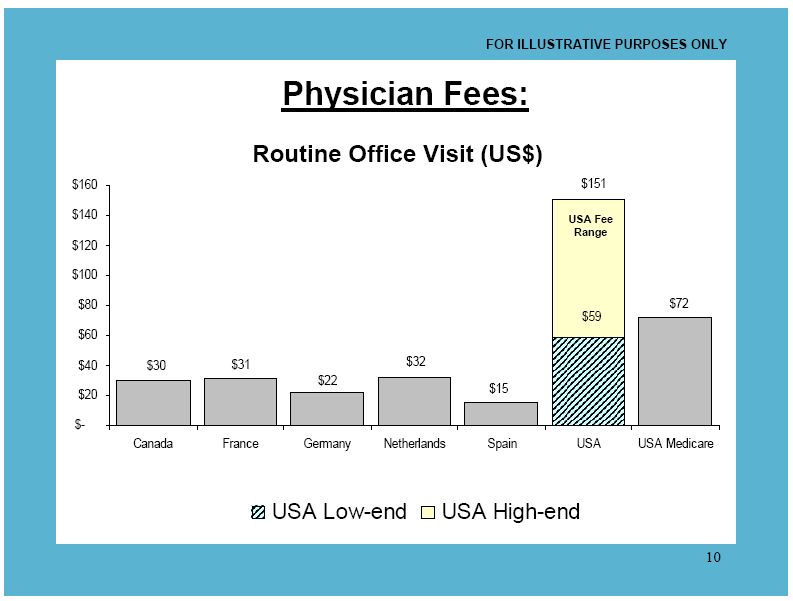
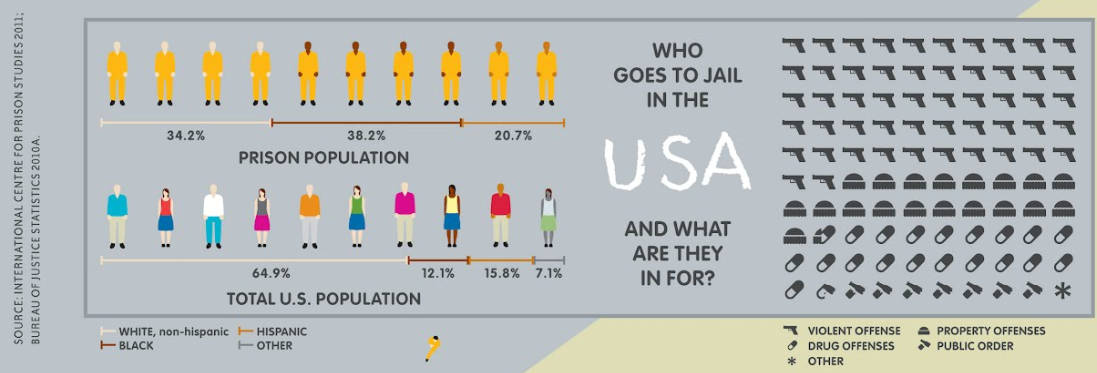
U.S. presidential candidate Mitt Romney recently traveled to Britain, Israel, and Poland, presumably to shore up his foreign policy credentials. Among a number of other statements that got a lot of attention, Romney praised Israel’s health care system, comparing it positively to the U.S. He stressed the cost differences, pointing out that Israel spends significantly less of its GDP on health care. This drew media attention because Israel has universal coverage provided by the state, and the glowing statements seemed a little odd in light of the Republicans’ opposition to the Affordable Care Act and the demonizing of the program as socialism.

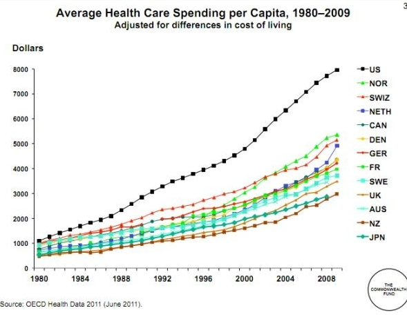
But all that aside, how much do Americans spend on health care? Well…a lot. Elizabeth McM. sent us a link to a story at The Atlantic comparing U.S. medical spending to a number of other nations:

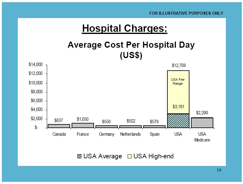
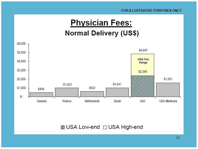
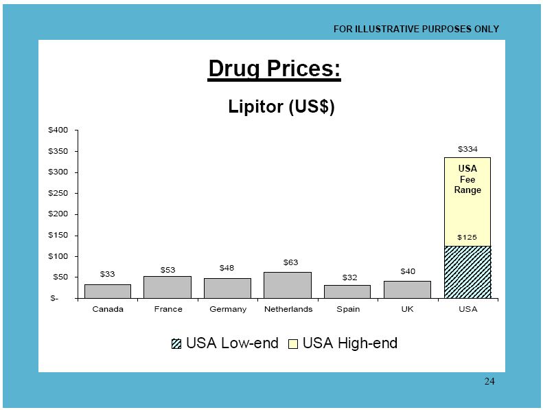
What are we spending it on? Hospital care is the single largest expense, followed by the cost of doctor/clinic visits. Another 10% is prescription drugs. The remainder falls into a variety of categories:

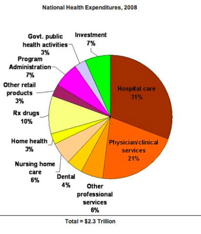
With overall spending distributed among so many different sectors of the health care sector, reducing costs requires more than just increased efficiency by hospitals or lowered drug costs — it requires changes and savings throughout the system.

Cross-posted at Reports from the Economic Front.

The Pew Research Center recently published a report titled “Pervasive Gloom About the World Economy.” The following two charts come from Chapter 4 which is called “The Causalities: Faith in Hard Work and Capitalism.”

The first suggests that the belief that hard work pays off remains strong in only a few countries: Pakistan (81%), the U.S. (77%), Tunisia (73%), Brazil (69%), India (67%) and Mexico (65%). The low scores in China, Germany, and Japan are worth noting. This is not to say that people everywhere are not working hard, just that many no longer believe there is a strong connection between their effort and outcome.

The second chart highlights the fact that growing numbers of people are losing faith in free market capitalism.  Despite mainstream claims that “there is no alternative,” a high percentage of people in many countries do not believe that the free market system makes people better off.

GlobeScan polled more than 12,000 adults across 23 countries about their attitudes towards economic inequality and, as the chart below reveals, the results were remarkably similar to those highlighted above.  In fact, as GlobeScan noted, “In 12 countries over 50% of people said they did not believe that the rich deserved their wealth.

It certainly seems that large numbers of people in many different countries are open to new ways of organizing economic activity.

Martin Hart-Landsberg is a professor of economics at Lewis and Clark College. You can follow him at Reports from the Economic Front.

Cross-posted at Reports from the Economic Front.

The Supreme Court has ruled favorably on the legality of the Affordable Care Act.  Actually, despite its name, the Act has more to do with extending and attempting to improve private health insurance coverage than it does with improving care or reducing its cost.

Unfortunately for us, the effort to improve our health care system has remained within bounds set by the needs of private health care providers and insurers.  As President Obama made clear from the start of his push for health care reform, there would be no consideration of a universal system.

Critics of such a universal system are always quick to argue that only market forces driven by the private pursuit of profit can ensure an efficient health care system.  Of course, in determining whether this is true, we need to recognize that efficiency is a complex term and that our health care system, like all systems, produces multiple outcomes.  The most obvious ones are private profit as well as the quality and cost of the relevant health care.

In terms of private profit there can be no doubt that our health care system functions well.  However, the story is quite different if we evaluate it in terms of quality and cost.  The fact that we continue to embrace a private health care system makes clear which measures of efficiency are considered most important and by whom.

The following map shows the countries, colored green, that have adopted a universal health care system.

mf-healthcaremap-p-thumb-615x314-91612.jpg

As Max Fisher explains:

What’s astonishing is how cleanly the green and grey separate the developed nations from the developing, almost categorically. Nearly the entire developed world is colored, from Europe to the Asian powerhouses to South America’s southern cone to the Anglophone states of Australia, New Zealand, and Canada. The only developed outliers are a few still-troubled Balkan states, the Soviet-style autocracy of Belarus, and the U.S. of A., the richest nation in the world.

The handful of developing countries that provide universal access to health care include oil-rich Saudi Arabia and Oman, Latin success story Costa Rica, Kyrgyzstan, and, famously, Cuba, among a few others. A number of countries have attempted universal health care but failed, such as South Africa, which maintains a notoriously inefficient and troubled public plan to complement the private plans popular among middle- and upper-class citizens…

That brings us to another way that America is a big outlier on health care. The grey countries on this map tend to spend significantly less per capita on health care than do the green countries — except for the U.S., where the government spends way more on health care per person than do most countries with free, universal health care. This is also true of health care costs as a share of national GDP — in other words, how much of a country’s money goes into health care.

The OECD just published a major study on the health care systems of its 34 member nations.  It found that:

 Health spending accounted for 17.6% of GDP in the United States in 2010, down slightly from 2009 (17.7%) and by far the highest share in the OECD, and a full eight percentage points higher than the OECD average of 9.5%. Following the United States were the Netherlands (at 12.0% of GDP), and France and Germany (both at 11.6% of GDP).

The United States spent 8,233 USD on health per capita in 2010, two-and-a-half times more than the OECD average of 3,268 USD (adjusted for purchasing power parity). Following the United States were Norway and Switzerland which spent over 5,250 USD per capita. Americans spent more than twice as much as relatively rich European countries such as France, Sweden and the United Kingdom.

combined1.jpg
What does all of this mean in terms of health outcomes?  According to the OECD report:

Most OECD countries have enjoyed large gains in life expectancy over the past decades. In the United States, life expectancy at birth increased by almost 9 years between 1960 and 2010, but this is less than the increase of over 15 years in Japan and over 11 years on average in OECD countries. As a result, while life expectancy in the United States used to be 1½ year above the OECD average in 1960, it is now, at 78.7 years in 2010, more than one year below the average of 79.8 years. Japan, Switzerland, Italy and Spain are the OECD countries with the highest life expectancy, exceeding 82 years.

One possible explanation for this lagging performance, highlighted in an earlier OECD report, is that the U.S. ranked 26th in terms of the number of practicing physicians relative to its population, 29th in terms of the number of doctor consultations per capita, 29th in terms of the number of hospital beds per capita, and 29th in terms of the average length of hospital stay.  At the same time, the “U.S. health system does do a lot of interventions… it has a lot of expensive diagnostic equipment, which it uses a lot. And it does a lot of elective surgery — the sort of activities where it is not always clear cut about whether a particular intervention is necessary or not.”

Private health care providers and insurers are clear about how they measure health care efficiency.  And as long as we rely on them to set the terms of the debate we will continue to suffer the consequences.

In a previous post I discussed how the U.S. became more religious in the 1950s, in part in response to its the Cold War enemies (atheist communists).  In fact, the U.S. is among the most religious countries in the world.  Using data from the International Social Survey Programme, Sociologist Tom Smith paints wildly different religious portraits of 28 nations (full text).

When asked whether they “know that God really exists and… have no doubt about it,” 61% of Americans say “yes.”  Of the 28 nations studied, only four were more likely to say “yes” to this question: Poland, Israel, Chile, and the Philippines. Here’s how we look compared to similar countries:

Here’s all 28 in rank order (borrowed from LiveScience).  Notice how wide the divergence is.  In Japan, the least religious country according to this measure, only 4% say they have no doubt God exists.  In The Philippines, 84% have no doubt.

% Have No Doubt God Exists:

  • Japan: 4.3 percent
  • East Germany: 7.8 percent
  • Sweden: 10.2
  • Czech Republic: 11.1
  • Denmark: 13.0
  • Norway: 14.8
  • France: 15.5
  • Great Britain: 16.8
  • The Netherlands: 21.2
  • Austria: 21.4
  • Latvia: 21.7
  • Hungary: 23.5
  • Slovenia: 23.6
  • Australia: 24.9
  • Switzerland: 25.0
  • New Zealand: 26.4
  • West Germany: 26.7
  • Russia: 30.5
  • Spain: 38.4
  • Slovakia: 39.2
  • Italy: 41.0
  • Ireland: 43.2
  • Northern Ireland: 45.6
  • Portugal: 50.9
  • Cyprus: 59.0
  • United States: 60.6
  • Poland: 62.0
  • Israel: 65.5
  • Chile: 79.4
  • The Philippines: 83.6

Americans are also particularly likely to believe in a “personal God,” one who is closely attentive to the lives of each and every person.

Quite interestingly, the U.S. is in the minority in that Americans tend to become increasingly religious as they age.  In most countries, people become less religious over time.  This graph (confusingly labeled), shows changes in DISbelief over the life course.  The U.S. is the only country among these in which disbelief declines:

Lifetime Change in Religiosity (from increase in disbelief to increase in belief):

  • The Netherlands: -14.0
  • Spain: -12.4
  • Australia: -12.0
  • France: -11.3
  • Norway: -11.0
  • Great Britain: -10.1
  • Switzerland: -8.2
  • Germany (East): -6.9
  • Denmark: -6.1
  • Czech Republic: -5.5
  • Sweden: -5.5
  • Germany (West): -5.4
  • New Zealand: -4.0
  • Italy: -2.7
  • Poland: -1.8
  • Japan: -1.5
  • Ireland: -0.9
  • Chile: +0.1
  • Cyprus: +0.2
  • Portugal: +0.6
  • The Philippines: +0.8
  • Hungary: +1.0
  • Northern Ireland: +1.0
  • United States: +1.4
  • Israel: +2.6
  • Slovakia: +5.6
  • Slovenia: +8.5
  • Latvia: +11.9
  • Russia: +16.0

Rates of atheism — a strong disbelief in God — also vary tremendously.  East Germany is the most atheist, with more than half of citizens claiming disbelief.  The country is a stark contrast to the atheist among them, Poland and the U.S. (only 3% atheist), Chile and Cyprus (2%), and The Phillipines (1%).

% Atheist:

  • East Germany: 52.1
  • Czech Republic: 39.9
  • France: 23.3
  • The Netherlands: 19.7
  • Sweden: 19.3
  • Latvia: 18.3
  • Great Britain: 18.0
  • Denmark: 17.9
  • Norway: 17.4
  • Australia: 15.9
  • Hungary: 15.2
  • Slovenia: 13.2
  • New Zealand: 12.6
  • Slovakia: 11.7
  • West Germany: 10.3
  • Spain: 9.7
  • Switzerland: 9.3
  • Austria: 9.2
  • Japan: 8.7
  • Russia: 6.8
  • Northern Ireland: 6.6
  • Israel: 6.0
  • Italy: 5.9
  • Portugal: 5.1
  • Ireland: 5.0
  • Poland: 3.3
  • United States: 3.0
  • Chile: 1.9
  • Cyprus: 1.9
  • The Philippines: 0.7

As a post-9/11 American watching another election cycle, I can’t help but notice how so much of our rhetoric revolves — sometimes overtly and sometimes not — around people who are the wrong religion.  Notably, Muslims.  And yet, the U.S. and many Muslim countries are alike in being strongly religious, at least in comparison to the many strongly secular countries.

This is odd because stands in contrast to recent data on American attitudes.  Within the U.S., people express much less tolerance for atheists than they do Muslims (homosexuals, African Americans, and immigrants). Weirdly, we think we have more in common with more secular nations like Great Britain than we do with countries like Pakistan or Saudi Arabia. In certain ways, the opposite might be true.

Thanks to Claude Fischer for the graphs.  Fischer, a sociologist at UC Berkeley, is the author of Made in America: A Social History of American Culture and Character.

Lisa Wade, PhD is an Associate Professor at Tulane University. She is the author of American Hookup, a book about college sexual culture; a textbook about gender; and a forthcoming introductory text: Terrible Magnificent Sociology. You can follow her on Twitter and Instagram.

Cross-posted at Montclair SocioBlog.

In case you wondered about what we in the U.S. pay for health care compared with those unfree unfortunates who suffer under various forms of socialized medicine, here are some graphs from 2009 showing the advantages of what is sometimes called “the best health care system in the world.”

The graphs are from the International Federation of Health Plans. I’ve selected only four — to show the relative costs* of

  • an office visit
  • a day in the hospital
  • a common procedure (childbirth without complications)
  • a widely used drug (Lipitor)

You can download all the charts here, but be warned: it gets boring. We’re number one in every chart, at least in this one category of how much we shell out.

Since we have the best health care in the world, this must mean that you get what you pay for. Our Lipitor must be four to ten times as good as the Lipitor that Canadians take.

Hat tip: Ezra Klein.

———————–

*These amounts are what providers are paid by governments or other insurers, not what the patient pays, which in many Eurpean countries is essentially nothing. See the footnotes for the tables in the original document. Or look at the comments on this at Boing Boing, a discussion which is remarkably civil (do they monitor comments?).

Norton Sociology recently posted an image that illustrate differences in rates of imprisonment in a number of countries. Imprisonment rates are influenced by a number of factors — what is made illegal, how intense law enforcement efforts are, preference for prison time over other options, etc. The U.S. does not compare favorably, with 74.3 per 100,000 10,000 of our population behind bars (click here for a version you can zoom in on, and sorry for the earlier typo!):

Here’s a close-up of the breakdown of the U.S. prison population:

Via Urban Demographics.

The Paris School of Economics has posted a database, compiled by Facundo Alvaredo, Tony Atkinson, Thomas Piketty, and Emmanuel Saez, of the distribution of top incomes in a number of nations, with more on the way. Using income tax records, they provide a quick glance at concentration of income among the wealthy over decades (and in some cases, data extends back over a century). As the authors point out, there are limitations to using tax info to measure inequality, so it’s important to be aware of the limitations of this data series. Most obviously, individuals may take steps to hide their income to evade taxes, and the very wealthy may be particularly able to do so through the use of tax havens, etc. Also, tax policies change, so what counts as “income” at one point might not at another. The authors also had to contend with differences in the taxation unit (households vs. individuals) in different countries to provide some level of comparability.

The database allows you to select a country, a time period, and a variable (top 5% income share, etc.), and get a table showing the results for all years in which data were available. Here, for instance, is part of the table for the share of income earned by the top 1% in Singapore:

Of course, this includes only data on income. In many countries, including the U.S., wealth (value of all assets) is significantly more concentrated than income.

Looking at the dataset, you can see patterns over time. For instance, here’s part of the data from the U.S. (notice there are time gaps between the end of each column and the beginning of the next–I was just grabbing some illustrative screencaps), showing how the percent of income earned by the top 0.1% decreased significantly starting in the 1940s, but began creeping up again by the late 1980s and has grown since then:

The site also allows you to create graphs. They provide a comparison of the share of income earned by the top 1% in 2005 in the U.S., Japan, Australia, and France, but you can look at data for individual nations:

It’s worth playing around a bit, but keeping in mind the caveats about what these data do and don’t tell us. Thanks to Shamus Khan for the tip!

A recent post on Boing Boing discussed the newly discovered “rules for jazz performers during the Nazi occupation.”  Jewish and Black people — two groups targeted by the Nazis — were also the primary innovators of jazz music. But even as the German state denigrated jazz, jazz musicians, and swing dancers, Nazi soldiers loved jazz!  How to handle such a contradiction? Rules for playing jazz music: no “Jewishy gloomy lyrics,”  no “Negroid excesses in tempo,” and no “hysterical rhythmic reverses characteristic of the barbarian races.”  

It’s well worth a look, as is this post from 2010 explaining how many groups vilified by Nazis survived the Holocaust by playing jazz for Nazi soldiers…

————————–

I have a favorite historical musician: Django Reinhardt.

Reinhardt was a Roma jazz musician. During World War II both Roma and jazz musicians were targeted by the Nazi regime. Over a million Roma were exterminated for presumed racial inferiority and jazz was believed to combine the worst of Blacks and Jews (i.e., “musical race defilement”). Just listening to a jazz record could get you sent to a concentration camp.

Reinhardt, however, enjoyed the most lucrative period of his career during the war, while living and playing openly among Nazi soldiers.

How?

Reinhardt biographer Michael Dregni, recently interviewed by NPR, explained:

The Germans used Paris basically as their rest-and-relaxation center, and when the soldiers came, they wanted wine and women and song. And to many of them, jazz was the popular music, and Django was the most famous jazz musician in Paris… And it was really a golden age of swing in Paris, with these [Romas] living kind of this grand irony.

Reinhardt, then, survived because the Nazis loved jazz music, even as Hitler censored the music and, on his orders, people who dared to listen to, dance to, or play it were encamped and members of the groups who invented it were murdered.  Irony indeed.

For more on Reinhardt, jazz, and World War II, here is a clip from a documentary on Reinhardt’s remarkable talent, career, and luck:

—————————

UPDATE: A commenter, Bernardo Soares, offered an interesting critique/clarification in the thread.  Here’s part of what he had to say:

…I think it is grossly misleading to write that Reinhardt “enjoyed the most lucrative period of his career during the war”. He enjoyed the protection of some individuals in the German occupation force. This is not so unusual — the composer Richard Strauss who headed the Reichsmusikkammer used his influence to protect some Jewish composers. But as many other examples show, this was extremely precarious. As long as these individuals had the power to protect him, he was probably relatively safe, but he could still be shot by any soldier at a whim or be accidentally included in a deportation action. Also, these individuals could lose their power, or some higher-ranking officer could order him to be deported. Reinhardt tried several times to escape occupied France.

[Also] …the whole issue of music and art politics in the Third Reich is much more complex than stated in the video. The Reichsmusikkammer (Reich Music Chamber) was not the only institution regulating music politics. As with many other bureaucratic institutions in the Third Reich, several agencies struggled for influence and power. This means that music politics was often contradictory, and the absence of a clear regulation as stated in the video opened the door for arbitrary measures – again emphasizing the precarious situation of musicians. The competition and struggle for power between different agencies led to a radicalisation of racial and cultural politics, and this was even taken further in the occupied countries.

I do love this topic.  I also have a post on racial borrowing and lindy hop, the dance that made me love Django.  A paper I wrote about gender and lindy hop can be found in the journal Ethnography. And I have a talk based on the paper that I love to give in theory classes.

Lisa Wade, PhD is an Associate Professor at Tulane University. She is the author of American Hookup, a book about college sexual culture; a textbook about gender; and a forthcoming introductory text: Terrible Magnificent Sociology. You can follow her on Twitter and Instagram.