nation: Ethiopia

Katrin sent us a link to a image at GOOD that illustrates the geopolitics of first-person shooter video games. The image was created by a group at Complex to illustrate the way that the changing actual political landscape can be seen in the nationality of villains in video games. Peter Rubin, of Complex, explains, “Gone are the days of all FPSes being either World War II or sci-fi; in the new milennium, developers are on the hunt for enemies that are speculative but still plausible.”

They looked at 20 FPS games from the past decade (unfortunately, they give no details about how those 20 games were chosen

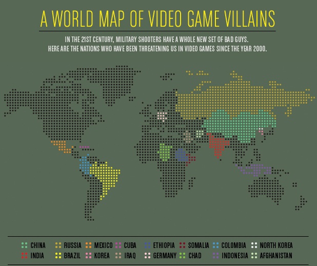
The selected titles:

Return to Castle Wolfenstein (2001): Germany
Tom Clancy’s Ghost Recon: Desert Siege (2002): Ethiopia
Tom Clancy’s Ghost Recon: Island Thunder (2003): Cuba
Delta Force: Black Hawk Down (2003): Somalia
Tom Clancy’s Ghost Recon: Jungle Storm (2004): Colombia
Tom Clancy’s Ghost Recon 2 (2004): North Korea
Joint Operations: Typhoon Rising (2004): Indonesia
Tom Clancy’s Ghost Recon 2: Summit Strike (2005): Afghanistan
Delta Force Xtreme (2005): Chad
Tom Clancy’s Ghost Recon: Advanced Warfighter (2006): Mexico
Call of Duty 4: Modern Warfare (2007): Russia/Afghanistan
Army of Two (2008): Somalia/Afghanistan/China/Iraq
Frontlines: Fuel of War (2008): Russia/China
Call of Duty: Modern Warfare 2 (2009): Russia/Afghanistan/Brazil
Operation Flashpoint: Dragon Rising (2009): China/Russia
Singularity (2010): Russia
MAG (2010): Russia/China/India
Army of Two: The 40th Day (2010): China
Homefront (2011): Korea (They don’t specify if it’s North or South Korea)
Operation Flashpoint: Red River (2011): China

Anyway, it provides a nice little illustration of the way that global politics seeps into this element of pop culture, as well as a snapshot of nations currently perceived as rivals or even enemies of the U.S. — a mixture of old tensions (Russia, Germany), ongoing anxiety about China, and emerging focal points.

As a member of a cattle-raising family, I hear a pretty steady stream of complaints about people eating less beef, which is variously attributed to a conspiracy against the American rancher (possibly by terrorists), the result of stupid city people who get all terrified over every little health concern (Mad Cow Disease is a myth! Unless it’s a terrorist plot to ruin ranching), environmentalists, animal rights activists, and me (I’ve been a vegetarian since 1996 and thus single-handedly nearly destroyed the beef industry).

The National Cattlemen’s Beef Association is similarly concerned about reduced beef consumption. And given that we frequently hear about the connections between red meat consumption and health concerns such as heart disease, and are advised to substitute white meat for red meat (to the point that the pork industry began branding pork as “the other white meat”), you’d probably expect to see a dramatic decline in consumption of beef.

And we do see a decline, but not as much as you might expect, as this graph from the Freakonomics blog, sent in by Dmitriy T.M. and Bryce M. (a student at Rensselaer Polytechnic Institute), illustrates:

Clearly beef consumption has declined since its peak in the late 1970s, when people in the U.S. ate nearly 90 pounds of beef each per year, to closer to 60 lbs. each today. On the other hand, all those health warnings, disease scares, and environmentalist-vegetarian terrorist plots haven’t yet knocked beef out of its position as the most-eaten meat in the U.S. Clearly, chicken seems poised to take over that position, but beef doesn’t exactly appear to be falling off the charts.

So how do we compare to other countries in terms of overall meat consumption? In a 2003 article in the Journal of Nutrition, Andrew Speedy provided data on global meat consumption (defined as “beef and buffalo, sheep and goat, pig meat and poultry”) — note it’s in kilograms, not pounds, and the legend should be read across, not down (so the first bar is for the U.S., the second is for France, and so on):

So insofar as there has been a decrease in beef consumption in the U.S., and more dramatic increase in chicken consumption: what’s going on? The Freakonomics article presents an explanation:

A study by the agricultural economists James Mintert, Glynn Tonsor, and Ted Schroeder found that for every 1 percent increase in female employment, beef consumption sank by .6 percent while chicken consumption rose by .6 percent. Why? Probably because beef takes longer than chicken to prepare, and because poultry producers did a good job marketing cheap and ready-to-cook chicken products. Furthermore, all those working women meant more household income, which meant more families eating in restaurants — where meals are less likely to contain beef than meals at home.

Health concerns do play a part; the authors found that negative media coverage of beef (either recalls due to contamination or general links to heart disease, etc.) reduced consumption, while positive coverage that linked eating meat to getting iron, zinc, and other minerals increased it. But they found that health effects were small compared to the effects of changing family dynamics — that is, women working outside the home and families eating fewer meals at home.

It’s a nice example of how the factors driving social changes are often much more complex than we’d expect. Common sense explanations of changes in beef consumption would, I think, a) overestimate how much less beef Americans eat than in the past and b) assume the major driving factors to be health-related concerns, whether about chronic disease or recalls. Yet it turns out a major aspect of the story is a structural change that doesn’t seem clearly connected at all.

I guess if I were a health advocate hoping people in the U.S. were starting to listen to messages about healthy eating, that might depress me. But I guess I can tell my grandma that the terrorists’ evil plans to infect U.S. cattle herds with Mad Cow or some other disease might not be as catastrophic as they might imagine.

UPDATE: As a couple of readers point out, the increase in chicken consumption can’t be explained just as a result of people eating chicken when they otherwise would have eaten beef; the drop in beef consumption is way overshadowed by the increase in how much chicken people eat. The total amount of all meat eaten each year has increased dramatically.

I don’t know what is driving all of that change, but I suspect a lot of it is marketing campaigns — not just directly to consumers, but efforts by industry groups and the USDA to get more meat into a wide variety of items at grocery stores and on restaurant menus, as they have done with cheese.

Teresa C. sent in this image created using UNICEF data to show what percent of women surveyed in various countries said it was acceptable for their husbands to hit them:

international-womens-attitudes-towards-domestic-v-28079-1250786064-13

(Found at BuzzFeed.)

You can find the data and a breakdown of UNICEF data collection methods here. The data for many more countries are available there too. I can’t quite figure out why these particular countries were used in the image; they aren’t all of the countries with the highest percentages. As far as I can tell, the UNICEF data table only includes numbers for the “developing” nations and some countries from eastern Europe, which is UNICEF’s focus. But I do wonder what the numbers would be if you asked women in the U.S. a question along the lines of “is it ever acceptable for a man to hit a woman?” or “can you think of any situation where it might be understandable that a man would hit his wife or girlfriend?” You might get higher “support” for violence against women than you’d think. The UNICEF page doesn’t provide the wording of this question, which would be interesting to know.

That’s not to downplay the issue of women justifying or accepting violence against women, just that those of us in the “developed” nations need to be sure not to pat ourselves on the back too much about how enlightened we are about domestic violence.

And I can’t help but dislike the image, in that at first glance it would appear to be a pie chart in which all of the sections add up to 100%; really a bar graph would be a better way to illustrate this. But then, I had a dissertation advisor with a 5-page single-spaced document outlining his standards for data presentation.

UPDATE: Reader P. makes the point I was getting at above (that the wording might greatly impact how much “support” you find for violence against women) much better than I did:

What they were actually asked, in the MICS and the DHS (the two primary sources for the data), was this question:

“Sometimes a husband is annoyed or angered by things that his wife does.  In your opinion, is a husband justified in hitting or beating his wife in the following situations:

– If she goes out with out telling him?
– If she neglects the children?
– If she argues with him?
– If she refuses sex with him?
– If she burns the food?”

I bet you get very different rates for different “justifications,” which is important both for data-gathering/presentation and for anti-domestic violence campaigns. And, again, I bet if you broke down various “reasons” for hitting a woman, I bet you’d get higher-than-expected acceptance of them in countries in the “developed” countries that weren’t presented in the table.