nation: Canada

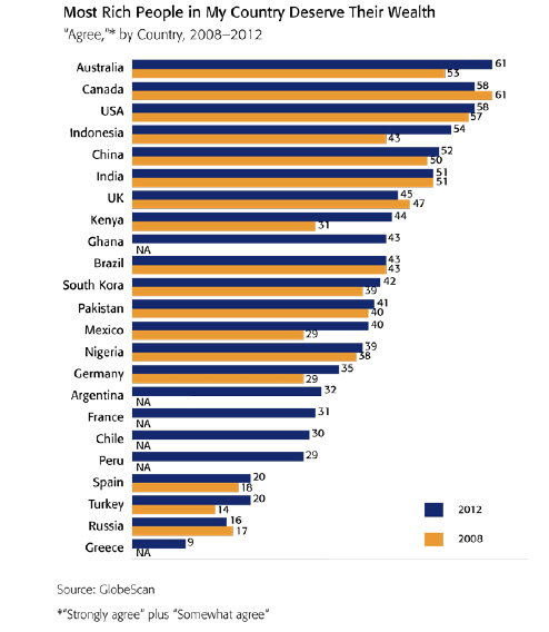
An emerging controversy in Canada is a good example of just how difficult it is to be racially-neutral when the context is racially-charged.  The country recently redesigned its money.  On the back of the $100 dollar bill celebrating medical innovation they sketched an Asian-appearing woman looking into a microscope.  In a focus group in Quebec, people complained that the bill reproduced the stereotype that Asians pursue careers in science and medicine.  The Vancouver Sun reports:

“Some have concerns that the researcher appears to be Asian,” says a 2009 report commissioned by the bank from The Strategic Counsel… “Some believe that it presents a stereotype of Asians excelling in technology and/or the sciences. Others feel that an Asian should not be the only ethnicity represented on the banknotes. Other ethnicities should also be shown.”

A few even said the yellow-brown colour of the $100 banknote reinforced the perception the woman was Asian, and “racialized” the note.

The Canadian government responded that they had never intended the woman to appear “ethnic” and ordered the image re-sketched so it would be more racially “neutral.”  

They were then accused of being prejudiced again. Mu-Qing Huang, a Chinese-Canadian interviewed for the story, objected to the deletion of the figure’s Asian features:

If Canada is truly multicultural and thinks that all cultural groups are equal, then any visible minority should be good enough to represent a country, including (someone with) Asian features.

This is a tricky problem.  By including racial or ethnic minorities on their bills, Canada risks reproducing a stereotype.  Including all “neutral” figures can be seen as exclusionary because neutral looks suspiciously like White people in a country dominated by White people.  The third option is to deliberately break stereotypes by putting, say, an Asian woman running the hurdles and a Black woman looking through a microscope, but this can seem overly contrived (as many attempts at diversity do).

The truth is that all of Canada’s options can be read in racially-charged ways.  This isn’t because people are unfairly reading into the sketches, it’s because life in Canada is, in fact, racially-charged.  When race matters, it matters, all claims to colorblindness aside.

Thanks to Craig G., Tom Megginson, Jesse, Helen, and Alex, an MLIS from McGill, for the submission!

Lisa Wade, PhD is an Associate Professor at Tulane University. She is the author of American Hookup, a book about college sexual culture; a textbook about gender; and a forthcoming introductory text: Terrible Magnificent Sociology. You can follow her on Twitter and Instagram.

In subarctic climates — ones in which the mean annual temperature is below 32° — the soil is frozen all year round.  It’s damn cold, but a nice base on which to build.  Until climate change starts melting the permafrost, of course.

These two now crooked buildings can be found in Dawson City, Canada.  Carleton University geographers have shown that the average temperatures have been increasing, melting the permafrost, and destabilizing the town.

This image reminds me that I am only barely beginning to understand climate change and its consequences.  How we will pay for climate change, and who will do so, is something I suspect I’ll learn much more about in the coming years.

Via Boing Boing.

Lisa Wade, PhD is an Associate Professor at Tulane University. She is the author of American Hookup, a book about college sexual culture; a textbook about gender; and a forthcoming introductory text: Terrible Magnificent Sociology. You can follow her on Twitter and Instagram.

U.S. presidential candidate Mitt Romney recently traveled to Britain, Israel, and Poland, presumably to shore up his foreign policy credentials. Among a number of other statements that got a lot of attention, Romney praised Israel’s health care system, comparing it positively to the U.S. He stressed the cost differences, pointing out that Israel spends significantly less of its GDP on health care. This drew media attention because Israel has universal coverage provided by the state, and the glowing statements seemed a little odd in light of the Republicans’ opposition to the Affordable Care Act and the demonizing of the program as socialism.

But all that aside, how much do Americans spend on health care? Well…a lot. Elizabeth McM. sent us a link to a story at The Atlantic comparing U.S. medical spending to a number of other nations:

What are we spending it on? Hospital care is the single largest expense, followed by the cost of doctor/clinic visits. Another 10% is prescription drugs. The remainder falls into a variety of categories:

With overall spending distributed among so many different sectors of the health care sector, reducing costs requires more than just increased efficiency by hospitals or lowered drug costs — it requires changes and savings throughout the system.

Cross-posted at Reports from the Economic Front.

The Pew Research Center recently published a report titled “Pervasive Gloom About the World Economy.” The following two charts come from Chapter 4 which is called “The Causalities: Faith in Hard Work and Capitalism.”

The first suggests that the belief that hard work pays off remains strong in only a few countries: Pakistan (81%), the U.S. (77%), Tunisia (73%), Brazil (69%), India (67%) and Mexico (65%). The low scores in China, Germany, and Japan are worth noting. This is not to say that people everywhere are not working hard, just that many no longer believe there is a strong connection between their effort and outcome.

The second chart highlights the fact that growing numbers of people are losing faith in free market capitalism.  Despite mainstream claims that “there is no alternative,” a high percentage of people in many countries do not believe that the free market system makes people better off.

GlobeScan polled more than 12,000 adults across 23 countries about their attitudes towards economic inequality and, as the chart below reveals, the results were remarkably similar to those highlighted above.  In fact, as GlobeScan noted, “In 12 countries over 50% of people said they did not believe that the rich deserved their wealth.

It certainly seems that large numbers of people in many different countries are open to new ways of organizing economic activity.

Martin Hart-Landsberg is a professor of economics at Lewis and Clark College. You can follow him at Reports from the Economic Front.

Cross-posted at Reports from the Economic Front.

The Supreme Court has ruled favorably on the legality of the Affordable Care Act.  Actually, despite its name, the Act has more to do with extending and attempting to improve private health insurance coverage than it does with improving care or reducing its cost.

Unfortunately for us, the effort to improve our health care system has remained within bounds set by the needs of private health care providers and insurers.  As President Obama made clear from the start of his push for health care reform, there would be no consideration of a universal system.

Critics of such a universal system are always quick to argue that only market forces driven by the private pursuit of profit can ensure an efficient health care system.  Of course, in determining whether this is true, we need to recognize that efficiency is a complex term and that our health care system, like all systems, produces multiple outcomes.  The most obvious ones are private profit as well as the quality and cost of the relevant health care.

In terms of private profit there can be no doubt that our health care system functions well.  However, the story is quite different if we evaluate it in terms of quality and cost.  The fact that we continue to embrace a private health care system makes clear which measures of efficiency are considered most important and by whom.

The following map shows the countries, colored green, that have adopted a universal health care system.

mf-healthcaremap-p-thumb-615x314-91612.jpg

As Max Fisher explains:

What’s astonishing is how cleanly the green and grey separate the developed nations from the developing, almost categorically. Nearly the entire developed world is colored, from Europe to the Asian powerhouses to South America’s southern cone to the Anglophone states of Australia, New Zealand, and Canada. The only developed outliers are a few still-troubled Balkan states, the Soviet-style autocracy of Belarus, and the U.S. of A., the richest nation in the world.

The handful of developing countries that provide universal access to health care include oil-rich Saudi Arabia and Oman, Latin success story Costa Rica, Kyrgyzstan, and, famously, Cuba, among a few others. A number of countries have attempted universal health care but failed, such as South Africa, which maintains a notoriously inefficient and troubled public plan to complement the private plans popular among middle- and upper-class citizens…

That brings us to another way that America is a big outlier on health care. The grey countries on this map tend to spend significantly less per capita on health care than do the green countries — except for the U.S., where the government spends way more on health care per person than do most countries with free, universal health care. This is also true of health care costs as a share of national GDP — in other words, how much of a country’s money goes into health care.

The OECD just published a major study on the health care systems of its 34 member nations.  It found that:

 Health spending accounted for 17.6% of GDP in the United States in 2010, down slightly from 2009 (17.7%) and by far the highest share in the OECD, and a full eight percentage points higher than the OECD average of 9.5%. Following the United States were the Netherlands (at 12.0% of GDP), and France and Germany (both at 11.6% of GDP).

The United States spent 8,233 USD on health per capita in 2010, two-and-a-half times more than the OECD average of 3,268 USD (adjusted for purchasing power parity). Following the United States were Norway and Switzerland which spent over 5,250 USD per capita. Americans spent more than twice as much as relatively rich European countries such as France, Sweden and the United Kingdom.

combined1.jpg
What does all of this mean in terms of health outcomes?  According to the OECD report:

Most OECD countries have enjoyed large gains in life expectancy over the past decades. In the United States, life expectancy at birth increased by almost 9 years between 1960 and 2010, but this is less than the increase of over 15 years in Japan and over 11 years on average in OECD countries. As a result, while life expectancy in the United States used to be 1½ year above the OECD average in 1960, it is now, at 78.7 years in 2010, more than one year below the average of 79.8 years. Japan, Switzerland, Italy and Spain are the OECD countries with the highest life expectancy, exceeding 82 years.

One possible explanation for this lagging performance, highlighted in an earlier OECD report, is that the U.S. ranked 26th in terms of the number of practicing physicians relative to its population, 29th in terms of the number of doctor consultations per capita, 29th in terms of the number of hospital beds per capita, and 29th in terms of the average length of hospital stay.  At the same time, the “U.S. health system does do a lot of interventions… it has a lot of expensive diagnostic equipment, which it uses a lot. And it does a lot of elective surgery — the sort of activities where it is not always clear cut about whether a particular intervention is necessary or not.”

Private health care providers and insurers are clear about how they measure health care efficiency.  And as long as we rely on them to set the terms of the debate we will continue to suffer the consequences.

Cross-posted at Montclair SocioBlog.

In case you wondered about what we in the U.S. pay for health care compared with those unfree unfortunates who suffer under various forms of socialized medicine, here are some graphs from 2009 showing the advantages of what is sometimes called “the best health care system in the world.”

The graphs are from the International Federation of Health Plans. I’ve selected only four — to show the relative costs* of

  • an office visit
  • a day in the hospital
  • a common procedure (childbirth without complications)
  • a widely used drug (Lipitor)

You can download all the charts here, but be warned: it gets boring. We’re number one in every chart, at least in this one category of how much we shell out.

Since we have the best health care in the world, this must mean that you get what you pay for. Our Lipitor must be four to ten times as good as the Lipitor that Canadians take.

Hat tip: Ezra Klein.

———————–

*These amounts are what providers are paid by governments or other insurers, not what the patient pays, which in many Eurpean countries is essentially nothing. See the footnotes for the tables in the original document. Or look at the comments on this at Boing Boing, a discussion which is remarkably civil (do they monitor comments?).

Norton Sociology recently posted an image that illustrate differences in rates of imprisonment in a number of countries. Imprisonment rates are influenced by a number of factors — what is made illegal, how intense law enforcement efforts are, preference for prison time over other options, etc. The U.S. does not compare favorably, with 74.3 per 100,000 10,000 of our population behind bars (click here for a version you can zoom in on, and sorry for the earlier typo!):

Here’s a close-up of the breakdown of the U.S. prison population:

Via Urban Demographics.

UPDATE:  Since posting this, I’ve discovered that the numbers do not accurately reflect the ratio of CEO vs. worker pay.  Writes PolitiFact:

We don’t doubt the chart’s underlying point that the ratio of CEO pay to worker pay is high in the United States, and is likely higher in our free-wheeling economy than it is in the historically more egalitarian nations of Europe.

But in its claim that the U.S. ratio is 475 to 1, the chart conveys a sense of certitude and statistical precision that simply isn’t warranted — and which is contradicted by the facts. The latest number for the U.S. is 185 to 1 in one study and 325 to 1 in another [though in previous years, those ratios have reached as high as 525 to 1] — and those numbers were not generated by groups that might have an ideological interest in downplaying the gaps between rich and poor. We rate the claim on the U.S. ratio False.

I apologize for not vetting this more carefully.

H/T KeepYourHopesUpHigh via GlobalSociologyBlog.

Lisa Wade, PhD is an Associate Professor at Tulane University. She is the author of American Hookup, a book about college sexual culture; a textbook about gender; and a forthcoming introductory text: Terrible Magnificent Sociology. You can follow her on Twitter and Instagram.