nation: Britain/the U.K.

The United States is a nation of immigrants… in that the majority of its citizens are not part of the native population of North America.  In other words, because it was and remains a colonized land.

That aside, is the United States unique in receiving an extremely large number of new immigrants relative to its size?  It turns out, No.

Lane Kenworthy, at Consider the Evidence, posted this figure, showing that the U.S. population does indeed include a substantial proportion of first generation immigrants (both legal and illegal), but it is not unique in that regard, nor does it carry the highest percentage:

It also fails to be true, as many anti-immigration people claim, that the U.S. accepts a uniquely large number of immigrants who need help once they arrive:

Lisa Wade, PhD is an Associate Professor at Tulane University. She is the author of American Hookup, a book about college sexual culture; a textbook about gender; and a forthcoming introductory text: Terrible Magnificent Sociology. You can follow her on Twitter and Instagram.

One of the things that continually stuns me about the U.S. wars against Iraq and Afghanistan is how little the average American is expected to sacrifice. Yes, many Americans are losing loved ones in this war. Other than those immeasurable sacrifices, however, most Americans are not asked to change a thing about their lives.

In contrast, during World War II, Americans were asked to make significant sacrifices, changing their daily lives and consumption patterns. Carpooling, for example, to save gas and rubber and staying off the phones.

Vintage Ads posted another great example of government propaganda encouraging the average person to change their lives for the war effort. In this case, the propaganda is British and they implore citizens not to waste food:

U.S. propaganda and advertising similarly encouraged citizens (i.e., women) to save food and stretch their rations (both from 1943):

Images also found at Vintage Ads: here, and here.

Lisa Wade, PhD is an Associate Professor at Tulane University. She is the author of American Hookup, a book about college sexual culture; a textbook about gender; and a forthcoming introductory text: Terrible Magnificent Sociology. You can follow her on Twitter and Instagram.

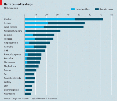
Katelyn G. sent in a link to a story at The Economist about a new study that attempted to measure the harmful effects, to both the user and to the U.K. more broadly, of a number of legal and illegal drugs. The methodology:

Members of the Independent Scientific Committee on Drugs, including two invited specialists, met in a 1-day interactive workshop to score 20 drugs on 16 criteria: nine related to the harms that a drug produces in the individual and seven to the harms to others. Drugs were scored out of 100 points, and the criteria were weighted to indicate their relative importance.

Harm to others included factors such as health care costs, family disruptions, social services, and the cost of criminal justice programs to regulate drugs.

The results? Alcohol outranked all illegal substances they considered by a significant margin, particularly in terms of the harm caused to others:

Will this lead to major changes in drug policy in the U.K.? Unlikely. Here’s a tidbit from an NPR story:

…last year in Britain, the government increased its penalties for the possession of marijuana. One of its senior advisers, David Nutt — the lead author on the Lancet study — was fired after he criticized the British decision.

“What governments decide is illegal is not always based on science,” said van den Brink. He said considerations about revenue and taxation, like those garnered from the alcohol and tobacco industries, may influence decisions about which substances to regulate or outlaw.

Life magazine offers a really neat set of photos of women soldiers, from many countries, during World War II.  Below are some of my favorites.

Women firefighters aim a hose at the fire after the attack on Pearl Harbor:

w1

A member of the Women’s Royal Naval Service (Britain):

w2

Italian resistance fighters:

w3

A member of the Finnish paramilitary:

w4

England’s first female military pilot: Pauline Gower:

w5

Chinese women soldiers:

w6

Via Shakesville.

Lisa Wade, PhD is an Associate Professor at Tulane University. She is the author of American Hookup, a book about college sexual culture; a textbook about gender; and a forthcoming introductory text: Terrible Magnificent Sociology. You can follow her on Twitter and Instagram.

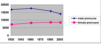
Dr. Paul Baker, a linguist at the University of Lancaster, sent us some graphs from his analysis of use of gendered language over time in the U.K. His data consisted of “four sets of data from written British English from 1931, 1961, 1991 and 2006 (a million words each)” — a full discussion of the methodology will be available in the forthcoming article in Gender and Language.*

First, Dr. Baker looked at use of male and female pronouns (he/his/him vs. she/hers/her) over time:

Clearly male pronouns are still used more than female ones, but the gap is narrowing. Baker found that though part of the reason is that male pronouns are more likely to be used generically to refer to everyone than female pronouns are, the major reason is that men are discussed more than women.

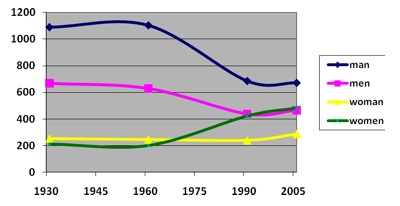
Here are the data specifically for the four words “man,” “men,” “woman,” and “women”:

Notice that the use of the plurals — “men”and “women” — have converged, though we still see higher usage of the male singular than of “woman.”

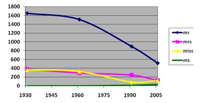
And finally, Dr. Baker looked at the usage of four gendered titles:

A large decrease, obviously, especially in the use of “Mr.,” but all have tapered off since the 1930s with the exception of “Ms.,” which never did really catch on. Baker argues that while some of the decrease may be due to attempts to use less sexist language, it’s more likely because of more informalization of society in general — titles of address often seem stiff and overly formal today.

Of course, this analysis just tells us the frequency with which these terms are used, not what is actually being said about men and women, a topic he addresses in the full article. But he concludes that the trend is rather encouraging for those who want to see more equal gender representation in terms of language.

* Baker, P. (2010) ‘Will Ms ever be as frequent as Mr? A corpus-based comparison of gendered terms across four diachronic corpora of British English.’ Gender and Language. Forthcoming.

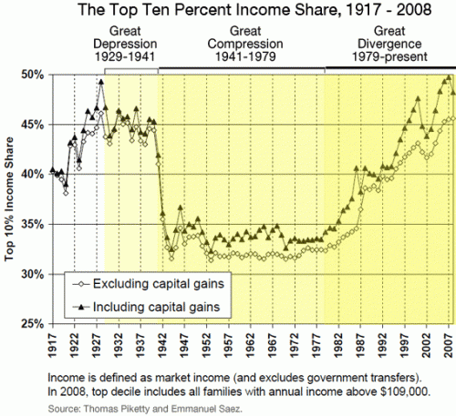
I’m back! I was in the middle of moving and just overwhelmed with everything. Anyway. Talking Points Memo posted a link to an article at Slate about income inequality in the U.S., and particularly the increasing proportion of total U.S. income earned by the very rich. Timothy Noah refers to the “great compression” as a time period when income concentration among top earners dropped significantly, and argues that in the past three decades we’ve seen a “great divergence,” with increasing income inequality hitting levels not seen since the Great Depression:

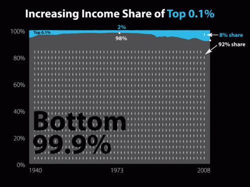
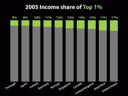
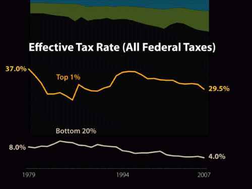
A slideshow accompanies the article, providing more info on the changes Noah discusses. A few examples (the slideshow provides the data source used to create each image):

Even among the very rich, we see increasing divergence, with the super-ultra rich, the top 0.1% of earners, now making 8% of all U.S. income:

A comparison to some other countries (I don’t know why these specific nations were chosen for the comparison):

Keep in mind, this data includes only income. Wealth — the worth of all assets, including retirement and savings accounts, stocks, homes, cars, and anything else of value — is much more unequally distributed.

Congress is about to be embroiled in a major debate about whether to extend the tax cuts on high incomes; as both sides weigh in, here’s some context to keep in mind:

The effective tax rate is what people actually pay, as opposed to what their tax rate theoretically is. While we’ve certainly seen a large drop since the late ’70s, Noah argues that, compared to other economic changes, the effective tax rate hasn’t affected the rise in income inequality much. It plays a role, yes, but changing the tax rate on the very rich doesn’t affect the overall distribution of income a huge amount, in part because the effective rate, what people end up actually paying, generally ends up being smaller than what they theoretically owe based on the stated tax rate, once you take into account deductions, write-offs, loopholes, and so on.

So…happy post-Labor Day!

Claude Fischer at Made in America offered some data speaking to the idea that Americans are especially patriotic. That they, in other words, are more likely than citizens of other nations to think that “We’re Number One!”

Fischer provides some evidence by Tom Smith at the International Social Science Programme (ISSP; Tom’s book).  The ISSP, Fischer explains…

…involves survey research institutions in dozens of countries asking representative samples of their populations the same questions. A couple of times the ISSP has had its members ask questions designed to tap respondents’ pride in their countries… One set of questions asked respondents how much they agreed or disagreed with five statements such as “I would rather be a citizen of [my country] than of any other country in the world” and “Generally, speaking [my country] is a better country than most other countries.”

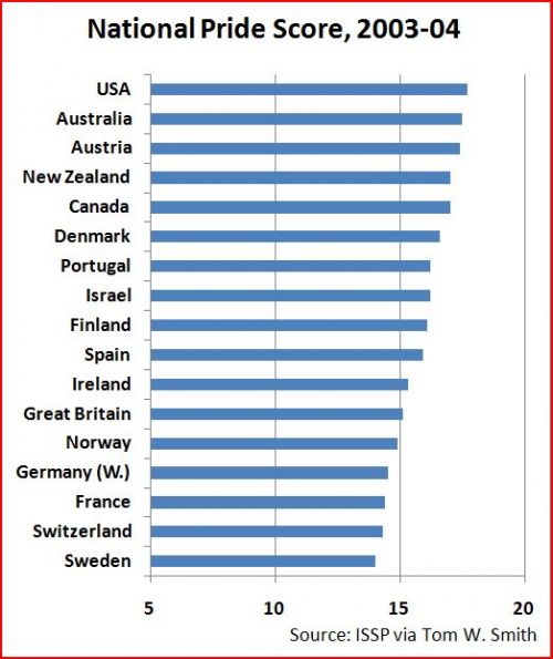
Smith put responses on a scale from 5 to 25, with 25 being the most patriotic.  Here are the results from some of the affluent, western democracies (on a shortened scale of 5 to 20):

As Fischer says, “Americans were #1 in claiming to be #1.”  Well, sort of.  Americans were the most patriotic among this group.  They turned out to be the second most patriotic of all countries.  Venezuela beat us.

(In any case, what struck me wasn’t the fact that the U.S. is so patriotic, but that many other of these countries were very patriotic as well!   The U.S. is certainly no outlier among this group.  In fact, it looks like all of these countries fall between 14 and 18 on this 20-point scale.  Statistically significant, perhaps, but how meaningful of a difference is it?)

Fischer goes on to ask what’s good and bad about pride and closes with the following concern for U.S. Americans:

We believe that we are #1 almost across the board, when in fact we are far below number one in many arenas – in health, K-12 education, working conditions, to mention just a few. Does our #1 pride then blind us to the possibility that we could learn a thing or two from other countries?

Lisa Wade, PhD is an Associate Professor at Tulane University. She is the author of American Hookup, a book about college sexual culture; a textbook about gender; and a forthcoming introductory text: Terrible Magnificent Sociology. You can follow her on Twitter and Instagram.

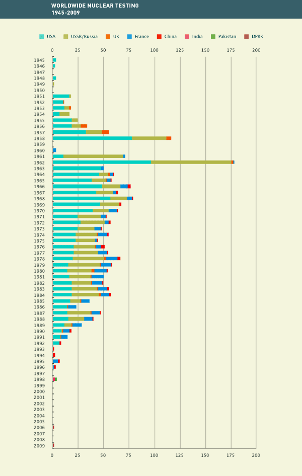
Dimitriy T.M. and Keith Marszalek sent in a video by Isao Hashimoto, posted at Wired. The video, titled 1945-1998, shows the location of all known nuclear tests during that period, as well as the nation conducting the tests. It starts off slowly (with the U.S. test during World War II and the two bombs dropped on Japan), and the U.S. has a monopoly on nuclear weapons for several years. By the early 1950s the number of tests starts to increase and the U.K. and Soviet Union start testing. By the late 1’50s and through the ’80s, the flashes indicating tests (with different sound effects to indicate different nation) are pretty much constant, and then drop off quite a lot by the ’90s.

The Wired article points out that there have been two more nuclear tests since 1998 (when the video ends), both by North Korea.

I found this graph over at the Comprehensive Nuclear Test-Ban Treaty Organization website:

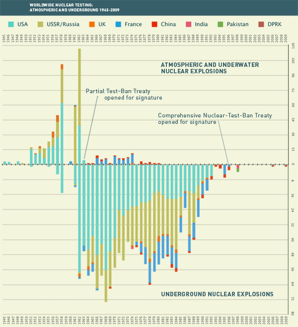
Broken down by type of test; since 1963 almost all testing has been underground:

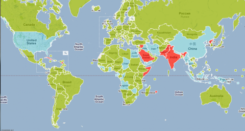
They also have an interactive map that includes information such as who has signed the test-ban treaty, where tests have occurred, and locations of facilities under the international monitoring system. Here’s a map showing the status of the test-ban treaty; green nations have ratified it, light blue ones have signed but not ratified it, and red ones haven’t signed it (sorry I couldn’t quite fit the whole map on my screen at once, so the screenshot cuts off some areas):

Gwen Sharp is an associate professor of sociology at Nevada State College. You can follow her on Twitter at @gwensharpnv.