nation: Britain/the U.K.

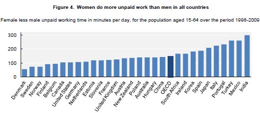
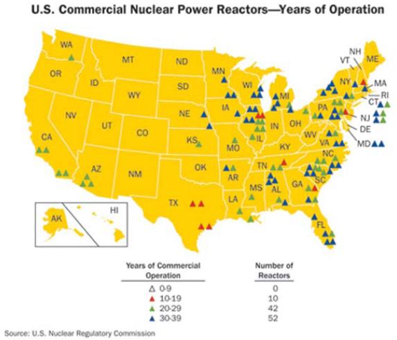
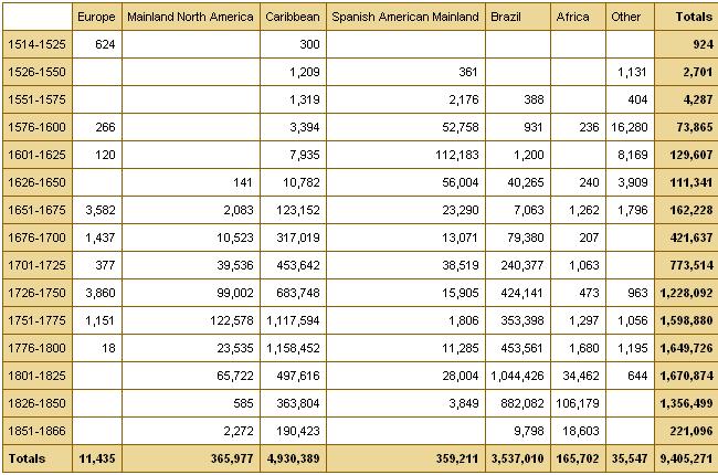
Deeb K. sent in a story from the New York Times about who does unpaid work — that is, the housework, carework, and volunteering that people do without financial compensation. Based on time-use surveys by the Organisation for Economic Co-operation and Development (OECD), this chart shows how many more minutes per day women in various nations spend doing such activities compared to men:

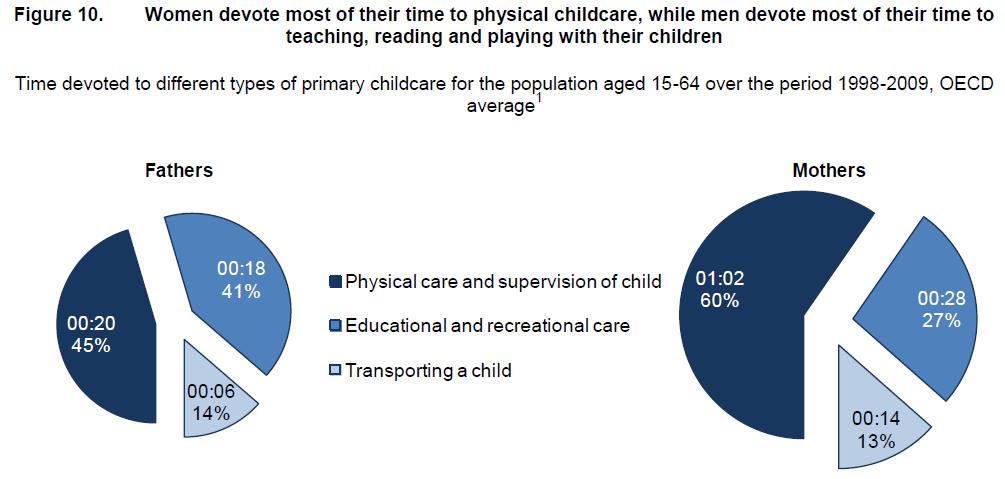
Childcare stuck out as an area with a particularly large gap:

On child care in particular, mothers spend more than twice as much time per day as fathers do: 1 hour 40 minutes for mothers, on average, compared to 42 minutes for fathers…On average, working fathers spend only 10 minutes more per day on child care when they are not working, whereas working mothers spend nearly twice as much time (144 minutes vs. 74) when not working.

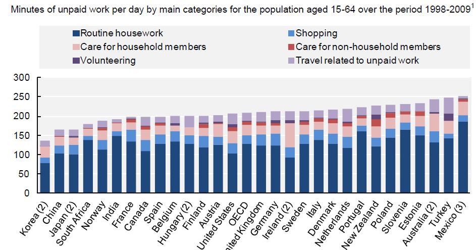
The full OECD report breaks down types of unpaid work (this is overall, including data for both men and women):

The study also found that non-working fathers spend less time on childcare than working mothers in almost every country in the study (p. 19). And mothers and fathers do different types of childcare, with dads doing more of what we might think of as the “fun stuff” (p. 20):

Source: Miranda, V. 2011. “Cooking, Caring and Volunteering: Unpaid Work around the World.” OECD Social, Employment and Migration Working Papers, No. 116. OECD Publishing.

Given the events in Japan and the ongoing concerns about the damaged Fukushima Daiichi nuclear reactors, I just wanted to point out that the New York Times has several very helpful images that explain the design of that type of nuclear reactor and what has happened over the last several days. The Union of Concerned Scientists has also posted several updates on their All Things Nuclear page.

The last decade or so had shown gradually increasing public support for nuclear energy. Just a year ago a Gallup poll of 1,014 U.S. adults showed the highest level of support since they first asked about nuclear power in 1994, with 28% saying they “strongly” and 34% saying they “somewhat” favor nuclear energy:

In November 2009, Ipsos MORI, a market research firm in the U.K., interviewed a representative sample of 2,050 people in Great Britain about their perceptions of the nuclear energy industry (at the request of the Nuclear Industry Association). Results of the question “How favorable or unfavorable is your opinion or impression of the nuclear energy industry?”:

Men viewed the nuclear industry more positively than women did:

Not surprisingly, the crisis in Japan has led to concerns about nuclear power in other countries; Germany, for instance, is at least temporarily shutting down all facilities built before 1980. There is likely to be increased scrutiny of older nuclear power facilities, in particular.

Sangyoub Park, an Assistant Professor of Sociology at Washburn University, sent in this map showing the location and age of reactors in the U.S. (via the U.S. Nuclear Regulatory Commission):

Though the current events in Japan would seem likely to decrease public support for nuclear energy, if the crisis at the Japanese nuclear facilities are contained with relatively little perceived harm, it’s possible we could see little long-term impact on public opinion. People might think that if a nuclear plant can be hit by an earthquake and a tsunami, suffer multiple explosions and fires, and not have a core meltdown, then they must be pretty safe. I’ll keep my eye out for polls on the subject over the next few weeks/months.

UPDATE: Sangyoub found a Gallup poll released this afternoon showing that the ongoing problems controlling the damage to nuclear reactors in Japan have increased public concerns about the possibility of a nuclear disaster in the U.S.:

This led to a dip in support for nuclear energy; the percent “somewhat” or “strongly” opposing nuclear power rose from 33% in 2010 to 38% now:

Related posts: the power of images in the environmental movement and Chernobyl, then and now.


The word “proletariat” “proletarian” refers to a member of the working class of a capitalist society, or the “proletariat.”  Combining the word with “precarious,” economist Guy Standing coined the term “precariat” to try to describe the reality of low wage workers in our modern, global economy.

In the ten-minute segment below, sent in by Jordan G., an interview with Standing is complimented by interviews with workers and activists in Britain.  He explains that new international labor markets have weakened the power of labor and strengthened that of employers.  The result is more jobs that are part time, with unpredictable hours, low wages, and few benefits.  This has been good for employers in that the risk inherent in capitalist enterprises has been transferred to the workers.  For example, if the hotel isn’t full, then the managers simply bring in fewer housekeepers.  This is hard on housekeepers, but easy on hotels.  Workers’ lives, then, are increasingly precarious, thus the term “precariat.”

Found at The Guardian via Global Sociology.

Lisa Wade, PhD is an Associate Professor at Tulane University. She is the author of American Hookup, a book about college sexual culture; a textbook about gender; and a forthcoming introductory text: Terrible Magnificent Sociology. You can follow her on Twitter and Instagram.

An infographic accompanying an article at the New York Times reveals how “advanced economies” compare on various measures of equality, well-being, educational attainment, and more.  To illustrate this, for each measure countries that rank well are coded tan, countries that rank poorly and very poorly are coded orange and red respectively, and countries that are in the middle are grey.  The countries are then ranked from best to worst overall, with Australia coming in #1 and the United States coming in last.  You might be surprised how some of these countries measure up.

Thanks to Dmitriy T.M. for the link.

Lisa Wade, PhD is an Associate Professor at Tulane University. She is the author of American Hookup, a book about college sexual culture; a textbook about gender; and a forthcoming introductory text: Terrible Magnificent Sociology. You can follow her on Twitter and Instagram.

Via Shamus Khan, I found the Economic Policy Institute’s interactive graph that lets you see which Americans have earned most of the growth (or, more recently, suffered the losses) in U.S. incomes over time, based on IRS data (and reported in constant 2008 dollars):

You can select beginning and ending points and find out how incomes changed during that period and how the growth was distributed. For instance, the increase in average incomes between 1950 and 1960 were widely distributed:

If we look at the 10-year span between 1995 and 2005, the increase was much more concentrated among the very wealthy:

The data come from a study on historical income in equality in the U.S. by economists Thomas Piketty and Emmanuel Saez. They compare the share of income earned by the richest 0.1% of earners in the U.S., France, and the U.K.:

See our previous posts on Saez’s work here and here.

In the last few hundred years, dark-skinned peoples have been likened to apes in an effort to dehumanize them and justify their oppression and exploitation.  This is familiar to most Americans as something that is done peculiarly to Black people (as examples, see  herehere, and here).  The history of U.S. discrimination against the Irish, however, offers an interesting comparative data point.  The Irish, too, have been compared to apes, suggesting that this comparison is a generalizable tactic of oppression, not one inspired by the color of the skin of Africans.

Irish woman, “Bridget McBruiser,” contrasted with Florence Nightengale:

(source)

A similar contrasting of the English woman (left) and the Irish woman (right):

(source)

Cartoon facing off “the British Lion” and “the Irish monkey”:

(source)

An Irishman, looking decidedly simian, in the left of this cartoon:

(source)

The Irish and the Black are compared as equally problematic to the North and the South respectively.  Notice how both are drawn to look less human:

(source)

A depiction of an Irish riot (1867):

(source)

An Irishman, depicted as drunk, sits atop a powderkeg threatening to destroy the U.S.:

(source)

Two similar cartoons from the same source:

About this cartoon, Michael O’Malley at George Mason University writes:

In this cartoon, captioned “A King of -Shanty,” the comparison becomes explicit. The “Ashantee” were a well known African tribe; “shanty” was the Irish word for a shack or poor man’s house. The cartoon mocks Irish poverty, caricatures irish people as ape like and primitive, and suggests they are little different from Africans, who the cartoonists seems to see the same way. This cartroon irishman has, again, the outhrust mouth, sloping forehead, and flat wide nose of the standard Irish caricature.

(source)

So, there you have it.  Being compared to apes is tactic of oppression totally unrelated to skin color — that is, it has nothing to do with Black people and everything to do with the effort to exert control and power.

For more on anti-Irish discrimination, see our post on Gingerism.  And see our earlier post on anti-Irish caricaturein which we touched on this before.

Lisa Wade, PhD is an Associate Professor at Tulane University. She is the author of American Hookup, a book about college sexual culture; a textbook about gender; and a forthcoming introductory text: Terrible Magnificent Sociology. You can follow her on Twitter and Instagram.

Laura Heron sent in a article from the Economist about changes in union membership. The article, which takes a fairly negative view of the effects of unionization, includes a graph, titled “Where trouble lies,” that illustrates how much union membership has shifted from the private to the public sector in the U.S. Today, 36% of public employees (7.6 million) are members of a union, while only about 7% of employees of private companies (7.1 million) are:

Such a change, from primarily private-sector and often blue-collar workers to government employees, many of whom will be white-collar, middle-class, and relatively highly educated, has significant consequences for employers, governments, employees, and the issues likely to be of primary concern to the labor movement more broadly.

I used the data given in the article to create a chart comparing the percent of private- and public-sector employees in unions in Canada, the U.S., and Britain “today” (by which I assume they mean 2010, though they don’t specify, so be cautious there; also, they didn’t provide the private-sector rate for Canada, so I just used the data I had):

Aside from that, Laura’s attention was drawn to the post partially by the way labor was represented. To make sure we don’t miss the fact that unions are “trouble,” they illustrate the story with this image depicting labor as a fat, ravenous, naked figure devouring resources from the trim man in business attire:

A subsection of the article is also titled “Fattening the Leviathan,” and as the image at the end of the article makes clear, we need to cut this monster down to size:

It’s sort of the mirror image of the “fat cat” rhetoric often used to depict the wealthy as greedy individuals who gorge themselves on profits at the expense of workers. In either case, the central element that makes such rhetoric work is the perception of fat people as lazy, ravenous, greedy individuals who take more than their fair share of available resources.

Emory University has a very detailed database about the Atlantic slave trade, titled Voyages: The Trans-Atlantic Slave Trade Database, which I don’t believe we’ve posted before (my apologies if we have). It includes nine maps providing information on major points of departure and destination ports for the trans-Atlantic trade; here’s a general overview:

Initially the vast majority of slave voyages were organized by firms or individuals in Spain and Portugal; however, over time the slave trade was dominated by groups from northern Europe. Great Britain eventually played a major role, and over 1/3 of documented slave voyages were organized there.The description of Map 6 explains, “vessels from the largest seven ports, Rio de Janeiro, Bahia, Liverpool, London, Nantes, Bristol, and Pernambuco carried off almost three-quarters of all captives removed from Africa via the Atlantic Ocean.”

This map shows where voyages were organized, and the % of all documented African slaves that voyages from that country/area transported:

In the U.S., students generally learn about slavery in relation to cotton plantations and, to a lesser extent, tobacco. However, overall those two crops played a relatively minor role in the growth of the global slave trade. It was the growing taste for sugar, and the creation of sugar plantations, particularly in the Caribbean and South American coastal areas, that produced such an enormous demand for African slaves in the Americas. According to the Voyages website, less than 4% of all Africans captured were sold in North America.

The website also has a database of thousands of documented trips in the trans-Atlantic slave trade, including everything from point of origin, destination, number of slaves, % who died during voyage, length of trip, and so on. Some include many more details than others, as you’d expect. You can also create tables to display the variables you’re interested in. Here’s the table showing the slave trade, broken into 25-year intervals and by destination. We can clearly see that the slave trade made one big jump in the late 1500s (going from 4,287 in the 1551-1575 interval to 73,865 between 1576 and the end of the century) and another huge jump in the late 1600s, with the height of the slave trade occuring in the 1700s through the mid-1800s:

You can also create various graphs and charts. Here is a graph of the % of slaves who died during the trip, by year:

I presume the extremely high numbers in the 1550s must be skewed by some ships that sank or met some other disaster that led to the death of everyone aboard.

Over time, ships carried larger numbers of individuals per trip:

The individuals taken as part of the slave trade were predominantly male:

Documented types of resistance from captives or from Africans trying to free them:

You can spend quite a bit of time on this, I warn you — creating timelines, graphs, and so on. It’s taken me an hour to write this post because I keep getting distracted creating charts and tables. Overall, the site is a fantastic resource for both specific information and for helping illuminate the enormity of the Atlantic slave trade. Thanks to Shamus Khan for the tip.