knowledge/intelligence

TW: racism  and sexual violence; originally posted at Family Inequality.

I’ve been putting off writing this post because I wanted to do more justice both to the history of the Black-men-raping-White-women charge and the survey methods questions. Instead I’m just going to lay this here and hope it helps someone who is more engaged than I am at the moment. I’m sorry this post isn’t higher quality.

Obviously, this post includes extremely racist and misogynist content, which I am showing you to explain why it’s bad.

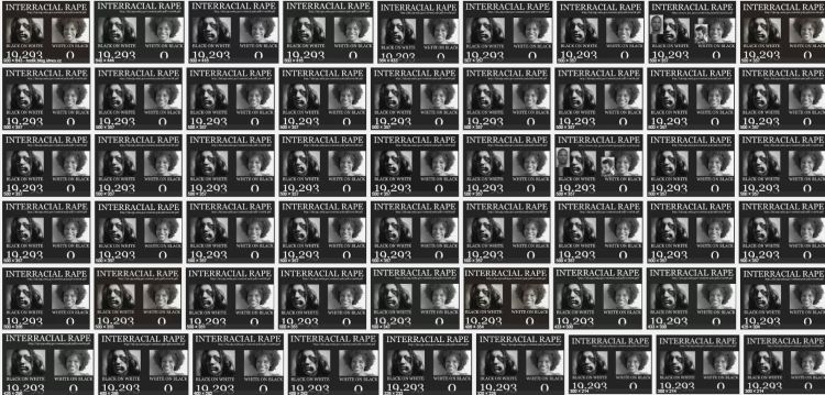
This is about this very racist meme, which is extremely popular among extreme racists.

tumblr_n2i5w0kygo1qaeo2oo1_500

The modern racist uses statistics, data, and even math. They use citations. And I think it takes actually engaging with this stuff to stop it (this is untested, though, as I have no real evidence that facts help). That means anti-racists need to learn some demography and survey methods, and practice them in public. I was prompted to finally write on this by a David Duke video streamed on Facebook, in which he used exaggerated versions of these numbers, and the good Samaritans arguing with him did not really know how to respond.

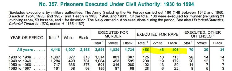
For completely inadequate context: For a very long time, Black men raping White women has been White supremacists’ single favorite thing. This was the most common justification for lynching, and for many of the legal executions of Black men throughout the 20th century. From 1930 to 1994 there were 455 people executed for rape in the U.S., and 89% of them were Black (from the 1996 Statistical Abstract):

1996statabs-executions

For some people, this is all they need to know about how bad the problem of Blacks raping Whites is. For better informed people, it’s the basis for a great lesson in how the actions of the justice system are not good measures of the crimes it’s supposed to address.

Good data gone wrong

Which is one reason the government collects the National Crime Victimization Survey (NCVS), a large sample survey of about 90,000 households with 160,000 people. In it they ask about crimes against the people surveyed, and the answers the survey yields are usually pretty different from what’s in the crime report statistics – and even further from the statistics on things like convictions and incarceration. It’s supposed to be a survey of crime as experienced, not as reported or punished.

It’s an important survey that yields a lot of good information. But in this case the Bureau of Justice Statistics is doing a serious disservice in the way they are reporting the results, and they should do something about it. I hope they will consider it.

Like many surveys, the NCVS is weighted to produce estimates that are supposed to reflect the general population. In a nutshell, that means, for example, that they treat each of the 158,000 people (over age 12) covered in 2014 as about 1,700 people. So if one person said, “I was raped,” they would say, “1700 people in the US say they were raped.” This is how sampling works. In fact, they tweak it much more than that, to make the numbers add up according to population distributions of variables like age, sex, race, and region – and non-response, so that if a certain group (say Black women) has a low response rate, their responses get goosed even more. This is reasonable and good, but it requires care in reporting to the general public.

So, how is the Bureau of Justice Statistics’ (BJS) reporting method contributing to the racist meme above? The racists love to cite Table 42 of this report, which last came out for the 2008 survey. This is the source for David Duke’s rant, and the many, many memes about this. The results of Google image search gives you a sense of how many websites are distributing this:

imagesearch

Here is Table 42, with my explanation below:

table42-highlighted

What this shows is that, based on their sample, BJS extrapolates an estimate of 117,640 White women who say they were sexually assaulted, or threatened with sexual assault, in 2008 (in the red box). Of those, 16.4% described their assailant as Black (the blue highlight). That works out to 19,293 White women sexually assaulted or threatened by Black men in one year – White supremacists do math. In the 2005 version of the table these numbers were 111,490 and 33.6%, for 37,460 White women sexually assaulted or threatened by Black men, or:

everyday

Now, go back to the structure of the survey. If each respondent in the survey counts for about 1,700 people, then the survey in 2008 would have found 69 White women who were sexually assaulted or threatened, 11 of whom said their assailant was Black (117,640/1,700). Actually, though, we know it was less than 11, because the asterisk on the table takes you to the footnote below which says it was based on 10 or fewer sample cases. In comparison, the survey may have found 27 Black women who said they were sexually assaulted or threatened (46,580/1,700), none of whom said their attacker was White, which is why the second blue box shows 0.0. However, it actually looks like the weights are bigger for Black women, because the figure for the percentage assaulted or threatened by Black attackers, 74.8%, has the asterisk that indicates 10 or fewer cases. If there were 27 Black women in this category, then 74.8% of them would be 20. So this whole Black women victim sample might be as little as 13, with bigger weights applied (because, say, Black women had a lower response rate). If in fact Black women are just as likely to be attacked or assaulted by White men as the reverse, 16%, you might only expect 2 of those 13 to be White, and so finding a sample 0 is not very surprising. The actual weighting scheme is clearly much more complicated, and I don’t know the unweighted counts, as they are not reported here (and I didn’t analyze the individual-level data).

I can’t believe we’re talking about this. The most important bottom line is that the BJS should not report extrapolations to the whole population from samples this small. These population numbers should not be on this table. At best these numbers are estimated with very large standard errors. (Using a standard confident interval calculator, that 16% of White women, based on a sample of 69, yields a confidence interval of +/- 9%.) It’s irresponsible, and it’s inadvertently (I assume) feeding White supremacist propaganda.

Rape and sexual assault are very disturbingly common, although not as common as they were a few decades ago, by conventional measures. But it’s a big country, and I don’t doubt lots of Black men sexual assault or threaten White women, and that White men sexually assault or threaten Black women a lot, too – certainly more than never. If we knew the true numbers, they would be bad. But we don’t.

A couple more issues to consider. Most sexual assault happens within relationships, and Black women have interracial relationships at very low rates. In round numbers (based on marriages), 2% of White women are with Black men, and 5% of Black women are with White men, which – because of population sizes – means there are more than twice as many couples with Black-man/White-woman than the reverse. At very small sample sizes, this matters a lot. But we would expect there to be more Black-White rape than the reverse based on this pattern alone. Consider further that the NCVS is a householdsample, which means that if any Black women are sexually assaulted by White men in prison, it wouldn’t be included. Based on a 2011-2012 survey of prison and jail inmates, 3,500 women per year are the victim of staff sexual misconduct, and Black women inmates were about 50% more likely to report this than White women. So I’m guessing the true number of Black women sexually assaulted by White men is somewhat greater than zero, and that’s just in prisons and jails.

The BJS seems to have stopped releasing this form of the report, with Table 42, maybe because of this kind of problem, which would be great. In that case they just need to put out a statement clarifying and correcting the old reports – which they should still do, because they are out there. (The more recent reports are skimpier, and don’t get into this much detail [e.g., 2014] – and their custom table tool doesn’t allow you to specify the perceived race of the offender).

So, next time you’re arguing with David Duke, the simplest response to this is that the numbers he’s talking about are based on very small samples, and the asterisk means he shouldn’t use the number. The racists won’t take your advice, but it’s good for everyone else to know.

Philip N. Cohen is a professor of sociology at the University of Maryland, College Park. He writes the blog Family Inequality and is the author of The Family: Diversity, Inequality, and Social Change. You can follow him on Twitter or Facebook.

Way back in 1996 sociologist Susan Walzer published a research article pointing to one of the more insidious gender gaps in household labor: thinking. It was called “Thinking about the Baby.”

In it, Walzer argued that women do more of the intellectual and emotional work of childcare and household maintenance. They do more of the learning and information processing (like buying and reading “how-to” books about parenting or researching pediatricians). They do more worrying (like wondering if their child is hitting his developmental milestones or has enough friends at school). And they do more organizing and delegating (like deciding when towels need washing or what needs to be purchased at the grocery store), even when their partner “helps out” by accepting assigned chores.

For Mother’s Day, a parenting blogger named Ellen Seidman powerfully describes this exhausting and almost entirely invisible job. I am compelled to share. Her essay centers on the phrase “I am the person who notices…” It starts with the toilet paper running out and it goes on… and on… and on… and on. Read it.

She doesn’t politicize what she calls an “uncanny ability to see things… [that enable] our family to basically exist.” She defends her husband (which is fine) and instead relies on a “reduction to personality,” that technique of dismissing unequal workloads first described in the canonical book The Second Shift: somehow it just so happens that it’s her and not her husband that notices all these things.

But I’ll politicize it. The data suggests that it is not an accident that it is she and not her husband that does this vital and brain-engrossing job. Nor is it an accident that it is a job that gets almost no recognition and entirely no pay. It’s work women disproportionately do all over America. So, read it. Read it and remember to be thankful for whoever it is in your life that does these things. Or, if it is you, feel righteous and demand a little more recognition and burden sharing. Not on Mother’s Day. That’s just one day. Everyday.

Cross-posted and in print at Money.

Lisa Wade, PhD is an Associate Professor at Tulane University. She is the author of American Hookup, a book about college sexual culture; a textbook about gender; and a forthcoming introductory text: Terrible Magnificent Sociology. You can follow her on Twitter and Instagram.

A new study led by philosopher Sarah-Jane Leslie challenges the idea that women are underrepresented in STEM fields. They first note that there are some STEM fields where women do well (they are 54% of molecular biologists, for example) and some humanities fields where they don’t (they are only 31% of philosophers). Something else, they gathered, must be going on.

They had a hunch. They asked 1,820 U.S. academics what it took to be successful in their field. They were particularly interested in answers that suggested hard work and ones that invoked brilliance.

Their results showed a clear relationship between the presence of women in a field and the assumption that success required brilliance.  The downward sloping line represents the proportion of female PhDs in stem fields (top) and social science and humanities fields (bottom) as they become increasingly associated with brilliance:

5

Interviewed at Huffington Post, Leslie says:

Cultural associations link men, but not women, with raw intellectual brilliance… consider, for example, how difficult it is to think of even a single pop-cultural portrayal of a woman who displays that same special spark of innate, unschooled genius as Sherlock Holmes or Dr. House from the show “House M.D.,” or Will Hunting from the movie “Good Will Hunting.”

In contrast, accomplished women are often portrayed as very hard working (and often having given up on marriage and children, I’ll add). She continues:

In this way, women’s accomplishments are seen as grounded in long hours, poring over books, rather than in some special raw effortless brilliance.

They extended their findings to race, testing whether the relationship held for African Americans, another group often stereotyped as less intelligent, and Asians, a group that attracts the opposite stereotype. As hypothesized, they found the relationship for the first group, but not the second (note the truncated y-axis).

6

The long term solution to this problem, of course, is to end white and Asian men’s claim on brilliance. In the meantime, the research team suggests, it may be a good idea to stop talking about some fields as if they’re the rightful home of the naturally brilliant and start advocating hard work for everyone.

Cross-posted at Pacific Standard.

Lisa Wade, PhD is an Associate Professor at Tulane University. She is the author of American Hookup, a book about college sexual culture; a textbook about gender; and a forthcoming introductory text: Terrible Magnificent Sociology. You can follow her on Twitter and Instagram.

Flashback Friday.

The D.C. Council’s Committee on Health released a report after surveying high school students about sex education. One of their questions was about the source of sexual health information. The pie chart below shows that students name, in order, their parents or guardians, health workers, teachers, friends, and boyfriends or girlfriends as the most common sources of information.

Capture

I asked a similar question in a study I did with college students (full text). The students in my sample rated their friends, secondary school teachers, books, their sexual partners, and the media as their most important sources. Men also included pornography. Very few students counted parents among their most valued sources. (Significance indicators are for sex difference.)

Capture1

My co-authors and I were interested in how those sources correlated with actual knowledge, specifically knowledge about the clitoris. And so we gave them a “cliteracy test,” we had them answer a set of true/false questions about the clitoris and find it on a diagram of the vulva.

We then compared their scores on the test to their reported sources of knowledge. The table below is a regression showing which sources of knowledge were most predictive of a high score. The findings were interesting: only two sources predicted significantly higher scores on the test: media (for men and women) and self-exploration (for women).

Capture2

So, only one of the most frequently used sources of information, media, actually translated into real knowledge. And, ironically, the best source of information for women, their own bodies, was among the least often cited source of information for women, beating out only pornography and parents.

In other words, the best source of information about the clitoris is probably the… clitoris, but female college students would rather read books to learn about it.

This puts the D.C. study into some perspective.  The high school students in that study reported that their parents or guardians, health workers, teachers, friends, and boyfriends or girlfriends were sources of sexual information, but that doesn’t mean that they are good sources. It could be that they’re giving them misinformation or good information only about certain things.

Originally posted in 2009. You can see a summary of our findings on the correlation (or lack thereof) between knowledge about the clitoris and orgasm for women here.

Lisa Wade, PhD is an Associate Professor at Tulane University. She is the author of American Hookup, a book about college sexual culture; a textbook about gender; and a forthcoming introductory text: Terrible Magnificent Sociology. You can follow her on Twitter and Instagram.

Not surprisingly, the new interactive chart Gendered Language in Teacher Reviews has been the subject of a lot of conversation among sociologists, especially those of us who study gender. For example, it reminded C.J. of an ongoing conversation she and a former Colorado College colleague repeatedly had about teaching evaluations. Comparing his evaluations to C.J.’s, he noted that students would criticize C.J. for the same teaching practices and behaviors that seemed to earn him praise: being tough, while caring about learning.

We’ve long known that student evaluations of teaching are biased. A recent experiment made headlines when Adam Driscoll and Andrea Hunt found that professors teaching online received dramatically different evaluation scores depending upon whether students thought the professor was a man or a woman; students rated male-identified instructors significantly higher than female identified instructors, regardless of the instructor’s actual gender.

Schmidt’s interactive chart provides a bit more information about exactly what students are saying when evaluating their professors in gendered ways. Thus far, most commentaries have focused on the fact that men are more likely to be seen as “geniuses,” “brilliant,” and “funny,” while women, as C.J. discovered, are more likely to be seen as “bossy,” “mean,” “pushy.”

18

These discrepancies are important, but in this post, we’ve used the tool to shed light on some forms of gendered workplace inequality that have received less attention: (1) comments concerning physical appearance, (2) comments related to messiness and organization, and (3) comments related to emotional (as opposed to intellectual) work performed by professors.

Physical Appearance

The results from Schmidt’s chart are not universally “bad” or “worse” for women. For instance, the results for students referring to professors as “hot” and “attractive” are actually mixed. Further, in some fields of study, women are more likely to receive “positive” appearance-based evaluations while, in other fields, men are more likely to receive these evaluations.

A closer examination, however, reveals an interesting pattern. Here is a list of the fields in which women are more likely to be referred to as “hot” or “attractive”: Criminal Justice, Engineering, Political Science, Business, Computer Science, Physics, Economics, and Accounting. And here is a list of fields in which men are more likely to receive these evaluations: Philosophy, English, Anthropology, Fine Arts, Languages, and Sociology.

111

Notice anything suspicious? Men are sexualized when they teach in fields culturally associated with “femininity” and women are sexualized when they teach in fields culturally associated with “masculinity.”

Part of this is certainly due to gender segregation in fields of study. There are simply more men in engineering and physics courses. Assuming most students are heterosexual, women teaching in these fields might be more likely to be objectified. Similarly, men teaching in female-dominated fields have a higher likelihood of being evaluated as “hot” because there are more women there to evaluate them. (For more on this, see Philip Cohen’s breakdown of gender segregation in college majors.)

Nonetheless, it is important to note that sexual objectification works differently when it’s aimed at men versus women. Women, but not men, are systematically sexualized in ways that work to symbolically undermine their authority. (This is why “mothers,” “mature,” “boss,” and “teacher” are among men’s top category searches on many online pornography sites.) And, women are more harshly criticized for failing to meet normative appearance expectations. Schmidt’s chart lends support to this interpretation as women professors are also almost universally more likely to be referred to as “ugly,” “hideous,” and “nasty.”

Level of (Dis)Organization

Christin and Kjerstin are beginning a new research project designed to evaluate whether students assess disorganized or “absent-minded” professors (e.g., messy offices, chalk on their clothing, disheveled appearances) differently depending on gender. Schmidt’s interactive chart foreshadows what they might find. Consider the following: women are more likely to be described as “unprepared,” “late,” and “scattered.” These are characteristics we teach little girls to avoid, while urging them to be prepared, organized, and neat. (Case in point: Karin Martin’s research on gender and bodies in preschool shows that boys’ bodies are less disciplined than girls’.)

In short, we hold men and women to different organizational and self-presentation standards. Consequently, women, but not men, are held accountable when they are perceived to be unprepared or messy. Emphasizing this greater scrutiny of women’s organization and professionalism is the finding that women are more likely than men to be described as either professionalorunprofessional,” and eitherorganizedordisorganized.”

Emotional Labor

Finally, emotional (rather than intellectual) terms are used more often in women’s evaluations than men’s. Whether mean, kind, caring or rude, students are more likely to comment on these qualities when women are the ones doing the teaching. When women professors receive praise for being “caring,” “compassionate,” “nice,” and “understanding,” this is also a not-so-subtle way of telling them that they should exhibit these qualities. Thus, men may receive fewer comments related to this type of emotion work because students do not expect them to be doing it in the first place. But this emotional work isn’t just “more” work, it’s impossible work because of the competence/likeability tradeoff women face.

There are all sorts of things that are left out of this quick and dirty analysis (race, class, course topic, type of institution, etc.), but it does suggest we begin to question the ways teaching evaluations may systematically advantage some over others. Moreover, if certain groups—for instance, women and scholars of color (and female scholars of color)—are more likely to be in jobs at which teaching evaluations matter more for tenure and promotion, then unfair and biased evaluations may exacerbate inequality within the academy.

Cross-posted at Girl w/ Pen.

The day I defended my dissertation I watched Chaotic, the Britney Spears/Kevin Federline reality show, from beginning to end. True story. The next day I pulled all of the paperback classic novels from my bookshelves and donated them to Goodwill. They were mostly tattered Penguin copies of things like The Sun Also Rises and The Stranger. I was done with them.

I was the first person in my family to get a traditional college degree and those books meant a lot to me for a long time. I was an insecure student; a sufferer of the famous imposter syndrome.  The books were a signal to myself — and perhaps others, too — that I was a Smart, Educated Person with Intelligent Tastes. They were what sociologist Pierre Bourdieu would call cultural capital, objects that indicate my membership in a particular class. Both Chaotic and the purging of the books were part of the same cathartic expression: relief, incredible relief, at having not-failed. I had a new form of cultural capital now, a more powerful version of that message. I had a PhD. I could afford to toss the paperbacks.

Today, as someone who has officially “made it” in academia, I need those books even less than I did on that transitional day. And, as I’ve made the journey from nervous graduate student to tenured professor, I’ve slowly come to understand what an incredible privilege it is to carry the institutional capital that I do.

Every time I have the opportunity to admit I was wrong or confess a lack of knowledge, for example, I can do so without fear that anyone will think that I’m generally stupid or ignorant. Others assume I’m smart and knowledgeable because of the pedigree, whether I am or not. People who aren’t as lucky as I — who have the wrong accent, the wrong teeth, or the wrong clothes, and who don’t have the right degrees, jobs, and colleagues — they are at risk of being labeled as generally stupid or ignorant whenever they make an intellectual misstep, whether they are or not.

To them, that used Penguin copy of The Stranger may be more valuable than the $0.03 it costs on Amazon. In another part of the social strata, it might be worth it to pay $46 for that subscription to The New Yorker. The subscriber may only read the cartoons, but they don’t mind because, after all, that’s not really what they’re paying for.

1aImage via PostSecret. Cross-posted at Pacific Standard.

Lisa Wade, PhD is an Associate Professor at Tulane University. She is the author of American Hookup, a book about college sexual culture; a textbook about gender; and a forthcoming introductory text: Terrible Magnificent Sociology. You can follow her on Twitter and Instagram.

2At Junk Charts, Kaiser Fung drew my attention to a graph released by Reuters.  It is so deeply misleading that I loathe to expose your eyeballs to it.  So, I offer you this:

1The original figure is on the left.  It counts the number of gun deaths in Florida.  A line rises, bounces a little, reaches a 2nd highest peak labeled “2005, Florida enacted its ‘Stand Your Ground’ law,” and falls precipitously.

What do you see?

Most people see a huge fall-off in the number of gun deaths after Stand Your Ground was passed.  But that’s not what the graph shows.  A quick look at the vertical axis reveals that the gun deaths are counted from top (0) to bottom (800).  The highest peaks are the fewest gun deaths and the lowest ones are the most.  A rise in the line, in other words, reveals a reduction in gun deaths.  The graph on the right — flipped both horizontally and vertically — is more intuitive to most: a rising line reflects a rise in the number of gun deaths and a dropping a drop.

The proper conclusion, then, is that gun deaths skyrocketed after Stand Your Ground was enacted.

This example is a great reminder that we bring our own assumptions to our reading of any illustration of data.  The original graph may have broken convention, making the intuitive read of the image incorrect, but the data is, presumably, sound.  It’s our responsibility, then, to always do our due diligence in absorbing information.  The alternative is to be duped.

Cross-posted at Pacific Standard.

Lisa Wade, PhD is an Associate Professor at Tulane University. She is the author of American Hookup, a book about college sexual culture; a textbook about gender; and a forthcoming introductory text: Terrible Magnificent Sociology. You can follow her on Twitter and Instagram.

2A new study finds that people with high “justice sensitivity” are using logic, not emotions.  Subjects were put in a fMRI machine, one that measures ongoing brain activity and shown videos of people acting kindly or cruelly toward a homeless person.

Some respondents reacted more strongly than others — hence the high versus low justice sensitivity — and an analysis of the high sensitivity individuals’ brain activity showed that they were processing the images in the parts of the brain where logic and rationality live.   “Individuals who are sensitive to justice and fairness do not seem to be emotionally driven,” explained one of the scientists, “Rather, they are cognitively driven.”

Activists aren’t angry, they reasonably object to unjust circumstances that they understand all too well.

Image borrowed from Jamie Keiles at Teenagerie, who is a high sensitivity individual.

Lisa Wade, PhD is an Associate Professor at Tulane University. She is the author of American Hookup, a book about college sexual culture; a textbook about gender; and a forthcoming introductory text: Terrible Magnificent Sociology. You can follow her on Twitter and Instagram.