international comparisons

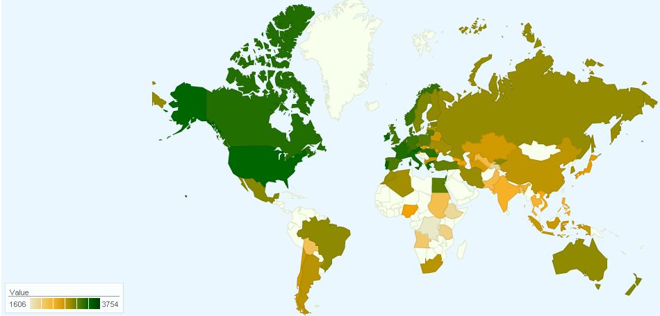
Dolores R. sent us a link to some graphics at Mother Jones about work and income. There are a lot of different topics covered, but I thought I’d highlight their inclusion of some maps generated by the McGill Institute for Health and Social Policy, which gathers international data on government policies about work and family, such as requirements for paid parental leave.

This map shows how much weekly time off from work national governments have guaranteed workers (16 nations require none):

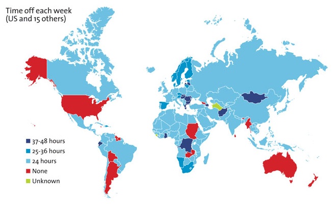
Of course, some nations, like the U.S., don’t regulate whether hourly-wage workers must have a day off each week but require they be paid at a higher rate if they work more than a certain number of hours (40 is usually the magic number in the U.S.), though this often doesn’t really apply to salaried workers, who aren’t paid by the hour.

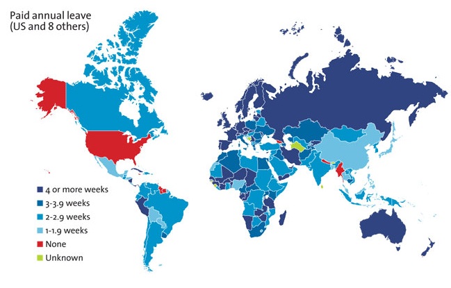
Here’s paid annual leave (9 nations have none):

Paid maternity leave (6 nations have none):

The McGill Institute has interactive maps that let you compare global policies on a number of family-work balance issues. You can get global maps, such as these, or compare specific countries.

Dolores and Diego sent in a new study by the Organisation for Economic Co-operation and Development (OECD).  The study measured time use in 30 countries, demonstrating significant differences in the amount of work and leisure enjoyed, on average.

The country reporting the fewest work hours was Belgium at just about 7 hours a day.  The country reporting the most was Mexico; Mexicans reported working almost 10 hours per day.  That’s enough hours to translate into 45.5 extra days a year that Mexicans work in excess of Belgians, and a month of extra work hours compared to the average country in this study (at 8 hours a day).

The OECD has also reported gender gaps in leisure across countries (Norway had the smallest gap in that study; Italy the largest) and we’ve seen the gender leisure gap reflected in American advertising.

Lisa Wade, PhD is an Associate Professor at Tulane University. She is the author of American Hookup, a book about college sexual culture; a textbook about gender; and a forthcoming introductory text: Terrible Magnificent Sociology. You can follow her on Twitter and Instagram.

Dmitriy T.M. sent in a link to the website If It Were My Home. The site allows you to select two nations and then explains how your life would compare if you lived in each one in terms of rates of HIV/AIDS, employment, energy consumption, infant mortality, class inequality, and other factors (based on CIA data). As an example, Dmitriy chose to compare the U.S. and Ukraine, “the 2 greatest countries in the world, as determined by the poll conducted in my head”:

You can then choose one of the items for more details; I selected life expectancy:

The site is set up with the U.S. as one of the default comparisons, but at the top there’s a button that lets you select a non-U.S. comparison. (Note: Reader Parodie says it appears to detect whatever country you’re accessing the site from and set that as one of the default comparisons.) It’s a fun site that you can spend quite a bit of time playing around with.

UPDATE: Just a caution–a couple of readers seem to have found situations where the math doesn’t add up in the comparisons of some countries. And other readers noted that this does an enormous amount of averaging, which definitely hides the differences in quality of life in various countries, which are so extreme in some nations that “averages” might be nearly meaningless.

I bumped up against two pieces of information today regarding caloric intake. I can’t confirm either, but I found both quite interesting. First, State Info features a map showing the average number of calories consumed each day in different countries across the globe. In the U.S., for example, the average is 3,754, in Argentina it is 2,959, in China it is 2,940, and in Congo it is 1,606.  Citizens of some countries, then, eat more than twice as many calories as citizens of others.

The fact that the average in almost every country exceeds the 2,000 calorie goal suggested by the U.S. Food and Drug Administration is fascinating in itself.

I was surprised at the average number of calories consumed in the U.S., where I live.  But then I came across the second graphic at GOOD which purports to reveal the number of calories and distribution of food types in the average school lunch and prison meal.  The comparison between the two is interesting enough, but I was struck by just how high the numbers were.  An average of 1,400 calories in your typical school lunch may very well indeed translate into over 3,000 calories a day.

Lisa Wade, PhD is an Associate Professor at Tulane University. She is the author of American Hookup, a book about college sexual culture; a textbook about gender; and a forthcoming introductory text: Terrible Magnificent Sociology. You can follow her on Twitter and Instagram.

Does American prosperity translate into long retirements?  Not compared to other developed countries in the world.  Flowing Data borrowed OECD numbers on life expectancy and age of retirement to calculate the average number of years in retirement for men and women across many different countries.  The portion of each bar with the line is the average number of years working, while the non-lined portion represents years in retirement.

Largely because of life expectancy, women enjoy more years than men in all states except Turkey, but the number of years varies quite tremendously, from an average of zero years for men in Mexico, to an average of 26 years for women in Austria and Italy.  The United States is way down on this list, not doing so well relatively after all.

Lisa Wade, PhD is an Associate Professor at Tulane University. She is the author of American Hookup, a book about college sexual culture; a textbook about gender; and a forthcoming introductory text: Terrible Magnificent Sociology. You can follow her on Twitter and Instagram.

Photographer Peter Menzel has a habit of displaying people’s lives in illuminating ways.  Previously we highlighted a project in which he went around the world asking families to pose in front of their house with all of their stuff.  He now has a book, Hungry Planet, featuring photographs of families posting with a week’s worth of food.  It tells a fascinating qualitative and quantitative story of cultural gastronomical difference.

Go to Menzel’s website for more information.


Lisa Wade, PhD is an Associate Professor at Tulane University. She is the author of American Hookup, a book about college sexual culture; a textbook about gender; and a forthcoming introductory text: Terrible Magnificent Sociology. You can follow her on Twitter and Instagram.

I am trying to re-enter society after several days being sick, so I’m going with something short and simple today. Eden H. sent in this chart, found at Business Insider, that compares hourly minimum wages in a number of European countries to the U.S.:

The European data are available from Eurostat (though note they report minimum wages in terms of Euros per month, not hour, so the data was converted for the chart).

Deeb K. sent in a story from the New York Times about who does unpaid work — that is, the housework, carework, and volunteering that people do without financial compensation. Based on time-use surveys by the Organisation for Economic Co-operation and Development (OECD), this chart shows how many more minutes per day women in various nations spend doing such activities compared to men:

Childcare stuck out as an area with a particularly large gap:

On child care in particular, mothers spend more than twice as much time per day as fathers do: 1 hour 40 minutes for mothers, on average, compared to 42 minutes for fathers…On average, working fathers spend only 10 minutes more per day on child care when they are not working, whereas working mothers spend nearly twice as much time (144 minutes vs. 74) when not working.

The full OECD report breaks down types of unpaid work (this is overall, including data for both men and women):

The study also found that non-working fathers spend less time on childcare than working mothers in almost every country in the study (p. 19). And mothers and fathers do different types of childcare, with dads doing more of what we might think of as the “fun stuff” (p. 20):

Source: Miranda, V. 2011. “Cooking, Caring and Volunteering: Unpaid Work around the World.” OECD Social, Employment and Migration Working Papers, No. 116. OECD Publishing.