housing/residential segregation

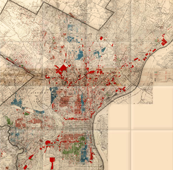
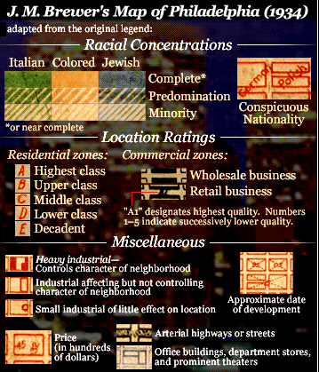
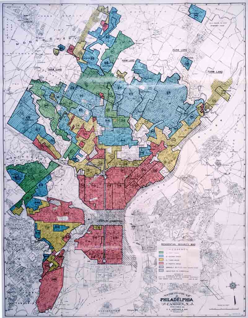
The foreclosure crisis that emerged in 2006 continues to displace families and change neighborhoods, creating holes in the social fabric of communities. Kathryn Clark, artist and former urban planner, has created a series of “foreclosure quilts” based on maps of urban areas, with holes representing foreclosed houses.  These unique visual representations call our attention to the holes that remain after foreclosure.

Clark writes on her blog:

The quilt is pieced together using patterns of neighborhood blocks taken from RealtyTrac maps.  Within these, foreclosed lots are shown as holes in the quilts.  The lot locations are completely random and they yield an unexpected beauty when laid out on fabric. These torn holes question the protective nature of a quilt. The situation is so dire that even a quilt can’t provide the security one needs.

Clark’s artistic rendering of these maps points to the size and spread of the foreclosure problem, but also evokes the conflicting experience of home and the reality of the housing market.  Homes, like quilts, promise warmth, comfort and continuity, a connection to family and a sense of protection.  The holes in the quilts powerfully evoke the false promise of security offered by home ownership in the contemporary U.S.

Public policy and real estate market professionals have actively worked to construct home as an owner-occupied, single family house (as opposed to rental, communal space, or other residential option).  The preference for ownership has become so strong that many forgo other forms of investment for a mortgage on a house, and those who rent are told that they are “throwing their money away.”  This normative belief that home ownership is the most desirable option for adults provided justification for consumers to risk their savings, even when offered poor subprime loans, because ownership is symbolically important.

The foreclosure quilts call our attention to the holes that have been produced by the collapse of the housing market.  The focus on neighborhoods and blocks rather than individual houses and families encourages us to think about the impact on communities as well as individuals.  These quilts offer little comfort, and hopefully provoke questions about the sustainability of our singular focus on home ownership.

For images of Clark’s quilts, check out her blog and website or an article on her work at The Atlantic Cities page.

Karen McCormack is an assistant professor of sociology at Wheaton College in Norton, Massachusetts.  She is currently studying the strategies that people employ to manage the risk of losing their homes to foreclosure.

Erin Hatton sent in a 1937 redlining map of Philadelphia, so I decided to update our earlier post on segregation and redlining in the city.

—————

One historical cause of residential segregation was redlining. Lenders would color-code different neighborhoods on residential maps; red was generally the color used to designate a neighborhood as “dangerous,” meaning mortgages would not be approved in those areas, since they were considered to be high-risk areas for mortgage defaults. This was generally a blanket rule: people found themselves unable to get mortgages to buy property in redlined areas, regardless of their income or the value of the particular house they wanted to buy. And a high proportion of Black (and sometimes White immigrant) residents generally meant that a neighborhood would be automatically tagged as a high-risk area.

The University of Pennsylvania Redlining in Philadelphia project provides an example of a map created to guide lending in Philadelphia. The map was created in 1934 by J.M. Brewer, who owned a real estate consulting company and later was chief appraiser for Metropolitan Life Insurance.

This legend was adapted from the original for the U. of Pennsylvania website:

The legend looks like the “colored” areas are coded yellow, but it’s actually red on the map. Brewer created another map in 1935 and helped draw the federal Home Owners’ Loan Corporation (HOLC) map of Philadelphia in 1937.

Erin Hatton sent a link to that 1937 HOLC map, which reflects the governmental institutionalization of racism, marking some groups as inherently undesirable:

If you go to Redlining Philadelphia and click on areas of the map, it links to the survey sheets used to rate each neighborhood. All include a section on detrimental elements and a demographics breakdown, with areas to note the presence of immigrants, African Americans, poor families, and so on, such as this section of a survey sheet for area 22, giving a security grade of D:

African Americans were not the only group targeted by redlining. For instance, the survey sheet for area 5 mentions the “danger of Jewish encroachment”:

Redlining made it difficult for Blacks (and some White ethnics) to buy homes. Racial discrimination meant Blacks often couldn’t buy homes outside Black neighborhoods, but Black neighborhoods were often redlined by lenders, meaning Blacks couldn’t get mortgages to buy houses inside them, either. As a result, African Americans were disproportionately barred from one of the major avenues to acquiring wealth (building equity through home ownership), leading to increasing racial disparities in wealth and home ownership over time.

Also check out our post on segregated Durham.

The presence of vintage cars on Cuban roads is one of the  most iconic consequences of the 50-year-old U.S. trade embargo on the communist country.  Cubans, however, have had to preserve many other types of items that Americans routinely replace, while making do with the gradual deterioration that comes with age.

Offering another peek into this life, Ellen Silverman has been photographing Cuban kitchens.  NPR describes how they capture, among other things, the “grand, but crumbling” architecture,” mismatched kitchenware, and vintage appliances:

See the photographs of Cuban kitchens and more at her webpage.

Lisa Wade, PhD is an Associate Professor at Tulane University. She is the author of American Hookup, a book about college sexual culture; a textbook about gender; and a forthcoming introductory text: Terrible Magnificent Sociology. You can follow her on Twitter and Instagram.

Recently we posted a comparison of the types of jobs Americans held in 1940 and 2010, based on Census data. Now NPR has posted an interesting image showing how spending on different categories has changed:

Source: Bureau of Labor Statistics. Credit: Lam Thuy Vo / NPR

[Note: Sorry I initially accidentally left out the link to the original NPR story!]

The change in spending on food is especially noteworthy, given the role that cost of food plays in determining the poverty line in the U.S. It is still based on a calculation developed in the 1960s, which assumed that the average family spent about a third of its income on food. To figure out how much a family needed to survive, the minimum cost of a nutritionally-complete diet for a particular family size was calculated; multiplying it by three provided the poverty line. It was then adjusted over time. This is the number generally used to determine eligibility for government assistance programs.

But since then, food prices have fallen significantly, while other necessities, such as housing and medical care, have often gotten more expensive. Many have criticized the poverty line calculation, including the National Academy of Sciences, arguing that as food has gotten cheaper, the official poverty line does a worse and worse job of capturing exactly how much it costs to survive in the U.S.

NPR also provided a more detailed breakdown of spending on a number of major categories in 2011:

Source: Bureau of Labor Statistics. Credit: Lam Thuy Vo / NPR

Thanks to my friend Kathy B. for letting me know!

Autism appears to be on the rise. The U.S. Centers for Disease Control and Prevention reports that there are 20 times more cases of autism today than there were in the 1980s.  This figure, from the Los Angeles Times, shows a 200% increase in California:

The rise in cases of autism led scientists to ask whether there was an actual increase in incidence or if we were just getting better at identifying it.  The evidence seems to suggest that it’s (at least mostly) the latter.  Said anthropologist Roy Richard Grinker: “Once we are primed to see something, we see it and wonder how we could have never seen it before.”

But how to explain disparities like this?

Often regional differences in health and mental health can be traced to heavier environmental toxin loads.   In most of those cases, though, clusters of illness occur in poor and often disproportionately non-white neighborhoods.  Autism clusters were happening in class-privileged places.

Sociologist Peter Bearman discovered that these clusters were the result of conversation.  Class-privileged parents had the resources to get their child diagnosed, then they talked to other parents.  Some of these parents would recognize the symptoms and take their child to the doctor and… voila… a cluster.  “Living within 250 meters [of a child diagnosed with autism], reports the Los Angeles Times, boosted the chances by 42%, compared to living between 500 and 1,000 meters away.”

Lisa Wade, PhD is an Associate Professor at Tulane University. She is the author of American Hookup, a book about college sexual culture; a textbook about gender; and a forthcoming introductory text: Terrible Magnificent Sociology. You can follow her on Twitter and Instagram.

Trudi Abel, who directs the Digital Durham Project at Duke University, sent in a map she thought we might like to post. Created by the Department of Public works in Durham, NC, in 1937, the map illustrates the legal and taken-for-granted racial segregation of the time. The map indicates which parks and residential areas were for Whites and which for African Americans:

The map:

Obviously you can’t see much, other than a general idea of which parts of town each race lived in. Go to the Digital Durham website and click on the map for a version that lets you zoom in to read all the details.

You might also want to check out our posts on a 1934 redlining map of Philadelphia and 2010 Census data on segregation.

In his book, Great American City, sociologist Robert Sampson argues that, while the effects of macro factors like poverty and political neglect on individual lives are well-documented, other local mechanisms matter too.  It’s important, then, to think about the constitution of neighborhoods.

Along these lines, he argues, even if a community is economically- and socially-marginalized, an existing neighborhood organizations can make a big difference.  He takes natural disasters as a case study.  A neighborhood organization can spread the news of an impending disaster, establish leadership, and organize assistance before, during, and after a crisis.  In this way, Sampson brings together micro, meso, and macro forces shaping the impact of disaster.

Lisa Wade, PhD is an Associate Professor at Tulane University. She is the author of American Hookup, a book about college sexual culture; a textbook about gender; and a forthcoming introductory text: Terrible Magnificent Sociology. You can follow her on Twitter and Instagram.

The Federal Reserve Bank recently released 1,197 pages of transcripts of its 2006 closed door meetings.  As the Wall Street Journal comments: “The transcripts paint the most detailed picture yet of how top officials at the central bank didn’t anticipate the storm about to hit the U.S. economy and the global financial system.”  

Federal Reserve officials suspected that housing prices were peaking (see chart below).  But since they didn’t believe that prices had been driven up by a well entrenched bubble, they were not very concerned that they were coming down. 

p1-be338_fed_ns_20120112181819.jpg 

The Financial Times described the general Federal Reserve stance as follows:

Almost every Fed policymaker concluded that weaker housing would cause a slowdown in consumption and investment but expected that to offset strength elsewhere in the economy, leading to continued growth overall.

“Housing is the crucial issue. To get a soft landing, we need some cooling in housing,” said Ben Bernanke, Fed chairman, in his summing up of the economic situation in March 2006. “I think we are unlikely to see growth being derailed by the housing market.”

Indeed, a number of Fed officials saw the housing slowdown as welcome news that would help resolve a potential threat to the economy. “As to housing, we are in fact, as all have noted, squeezing out of that sector the speculative excesses that developed with the low interest rates of recent years — and doing so is unavoidable if we want to correct the sector,” said Thomas Hoenig, then president of the Kansas City Fed, at the September 2006 meeting of the FOMC. 

The transcripts show that the Federal Reserve was so confident that the economy was on solid footing that many officials were, according to the Wall Street Journal:   

…offering praise for outgoing Fed Chairman Alan Greenspan, who attended his final Fed meeting in January 2006. Timothy Geithner, then president of the Federal Reserve Bank of New York and now Treasury Secretary, playfully offered this forecast about Mr. Greenspan’s legacy: “I think the risk that we decide in the future that you’re even better than we think is higher than the alternative.”

The transcripts also suggest that Fed officials misgauged the potential for housing problems to spill over into the broader economy.

“Our recent financial-market data don’t, in my view, provide a convincing case for a substantial increase in the probability of a much weaker path for growth going forward,” Mr. Geithner said at a meeting in December 2006.  

So how did the best and the brightest get it so wrong?

Perhaps the major reason is because it served their interests to pretend there was no housing bubble.  The recovery from our 2001 recession was driven by consumption and that consumption was supported directly and indirectly by the housing bubble.  In other words stopping the bubble would have revealed the weakness in our economy and the need for serious structural change.  It was far easier and more lucrative for those at the top to just let the bubble go on expanding and pretend that it didn’t exist.

The following chart from the New York Times puts the movement in housing prices highlighted above into a longer term perspective, revealing just how strong speculative pressures were in the housing market.

shiller-housing-bubble-graph.jpg

As Dean Baker, one of the very few economists to warn about the dangers of the bubble, explains 

First, what happened is very straightforward: we had a huge run-up in house prices that had no basis in the fundamentals of the housing market. After 100 years in which nationwide house prices just kept even with the overall rate of inflation, house prices began to sharply outpace inflation, beginning in the late 1990s.

By 2002, when some of us first noticed the bubble, house prices had already risen by more than 30 per cent in excess of inflation. By the peak of the bubble in 2006, the increase in house prices was more than 70 per cent above the rate of inflation.

This was a huge problem because this bubble was driving the economy. It drove the economy directly by creating a boom in residential housing construction. We were building housing at a near record pace in the years 2002-2006. This was in spite of the fact that we had an ageing population and record levels of vacancies at the start of that period.

The other way in which the bubble was driving the economy was through its effect on consumption. The bubble created more than US $8tn [trillion] in ephemeral wealth in housing. Homeowners thought this wealth was real and spent accordingly. The result was a massive consumption boom that sent the saving rate down to zero in the years from 2004-2006.

In reality, a lot of the consumer spending driving growth was financed by home refinancing, which helped many housholds compensate for stagnant wages and weak job creation at the cost of a sharp rise in debt.  As a Wall Street Journal blog post pointed out, “From 2000 to 2007, household debt doubled from $7 trillion to $14 trillion, with debt related to housing responsible for 80% of the increase. By 2007, the household debt to GDP ratio reached its highest level since 1929.”

As we now know only too well, the collapse of the housing bubble reverberated through the economy, including the financial sector, triggering the Great Recession.  Tragically, many of the “best and brightest” remain in leadership positions today, still arguing for the soundness of economic fundamentals.