In February of 1926, Carter G. Woodson helped establish “Negro History Week” to educate teachers, students, and community members about the accomplishments and experiences of Blacks in the United States. A native of Virginia, and the son of formerly enslaved parents, Woodson earned a PhD in history from Harvard University, and dedicated much of his life to writing and teaching about information largely omitted from textbooks and other historical accounts. Although Woodson died in 1950, his legacy continues, as “Negro History Week” eventually became “Black History Month” in 1976.
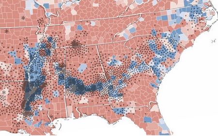
Nearly a century later, Black History is still at risk of erasure, especially in (once) geographically isolated areas, like Appalachia. The standard narrative that Scots-Irish “settled” Appalachia starting in the 18th century hides the fact that there were often violent interactions between European immigrants and indigenous people in the region. Even in the 1960s when authors like Michael Harrington and Harry Caudill reported on Appalachian mountain folk, the people were depicted as Scots-Irish descendants, known for being poor, lazy, and backward, representations that are reinforced in contemporary accounts of the region, such as J. D. Vance’s wildly popular memoir Hillbilly Elegy.


Accounts like these offer stereotypical understandings of poor Appalachian whites, and at the same time, they ignore the presence and experiences of Blacks in the region. Work by social scientists William Turner and Edward Cabell, as well as “Affrilachia” poet Frank X. Walker, and historian Elizabeth Catte attempts to remedy this problem, but the dominant narrative of the region centers still on poor whites and their lives.
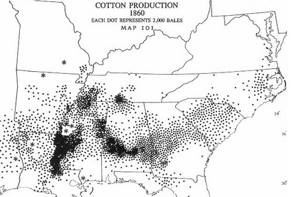
Work I have been doing documenting the life experiences of Leslie [“Les”] Whittington, a native of Western North Carolina and a descendent of a formerly enslaved people, has opened my eyes to a historical narrative I never fully knew. African Americans, for instance, accounted for approximately 10% of the Appalachian region’s population by 1860, and many were enslaved, including Les’ grandfather, John Myra Stepp. Yet, their stories are glaringly missing from the dominant narrative of the region.
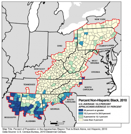
So too are the stories of Blacks living in Appalachia today. Even though the number of African American residents has increased in some parts of Appalachia, while the white population has decreased, little is formally documented about their lives. That absence has led scholar William Turner, to refer to Blacks in Appalachia as a “racial minority within a cultural minority.” Not only does erasing African Americans from the past and present of Appalachia provide an inaccurate view of the region, but it also minimizes the suffering of poor Blacks, who relative to their white counterparts, are and have been the poorest of an impoverished population.
Woodson established “Negro History Week” to document and share the history of Blacks in the United States, recognizing that, “If a race has no history, it has no worthwhile tradition, it becomes a negligible factor in the thought of the world, and it stands in danger of being exterminated.” The history of African Americans in the Appalachian region is largely absent from the area’s official record, and without making it part of the dominant narrative, we risk losing that history.
Jacqueline Clark, PhD is a professor of sociology at Ripon College. Her teaching and research interests include social inequalities, the sociology of health and illness, and the sociology of jobs and work.