demography

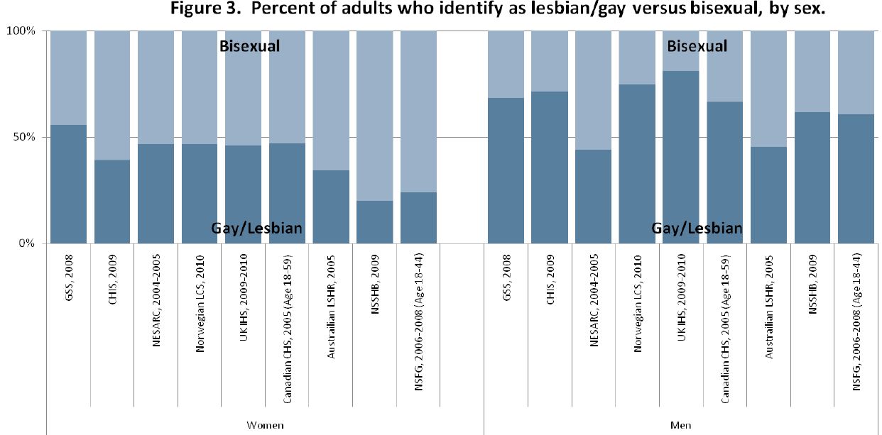
Cross-posted at Global Policy TV.

Title IX, an amendment to the Civil Rights Act of 1964, stated that “No person in the United States shall, on the basis of sex, be excluded from participation in, be denied the benefits of, or be subjected to discrimination under any education program or activity receiving Federal financial assistance…”  Passed on this day in 1972, this policy meant that schools and colleges receiving federal funding could not legally give preference to men.  Instead, they had to allocate their resources to men and women in proportion to their interest and enrollment.

The intention of the policy was to change the norms that gave preference to men in all sorts of fields, from medical schools to sports teams.  Because most schools and colleges have extensive athletics departments, sports was included among the resources that the schools were required to dole out fairly.

Accordingly, even grudging and partial compliance with the requirements of Title IX dramatically increased the opportunity for women to play sports.  In the next 35 years, women’s participation in high school and college sports would increase by 904% and 456% respectively (source).  Today, 42% of high school athletes and 45% of college athletes are women (source).

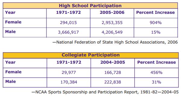
Title IX is often mistakenly accused of forcing schools to cut funding for men’s athletics.  In fact, funding for men’s athletics, as well as the number of men who play sports in school, has increased since Title IX.  The chart above also shows that men’s participation has increased by 15% in high school and 31% in college.  It’s not true, then, that Title IX has led to fewer male athletes (especially because some colleges count men as women).  Still, there is great resistance to the Amendment, with a particular emphasis on sports.  Many schools are only marginally compliant, and then only because (tireless) Title IX Officers keep pressure on institutions to follow the law.

It will be fascinating to see how changing college demographics affect the politics around Title IX.  After all, forty years later, people still argue that it’s not right that women’s sports get (almost) as much funding men’s.  Now there are more women on college campuses than men, so proportional funding may mean spending more money on women’s sports than men’s.  Fire and brimstone upon us.

Lisa Wade, PhD is an Associate Professor at Tulane University. She is the author of American Hookup, a book about college sexual culture; a textbook about gender; and a forthcoming introductory text: Terrible Magnificent Sociology. You can follow her on Twitter and Instagram.

In this talk, statistician Hans Rosling looks at whether, globally, religion impacts national fertility rates. His conclusion? Nah, not really. He also points out that while fertility rates are certainly correlated with national income levels, it’s no longer true that a nation must be wealthy before experiencing significant reductions in fertility rates. While all of the nations with fertility rates of 6 or more children per woman are, indeed, quite poor, many similarly poor countries have fertility levels similar to that in much wealthier nations — an average of about 2 children per woman.

Last week, the Census Bureau announced that as of July 1, 2011, for the first time the majority (50.4%) of babies under age 1 in the U.S. were not non-Hispanic Whites. Animal New York posted a video by Jay Smooth discussing the reactions to and implications of this news:

You can see the NYT article Jay Smooth parodies here, but note that the graph is mislabeled. The line labeled “White” actually only represents the data for non-Hispanic Whites, while the line labeled “Non-White” includes births to White Hispanics, so the terminology they used doesn’t accurately reflect what the graph illustrates.

There is no one answer to the question, “How many people are lesbian, gay, bisexual or transgender?” But demographer Gary Gates, who works for the Williams Institute at UCLA’s School of Law, has compiled the results from nine surveys that attempt to measure sexual orientation — five of them from the U.S. He estimates that 3.5% of the U.S. population identify as lesbian, gay or bisexual, while 0.3% are transgender. Here is the breakdown for the different surveys:

He also points out that bisexual identification is generally more common among women than among men. Among women, more than half of the lesbian/bisexual population identifies as bisexual; among men more than half identify as gay.

As is the case with race, we may rely on self-identification when it comes to sexual orientation. But criteria external to individuals’ identities may matter as well. These include the perceptions or actions of others (such as cross-burning or job discrimination), as well as qualities measurable by impersonal means (such as phenotypical traits or genes). In the case of sexual orientation more than race, these externally-measurable qualities include behavior (such as the gender of those one has sex with). The interpretation of these qualities, and their measurement, necessarily are highly contingent on social constructions.

In the case of sexual orientation, the questions are not usually asked, so the answers are not bureaucratically normalized. If the government and other data collectors were to start asking the question regularly, the results would probably settle down, as they have with race. In Michel Foucault’s terms, you might say the population is not disciplined with regard to sexual orientation as well as it is with race. (Of course, the public is unruly when it comes to measuring race as well, especially outside those outside the Black/White dichotomy, as “Asians” and “Hispanics” often offer national-origin identities when asked to describe their race.) Settling down doesn’t mean there would be no more changes, just that variability between surveys would probably decline.

Because of this complexity, it is interesting to compare results when people are asked about their sexual behavior, and their sexual attraction. Here surveys find much higher rates of gayness. As Gates shows, for example, 11% of Americans ages 18-44 report any same-sex sexual attraction, while 8.8% report any same-sex sexual behavior.

Whether demographers, or the public, or anyone else, considers these experiences and feelings to define people as gay/lesbian or bisexual is not resolved. For example, as Gates notes in a much longer law review article that describes the methods behind his report – and the reactions to it – some media simply ignored the self-identified bisexual population, and those with same-sex attraction or behavior, declaring that the gay and lesbian population was less than 2% of Americans. Others concluded that the commonness of bisexuality implies most gays and lesbians in fact have a “choice” about their sexual orientation.

I recommend the law review article for Gates’s in-depth discussion of “the closet” issue with regard to surveys, and the problem of measuring concealed identities — which vary according to social context and sometimes change over the course of people’s lives.

I’m grateful that Gates has pursued these questions, and taken a lot of grief in the process. He concludes:

These are challenging questions with no explicitly correct answers. The good news is that strong evidence suggests that, politically at least, the stakes in this discussion are no longer rooted in an urgent need to prove the very existence of LGBT people. This progress hopefully provides the space to more critically and thoughtfully assess these issues in an environment where a sense of urgency is not paramount. Today, the size of the LGBT community is less important than understanding the daily lives and struggles of this still-stigmatized population and informing crucial policy debates with facts rather than stereotype and anecdote.

As with race, measurement of sexual orientation may be essential to legal and political responses to inequality and discrimination — even as the process helps solidify fixed identity categories we might rather do without.

Philip N. Cohen is a professor of sociology at the University of Maryland, College Park, and writes the blog Family Inequality. You can follow him on Twitter or Facebook.

NASA has posted a series of pairs of satellite images that show a range of changes around the world. They’re great for illustrating human-environment interactions; some of the changes are directly human-caused, while others, while others show the changing consequences of floods and fires as our settlement and agricultural patterns change.

For those of us living in Las Vegas, these images of the shrinking Lake Mead reservoir, which provides water and electricity, is not reassuring. The reservoir has gotten smaller due to multiple factors, including a long-term drought and more water being taken from the Colorado River upstream:

Deforestation in Niger, as land has increasingly been turned over to agriculture:

Here, we see increasing urban growth around Denver International Airport, which now takes up 53 square miles of what used to be farmland:

Algal blooms due to agricultural and household runoff into Lake Atitlan, Guatemala:

Changes to the Sonoran coastline in Mexico due to shrimp farming:

The dramatic shrinking of the Aral Sea, largely due to the amount of water taken out of rivers for irrigation:

The full set of 167 paired images is really striking, and if viewed in the “all images” layout, you can select among various topics, focusing on cities, water, human impacts, and so on.


The Pew Hispanic Center has released a new report on trends in migration from Mexico. For the first time in 40 years, immigration from Mexico has slowed:

This is a notable change, as Mexican immigration has been the single largest immigrant flow to the U.S. form a single country, in overall numbers (though in the late 1800s, German and Irish immigrants made up a larger percent of all immigrants annually than Mexicans make up today). The report attributes this change to a range of factors, from changing economic conditions in Mexico, the recession’s effects on the U.S. economy, border enforcement, and the dangers of border crossings.

Indeed, we may now be seeing more people moving from the U.S. to Mexico than vice versa:

The change is due primarily to a drop in undocumented immigration, which peaked around 2007 and has dropped off significantly since:

There’s a lot more information available on changes in border enforcement and socio-economic changes in Mexico, so check out the full report.

Urban Demographics posted some graphs from the UN’s State of the World’s Cities 2010/2011 report on global urbanization trends. A snapshot of urbanization in 11 countries:

You can see a few other notable trends here that illustrate various national trajectories, as Phil McDermott at Cities Matter points out. For instance, notice that while Russia underwent rapid urbanization between 1950 and 1980, it has leveled off since then. Similarly, Indonesia’s urbanization slowed significantly in the late ’90s and has continued at a much slower pace since then. We also see quite different patterns between the world’s two most populous nations: While China’s urbanization rate sped up in the early ’90s (after urbanization actually dipped in the ’70s), India has experienced fairly slow urbanization.

Credit Suisse released a report on urbanization and emerging markets, if you’re interested in the impacts of urbanization on a wide array of economic development indicators, from electricity and steel consumption to projections of future housing needs to incomes and standards of living.

Sangyoub Park sent us a link to a post by the Brookings Institution about the changing racial/ethnic demographics of the 100 largest metro areas in the U.S. While White non-Hispanics still make up the majority in those areas (at 57% of the population), the minority population has grown rapidly in a number of cities; 22 of the top 100 metro areas are now majority-minority:

A detailed map of the majority-minority metro areas, with the largest racial/ethnic minority group in each (and the White non-Hispanic population in parentheses):

This demographic shift in metro areas should accelerate, given the racial/ethnic makeup of the population of children under age 1:

The Washington Post has an interactive map that lets you select an area and get detailed demographic information at the Census tract level (racial/ethnic makeup, household type, etc.) from 1990 to 2010.

Of course, as Sangyoub points out, being in the numerical majority doesn’t imply that a group no longer meets the definition of a minority group in a social sense. In many areas, racial/ethnic minorities continue to have less access to or control over economic resources, social prestige, and political power than do non-Hispanic Whites. Accumulated advantages do not get automatically redistributed when demographics change.